 Compass のミックスイン
2014年3月27日
Compass のミックスインに関するメモ。インストールや設定に関しては「 Sass/Compass のインストールと基本的な環境設定」に記載。
目次
CSS3 モジュール
CSS3 モジュールは、ベンダープレフィックスや、ブラウザの下位バージョンに対応するプロパティを書き出してくれる。
関連項目
ベンダープレフィックスのオン・オフ
レガシーブラウザの対応のオン・オフ
border-radius() 角丸
- 書式: border-radius($radius)
- $radius(角丸の半径):値を指定しない場合は、デフォルトの 5px になる( $default-border-radius: 5px )
- 値が1つ:一括指定
- 値が2つ: 左上と右下 右上と左下
- 値が3つ: 左上 右上と左下 右下
- 値が4つ: 左上 右上 右下 左下
//一括指定
.simple   { @include border-radius(10px); }

// 左上と右下 右上と左下
.compound { @include border-radius(4px 8px); }

//左上 右上と左下 右下
.crazy1    { @include border-radius(4px 10px 20px);}

// 左上 右上 右下 左下
.crazy2    { @include border-radius(1px 3px 5px 7px)}
simple
compound
crazy1
crazy2
値をカンマで区切ると、水平方向、垂直方向の丸みを指定できる。
border-radius(水平方向, 垂直方向)
.simple2 { @include border-radius(10px, 20px); }
simple2
Scss
.kadomaru1 {
  @include border-radius(10px);
}

.kadomaru2 {
  @include border-radius(10px 20px);
}

.kadomaru3 {
  @include border-radius(10px, 20px);
}

.kadomaru4 {
  @include border-radius(10px 5px, 20px 10px);
}
CSS(コンパイル後)
.kadomaru1 {
  -webkit-border-radius: 10px;
  -moz-border-radius: 10px;
  -ms-border-radius: 10px;
  -o-border-radius: 10px;
  border-radius: 10px;
}

.kadomaru2 {
  -webkit-border-radius: 10px 20px;
  -moz-border-radius: 10px 20px;
  -ms-border-radius: 10px 20px;
  -o-border-radius: 10px 20px;
  border-radius: 10px 20px;
}

.kadomaru3 {
  -webkit-border-radius: 10px 20px;
  -moz-border-radius: 10px / 20px;
  border-radius: 10px / 20px;
}

.kadomaru4 {
  -webkit-border-radius: 10px 20px;
  -moz-border-radius: 10px 5px / 20px 10px;
  border-radius: 10px 5px / 20px 10px;
}
kadomaru1
kadomaru2
kadomaru3
kadomaru4
値は「%」でも指定可能。以下は円(まん丸)を作成する例。
.circle {
  @include border-radius(50%);
  border: 1px solid #ccc;
  background:#EFEFEF;
  height: 80px;
  width: 80px;
  /* display: block; */
  text-align: center;
  line-height: 80px;
}
circle
border-radius() の他にそれぞれの角に対して以下のようなミックスインもある。
- border-top-left-radius($radius)
- border-top-right-radius($radius)
- border-bottom-left-radius($radius)
- border-bottom-right-radius($radius)
- border-top-radius($radius)
- border-right-radius($radius)
- border-bottom-radius($radius)
- border-left-radius($radius)
.btrr {
  @include border-top-right-radius(100%);
}

//コンパイル後
.btrr {
  -moz-border-radius-topright: 100%;
  -webkit-border-top-right-radius: 100%;
  border-top-right-radius: 100%;
}
btrr
box-shadow() ボックスシャドウ
- 書式: box-shadow($shadow)
- $shadow(影の値):CSS3 の指定方法と同じ。値を指定しない場合は、縦・横位置は「0px」、ぼかし「5px」、色「#333333」になる。またカンマ区切りで複数の「影の値」を指定できる。
box-shadow(横オフセット, 縦オフセット, ブラー, スプレッド, 色, inset キーワード)
- 影の値は2~4つの長さの値で指定。
- 任意で色、inset キーワードを指定することが可能。
- inset キーワードを付けると、影がボックスの外側ではなく内側につく。
- 長さの指定を省略すると 0 となる。
- 色の指定を省略するとユーザーエージェントが選んだ色になる。
- 複数の影を指定する場合には、カンマ( , )区切りで影のリストを複数指定。
以下はそれぞれの指定について。
- 横オフセット:水平方向の影のオフセット距離。正の値を指定すると右へ、負の値を指定すると左へ影が移動。
- 縦オフセット:垂直方向の影のオフセット距離。正の値を指定すると下へ、負の値を指定すると上へ影が移動。
- ブラー:ぼかし距離。 値が大きいほど影の端のぼかしが強くなり、値が 0 の場合には端がくっきりとした影になる。負の値は指定できない。
- スプレッド:広がり距離。正の値を指定すると影を全方向に拡大、負の値を指定すると縮小する。
- 色:色の値を指定すると、影がその色になる。
- inset キーワード:inset キーワードを指定すると、ボックスの外側の影から内側の影に変更される。
以下はデフォルトの値
- $default-box-shadow-h-offset: 0px(横オフセット)
- $default-box-shadow-v-offset: 0px(縦オフセット)
- $default-box-shadow-blur: 5px(ブラー)
- $default-box-shadow-spread: false(スプレッド)
- $default-box-shadow-color: #333333(色)
- $default-box-shadow-inset: false(inset キーワード)
また、CSS では16進数の RGB 値に透明度を指定するとエラーになるが、Sass ではこれを自動的に変換する rgba() という関数があるので、16進数の RGB 値に透明度を指定することが可能(カラーネームのキーワードでの指定も可能)
.bs1 {
  @include box-shadow();
}

.bs2 {
  @include box-shadow(0 2px 4px rgba(#5540CC, .8));
}

.bs3 {
  @include box-shadow(0 2px 4px 1px rgba(#000, .3), 5px 5px 10px 3px rgba(orange ,0.1) inset);
}
CSS(コンパイル後)
.bs1 {
  -webkit-box-shadow: 0px 0px 5px #333333;
  -moz-box-shadow: 0px 0px 5px #333333;
  box-shadow: 0px 0px 5px #333333;
}

.bs2 {
  -webkit-box-shadow: 0 2px 4px rgba(85, 64, 204, 0.8);
  -moz-box-shadow: 0 2px 4px rgba(85, 64, 204, 0.8);
  box-shadow: 0 2px 4px rgba(85, 64, 204, 0.8);
}

.bs3 {
  -webkit-box-shadow: 0 2px 4px 1px rgba(0, 0, 0, 0.3), 5px 5px 10px 3px rgba(255, 165, 0, 0.1) inset;
  -moz-box-shadow: 0 2px 4px 1px rgba(0, 0, 0, 0.3), 5px 5px 10px 3px rgba(255, 165, 0, 0.1) inset;
  box-shadow: 0 2px 4px 1px rgba(0, 0, 0, 0.3), 5px 5px 10px 3px rgba(255, 165, 0, 0.1) inset;
}
bs1
bs2
bs3
.bs4 {
  @include box-shadow(10px 10px 10px 10px rgba(0, 0, 0, 0.4) inset, 3px 3px 10px 3px rgba(0, 0, 0, 0.2));
}

//コンパイル後
.bs4 {
  -webkit-box-shadow: 10px 10px 10px 10px rgba(0, 0, 0, 0.4) inset, 3px 3px 10px 3px rgba(0, 0, 0, 0.2);
  -moz-box-shadow: 10px 10px 10px 10px rgba(0, 0, 0, 0.4) inset, 3px 3px 10px 3px rgba(0, 0, 0, 0.2);
  box-shadow: 10px 10px 10px 10px rgba(0, 0, 0, 0.4) inset, 3px 3px 10px 3px rgba(0, 0, 0, 0.2);
}
bs4
text-shadow テキストシャドウ
ベンダープレフィックスは付かないので、CSS で指定しても同じ(だと思う)。
- 書式: text-shadow($shadow)
- $shadow(影の値):CSS3 の指定方法と同じ。値を指定しない場合は、縦・横位置は「0px」、ぼかし「1px」、色「#aaaaaa」になる。またカンマ区切りで複数の「影の値」を指定できる。
text-shadow(横オフセット, 縦オフセット, ブラー, [スプレッド,] 色)
デフォルトの値
- $default-text-shadow-color : #aaaaaa(色)
- $default-text-shadow-h-offset : 0px(横オフセット)
- $default-text-shadow-v-offset : 0px( 縦オフセット)
- $default-text-shadow-blur : 1px(ブラー)
- $default-text-shadow-spread : false (スプレッド)
.ts1 {
  @include text-shadow();
}

.ts2 {
  @include text-shadow(1px 1px 0 rgba(orange, 0.4) );
}

.ts3 {
   @include text-shadow(rgba(blue, 0.2) 1px 1px 0, rgba(blue, 0.2) 2px 2px 0, rgba(blue, 0.2) 3px 3px 0);

}
コンパイル後
.ts1 {
  text-shadow: 0px 0px 1px #aaaaaa;
}

.ts2 {
  text-shadow: 1px 1px 0 rgba(255, 165, 0, 0.4);
}

.ts3 {
  text-shadow: rgba(0, 0, 255, 0.2) 1px 1px 0, rgba(0, 0, 255, 0.2) 2px 2px 0, rgba(0, 0, 255, 0.2) 3px 3px 0;
}
Text Shadow 1
Text Shadow 2
Text Shadow 3
文字にグロー効果をつけたい場合も、text-shadow を使える。縦横の影のオフセットを「0」に指定。
.ts4 {
  @include text-shadow(0px 0px 5px white, 0px 0px 5px white, 0px 0px 5px white);
}

//コンパイル後
.ts4 {
  text-shadow: 0px 0px 5px white, 0px 0px 5px white, 0px 0px 5px white;
}
Text Shadow 4
linear-gradient(), radial-gradient() グラデーション
CSS グラデーション(参考)
CSS グラデーションの利用
linear-gradient
CSS3 のグラデーションをベンダープレフィックス付きで使用する場合は、background または background-image ミックスインを利用する。
- グラデーションの指定方法は CSS と同じでカンマ区切りのショートハンドで指定できる。
- グラデーションや URL だけを指定する場合は、 background-image ミックスインを使用するとよい。
@include background(linear-gradient(値));
@include background(radial-gradient(値));
@include background-image(linear-gradient(値));
@include background-image(radial-gradient(値));
線形グラデーション
- 書式
- linear-gradient(角度, カラーストップ, カラーストップ …)
- 角度(開始位置)
- 0deg や 90deg などの角度で指定
または、キーワード(top/bottom/left/right)やその組み合わせ(top left など)
角度を省略すると「top」として処理される
top : (270deg または -90deg)上から下
left: (0deg)左から右
bottom: (90deg -270deg)下から上
right: (180deg)右から左 - カラーストップ
-
色の値と位置を半角スペースで区切って指定(数値 または %)。
「色の値 位置」
始点の位置は「0%」や「0px」で、終点の位置は「100%」で指定
「0%」と「100%」の指定は省略可能
単一方向のグラデーションの例
.lg1 {
  @include background-image(linear-gradient(#FFF, #999));
}

//コンパイル後
.lg1 {
  background-image: -webkit-gradient(linear, 50% 0%, 50% 100%, color-stop(0%, #ffffff), color-stop(100%, #999999));
  background-image: -webkit-linear-gradient(#ffffff, #999999);
  background-image: -moz-linear-gradient(#ffffff, #999999);
  background-image: -o-linear-gradient(#ffffff, #999999);
  background-image: linear-gradient(#ffffff, #999999);
}
lg1
第1引数に角度(開始位置)を指定した例
.lg2 {
  @include background-image(linear-gradient(left, #FFF, #6587CD));
}

//コンパイル後
.lg2 {
  background-image: -webkit-gradient(linear, 0% 50%, 100% 50%, color-stop(0%, #ffffff), color-stop(100%, #6587cd));
  background-image: -webkit-linear-gradient(left, #ffffff, #6587cd);
  background-image: -moz-linear-gradient(left, #ffffff, #6587cd);
  background-image: -o-linear-gradient(left, #ffffff, #6587cd);
  background-image: linear-gradient(left, #ffffff, #6587cd);
}
lg2
途中の色を増やして位置を指定する例
.lg3 {
  @include background-image(linear-gradient(#efefef, #69B6A7 30%, #8CC486 70%, #BEB870));
}

//コンパイル後
.lg3 {
  background-image: -webkit-gradient(linear, 50% 0%, 50% 100%, color-stop(0%, #efefef), color-stop(30%, #69b6a7), color-stop(70%, #8cc486), color-stop(100%, #beb870));
  background-image: -webkit-linear-gradient(#efefef, #69b6a7 30%, #8cc486 70%, #beb870);
  background-image: -moz-linear-gradient(#efefef, #69b6a7 30%, #8cc486 70%, #beb870);
  background-image: -o-linear-gradient(#efefef, #69b6a7 30%, #8cc486 70%, #beb870);
  background-image: linear-gradient(#efefef, #69b6a7 30%, #8cc486 70%, #beb870);
}
lg1
円形グラデーション
- 書式
- radial-gradiend(横の表示位置, 縦の表示位置, 形状 半径, カラーストップ, カラーストップ …)
- 横の表示位置, 縦の表示位置
- 横の表示位置, 縦の表示位置で中心点の表示位置を指定
ボックスの左辺と上辺からの距離(ピクセル)または比率(%)で指定する
または、キーワードで指定する
中心点の表示位置を省略すると初期値の center になる。
横の表示位置
left: (0%)左
center: (50%)中央
right: (100%)右
縦の表示位置
top : (0%)上
center: (50%)中央
bottom: (100%)下 - 形状 半径
-
形状と半径を半角スペースで区切って指定。
形状
形状は正円(circle)と楕円(ellipse)を選択できる。
指定を省略すると、初期値の ellipse となる。 -
半径
closest-side : 中心点から最も近い辺までの長さを半径とする
closest-corner : 中心点から最も近い角までの長さを半径とする
farthest-side : 中心点から最も遠い辺までの長さを半径とする
farthest_corner : 中心点から最も遠い角までの長さを半径とする
contain : 円全体がボックスに収まる大きさで表示
cover : 円全体がボックスをカバーする大きさで表示
指定を省略すると、初期値の cover になる - カラーストップ
-
色の値と位置を半角スペースで区切って指定(数値 または %)。
「色の値 位置」
始点(円の中心)の位置は「0%」や「0px」で、終点(円の外周)の位置は「100%」で指定
「0%」と「100%」の指定は省略可能
単一方向のグラデーションの例
.rg1 {
  @include background-image(radial-gradient(#FFF, #999));
}

//コンパイル後
.rg1 {
  background-image: -webkit-gradient(radial, 50% 50%, 0, 50% 50%, 100, color-stop(0%, #ffffff), color-stop(100%, #999999));
  background-image: -webkit-radial-gradient(#ffffff, #999999);
  background-image: -moz-radial-gradient(#ffffff, #999999);
  background-image: -o-radial-gradient(#ffffff, #999999);
  background-image: radial-gradient(#ffffff, #999999);
}
rg1
途中の色を増やして位置を指定する例
.rg2 {
  @include background-image(radial-gradient(yellow 0%, orange 50%, pink 100%));
}

//コンパイル後
.rg2 {
  background-image: -webkit-gradient(radial, 50% 50%, 0, 50% 50%, 100, color-stop(0%, #ffff00), color-stop(50%, #ffa500), color-stop(100%, #ffc0cb));
  background-image: -webkit-radial-gradient(#ffff00 0%, #ffa500 50%, #ffc0cb 100%);
  background-image: -moz-radial-gradient(#ffff00 0%, #ffa500 50%, #ffc0cb 100%);
  background-image: -o-radial-gradient(#ffff00 0%, #ffa500 50%, #ffc0cb 100%);
  background-image: radial-gradient(#ffff00 0%, #ffa500 50%, #ffc0cb 100%);
}
rg2
IE9 にグラデーション対応
IE9 はグラデーションに対応していないので、SVG を埋め込むことができ、その場合は設定変数「$experimental-support-for-svg」を「true」にする。
.lg_svg {
  $experimental-support-for-svg: true;
  @include background-image(linear-gradient(#78B9C5, #A0D8A9));
}

//コンパイル後
.lg_svg  {
  background-image: url('data:image/svg+xml;base64,PD94bWwgdmVyc2lvbj0iMS4wIiB...C9zdmc+IA==');
  background-size: 100%;
  background-image: -webkit-gradient(linear, 50% 0%, 50% 100%, color-stop(0%, #78b9c5), color-stop(100%, #a0d8a9));
  background-image: -webkit-linear-gradient(#78b9c5, #a0d8a9);
  background-image: -moz-linear-gradient(#78b9c5, #a0d8a9);
  background-image: -o-linear-gradient(#78b9c5, #a0d8a9);
  background-image: linear-gradient(#78b9c5, #a0d8a9);
}
IE6~IE8 で利用可能な filter プロパティでグラデーションを書き出す
filter-gradient ミックスインを使用する。background-image ミックスインなどと併用する場合は、filter-gradient ミックスインを先に記述する。
- filter-gradient(開始色, 終了色, 方向)
- 方向:縦の「vertical」か横の「horizontal」を指定
.lg4 {
   background-color:#EEE;  /* フォールバック */
   @include filter-gradient(#EEE, #666, vertical);
   @include background-image(linear-gradient(#EEE, #666));
}

//コンパイル後
.lg4 {
  background-color: #EEE;
  *zoom: 1;
  filter: progid:DXImageTransform.Microsoft.gradient(gradientType=0, startColorstr='#FFEEEEEE', endColorstr='#FF666666');
  background-image: url('data:image/svg+xml;base64,PD94bWwgdmVyc2lvbj0iMS4wIiBlbmNvZG...');
  background-size: 100%;
  background-image: -webkit-gradient(linear, 50% 0%, 50% 100%, color-stop(0%, #eeeeee), color-stop(100%, #666666));
  background-image: -webkit-linear-gradient(#eeeeee, #666666);
  background-image: -moz-linear-gradient(#eeeeee, #666666);
  background-image: -o-linear-gradient(#eeeeee, #666666);
  background-image: linear-gradient(#eeeeee, #666666);
}
Color Helpers
色関係のヘルパー関数
- adjust-lightness($color, $amount)
- 明るさの調整。Sass の lighten() と darken() の両方の機能を持つ。
$color:色
$amount:値(%)。負の値も指定可能。
.test {
  color: adjust-lightness(#999, -10%);
}

.test2 {
  color: darken(#999, 10%);
}

//コンパイル後
.test {
  color: gray;
}

.test2 {
  color: gray;
}
- scale-lightness($color, $amount)
- 明るさの調整。adjust-lightness()と微妙に異なる。
$color:色
$amount:値(%)。負の値も指定可能。
参考サイト:Using scale-color in Sass
- adjust-saturation($color, $amount)
- 彩度の調整。Sass の saturate() と desaturate() の両方の機能を持つ。
$color:色
$amount:値(%)。負の値も指定可能。
.test {
  color: adjust-saturation(blue, -50%);

}

.test2 {
  color: desaturate(blue, 50%);
}

//コンパイル後
.test {
  color: #4040bf;
}

.test2 {
  color: #4040bf;
}
- scale-saturation($color, $amount)
- 彩度の調整。adjust-saturation()との差異がわからない。。。
$color:色
$amount:値(%)。負の値も指定可能。
参考サイト:http://jackiebalzer.com/color
一番上のサンプルカラーを選択すると、それぞれの関数での結果の色が表示されるのでおもしろい。
- shade($color, $percentage)
- 黒を混ぜることにより暗くする。
$color:色
$percentage:割合(%)。負の値は不可。
- tint($color, $percentage)
- 白を混ぜることにより明るくする。
$color:色
$percentage:割合(%)。負の値は不可。
transform 変形処理
Compass/CSS3/transform
デモ:Demo: Transform
| 変形処理 | トランスフォーム関数 | 値 |
|---|---|---|
| 移動 | translate(Tx, Ty) |
Tx : x 軸方向の移動距離 Ty : y軸方向の移動距離 |
| translateX(Tx) | ||
| translateY(Ty) | ||
| 拡大・縮小 | scale(Sx, Sy) |
Sx : x 軸方向の拡大縮小の倍率 Sy : y軸方向の拡大縮小の倍率 |
| scaleX(Sx) | ||
| scaleY(Sy) | ||
| 回転 | rotate(R) | R : 回転角度 |
| スキュー | skew(Sx, Sy) |
Sx : x 軸方向のスキューの角度 Sy : y軸方向のスキューの角度 |
| skewX(Sx) | ||
| skewY(Sy) |
rotate 回転
.rotate15 {
  @include rotate(15deg);
}

//コンパイル後
.rotate15{
  -webkit-transform: rotate(15deg);
  -moz-transform: rotate(15deg);
  -ms-transform: rotate(15deg);
  -o-transform: rotate(15deg);
  transform: rotate(15deg);
  -ms-filter: "progid:DXImageTransform.Microsoft.Matrix(sizingMethod='auto expand', M11=0.96593, M12=-0.25882, M21=0.25882, M22=0.96593)";
  filter: progid:DXImageTransform.Microsoft.Matrix(sizingMethod='auto expand', M11=0.96593, M12=-0.25882, M21=0.25882, M22=0.96593);
}
.rotate15
リストのリンク要素にホバーすると、回転させる例。
li {
  a {
    display: block;
    padding:10px 0 0 40px;
    height: 32px;
    font-size: 14px;
    &:hover {
      @include rotate(15deg);
    }
  }
}

//コンパイル後
li a {
  display: block;
  padding: 10px 0 0 40px;
  height: 32px;
  font-size: 14px;
}
li a:hover {
  -webkit-transform: rotate(15deg);
  -moz-transform: rotate(15deg);
  -ms-transform: rotate(15deg);
  -o-transform: rotate(15deg);
  transform: rotate(15deg);
  -ms-filter: "progid:DXImageTransform.Microsoft.Matrix(sizingMethod='auto expand', M11=0.96593, M12=-0.25882, M21=0.25882, M22=0.96593)";
  filter: progid:DXImageTransform.Microsoft.Matrix(sizingMethod='auto expand', M11=0.96593, M12=-0.25882, M21=0.25882, M22=0.96593);
}
skew スキュー
.skew {
  @include skew(-20deg, -20deg);
}

//コンパイル後
.skew {
  -webkit-transform: skew(-20deg, -20deg);
  -moz-transform: skew(-20deg, -20deg);
  -ms-transform: skew(-20deg, -20deg);
  -o-transform: skew(-20deg, -20deg);
  transform: skew(-20deg, -20deg);
}
skew
scale 拡大・縮小
.scale:hover {
  @include scale(2);
}

//コンパイル後
.scale:hover {
  -webkit-transform: scale(2, 2);
  -moz-transform: scale(2, 2);
  -ms-transform: scale(2, 2);
  -o-transform: scale(2, 2);
  transform: scale(2, 2);
}
translate 移動
.translate:hover {
  @include translate(20px, 20px);
}

//コンパイル後
.translate:hover {
  -webkit-transform: translate(20px, 20px);
  -moz-transform: translate(20px, 20px);
  -ms-transform: translate(20px, 20px);
  -o-transform: translate(20px, 20px);
  transform: translate(20px, 20px);
}
opacity 不透明度
不透明度のミックスイン
- @include opacity($opacity)
- $opacity には 0.1 ~ 1.0 の値を指定(必須)
.opacity50 {
  @include opacity(0.5);
}

//コンパイル後
.opacity50 {
  filter: progid:DXImageTransform.Microsoft.Alpha(Opacity=50);
  opacity: 0.5;
}
inline-block
コンテンツを横並びにするミックスイン
.inlineBox {
  @include inline-block;
}

//コンパイル後
.inlineBox {
  display: -moz-inline-stack;
  display: inline-block;
  vertical-align: middle;
  *vertical-align: auto;
  zoom: 1;
  *display: inline;
}
background-size()
背景画像のサイズを設定する。現在の対象ブラウザは Opera, Gecko, Webkit
- background-size($size)
- $size:px, %, キーワード(auto, contain, cover)を使って指定。
#cover {
    @include background-size(cover);
}
#percent {
    @include background-size(50% 50%);
}
#absolute {
    @include background-size(100px 25px);
}

//コンパイル後
#cover {
  -webkit-background-size: cover;
  -moz-background-size: cover;
  -o-background-size: cover;
  background-size: cover;
}

#percent {
  -webkit-background-size: 50% 50%;
  -moz-background-size: 50% 50%;
  -o-background-size: 50% 50%;
  background-size: 50% 50%;
}

#absolute {
  -webkit-background-size: 100px 25px;
  -moz-background-size: 100px 25px;
  -o-background-size: 100px 25px;
  background-size: 100px 25px;
}
Utilities モジュール
ユーティリティ系ミックスインで以下のような種類がある。(リストやテキストは Typography モジュールにも属しているみたいで区分があいまい?)
- Links – アンカーのスタイル
- Lists – リストのスタイル
- Text – テキストのスタイル
- Color – 色関連のユーティリティ
- General – 他に属さない色関連のユーティリティ
- Sprites – スプライトのミックスイン
- Tables – テーブルのスタイル
clearfix
clearfix のミックスイン(float の回り込みの解除等)
「overflow: hidden;」で回り込みを解除して IE 用のハック「*zoom: 1;」が付くもの
.clearfix {
  @include clearfix;
}

//コンパイル後
.clearfix {
  overflow: hidden;
  *zoom: 1;
}
pie-clearfix と legacy-pie-clearfix
Firefox 3.5 より前をサポートするには「legacy-pie-clearfix」を使用するとのこと。
pie-clearfix
.clearfix2 {
  @include pie-clearfix;
}

//コンパイル後
.clearfix2 {
  *zoom: 1;
}
.clearfix2:after {
  content: "";
  display: table;
  clear: both;
}
legacy-pie-clearfix
.clearfix3 {
  @include legacy-pie-clearfix;
}

//コンパイル後
.clearfix3 {
  *zoom: 1;
}
.clearfix3:after {
  content: "\0020";
  display: block;
  height: 0;
  clear: both;
  overflow: hidden;
  visibility: hidden;
}
clearfix について参考になる記事
「clearfix」についてちょっと考えてみた。(tam-tam.co.jp)
floatを解除する手法のclearfix と 次世代のレイアウトの話(kojika17.com)
min-height min-width
min-height と min-width をレガシーブラウザに対応させるミックスイン。
.minWidth {
  @include min-width(320px);
}

.minHeight {
  @include min-height(200px);
}

//コンパイル後
.minWidth {
  min-width: 320px;
  width: auto !important;
  width: 320px;
}

.minHeight {
  min-height: 200px;
  height: auto !important;
  height: 200px;
}
contrasted 色の対比
背景色の明るさにより文字色を変更するミックスイン。
- @include contrasted($background-color, $dark, $light, $threshold)
- $background-color:背景色(必須)
$dark:背景色が明るい場合の文字色(オプション。デフォルトは「black」)
$light:背景色が暗い場合の文字色(オプション。デフォルトは「white」)
$threshold:しきい値。背景色が「暗い」から「明るい」への変化する度合い(?)0%~100% で指定(オプション)
以下の設定変数を指定することでデフォルトを変更することが可能。
$contrasted-dark-default : black
$contrasted-light-default : white
$contrasted-lightness-threshold : 30%
.foo {
  @include contrasted(#eee);
}

.bar {
  @include contrasted(#333, #666, #efefef);
}

//コンパイル後
.foo {
  background-color: #eeeeee;
  color: black;
}

.bar {
  background-color: #333333;
  color: #efefef;
}
インラインリスト
リストを横並びにするミックスインで以下の3種類があり、ul 要素または ol 要素に対して指定する。
inline-list
.il {
  @include inline-list;
}

//コンパイル後
.il {
  list-style-type: none;
}
.il, .il li {
  margin: 0px;
  padding: 0px;
  display: inline;
}
inline-block-list
.ibl {
  @include inline-block-list;
}

//コンパイル後
.ibl {
  margin: 0;
  padding: 0;
  border: 0;
  overflow: hidden;
  *zoom: 1;
}
.ibl li {
  list-style-image: none;
  list-style-type: none;
  margin-left: 0;
  display: -moz-inline-stack;
  display: inline-block;
  vertical-align: middle;
  *vertical-align: auto;
  zoom: 1;
  *display: inline;
  white-space: nowrap;
}
horizontal-list
.hl {
  @include horizontal-list;
}

//コンパイル後
.hl {
  margin: 0;
  padding: 0;
  border: 0;
  overflow: hidden;
  *zoom: 1;
}
.hl li {
  list-style-image: none;
  list-style-type: none;
  margin-left: 0;
  white-space: nowrap;
  display: inline;
  float: left;
  padding-left: 4px;
  padding-right: 4px;
}
.hl li:first-child, .hl li.first {
  padding-left: 0;
}
.hl li:last-child {
  padding-right: 0;
}
.hl li.last {
  padding-right: 0;
}
リストアイコン pretty-bullets
リストにアイコン画像を付けるミックスイン。
Compass/Utilities/Bullets
- 書式:@include pretty-bullets(画像ファイル名, 幅, 高さ, 行間, 左パディング )
- 画像ファイル名:必須(URL は自動で取得)
幅, 高さ, 行間, 左パディング :オプション
- 画像ファイル名のみを指定すると、自動でサイズを取得してくれる
- 行間のデフォルトは「18px」、左パディングのデフォルトは「14px」
- 必要に応じて幅, 高さ, 行間, 左パディングを指定する(単位は統一する必要がある)
- ul 要素または ol 要素に対して指定する
.greenArrowList {
  @include pretty-bullets('arrow_green_small-trans.png', 10px, 10px, 20px, 20px);
}

//コンパイル後
.greenArrowList {
  margin-left: 0;
}
.greenArrowList li {
  padding-left: 20px;
  background: url('images/arrow_green_small-trans.png?1365895820') no-repeat 5px 5px;
  list-style-type: none;
}
画像ファイル名の末尾にクエリ情報が付く場合があるが、設定ファイル(config.rb)で「asset_cache_buster :none」を指定すれば付かないようになる。
- sample list
- sample list
- sample list
Typography モジュール
テキスト関連のモジュール
force-wrap
長いテキストや URL がはみ出してレイアウトが崩れるのを防ぐミックスイン。
.forceWrap {
  @include force-wrap;
}

//コンパイル後
.forceWrap {
  white-space: pre;
  white-space: pre-wrap;
  white-space: pre-line;
  white-space: -pre-wrap;
  white-space: -o-pre-wrap;
  white-space: -moz-pre-wrap;
  white-space: -hp-pre-wrap;
  word-wrap: break-word;
}
link-colors リンクカラー
文字色と疑似クラスを設定するミックスイン。
- link-colors($normal, $hover, $active, $visited, $focus)
- $normal:通常の色(必須)
$hover – :hover の色
$active – :active の色
$visited – :visited の色
$focus – :focus の色
.foo {
  @include link-colors(#3567CE, lighten(#3567CE, 10%), lighten(#3567CE,20%), darken(#3567CE,10%));
}

//コンパイル後
.foo {
  color: #3567ce;
}
.foo:visited {
  color: #2952a7;
}
.foo:hover {
  color: #5e86d8;
}
.foo:active {
  color: #87a5e2;
}
画像置換 replace-text-with-dimensions
画像置換のミックスイン。(text-indent プロパティでテキストを飛ばして置換)
おなじようなミックスインに「replace-text」があるが、対象の文字列の font-size と画像のサイズが大きく異なる場合などは画像が切れて表示されてしまう。
replace-text-with-dimensions は画像のサイズを取得して幅と高さを自動で指定してくれる。
- replace-text-with-dimensions($img, $x, $y, $inline)
- $img:画像ファイル名(必須)
$x:background-position-x (デフォルトは 50%)
$y:background-position-y (デフォルトは 50%)
$inline:true を指定するとインラインイメージ(data uri)が使用される(デフォルトは false)
画像ファイル名の末尾にクエリ情報が付く場合があるが、設定ファイル(config.rb)で「asset_cache_buster :none」を指定すれば付かないようになる。
.replace_txt {
  @include replace-text-with-dimensions('test.png', 0, 0);
}

//コンパイル後
.replace_txt {
  text-indent: -119988px;
  overflow: hidden;
  text-align: left;
  background-image: url('images/test.png');
  background-repeat: no-repeat;
  background-position: 0 0;
  width: 130px;
  height: 30px;
}
インラインイメージ
画像を文字列に変換してそのデータそのものを HTML や CSS のソースコード内に埋め込む方法
利点:
HTTPリクエストを減らせる
注意点(デメリット):
データサイズが 37% 増加する
古いIEには対応していない。比較的新しいIEでも制限があり注意が必要
データ自体はキャッシュされない
hide-text()
text-indent プロパティでテキストを飛ばして見えないようにする。
- hide-text($direction)
- $direction(オプション):デフォルトは設定変数「$hide-text-direction」の値「left 」
.test {
   @include hide-text();
}

//コンパイル後
.test {
  text-indent: -119988px;
  overflow: hidden;
  text-align: left;
}
Vertical Rhythm
サイトの文字サイズや行間などを読みやすいように設定するミックスイン。
参考にしたサイト
- 脳に優しいデザインを!「Vertical Rhythm」の基本と実現方法(LIG)
- How to: sensible default typography with a vertical rhythm
- Vertical Rhythm with Compass
- Using Sass & Compass Vertical Rhythm to set up typography defaults in a project.
- Compass Tutorials #10 – Vertical Rhythm
基準となるフォントサイズと行間の設定
以下の設定変数を使って指定し、その後に「establish-baseline」ミックスインを記述する。
$base-font-size(基準となるフォントサイズ。デフォルトは 16px)
$base-line-height(基準となる行間。デフォルトは 24px)
- establish-baseline($font-size) ミックスイン
- $font-size:省略可能(デフォルトは $base-font-size)
$base-font-size: 16px;
$base-line-height: 24px;
@include establish-baseline;
コンパイル後
* html {
  font-size: 100%;
}

html {
  font-size: 16px;
  line-height: 1.5em;
}
見出しサイズ等の設定
段落のフォントサイズは「adjust-font-size-to」ミックスインを使う。
- adjust-font-size-to($to-size, $lines, $from-size)
- $to-size:フォントサイズ。何 px に設定するかを指定(必須)
$lines:line-height を基準となる行間の何倍に設定するか。「2」なら、ベースユニットの2倍になる。
$from-size:基準となるフォントサイズ。デフォルトは $base-font-size。
段落の上部スペースの設定は「leader」「padding-leader」「margin-leader」ミックスインを使って指定。(適するミックスインを使用。)
- leader($lines, $font-size, $property)
-
margin-top($property の設定により padding-top)を設定
$lines:基準となる行間の何倍にするか。
$font-size:基準となるフォントサイズ。デフォルトは $base-font-size
$property:margin か padding を指定。デフォルトは margin
- padding-leader($lines, $font-size)
-
padding-top を設定
$lines:基準となる行間の何倍にするか。
$font-size:基準となるフォントサイズ。デフォルトは $base-font-size
- margin-leader($lines, $font-size)
-
margin-top を設定
$lines:基準となる行間の何倍にするか。
$font-size:基準となるフォントサイズ。デフォルトは $base-font-size
段落の下部スペースの設定は「trailer」「padding-trailer」「margin-trailer」ミックスインを使って指定。(適するミックスインを使用。)
- trailer($lines, $font-size, $property)
-
margin-bottom($property の設定により padding-bottom)を設定
$lines:基準となる行間の何倍にするか。
$font-size:基準となるフォントサイズ。デフォルトは $base-font-size
$property:margin か padding を指定。デフォルトは margin
- padding-trailer($lines, $font-size)
-
padding-bottom を設定
$lines:基準となる行間の何倍にするか。
$font-size:基準となるフォントサイズ。デフォルトは $base-font-size
- margin-trailer($lines, $font-size)
-
margin-bottom を設定
$lines:基準となる行間の何倍にするか。
$font-size:基準となるフォントサイズ。デフォルトは $base-font-size
h1 の設定例
h1 {
    $font-size:36px;
    @include adjust-font-size-to($font-size,3);
    @include leader(1,$font-size);
    @include trailer(1,$font-size);
}
コンパイル後
h1 {
  font-size: 2.25em;
  line-height: 2em;
  margin-top: 0.66667em;
  margin-bottom: 0.66667em;
}
rhythm 関数を使ってのマージンの指定
「leader」や「trailer」を使わないで、rhythm 関数を使って指定することもできる。(ミックスインの rhythm とは異なる)
- rhythm($lines, $font-size, $offset) 関数
-
$lines:基準となる行間の何倍にするか。(デフォルトは1)
$font-size:基準となるフォントサイズ。(デフォルトは $base-font-size )
$offset:オフセット(デフォルトは0)
h1 {
  @include adjust-font-size-to(36px);
  margin: 0 0 rhythm(1, 36px) 0;
}

h2 {
  @include adjust-font-size-to(30px);
  margin: rhythm(.5, 30px) 0 rhythm(1, 30px) 0;
}
コンパイル後
h1 {
  font-size: 2.25em;
  line-height: 1.33333em;
  margin: 0 0 0.66667em 0;
}

h2 {
  font-size: 1.875em;
  line-height: 1.6em;
  margin: 0.4em 0 0.8em 0;
}
ボーダーの処理
ボーダーを指定した場合、その幅の分ずれる(リズムが狂う)ので「leading-border」「trailing-border」ミックスインを利用することができる。
- leading-border($width, $lines, $font-size, $border-style)
- $width:ボーダーの幅(デフォルトは 1px)
$lines:基準となる行間の何倍にするか。(デフォルトは 1)
$font-size:基準となるフォントサイズ。(デフォルトは $base-font-size)
$border-style:ボーダーのスタイル(デフォルトは $default-rhythm-border-style:solid )
- trailing-border($width, $lines, $font-size, $border-style)
- $width:ボーダーの幅(デフォルトは 1px)
$lines:基準となる行間の何倍にするか。(デフォルトは 1)
$font-size:基準となるフォントサイズ。(デフォルトは $base-font-size)
$border-style:ボーダーのスタイル(デフォルトは $default-rhythm-border-style:solid )
.bordered {
  @include leading-border(2px, .5);
  @include trailing-border(2px, .5);
}
$width:ボーダーの幅を 2px、$lines:基準となる行間の何倍にするかを 0.5 に指定したので、24px(基準となる行間)の半分 12px (10px + 2px)が上下にあてられる。
コンパイル後
.bordered {
  border-top-style: solid;
  border-top-width: 0.125em;  // 2px
  padding-top: 0.625em;  // 10px
  border-bottom-style: solid;
  border-bottom-width: 0.125em;  // 2px
  padding-bottom: 0.625em;  // 10px
}
Compass Helper Functions
ヘルパー関数の一覧
Compass Helper Functions
画像の幅と高さの取得
- image-width(“path/to/$image”), image-height(“path/to/$image”)
- path/to/$image:画像ファイルへのパス
.test {
  width: image-width('icon/contact.png');
  height: image-height('icon/contact.png');
}

//コンパイル後
.test {
  width: 32px;
  height: 32px;
}
画像の URL を補完
- image-url($path, $only-path, $cache-buster)
- $path:画像ファイルへのパス
$only-path:デフォルトは「false」。「true」を指定すると url() なしのパスが返る。
$cache-buster:デフォルトは「true」。「false」を指定すると cache-buster の機能を使用しない。
.test {
  background-url: image-url('icon/contact.png');
}

//コンパイル後
.test {
  background-url: url('../images/icon/contact.png');
}
/* config.rb での「relative_assets」の設定により変わる。
上記は「relative_assets = true」の場合。この指定がなければプロジェクトフォルダからのパスになる。
また、第2引数を「true」にすると url() なしの /images/icon/contact.png になる。*/
画像をインラインイメージ(base64)に変換
- inline-image($image)
- インラインイメージ(data uri)に変換する
$image:画像ファイル名
.test {
   background-image: inline-image('icon/pizza.png');
}

//コンパイル後
.test {
  background-image: url('data:image/png;base64,iVBORw0KGgoAAAANSUhEUgAAACAAAAAgCAY....);
}
inline-font-files() というヘルパー関数もある。
Headings h 要素の出力
#{headings()} {
    font-weight: normal;
}

.foo #{headings(2)} {
    color: blue;
}

.bar #{headings(3,5)} {
    color: orange;
}

//コンパイル後
h1, h2, h3, h4, h5, h6 {
  font-weight: normal;
}

.foo h1, h2 {
  color: blue;
}

.bar h3, h4, h5 {
  color: orange;
}
特定のタイプの要素を返す
- elements-of-type($display)
- $display:要素のタイプ
指定できる要素のタイプには次のようなものがある。
block, inline, inline-block, table, list-item, table-row-group, table-header-group, table-footer-group, table-row, table-cell, html5-block, html5-inline, html5
これらのタイプを指定したときに返される要素については「Compass Display Helpers」を参照。
.example {
  #{elements-of-type(block)} {
    border: 1px solid #777777;
    margin: 1em 3em;
  }
  #{elements-of-type(inline)} {
    color: #cc0000;
  }
}

//コンパイル後
.example address, .example article, .example aside, .example blockquote, .example center, .example dir, .example div, .example dd, .example details, .example dl, .example dt, .example fieldset, .example figcaption, .example figure, .example form, .example footer, .example frameset, .example h1, .example h2, .example h3, .example h4, .example h5, .example h6, .example hr, .example header, .example hgroup, .example isindex, .example menu, .example nav, .example noframes, .example noscript, .example ol, .example p, .example pre, .example section, .example summary, .example ul {
  border: 1px solid #777777;
  margin: 1em 3em;
}
.example a, .example abbr, .example acronym, .example audio, .example b, .example basefont, .example bdo, .example big, .example br, .example canvas, .example cite, .example code, .example command, .example datalist, .example dfn, .example em, .example embed, .example font, .example i, .example img, .example input, .example keygen, .example kbd, .example label, .example mark, .example meter, .example output, .example progress, .example q, .example rp, .example rt, .example ruby, .example s, .example samp, .example select, .example small, .example span, .example strike, .example strong, .example sub, .example sup, .example textarea, .example time, .example tt, .example u, .example var, .example video, .example wbr {
  color: #cc0000;
}
検証用に使ったり、次のような使い方もありかも。
@mixin reset-html5 {
    #{elements-of-type(html5-block)} {
        display: block;
    }
}

@include reset-html5;

//コンパイル後
article, aside, details, figcaption, figure, footer, header, hgroup, menu, nav, section, summary {
  display: block;
}
参考にしたサイト:http://hugogiraudel.com/2013/03/25/compass-extensions/
CSS スプライト
マジックインポートの機能を使う方法は「Compass で CSS スプライト」に記載。
CSS スプライト作成時の注意点
- スプライト画像は PNG フォーマットのみが対応している
- フォルダ名、ファイル名は先頭が数字や日本語などは使用できない
- config.rb の設定でパスの指定により書き出される画像の URL が異なる
この例では以下のような画像を用意。
images/icon/
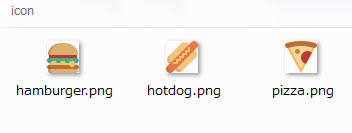
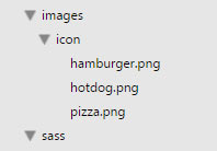
スプライト関数
CSS Sprite Helpers for Compass
- sprite-map(“icon/*.png”, $spacing, $position, $repeat, $layout)
- スプライト画像を生成する関数。戻り値はスプライト画像の URL で、変数に格納しておく(と便利)。
“icon/*.png” :スプライト画像を生成するための個別の画像全て
(この例では icon フォルダ内の全ての画像)
$spacing :画像の間隔(デフォルトは 0px)
$position :横方向の画像の位置。px または %(デフォルトは 0px。左寄せ)100% は一番右。
$repeat :画像の繰り返し(デフォルトは no-repeat)
$layout :画像の書き出しパターン(レイアウト)vertical, horizontal, diagonal, smart
Sprite Layouts 参照
最初にこの関数を実行して戻り値を変数に格納しておく。
以下を実行するとスプライト画像が生成される。
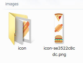
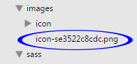
$map: sprite-map("icon/*.png", $spacing: 10px);

.examle {
  background: $maps; //戻り値の確認
}

//コンパイル後
.examle {
  background: url('../images/icon-se3522c8cdc.png');
}
「icon-se3522c8cdc.png」というスプライト画像が生成されている。
次のようなアイコンのリンクリストを作成する場合。
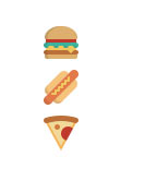
HTML
<ul>
<li><a href="#" class="hamburger">hamburger</a></li>
<li><a href="#" class="hotdog">hotdog</a></li>
<li><a href="#" class="pizza">pizza</a></li>
</ul>
以下のようなミックスイン「spriteBg($sprite)」を作成
$map: sprite-map("icon/*.png", $spacing: 10px);

@mixin spriteBg($sprite) {
  background-image: sprite-url($map);
  background-position: sprite-position( $map, $sprite );
  background-repeat: no-repeat;
  width: image-width(sprite-file($map, $sprite));
  height: image-height(sprite-file($map, $sprite));
  @include hide-text();
  margin: 10px 0;
  display: block;
}

.hotdog {
  @include spriteBg(hotdog);
}
- sprite-url($map)
- 背景画像の URL を取得
$map:sprite-map() の戻り値(生成されたスプライト画像の URL)
- sprite-position($map, $sprite, $offset-x, $offset-y)
- 背景位置を取得
$map:sprite-map() の戻り値(生成されたスプライト画像の URL)
$sprite:個々の画像のファイル名(拡張子 .png を除いたもの)
$offset-x:横方向のオフセット(デフォルト 0)
$offset-y:縦方向のオフセット(デフォルト 0)
- sprite-file($map, $sprite)
- (結合前の)個々の画像のパスを取得
$map:sprite-map() の戻り値(生成されたスプライト画像の URL)
$sprite:個々の画像のファイル名(拡張子 .png を除いたもの)
image-width() image-height() : 画像の幅と高さの取得
hide-text() : テキストを飛ばして見えないようにする
コンパイル結果
.hotdog {
  background-image: url('../images/icon-se3522c8cdc.png');
  background-position: 0 -42px;
  background-repeat: no-repeat;
  width: 32px;
  height: 32px;
  text-indent: -119988px;
  overflow: hidden;
  text-align: left;
  margin: 10px 0;
  display: block;
}
次のようなミックスインでも同じことが可能。この例の場合はこちらの方が簡潔に書ける。
$map: sprite-map("icon/*.png", $spacing: 10px);

@mixin spriteBg2($sprite) {
  background:sprite($map, $sprite);
  @include sprite-dimensions($map, $sprite);
  @include hide-text();
  margin: 10px 0;
  display: block;
}

.hamburger {
  @include spriteBg2(hamburger);
}
- sprite($map, $sprite, $offset-x, $offset-y)
- 画像のパスと位置を取得
sprite-url() と sprite-position() をあわせたようなもの。
$map:sprite-map() の戻り値(生成されたスプライト画像の URL)
$sprite:個々の画像のファイル名(拡張子 .png を除いたもの)
$offset-x:横方向のオフセット(デフォルト 0)
$offset-y:縦方向のオフセット(デフォルト 0)
- sprite-dimensions($map, $sprite) ミックスイン
- 画像のサイズを取得
$map:sprite-map() の戻り値(生成されたスプライト画像の URL)
$sprite:個々の画像のファイル名(拡張子 .png を除いたもの)
コンパイル結果
.hamburger {
  background: url('../images/icon-se3522c8cdc.png') 0 -84px;
  height: 32px;
  width: 32px;
  text-indent: -119988px;
  overflow: hidden;
  text-align: left;
  margin: 10px 0;
  display: block;
}
このままだと、それぞれの画像に対してミックスインを呼び出さなければならないので、@each を使って出力するミックスインを別に作成。
@mixin output-sprite-css($map) {

    //$sprite を1つずつ出力
    @each $name in sprite-names($map) {
        .#{$name} {
            @include spriteBg($name);
        }
    }
}

@include output-sprite-css($map);
- sprite-names($map)
- スプライトの個々の名前を取得
$map:sprite-map() の戻り値(生成されたスプライト画像の URL)
$map: sprite-map("icon/*.png", $spacing: 10px);

@mixin spriteBg($sprite) {
  background:sprite($map, $sprite);
  @include sprite-dimensions($map, $sprite);
  @include hide-text();
  margin: 10px 0;
  display: block;
}

@mixin output-sprite-css($map) {

    @each $name in sprite-names($map) {
        .#{$name} {
            @include spriteBg($name);
        }
    }
}

@include output-sprite-css($map);
コンパイル結果
.hamburger {
  background: url('../images/icon-se3522c8cdc.png') 0 -84px;
  height: 32px;
  width: 32px;
  text-indent: -119988px;
  overflow: hidden;
  text-align: left;
  margin: 10px 0;
  display: block;
}

.hotdog {
  background: url('../images/icon-se3522c8cdc.png') 0 -42px;
  height: 32px;
  width: 32px;
  text-indent: -119988px;
  overflow: hidden;
  text-align: left;
  margin: 10px 0;
  display: block;
}

.pizza {
  background: url('../images/icon-se3522c8cdc.png') 0 0;
  height: 32px;
  width: 32px;
  text-indent: -119988px;
  overflow: hidden;
  text-align: left;
  margin: 10px 0;
  display: block;
}
sprite-names($map) 関数は Compass のサイトで見つからなかった。。。(見落とし?)
以下のサイトを参考にさせていただきました。
CompassでCSSスプライト対応、Retina対応を行う(yoheim.net)
Sass/Compassを使ってCSSスプライトに挑戦してみました(riaxdnp.jp)
New Web 制作リファレンス