Bootstrap3 の使い方 (2)
作成日:2017年7月4日
関連ページ:Bootstrap4 の使い方
文字と見出し
bootstrap.min.css (bootstrap.css) には、h1~h6 や a 要素などの要素に対するスタイルの設定や normalize.css が含まれています。このため、クラスを適用していなくてもデフォルトのスタイルと異なっていたり、Bootstrap のデザインで文字などが表示される場合があります。(Bootstrap を導入した場合の変化)
また、Bootstrap には見出しや文字の書式を設定するクラスが用意されているので、必要に応じて利用することができます。(Typography)
文字関連
デフォルトのフォントサイズは 14px、line-height は 1.428、文字色は #333、背景色は白(#fff) です。 bootstrap.css には body 要素に対して以下が記述されています。
body {
  font-family: "Helvetica Neue", Helvetica, Arial, sans-serif;
  font-size: 14px;
  line-height: 1.42857143;
  color: #333;
  background-color: #fff;
}
以下の要素は記述すると、Bootstrap のスタイルが適用されます(これら以外にも Bootstrap のスタイルが適用されている要素があります)。
mark 要素
bootstrap.css には以下が設定されています。
mark,
.mark {
  padding: .2em;
  background-color: #fcf8e3;
}
You can use the mark tag to highlight text.
<p>You can use the mark tag to <mark>highlight</mark> text.</p>
mark というクラスも設定されているので、span 要素等に指定することができます。
これは mark のサンプルです。
<p>これは<span class="mark"> mark のサンプル</span>です。</p>
- 関連ページ:mark 要素
small 要素
bootstrap.css には以下が設定されています。
small,
.small {
  font-size: 85%;
}
small というクラスが設定されているので、span 要素等に指定することができます。
これは small のサンプルです。
<p>これは<span class="small"> small のサンプル</span>です。</p>
- 関連ページ:small 要素
kbd 要素
ユーザーが(主にキーボードから)入力する内容を表す kbd 要素ですが、以下のように表示されます。
<p>ディレクトリを移動するには、 <kbd>cd</kbd> と入力します。</p>
<p>ログアウトするには、<kbd><kbd>Ctrl</kbd> + <kbd>Alt</kbd> + <kbd>Del</kbd></kbd> を押します。</p>
ディレクトリを移動するには、 cd と入力します。
ログアウトするには、Ctrl + Alt + Del を押します。
blockquote 要素
blockquote 要素は以下のように表示されます。
<blockquote>
  <p>Lorem ipsum dolor sit amet, consectetur adipiscing elit.</p>
</blockquote>
Lorem ipsum dolor sit amet, consectetur adipiscing elit.
bootstrap.css には以下が設定されています。(一部抜粋)
blockquote {
  padding: 10px 20px;
  margin: 0 0 20px;
  font-size: 17.5px;
  border-left: 5px solid #eee;
}
footer 要素と cite 要素を使って引用元を示すと以下のように表示されます。
<blockquote cite="http://www.html5.jp/tag/elements/blockquote.html">
  <p>引用の帰属は blockquote 要素の中に置くことはできますが....</p>
  <footer>HTML5.jp <cite title="blockquote 要素">blockquote 要素</cite></footer>
</blockquote>
引用の帰属は blockquote 要素の中に置くことはできますが、それは、テキストの中で cite 要素に入れるか、footer 要素の中に入れなければいけません。
blockquote-reverse クラスを指定すると右寄せになります。
<blockquote class="blockquote-reverse">
  <p>Lorem ipsum dolor sit amet, consectetur adipiscing elit.</p>
</blockquote>
Lorem ipsum dolor sit amet, consectetur adipiscing elit.
abbr 要素
abbr 要素は長い単語や語句の略語(省略/Abbreviation)を示す要素で、title 属性と組み合わせて使います。title 属性には、略語や頭字語の正式な名称を指定します。title 属性を指定した場合、一般的なブラウザではマウスカーソルを乗せた際にツールチップとして表示されます。
HTML4.01 では、略語と頭字語(acronym)を別の要素(acronym 要素)として区別していましたが、HTML5 ではどちらも abbr 要素で表すように変更されています。
Bootstrap では以下のように略語が点線の下線付きで表示され、マウスオーバーすると title 属性で指定した文字列が表示されます。
<p><abbr title="HyperText Markup Language">HTML</abbr> is fun!</p>
HTML is fun!
リードクラス(.lead)
bootstrap.css には以下が設定されています。
.lead {
  margin-bottom: 20px;
  font-size: 16px;
  font-weight: 300;
  line-height: 1.4;
}
@media (min-width: 768px) {
  .lead {
    font-size: 21px;
  }
}
文字を大きく表示して目立つようにするクラスです。
これはリードクラスです。
<p class="lead">これはリードクラスです。</p>
大文字・小文字の変換
以下のような大文字・小文字を変換するクラスが用意されています。
<p class="text-lowercase">Lowercased text sample.</p>
<p class="text-uppercase">Uppercased text sample.</p>
<p class="text-capitalize">Capitalized text sample.</p>
Lowercased text sample.
Uppercased text sample.
Capitalized text sample.
bootstrap.css には以下が設定されています。
.text-lowercase {
  text-transform: lowercase;
}
.text-uppercase {
  text-transform: uppercase;
}
.text-capitalize {
  text-transform: capitalize;
}
見出し
bootstrap.css には以下のように <h1>~<h6> 要素及び同じ名前のクラスが設定されています。
h1, .h1 {
  font-size: 36px;
}
h2, .h2 {
  font-size: 30px;
}
h3, .h3 {
  font-size: 24px;
}
h4, .h4 {
  font-size: 18px;
}
h5, .h5 {
  font-size: 14px;
}
h6, .h6 {
  font-size: 12px;
}
.h1 ~ .h6 を使用すると、普通のテキスト(p 要素や span 要素等)を見出しと同じ表示にすることができます。
<p class="h3">h3 クラス(.h3) 見出し</p>
h3 クラス(.h3) 見出し
セカンダリーテキスト
見出しにサブタイトルを付けたい場合などは、セカンダリーテキストを利用すると便利です。
見出し要素のタグ内で、<small> タグまたは .small クラスを指定すると、文字が小さく表示され、サブタイトルのように表示されます。
bootstrap.css には以下のようなスタイルが設定されています。(一部抜粋)
h1 small, .h1 small,
h2 small, .h2 small,
h3 small, .h3 small,
h1 .small, .h1 .small,
h2 .small, .h2 .small,
h3 .small, .h3 .small {
  font-size: 65%;
}
h1 small,h2 small,h3 small,h4 small,h5 small,h6 small,
.h1 small,.h2 small,.h3 small,.h4 small,.h5 small,.h6 small,
h1 .small,h2 .small,h3 .small,h4 .small,h5 .small,h6 .small,
.h1 .small,.h2 .small,.h3 .small,.h4 .small,.h5 .small,.h6 .small {
  font-weight: normal;
  line-height: 1;
  color: #777;
}
<h3>h3 Heading <span class="small">secondary text</span></h3>
h3 Heading secondary text
行揃えの指定
Bootstrap には以下のような行揃えのクラスが用意されているので、クラスを指定するだけで行揃えを適用することができます。(Alignment classes)
| クラス | 行揃え | CSS |
|---|---|---|
| text-left | 左揃え | text-align: left; |
| text-center | 中央揃え | text-align: center; |
| text-right | 右揃え | text-align: right; |
| text-justify | 両端揃え | text-align: justify; |
| text-nowrap | 改行なし | white-space: nowrap; |
<p class="text-left">Left aligned text (左揃え)</p>
<p class="text-center">Center aligned text (中央揃え)</p>
<p class="text-right">Right aligned text (右揃え)</p>
<p class="text-justify">Justified text (両端揃え)</p>
<p class="text-nowrap">No wrap text (改行なし) </p>
Left aligned text (左揃え)
Center aligned text (中央揃え)
Right aligned text (右揃え)
Justified text (両端揃え)
No wrap text (改行なし)
ブロックを中央寄せするには center-block クラスを指定します。
リスト
Bootstrap のリスト(ul, ol, dl)のスタイルやクラスについて。(Lists)
ul li (Unordered List)
以下は、ul 要素と li 要素で作成したリストの例です。左側に 40px のパディングとマーカーが表示されます。
<ul>
  <li>Lorem ipsum dolor sit amet</li>
  <li>Consectetur adipiscing elit</li>
  <li>Integer molestie lorem at massa</li>
  <li> Nulla volutpat aliquam velit <ul>
      <li>Phasellus iaculis neque</li>
      <li>Vestibulum laoreet porttitor sem</li>
      <li>Ac tristique libero volutpat at</li>
    </ul> </li>
  <li>Faucibus porta lacus fringilla vel</li>
  <li>Eget porttitor lorem</li>
</ul>
- Lorem ipsum dolor sit amet
- Consectetur adipiscing elit
- Integer molestie lorem at massa
- Nulla volutpat aliquam velit
- Phasellus iaculis neque
- Vestibulum laoreet porttitor sem
- Ac tristique libero volutpat at
- Faucibus porta lacus fringilla vel
- Eget porttitor lorem
list-unstyled クラスを指定すると、各項目の先頭のマーカーが削除され、左の余白が 0 になります。list-unstyled クラスは、番号付きリスト(ol)にも指定できます。
<ul class="list-unstyled">
  <li>Lorem ipsum dolor sit amet</li>
  <li>Consectetur adipiscing elit</li>
  <li>Integer molestie lorem at massa</li>
  <li> Nulla volutpat aliquam velit <ul>
      <li>Phasellus iaculis neque</li>
      <li>Vestibulum laoreet porttitor sem</li>
      <li>Ac tristique libero volutpat at</li>
    </ul> </li>
  <li>Faucibus porta lacus fringilla vel</li>
  <li>Eget porttitor lorem</li>
</ul>
- Lorem ipsum dolor sit amet
- Consectetur adipiscing elit
- Integer molestie lorem at massa
- Nulla volutpat aliquam velit
- Phasellus iaculis neque
- Vestibulum laoreet porttitor sem
- Ac tristique libero volutpat at
- Faucibus porta lacus fringilla vel
- Eget porttitor lorem
bootstrap.css には以下が設定されています。
.list-unstyled {
  padding-left: 0;
  list-style: none;
}
インラインリスト(横並びリスト)
リストの各項目を横に並べて表示するクラス list-inline が用意されています。
<ul class="list-inline">
  <li>Manhattan</li>
  <li>Brooklyn</li>
  <li>Queens</li>
  <li>Bronx </li>
  <li>Staten Island</li>
</ul>
- Manhattan
- Brooklyn
- Queens
- Bronx
- Staten Island
bootstrap.css には以下が設定されています。
.list-inline {
  padding-left: 0;
  margin-left: -5px;
  list-style: none;
}
.list-inline > li {
  display: inline-block;
  padding-right: 5px;
  padding-left: 5px;
}
定義リスト(dl)
以下は、dl 要素、dt 要素、dd 要素で作成した定義リストの例です。dd 要素の左側に余白はありません。
<dl>
  <dt>Description lists</dt>
  <dd>A description list is perfect for defining terms.</dd>
</dl>
- Description lists
- A description list is perfect for defining terms.
bootstrap.css には以下が設定されています。
dl {
  margin-top: 0;
  margin-bottom: 20px;
}
dt,
dd {
  line-height: 1.42857143;
}
dt {
  font-weight: bold;
}
dd {
  margin-left: 0;
}
水平定義リスト
dt 要素と dd 要素を横に並べて表示するクラス dl-horizontal が用意されています。但し、このクラスはウィンドウ幅が 768px 未満の場合は、通常の定義リストとして表示されます。
<dl class="dl-horizontal">
  <dt>Description lists</dt>
  <dd>A description list is perfect for defining terms.</dd>
</dl>
<dl class="dl-horizontal">
  <dt>Auto-truncating</dt>
  <dd>Horizontal description lists will truncate terms that are too long to fit in the left column with text-overflow...</dd>
</dl>
- Description lists
- A description list is perfect for defining terms.
- Auto-truncating
- Horizontal description lists will truncate terms that are too long to fit in the left column with text-overflow. In narrower viewports, they will change to the default stacked layout.
bootstrap.css には以下が設定されています。
@media (min-width: 768px) {
  .dl-horizontal dt {
    float: left;
    width: 160px;
    overflow: hidden;
    clear: left;
    text-align: right;
    text-overflow: ellipsis;
    white-space: nowrap;
  }
  .dl-horizontal dd {
    margin-left: 180px;
  }
}
テーブル
Bootstrap では、用意されたクラスを指定することでテーブルレイアウト(表組み)のスタイルを簡単に変更することができます。(Tables)
table 要素に table クラスを指定すると以下のようなシンプルなテーブル表示になります。
<table class="table">
  <tr>
    <th>画面サイズ</th>
    <th>prefix</th>
    <th>指定方法</th>
  </tr>
  <tr>
    <td>モバイル</td>
    <td>xs</td>
    <td>col-xs-n</td>
  </tr>
  ・・・中略・・・
  <tr>
    <td>デスクトップ</td>
    <td>lg</td>
    <td>col-lg-n</td>
  </tr>
</table>
| 画面サイズ | prefix | 指定方法 |
|---|---|---|
| モバイル | xs | col-xs-n |
| タブレット | sm | col-sm-n |
| デスクトップ | md | col-md-n |
| デスクトップ | lg | col-lg-n |
ストライプテーブル
table 要素に table クラスと table-striped クラスを指定すれば、1行間隔で背景色を変えることができます。
<table class="table table-striped">
  <tr>
    <th>画面サイズ</th>
    <th>prefix</th>
    <th>指定方法</th>
  </tr>
  ・・・中略・・・
  <tr>
    <td>デスクトップ</td>
    <td>lg</td>
    <td>col-lg-n</td>
  </tr>
</table>
| 画面サイズ | prefix | 指定方法 |
|---|---|---|
| モバイル | xs | col-xs-n |
| タブレット | sm | col-sm-n |
| デスクトップ | md | col-md-n |
| デスクトップ | lg | col-lg-n |
※見出しの行に背景色を付けないようにするには、表をヘッダー部分(thead)とデータ部分(tbody)に分ける必要があります。必要に応じてフッター部分(tfoot)にも分けます。
ヘッダー部分とデータ部分に分けない場合、表全体がデータ部分と見なされ、見出しの行にも背景色が付いてしまいます。
<table class="table table-striped table-bordered">
  <thead>
    <tr>
      <th>画面サイズ</th>
      <th>prefix</th>
      <th>指定方法</th>
    </tr>
  </thead>
  <tbody>
    <tr>
      <td>モバイル</td>
      <td>xs</td>
      <td>col-xs-n</td>
    </tr>
   ・・・中略・・・
    <tr>
      <td>デスクトップ</td>
      <td>lg</td>
      <td>col-lg-n</td>
    </tr>
  </tbody>
</table>
| 画面サイズ | prefix | 指定方法 |
|---|---|---|
| モバイル | xs | col-xs-n |
| タブレット | sm | col-sm-n |
| デスクトップ | md | col-md-n |
| デスクトップ | lg | col-lg-n |
ボーダー付きテーブル
table 要素に table クラスと table-bordered クラスを指定すれば、枠線を付けることができます。(table-striped クラスも同時に指定できます)
<table class="table table-striped table-bordered">
  <tr>
    <th>画面サイズ</th>
    <th>prefix</th>
    <th>指定方法</th>
  </tr>
    ・・・中略・・・
  <tr>
    <td>デスクトップ</td>
    <td>lg</td>
    <td>col-lg-n</td>
  </tr>
</table>
| 画面サイズ | prefix | 指定方法 |
|---|---|---|
| モバイル | xs | col-xs-n |
| タブレット | sm | col-sm-n |
| デスクトップ | md | col-md-n |
| デスクトップ | lg | col-lg-n |
マウスオーバー(hover)時に効果を追加する
table 要素に table クラスと table-hover クラスを指定すると、テーブルにマウスオーバーしたときのエフェクト(行に背景色を付ける)を追加できます。
<table class="table table-hover table-bordered">
  <tr>
    <th>画面サイズ</th>
    <th>prefix</th>
    <th>指定方法</th>
  </tr>
    ・・・中略・・・
  <tr>
    <td>デスクトップ</td>
    <td>lg</td>
    <td>col-lg-n</td>
  </tr>
</table>
| 画面サイズ | prefix | 指定方法 |
|---|---|---|
| モバイル | xs | col-xs-n |
| タブレット | sm | col-sm-n |
| デスクトップ | md | col-md-n |
| デスクトップ | lg | col-lg-n |
パディングを減らしてコンパクトに表示
table 要素に table クラスと table-condensed クラスを指定すると、セルの余白(パディング)設定が半分のテーブルになります。
<table class="table table-condensed table-hover table-bordered">
  <tr>
    <th>画面サイズ</th>
    <th>prefix</th>
    <th>指定方法</th>
  </tr>
    ・・・中略・・・
  <tr>
    <td>デスクトップ</td>
    <td>lg</td>
    <td>col-lg-n</td>
  </tr>
</table>
| 画面サイズ | prefix | 指定方法 |
|---|---|---|
| モバイル | xs | col-xs-n |
| タブレット | sm | col-sm-n |
| デスクトップ | md | col-md-n |
| デスクトップ | lg | col-lg-n |
テーブルの行やセルに背景色を指定
テーブルの行(tr)やセル(td, th)にクラスを指定することで背景色を付けることができます。予め用意されているクラスは active、success、info、warning、danger の5種類です。
| クラス | 背景色 | 通常時 | マウスオーバー時 |
|---|---|---|---|
| active | 薄い灰色 | #f5f5f5 | #e8e8e8 |
| success | 薄い緑色 | #dff0d8 | #d0e9c6 |
| info | 薄い青色 | #d9edf7 | #c4e3f3 |
| warning | 薄い黄色 | #fcf8e3 | #faf2cc |
| danger | 薄い赤色 | #f2dede | #ebcccc |
<table class="table table-hover table-bordered">
  <tr class="active">
    <th>画面サイズ</th>
    <th>prefix</th>
    <th>指定方法</th>
  </tr>
  <tr class="success">
    <td>モバイル</td>
    <td>xs</td>
    <td>col-xs-n</td>
  </tr>
      ・・・中略・・・
  <tr class="danger">
    <td>デスクトップ</td>
    <td>lg</td>
    <td>col-lg-n</td>
  </tr>
</table>
| 画面サイズ | prefix | 指定方法 |
|---|---|---|
| モバイル | xs | col-xs-n |
| タブレット | sm | col-sm-n |
| デスクトップ | md | col-md-n |
| デスクトップ | lg | col-lg-n |
レスポンシブテーブル
table-responsive クラスを付与した div 要素(div class="table-responsive")で table 要素を囲むと、テーブルをレスポンシブに対応できます。スマホサイズ(767px)以下になると table 要素内にスクロールバーが出現します
<div class="table-responsive">
  <table class="table table-hover table-bordered" style="max-width:600px;">
    <tr>
      <th>画面サイズ</th>
      <th>prefix</th>
      <th>指定方法</th>
    </tr>
    <tr>
      <td>モバイル(768px未満)</td>
      <td>xs</td>
      <td>col-xs-n</td>
    </tr>
    ・・・中略・・・
    <tr>
      <td>デスクトップ(1200px以上)</td>
      <td>lg</td>
      <td>col-lg-n</td>
    </tr>
  </table>
</div>
| 画面サイズ | prefix | 指定方法 |
|---|---|---|
| モバイル(768px未満) | xs エキストラスモール | col-xs-n |
| タブレット(768px以上、992px未満) | sm スモール | col-sm-n |
| デスクトップ(992px以上、1200px未満) | md ミディアム | col-md-n |
| デスクトップ(1200px以上) | lg ラージ | col-lg-n |
フォーム
- インラインフォーム
- sr-only クラス
- 水平フォーム(Horizontal form)
- サイズの調整
- テキストエリア
- チェックボックスとラジオボタン
- セレクトメニュー
- スタティックコントロール
- 無効(disabled)の指定
- 補足テキスト
- バリデーションステート
- アイコンの追加
Bootstrap のフォームの書式の基本的な設定は、
- 入力項目のグループ(ラベルや入力欄)を form-group クラスを指定した div 要素で囲み
- input 要素や textarea 要素などの入力欄に form-control というクラスを指定します。
<form>
  <div class="form-group">
    <label for="name">お名前</label>
    <input type="text" class="form-control" id="name">
  </div>
  <div class="form-group">
    <label for="email">Email</label>
    <input type="text" class="form-control" id="email">
  </div>
  <div class="form-group">
    <label for="subject">件名</label>
    <input type="text" class="form-control" id="subject">
  </div>
  <div class="form-group">
    <label for="body">内容</label>
    <textarea class="form-control" id="body"></textarea>
  </div>
  <button type="submit" class="btn btn-primary">送信</button>
</form>
form-control クラスのスタイルは bootstrap.css に以下のように、幅100% や高さ、余白、角丸などが設定されています。
.form-control {
  display: block;
  width: 100%;
  height: 34px;
  padding: 6px 12px;
  font-size: 14px;
  line-height: 1.42857143;
  color: #555;
  background-color: #fff;
  background-image: none;
  border: 1px solid #ccc;
  border-radius: 4px;
  -webkit-box-shadow: inset 0 1px 1px rgba(0, 0, 0, .075);
          box-shadow: inset 0 1px 1px rgba(0, 0, 0, .075);
  -webkit-transition: border-color ease-in-out .15s, -webkit-box-shadow ease-in-out .15s;
       -o-transition: border-color ease-in-out .15s, box-shadow ease-in-out .15s;
          transition: border-color ease-in-out .15s, box-shadow ease-in-out .15s;
}
また、form-group クラスのスタイルは bootstrap.css に以下のように設定されています。
.form-group {
  margin-bottom: 15px;
}
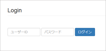
インラインフォーム
form-control クラスを適用すると、input 要素などが幅100%で表示されますが、横並びのフォーム(インラインフォーム)を表示するには、form 要素に form-inline というクラスを指定します。
また、インラインフォームでは、テキストボックスの幅を size 属性で指定することができます。
<form class="form-inline">
  <div class="form-group">
    <label for="name">ユーザーID</label>
    <input type="text" class="form-control" id="uid">
  </div>
  <div class="form-group">
    <label for="email">パスワード</label>
    <input type="text" class="form-control" id="pw">
  </div>
  <button type="submit" class="btn btn-primary">ログイン</button>
</form>
form 要素に form-inline クラスを指定すると、ウィンドウ幅が 768px 以上の場合に全ての項目が横1列に並べて配置されます。
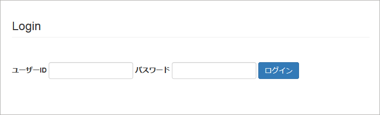
ウィンドウ幅が 768px 未満の場合は、項目が幅100%で表示されます。
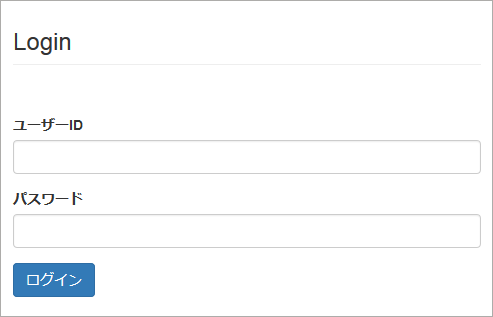
sr-only クラス
インラインフォームでは、1行に収まるようにするため placeholder 属性でラベルをテキストボックス内に表示しますが、label 要素を省略してしまうと目の不自由な方がスクリーンリーダー(Screen Reader)からラベルが読み上げられなくなってしまいます。
対策としては、label 要素に sr-only というクラスを指定します。sr-only クラスは、スクリーンリーダには読み上げられるが、画面には表示したくない要素に指定します。
また、以下のサンプルでは、テキストボックスの幅を size 属性で指定しています。
<form class="form-inline">
  <div class="form-group">
    <label class="sr-only" for="name">ユーザーID</label>
    <input type="text" class="form-control" placeholder="ユーザーID" id="uid" size="14">
  </div>
  <div class="form-group">
    <label class="sr-only" for="email">パスワード</label>
    <input type="text" class="form-control" placeholder="パスワード" id="pw" size="14">
  </div>
  <button type="submit" class="btn btn-primary">ログイン</button>
</form>
水平フォーム(Horizontal form)
ラベルと input 要素を垂直に並べるのではなく、水平に並べたい場合は、form 要素に form-horizontal を指定し、グリッドシステムを使用して配置します。
form 要素に form-horizontal を指定すると、<div class="form-group"> はグリッドシステムの <div class="row"> と同じ役目をします(<div class="row"> は不要です)。
label 要素には、列の幅を指定するクラス col-{prefix}-{columns} を直接指定します。input 要素や textarea 要素は div 要素で囲み、その div 要素に列の幅を指定するクラス col-{prefix}-{columns} を指定します。
ボタンのようなラベルと伴わない要素も <div class="form-group"> でグループ化して、その中に div 要素を配置して列の幅を指定するクラスを指定します。
また、label 要素に control-label というクラスを指定すると、ラベル文字を右揃えで配置することができます。
以下の例では、ボタンは col-sm-offset-2 で左側に2列分の間隔を空けて配置しています。text-right のクラスを削除すると、ボタンをテキストボックスの左端に揃えて配置することができます。
<form class="form-horizontal">
  <div class="form-group">
    <label for="name1" class="col-sm-2 control-label">お名前</label>
    <div class="col-sm-6">
      <input type="text" class="form-control" id="name1">
    </div>
  </div>
  <div class="form-group">
    <label for="email1" class="col-sm-2 control-label">Email アドレス</label>
    <div class="col-sm-6">
      <input type="text" class="form-control" id="email1">
    </div>
  </div>
  <div class="form-group">
    <label for="subject1" class="col-sm-2 control-label">件名</label>
    <div class="col-sm-10">
      <input type="text" class="form-control" id="subject1">
    </div>
  </div>
  <div class="form-group">
    <label for="body1" class="col-sm-2 control-label">お問い合わせ内容</label>
    <div class="col-sm-10">
      <textarea class="form-control" id="body1"></textarea>
    </div>
  </div>
  <div class="form-group">
    <div class="col-sm-offset-2 col-sm-10">
      <button type="reset" class="btn btn-default">クリア</button>
      <button type="submit" class="btn btn-primary">送信</button>
    </div>
  </div>
</form>
サイズの調整
Bootstrap には、テキストボックスのサイズ(高さ)を調整する以下のクラスがあります。
- input-lg :サイズ(高さ)を大きくするクラス
- input-sm :サイズ(高さ)を小さくするクラス
.input-lg {
  height: 46px;
  padding: 10px 16px;
  font-size: 18px;
  line-height: 1.3333333;
  border-radius: 6px;
}

.input-sm {
  height: 30px;
  padding: 5px 10px;
  font-size: 12px;
  line-height: 1.5;
  border-radius: 3px;
}
<form>
  <div class="form-group">
    <label for="input-lg-sampl">.input-lg</label>
    <input type="text" class="form-control input-lg" id="input-lg-sample">
  </div>
  <div class="form-group">
    <label for="input-sample">Default</label>
    <input type="text" class="form-control" id="input-sample">
  </div>
  <div class="form-group">
    <label for="input-sm-sample">.input-sm</label>
    <input type="text" class="form-control input-sm" id="input-sm-sample">
  </div>
</form>
form-horizontal クラスの場合
form 要素に form-horizontal クラスを指定している場合(水平フォーム)は、form-group クラスを指定している div 要素に form-group-lg または form-group-sm を指定することでラベルと input 要素のサイズを調整できます。
<form class="form-horizontal">
  <div class="form-group form-group-lg">
    <label for="form-group-lg" class="col-sm-2 control-label">Large</label>
    <div class="col-sm-10">
      <input type="text" class="form-control" id="form-group-lg">
    </div>
  </div>
  <div class="form-group">
    <label for="Default" class="col-sm-2 control-label">Default</label>
    <div class="col-sm-10">
      <input type="text" class="form-control" id="Default">
    </div>
  </div>
  <div class="form-group form-group-sm">
    <label for="form-group-sm" class="col-sm-2 control-label">Small</label>
    <div class="col-sm-10">
      <input type="text" class="form-control" id="form-group-sm">
    </div>
  </div>
</form>
カスタムサイズ
グリッドシステムを使用することで、幅を調整することができます。その場合、form-control クラスを指定した input 要素を col-xx-n を指定した div 要素で囲みます。
<div class="row">
  <div class="col-xs-3">
    <input type="text" class="form-control" placeholder=".col-xs-3">
  </div>
  <div class="col-xs-4">
    <input type="text" class="form-control" placeholder=".col-xs-4">
  </div>
  <div class="col-xs-5">
    <input type="text" class="form-control" placeholder=".col-xs-5">
  </div>
</div>
テキストエリア
テキストエリアでは、必要に応じて rows 属性で行数(高さ)を指定します。
<div class="form-group">
  <label for="body1">コメント1</label>
  <textarea class="form-control" id="body1" rows="2"></textarea>
</div>
<div class="form-group">
  <label for="body2">コメント2</label>
  <textarea class="form-control" id="body2" rows="5"></textarea>
</div>
チェックボックスとラジオボタン
- チェックボックス
- 各々の選択肢を div 要素で囲み、その div 要素に checkbox というクラスを指定します。
- ラジオボタン
- 各々の選択肢を div 要素で囲み、その div 要素に radio というクラスを指定します。
label 要素は暗黙的なラベル付け(for 属性は使わず、コントロールを label 要素で囲む方法)でマークアップします。
これらの div 要素に disabled というクラスを指定すると、マウスオーバー時に選択不可(無効)であることを示すカーソル(not-allowed)が表示されます。
<div class="form-group">
  <div class="checkbox">
    <label>
      <input type="checkbox" value="Option one">
      Option one
    </label>
  </div>
  <div class="checkbox disabled">
    <label>
      <input type="checkbox" value="Option two" disabled>
      Option two (disabled)
    </label>
  </div>
</div>
<div class="form-group">
  <div class="radio">
    <label>
      <input type="radio" name="optRadios" id="optRadios1" value="option1" checked>
      Option one
    </label>
  </div>
  <div class="radio">
    <label>
      <input type="radio" name="optRadios" id="optRadios2" value="option2">
      Option two
    </label>
  </div>
  <div class="radio disabled">
    <label>
      <input type="radio" name="optRadios" id="optRadios3" value="option3" disabled>
      Option three (disabled)
    </label>
  </div>
</div>;
インライン表示
選択肢を横に並べて表示することもできます。この場合、各々の選択肢を div 要素で囲む必要はありません。label 要素に checkbox-inline や radio-inline クラスを指定します。
インライン表示の場合に、input 要素を選択不可(disabled)に指定する場合、その lable 要素(checkbox-inline や radio-inline クラスが指定されている)に disabled というクラスを指定すると、ラベルにマウスオーバーすると選択不可(無効)であることを示すカーソル(not-allowed)が表示されます。
<div class="form-group">
  <label class="checkbox-inline">
    <input type="checkbox" id="inlineCheckbox1" value="Email">Email
  </label>
  <label class="checkbox-inline">
    <input type="checkbox" id="inlineCheckbox2" value="TEL">TEL
  </label>
  <label class="checkbox-inline disabled">
    <input type="checkbox" id="inlineCheckbox3" value="FAX" disabled>FAX (disabled)
  </label>
</div>
<div class="form-group">
  <label class="radio-inline">
    <input type="radio" name="inlineRadioOptions" id="inlineRadio1" value="Blue">Blue
  </label>
  <label class="radio-inline disabled">
    <input type="radio" name="inlineRadioOptions" id="inlineRadio2" value="Yellow" disabled>Yellow (disabled)
  </label>
  <label class="radio-inline">
    <input type="radio" name="inlineRadioOptions" id="inlineRadio3" value="Green">Green
  </label>
</div>
グリッドシステムでの配置
グリッドシステムを使ってフォームを配置する場合は、チェックボックスやラジオボタンの見出しとなる文字を label 要素で囲み、control-label のクラスを指定します。
<form class="form-horizontal">
  ・・・中略・・・
  <div class="form-group">
    <label class="col-sm-2 control-label">ご希望のツアー</label>
    <div class="col-sm-10">
      <div class="checkbox">
        <label>
          <input type="checkbox" value="夜景ツアー">
          夜景ツアー </label>
      </div>
      <div class="checkbox">
        <label>
          <input type="checkbox" value="食べ放題ツアー">
          食べ放題ツアー </label>
      </div>
    </div>
  </div>
  <div class="form-group">
    <label class="col-sm-2 control-label">お支払い方法</label>
    <div class="col-sm-10">
      <label class="radio-inline">
        <input type="radio" name="payment" id="cash" value="現金">
        現金</label>
      <label class="radio-inline">
        <input type="radio" name="payment" id="credit" value="カード">
        カード </label>
      <label class="radio-inline disabled">
        <input type="radio" name="payment" id="bitcoin" value="ビットコイン" disabled>
        ビットコイン </label>
    </div>
  </div>
  ・・・中略・・・
</form>
セレクトメニュー
select 要素と option 要素でセレクトメニューを作成する場合は、select 要素に form-control クラスを指定します。multiple 属性を指定した場合も同じです。
<div class="form-group">
  <label for="select1">オプション</label>
  <select class="form-control" id="select1">
    <option value="1">One</option>
    <option value="2">Two</option>
    <option value="3">Three</option>
    <option value="4">Four</option>
    <option value="5">Five</option>
  </select>
</div>
<div class="form-group">
  <label for="select2">オプション</label>
  <select multiple class="form-control" id="select2" size="3">
    <option value="1">One</option>
    <option value="2">Two</option>
    <option value="3">Three</option>
    <option value="4">Four</option>
    <option value="5">Five</option>
  </select>
</div>
スタティックコントロール
グリッドシステムを使用している場合(水平フォーム)やインラインフォームで、ラベルの右側にフォーム部品ではなく、通常の文字を配置したい場合は、p 要素に form-control-static というクラスを指定します。これを指定しないと、ラベルと通常の文字の垂直方向の位置がずれてしまいます。
<form class="form-horizontal">
  <div class="form-group">
    <label class="col-sm-2 control-label">Email</label>
    <div class="col-sm-10">
      <p class="form-control-static">sample@example.com</p>
    </div>
  </div>
  <div class="form-group">
    <label for="pw" class="col-sm-2 control-label">Password</label>
    <div class="col-sm-10">
      <input type="password" class="form-control" id="pw" placeholder="Password">
    </div>
  </div>
</form>
<form class="form-inline">
  <div class="form-group">
    <label class="sr-only">Email</label>
    <p class="form-control-static">sample@example.com</p>
  </div>
  <div class="form-group">
    <label for="pw2" class="sr-only">Password</label>
    <input type="password" class="form-control" id="pw2" placeholder="Password" size="10">
  </div>
  <button type="submit" class="btn btn-default">確認</button>
</form>
無効(disabled)の指定
個々の input 要素に disabled 属性を指定すると、その要素にマウスオーバーするとカーソルが not-allowed に変化して入力できないことを表します。チェックボックスやラジオボタンの場合の例は「チェックボックスとラジオボタン」を参照ください。
<input class="form-control" id="dinput" type="text" placeholder="入力できません" disabled>
bootstrap.css には以下が記述されています。この他にボタンなどにも設定されています。
.form-control[disabled],
.form-control[readonly],
fieldset[disabled] .form-control {
  background-color: #eee;
  opacity: 1;
}

.form-control[disabled],
fieldset[disabled] .form-control {
  cursor: not-allowed;
}

input[type="radio"][disabled],
input[type="checkbox"][disabled],
input[type="radio"].disabled,
input[type="checkbox"].disabled,
fieldset[disabled] input[type="radio"],
fieldset[disabled] input[type="checkbox"] {
  cursor: not-allowed;
}

.radio-inline.disabled,
.checkbox-inline.disabled,
fieldset[disabled] .radio-inline,
fieldset[disabled] .checkbox-inline {
  cursor: not-allowed;
}

.radio.disabled label,
.checkbox.disabled label,
fieldset[disabled] .radio label,
fieldset[disabled] .checkbox label {
  cursor: not-allowed;
}
fieldset への無効(disabled)の指定
fieldset 要素に disabled クラスを指定すると、その fieldset 要素内の全てのコントロールを無効(操作できないよう)にすることができます。
<form>
  <fieldset disabled>
    <div class="form-group">
      <label for="dtInput">Disabled input</label>
      <input type="text" id="dtInput" class="form-control" placeholder="Disabled input">
    </div>
    <div class="form-group">
      <label for="dSelect">Disabled select menu</label>
      <select id="dSelect" class="form-control">
        <option>Disabled select</option>
      </select>
    </div>
    <div class="checkbox">
      <label>
        <input type="checkbox">
        Can't check this </label>
    </div>
    <button type="submit" class="btn btn-primary">Submit</button>
  </fieldset>
</form>
補足テキスト
テキストボックス等の下に補足説明文を入れる場合は、p 要素や span 要素を使い help-block のクラスを指定します。
また、その際に目の不自由な方などのためにスクリーンリーダーがその要素を選択した際にその内容を読み上げるように、aria-describedby 属性を指定します。
ARIA で説明する
フォームコントロールはラベルに加えて、説明文が結びつけられることがあります。ARIA には、説明文とコントロールを直接結びつけるための aria-describedby 属性があります。
対象の input 要素に aria-describedby 属性を使って補足テキストの id 属性の値を指定します。また、補足テキストには help-block のクラスを指定します。(関連:sr-only)
<label class="sr-only" for="inputHelpBlock">補足説明付き入力欄</label>
<input type="text" id="inputHelpBlock" class="form-control" aria-describedby="helpBlock">
<span id="helpBlock" class="help-block">半角英数字で入力してください。</span>
バリデーションステート
Bootstrap には、検証結果の状態(警告、エラー、成功)によるスタイルがそれぞれ(.has-warning, .has-error, .has-success)用意されています。
JavaScript 等による検証の結果により、適切なクラスを指定することでスタイルを変更することができます。
<div class="form-group has-success">
  <label class="control-label" for="inputSuccess1">Input with success(成功)</label>
  <input type="text" class="form-control" id="inputSuccess1" aria-describedby="help_block">
  <span id="help_block" class="help-block">補足テキスト</span>
</div>
<div class="form-group has-warning">
  <label class="control-label" for="inputWarning1">Input with warning(警告)</label>
  <input type="text" class="form-control" id="inputWarning1">
</div>
<div class="form-group has-error">
  <label class="control-label" for="inputError1">Input with error(エラー)</label>
  <input type="text" class="form-control" id="inputError1">
</div>
<div class="checkbox has-success">
  <label>
    <input type="checkbox" id="checkboxSuccess" value="option1">
    Checkbox with success </label>
</div>
以下は確認ボタンをクリックすると、検証結果の状態(警告、エラー、成功)によるスタイルを単に追加する例です。(通常は検証結果により動的にクラスを追加します)
アイコンの追加
テキストボックスの右端にアイコンを表示することもできます。
(<input class="form-control"> 要素のみ)
テキストボックスの右端にアイコンを表示するには、form-group クラスを指定した div 要素に has-feedback クラスを追加し、アイコンを表示する span 要素に form-control-feedback クラスを指定します。
その際に目の不自由な方などのためにスクリーンリーダーがその要素の状態を読み上げるように、aria-describedby 属性を指定し、span 要素等にその状態を記述します。この状態を記述した span 要素は通常のユーザーには、冗長で不要な場合は sr-only クラスを指定して非表示にします(以下の例)。但し、エラーの内容等を通常のユーザーに伝える場合は、その span 要素に sr-only クラスを指定せずに表示するようにし、更に class="help-block" を指定して関連付けします。
また、アイコン自体は装飾のためのものなので、 aria-hidden="true" を指定します。(aria-hidden プロパティの値に「true」を指定することで、その要素が非表示であることをブラウザに伝え、読み上げをしないようにすることができます。)
<div class="form-group has-success has-feedback">
  <label class="control-label" for="is2">Input with success</label>
  <input type="text" class="form-control" id="is2" aria-describedby="is2Status">
  <span class="glyphicon glyphicon-ok form-control-feedback" aria-hidden="true"></span>
  <span id="is2Status" class="sr-only">(success)</span>
</div>
<div class="form-group has-warning has-feedback">
  <label class="control-label" for="iw2">Input with warning</label>
  <input type="text" class="form-control" id="iw2" aria-describedby="iw2Status">
  <span class="glyphicon glyphicon-warning-sign form-control-feedback" aria-hidden="true"></span>
  <span id="iw2Status" class="sr-only">(warning)</span>
</div>
<div class="form-group has-error has-feedback">
  <label class="control-label" for="ie2">Input with error</label>
  <input type="text" class="form-control" id="ie2" aria-describedby="ie2Status">
  <span class="glyphicon glyphicon-remove form-control-feedback" aria-hidden="true"></span>
  <span id="ie2Status" class="sr-only">(error)</span>
</div>
以下は、確認ボタンをクリックすると、has-error と has-feedback クラスを追加し、更にアイコンの span 要素及び help-block クラスの span 要素にエラー内容を表示する例です。本来は検証の結果によりこのような操作をします。
<div class="form-group">
  <label class="control-label" for="ie">エラーのサンプル</label>
  <input type="text" class="form-control" id="ie" aria-describedby="ieStatus">
  <span id="ieStatus" class="help-block"></span>
</div>
確認ボタンをクリックすると、以下の HTML になります。
<div class="form-group has-error has-feedback">
  <label class="control-label" for="ie">エラーのサンプル</label>
  <input type="text" class="form-control" id="ie" aria-describedby="ieStatus">
  <span class="glyphicon glyphicon-remove form-control-feedback" aria-hidden="true"></span>
  <span id="ieStatus" class="help-block">エラー:半角英数字で入力してください。</span>
</div>
画像
Bootstrap には、画像(img 要素)に関するクラスがいくつか用意されています。(Images)
親要素の幅に応じて表示
img-responsive クラスは、親要素の幅に応じて画像を伸縮して表示するクラスで、以下のスタイルが bootstrap.css に設定されています。(但し、画像の幅が親要素の幅より小さい場合は、実サイズで表示され、拡大されることはありません)
.img-responsive,
.thumbnail > img,
.thumbnail a > img,
.carousel-inner > .item > img,
.carousel-inner > .item > a > img {
  display: block;
  max-width: 100%;
  height: auto;
}
また、画像を中央寄せして表示するには、center-block というクラスを指定します。
.center-block {
  display: block;
  margin-right: auto;
  margin-left: auto;
}
以下は中央寄せ(center-block)で、親要素の幅に応じて画像を伸縮して表示する(img-responsive)例です。
<p><img src="../images/sample.jpg" class="img-responsive center-block" alt=""></p>
画像の形状
Bootstrap には、以下のような画像の形状を変化させるクラスが用意されています。
- img-rounded : 角丸で表示
- img-circle : 円形で表示
- img-thumbnail : 角丸枠付きで表示
.img-rounded {
  border-radius: 6px;
}

.img-circle {
  border-radius: 50%;
}

.img-thumbnail {
  display: inline-block;
  max-width: 100%;
  height: auto;
  padding: 4px;
  line-height: 1.42857143;
  background-color: #fff;
  border: 1px solid #ddd;
  border-radius: 4px;
  -webkit-transition: all .2s ease-in-out;
       -o-transition: all .2s ease-in-out;
          transition: all .2s ease-in-out;
}
<img src="../images/sample_img.jpg" alt=""> <!--指定なし-->
<img src="../images/sample_img.jpg" class="img-rounded" alt="">
<img src="../images/sample_img.jpg" class="img-circle" alt="">

<img src="../images/sample_img.jpg" class="img-thumbnail" alt="">
<img src="../images/sample_img.jpg" class="img-thumbnail img-circle" alt="">
ヘルパークラス
Bootstrap では、ヘルパークラスと呼ばれる便利なクラスがいくつか用意されています。(Helper classes)
- コンテクスチュアル・カラー
- コンテクスチュアル・バックグラウンド
- クローズとキャレットのアイコン
- クイック・フロート
- センターコンテントブロック
- クリアフィックス
- 要素の表示・非表示
- スクリーンリーダ・オンリー
- 画像置換(テキスト非表示)
コンテクスチュアル・カラー
文字色のクラスです。コンテクスチュアル・カラーは「文脈上の色」と言うような意味になりますが、Bootstrap では以下のような意味を表す色が定義されています。
- primary:「主要な、第一の」
- success:「成功」
- info:「情報、お知らせ」
- warning:「警告」
- danger:「危険」
文字色は、text-xxxx というクラスを指定することで適用することができます。
<p class="text-muted">This is muted text.</p>
<p class="text-primary">This is primary text.</p>
<p class="text-success">This is success text.</p>
<p class="text-info">This is info text.</p>
<p class="text-warning">This is warning text.</p>
<p class="text-danger">This is danger text.</p>
This is muted text.
This is primary text.
This is success text.
This is info text
This is warning text.
This is danger text
※これらの色は、Bootstrap のカスタマイズ機能を使って変更することができます。
コンテクスチュアル・バックグラウンド
文字色と同様に、以下のような背景色のクラスが用意されています。背景色は、bg-xxxx というクラスを指定することで適用することができます。
<p class="bg-primary">This is primary background color.</p>
<p class="bg-success">This is success background color.</p>
<p class="bg-info">This is info background color.</p>
<p class="bg-warning">This is warning background color.</p>
<p class="bg-danger">This is danger background color</p>
This is primary background color.
This is success background color.
This is info background color.
This is warning background color.
This is danger background color
クローズとキャレットのアイコン
クローズ(閉じる)とキャレット(下向きの矢印)のアイコンを表示するクラスが用意されています。
クローズ・アイコン
close クラスを button 要素に適用すると、文字を右寄せにして半透明で表示し、マウスオーバー時にカーソルをポインターにします。X の文字は × を使うのが一般的です。
close クラスには以下のスタイルが設定されています。
.close {
  float: right;
  font-size: 21px;
  font-weight: bold;
  line-height: 1;
  color: #000;
  text-shadow: 0 1px 0 #fff;
  filter: alpha(opacity=20);
  opacity: .2;
}
.close:hover,
.close:focus {
  color: #000;
  text-decoration: none;
  cursor: pointer;
  filter: alpha(opacity=50);
  opacity: .5;
}
button.close {
  -webkit-appearance: none;
  padding: 0;
  cursor: pointer;
  background: transparent;
  border: 0;
}
アイコン自体は装飾のためのものなので、スクリーンリーダに読み上げられないように aria-hidden="true" を指定します。また、以下の例では button 要素に aria-label 属性を使ってラベル付けをしています。
aria-label
テキストの代わりに画像だけで目的を示しているボタンがあるとします。この視覚的なマークを見ることができないユーザー向けに目的を明確に示したい場合、aria-label 属性を使用することがあります。
<button type="button" class="close" aria-label="Close"><span aria-hidden="true">×</span></button>
キャレット・アイコン
キャレットを表示するには、caret クラスを指定します。
<span class="caret"></span>
クイック・フロート
クラスを使ってフロートを指定するには、pull-right(右フロート)、pull-left(左フロート)クラスを利用できます。bootstrap.css には以下が記述されています。
.pull-right {
  float: right !important;
}
.pull-left {
  float: left !important;
}
<div class="clearfix">
  <div class="pull-right">pull-right</div>
  <div class="pull-left">pull-left</div>
</div>
センターコンテントブロック
center-block クラスを指定すると、margin と display:block を使って要素を中央寄せすることができます。 bootstrap.css には以下が記述されています。
.center-block {
  display: block;
  margin-right: auto;
  margin-left: auto;
}
<div class="center-block">
  <div class="center-block text-center">center-block</div>
  <p class="text-center">text-center</p>
</div>
text-center
テキストを中央寄せするには text-center クラスを指定します。
クリアフィックス
クリアフィックス用のクラス clearfix も用意されています。
親要素の高さはフロートされた子要素の高さを含めないため、以下のような現象が発生します。(子要素のボックスが親要素のボックスを突き抜けてしまいます)
<div>
  <div class="pull-left text-center">float: left</div>
  <p>Lorem ipsum dolor sit amet</p>
</div>
Lorem ipsum dolor sit amet
親要素に clearfix クラスを指定することで解決することができます。
<div class="clearfix">
  <div class="pull-left text-center">float: left</div>
  <p>Lorem ipsum dolor sit amet</p>
</div>
Lorem ipsum dolor sit amet
クリアフィックスの手法はいくつかありますが、Bootstrap では micro clearfix を使用していて、bootstrap.css には以下が記述されています。
.clearfix:before,
.clearfix:afterr {
  display: table;
  content: " ";
}
.clearfix:after {
  clear: both;
}
要素の表示・非表示
show クラスは要素をブロックとして表示し、hidden クラスは要素を非表示にします。また、invisible クラスは領域を確保したまま非表示にします。bootstrap.css には以下が記述されています。
.hide {
  display: none !important;
}
.show {
  display: block !important;
}
.invisible {
  visibility: hidden;
}
visibility は、非表示(hidden)にした場合でも、ボックス自体が無くなるわけではなく、表示(visible)・非表示を切り替えてもページのレイアウトは変わりません(visibility: hidden は要素はあるけど見えない状態)。
<div class="show">表示</div>
<div class="hidden">非表示</div>
スクリーンリーダ・オンリー
スクリーンリーダ以外では非表示する(スクリーンリーダのみに読み上げられる)ようにするには、sr-only クラスを指定します。sr-only-fucuable クラスを指定すると、フォーカスがあたった場合のみ表示されます。
bootstrap.css には以下が記述されています。
.sr-only {
  position: absolute;
  width: 1px;
  height: 1px;
  padding: 0;
  margin: -1px;
  overflow: hidden;
  clip: rect(0, 0, 0, 0);
  border: 0;
}
.sr-only-focusable:active,
.sr-only-focusable:focus {
  position: static;
  width: auto;
  height: auto;
  margin: 0;
  overflow: visible;
  clip: auto;
}
<div>
  <p><a href="#content1">Skip to main content1</a></p>
  <p><a class="sr-only" href="#content2">Skip to main content2</a></p>
  <p><a class="sr-only sr-only-focusable" href="#content3">Skip to main content3</a></p>
</div>
この例の場合、2つ目のリンクは、スクリーンリーダのみに読み上げられますが、3つ目のリンクは、スクリーンリーダ及びフォーカスがあたった場合(タブキーで移動)に表示されます。
画像置換(テキスト非表示)
画像置換(テキストを背景画像に置きかえる手法)用の text-hide クラスも用意されています。bootstrap.css には以下が記述されています。
.text-hide {
  font: 0/0 a;
  color: transparent;
  text-shadow: none;
  background-color: transparent;
  border: 0;
}
<h1 class="text-hide">text-hide 画像置換(テキスト非表示)</h1>

<style>
h1.text-hide {
  width: 150px;
  height: 30px;
  background:url(../images/bgimg.png) 0 0 no-repeat;
}
</style>
text-hide 画像置換(テキスト非表示)
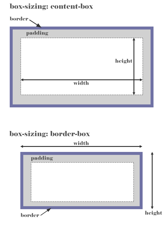
Box-sizing
Bootstrap では、全ての要素に CSS3 で導入された box-sizing: border-box; が以下のように bootstrap.css で設定されています。
* {
  -webkit-box-sizing: border-box;
     -moz-box-sizing: border-box;
          box-sizing: border-box;
}
*:before,
*:after {
  -webkit-box-sizing: border-box;
     -moz-box-sizing: border-box;
          box-sizing: border-box;
}
input[type="search"] { /* normalize.css を上書き*/
  -webkit-box-sizing: border-box;
     -moz-box-sizing: border-box;
          box-sizing: border-box;
}
box-sizing: border-box; は、パディング(内部の余白)とボーダー(枠線)が幅と高さに含まれます。デフォルトの box-sizing: content-box; は width と height で指定する幅と高さが内容領域に対して適用され、 幅と高さにはパディングとボーダーは含まれません。(関連ページ:box-sizing プロパティ)
以下は、div 要素に max-width: 300px を指定して、画像を配置した場合の例です。padding や border の値を大きくすると、内容(画像)のサイズが小さくなってます。
グリッドシステムを使って要素を配置した場合も同様です。div 要素に padding や border を指定すると、その分だけ内容のサイズは小さくなります。
<div id="samplebox1" class="samplebox">
  <img src="images/sample_box_img.jpg" class="img-responsive" alt="">
</div>
<div id="samplebox2" class="samplebox">
  <img src="images/sample_box_img.jpg" class="img-responsive" alt="">
</div>
<div id="samplebox3" class="samplebox">
  <img src="images/sample_box_img.jpg" class="img-responsive" alt="">
</div>
.samplebox {
  max-width: 300px;
  box-sizing: border-box;
  margin-bottom: 20px;
}
#samplebox1 {
  padding: 0;
  border-width: 0;
}
#samplebox2 {
  padding: 5px;
  border-width: 5px;
}
#samplebox3 {
  padding: 20px;
  border-width: 10px;
}

アイコン
Bootstrap には、Glyphicons というアイコンが250種類以上用意されています。
使い方は、アイコンを表示する位置に span 要素を記述して glyphicon クラスと表示したいアイコンのクラス名(glyphicon-xxxx)を指定します。
文字と並べて表示する場合は、適切な間隔ができるように、スペースを入れます。
また、(単に装飾目的で使用する場合は)スクリーンリーダーに読ませないように aria-hidden="true" を指定します。(aria-hidden プロパティの値に「true」を指定することで、その要素が非表示であることをブラウザに伝え、読み上げをしないようにすることができます。)
<p>
<span class="glyphicon glyphicon-envelope" aria-hidden="true"></span> E-mail
</p>
アイコンに意味を持たせる場合は、その意味を伝える内容を sr-only クラスを指定して追加します。アイコンの span 要素には、スクリーンリーダーに読ませないように aria-hidden="true" を指定します。
以下の例では、アイコンに Error という意味を持たせているので、Error: を span 要素で記述して sr-only クラスを指定しています。
<div class="alert alert-danger" role="alert">
  <span class="glyphicon glyphicon-exclamation-sign" aria-hidden="true"></span>
  <span class="sr-only">Error:</span>
  Enter a valid email address
</div>
テキストを含まない button 要素などのコントロールにアイコンを使う場合は、そのコントロールの意味が視覚障害の方にも伝わるように aria-label 属性を使ってコントロールの意味・目的を伝えるようにします。
<button type="button" class="btn btn-default" aria-label="左寄せ">
  <span class="glyphicon glyphicon-align-left" aria-hidden="true"></span>
</button>
サイズ
アイコンのサイズは、アイコンを配置する箇所の文字サイズに応じて自動的に調整されます。アイコンのサイズを調整するには、span 要素に font-size を指定して調整します。
<p>大きなハート <span style="font-size: 36px; color:#F45659;" class="glyphicon glyphicon-heart" aria-hidden="true"></span> です。</p>
大きなハート です。