CSS Grid + JavaScript で Masonry レイアウト
Masonry レイアウトは、コンテンツや画像を石やレンガを壁に敷き詰めるように配置するグリッドレイアウトのことで、利用可能な垂直方向のスペースに基づいて要素を最適な位置に配置する方法です。
CSS Grid と JavaScript を使えば比較的簡単に Masonry レイアウトを実装することができます。
以下は CSS Grid や CSS Multi-column、CSS Masonry Layout を使って Masonry レイアウトを実装する方法や JavaScript プラグインの Masonry の使用例、フィルタリング機能を追加する方法などについての覚書です。
作成日:2022年2月10日
関連ページ:CSS Grid(display:grid)の使い方
CSS Grid
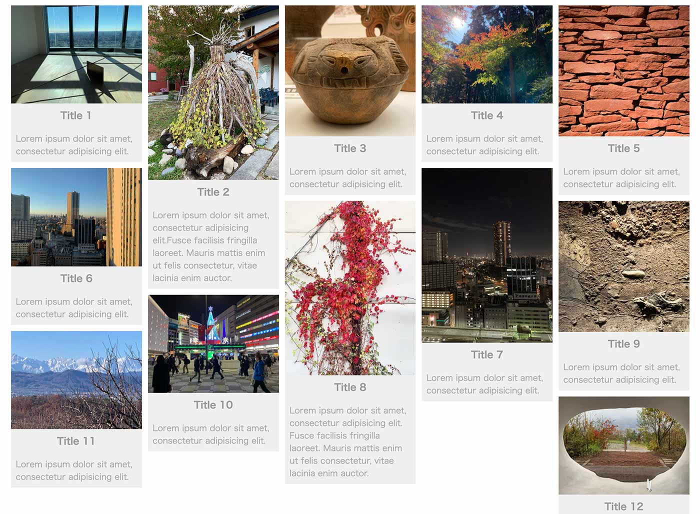
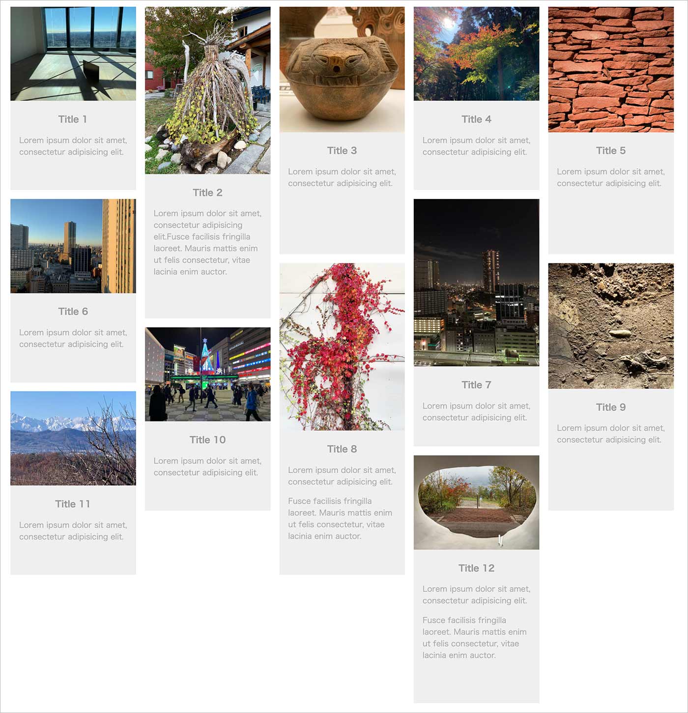
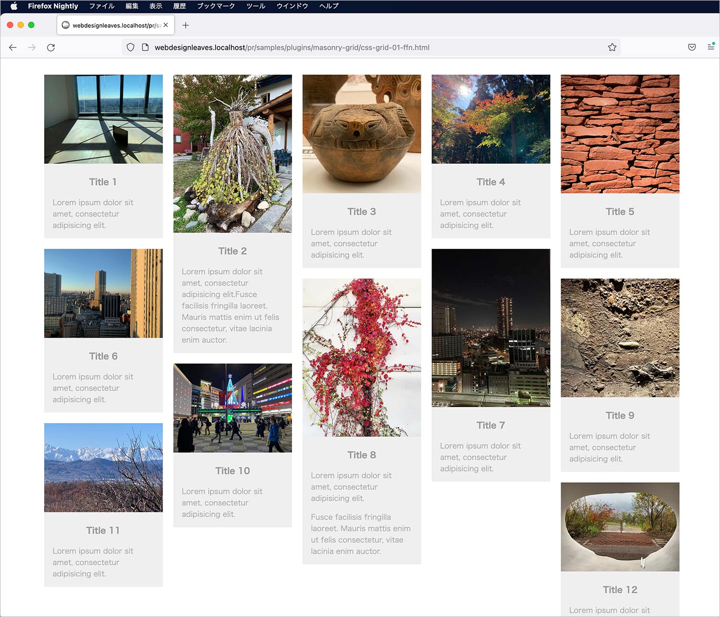
以下は CSS Grid を使った単純なカード型コンテンツのレイアウトの例です。
- コンテンツ(グリッドアイテム)は指定された順序を維持しながら列に配置されます
- 行の高さは、その行の最大のコンテンツ(アイテム)に自動的に調整されます
- グリッドは、スペースが許す限り、アイテムを自動的に新しい列に移動します
個々のカード型コンテンツ(masonry-item クラスを指定した div 要素)はグリッドアイテムとなっていて、その中にコンテンツ(画像、タイトル、説明文)を配置しています。
それらの親要素(masonry クラスを指定した div 要素)がグリッドのコンテナーになっています。
<div class="masonry-wrapper">
  <div class="masonry"><!-- グリッドコンテナー -->
    <div class="masonry-item"><!-- グリッドアイテム -->
      <div class="masonry-content">
        <img class="thumb" src="images/01.jpg" alt="sample image">
        <h3 class="title">Title 1</h3>
        <div class="desc">
          <p>Lorem ipsum dolor sit amet, consectetur adipisicing elit.</p>
        </div>
      </div>
    </div>
    <div class="masonry-item"><!-- グリッドアイテム -->
      <div class="masonry-content">
        <img class="thumb" src="images/02.jpg" alt="sample image">
        <h3 class="title">Title 2</h3>
        <div class="desc">
          <p>Lorem ipsum dolor sit amet, consectetur adipisicing elit.Fusce facilisis fringilla laoreet. Mauris mattis enim ut felis consectetur, vitae lacinia enim auctor. </p>
        </div>
      </div>
    </div>

		・・・中略・・・

    <div class="masonry-item"><!-- グリッドアイテム -->
      <div class="masonry-content">
        <img class="thumb" src="images/12.jpg" alt="sample image">
        <h3 class="title">Title 12</h3>
        <div class="desc">
          <p>Lorem ipsum dolor sit amet, consectetur adipisicing elit.</p>
          <p>Fusce facilisis fringilla laoreet. Mauris mattis enim ut felis consectetur, vitae lacinia enim auctor. </p>
        </div>
      </div>
    </div>
  </div>
</div>
以下は CSS です。グリッドの設定は 8〜11行目になります。
.masonry-wrapper {
  padding: 1.5em;
  max-width: 1200px;
  margin-right: auto;
  margin-left: auto;
}
.masonry {
  display: grid;
  grid-gap: 1rem; /* 古いブラウザ用 */
  gap: 1rem;
  grid-template-columns: repeat( auto-fill, minmax( 200px, 1fr ) );
}
.masonry-item {
  background-color: #efefef;
}
.thumb {
  max-width: 100%;
}
| プロパティ | 説明 |
|---|---|
| display | コンテナーとなる要素に display: grid を指定してグリッドを定義します。これによりコンテナーの直接の子要素のすべてがグリッドアイテムになります。 |
| gap | グリッドトラック間の余白(ガター)を指定します。grid-gap は念の為、古いブラウザ用に指定しています。 |
| grid-template-columns | グリッドの列を定義するプロパティ。列のサイズのリストを指定してグリッドの列トラックを定義することができます。 |
grid-template-columns
grid-template-columns はグリッドの列を定義するプロパティです。
この例では repeat( auto-fill, minmax( 200px, 1fr ) ) と設定していますが、この指定により最小幅が 200px でスクリーンサイズに合わせてカラム数を変更させるグリッドを作成しています。
それぞれの値は以下のような意味になります。
| 値 | 説明 |
|---|---|
| repeat() | 複数の同様の列を作成する関数です。repeat() 関数を使用して、トラックのリストのすべてまたは一部を繰り返すことができます。第1引数には繰り返し回数か auto-fill または auto-fit を指定します。 |
| auto-fill | 使用可能なグリッド幅に収まる数の列を作成します(以下の例ではこちらを使用します) |
| auto-fit | auto-fill と同様に動作しますが、スペースが余る場合は各列トラックの幅を大きくしてスペースを埋め尽くします |
| minmax(200px,1fr) | minmax() 関数を使用するとトラックの最小値と最大値を設定できます。この場合、最小幅が 200px で最大幅が 1fr になります。 |
auto-fill と auto-fit はほぼ同様に動作しますが、スペースが余る場合の動作が異なります。auto-fill の場合、余ったスペースに最小幅を持った空のトラックを可能な限り追加しますが、auto-fit の場合は余ったスペースを埋め尽くし、空のトラックを追加しません(auto-fill/auto-fit)。
また、現在策定中の CSS Masonry Layout の仕様では repeat(auto-fit) は repeat(auto-fill) として動作するようになっているようです。
関連項目:フィルタリングの追加
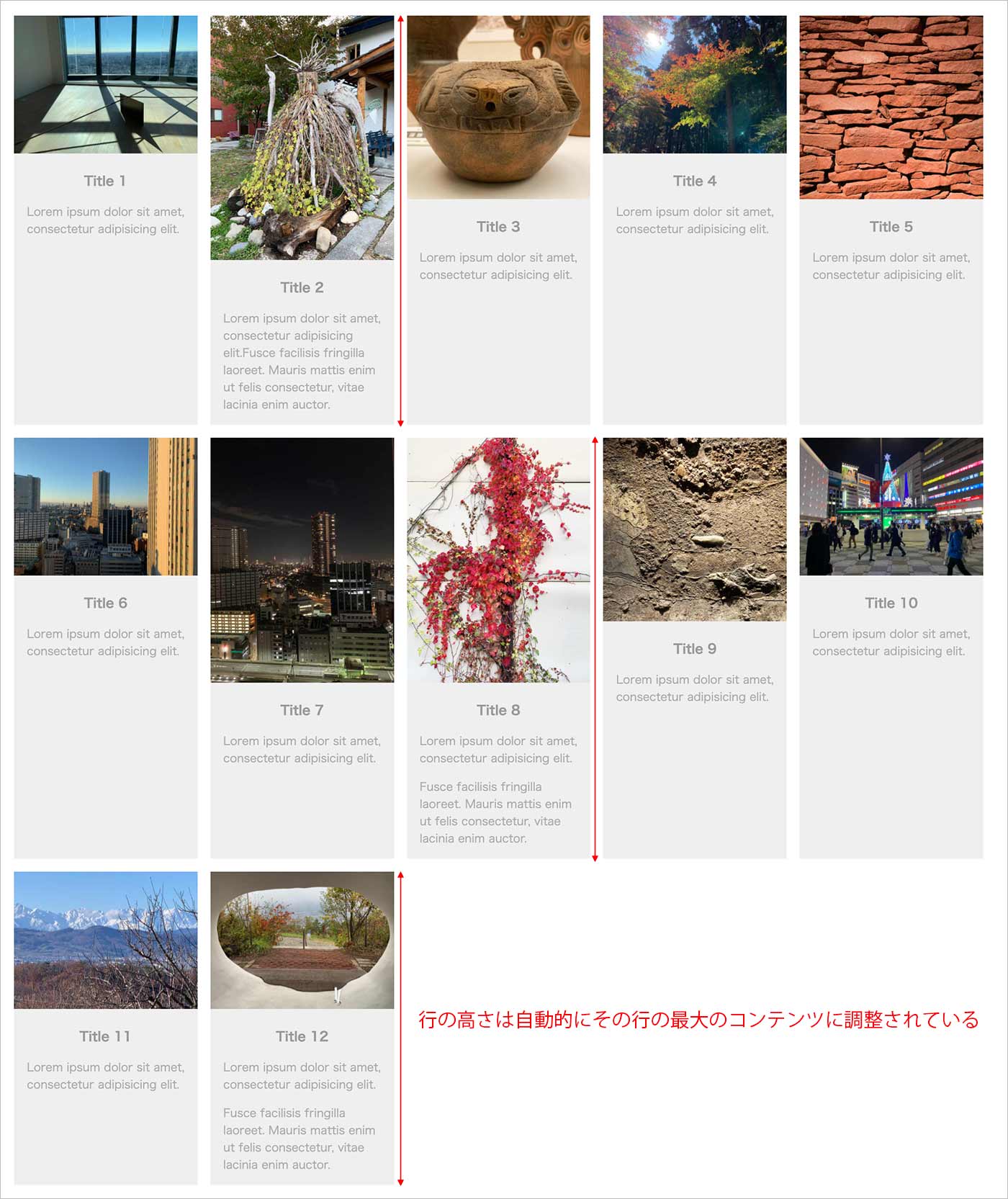
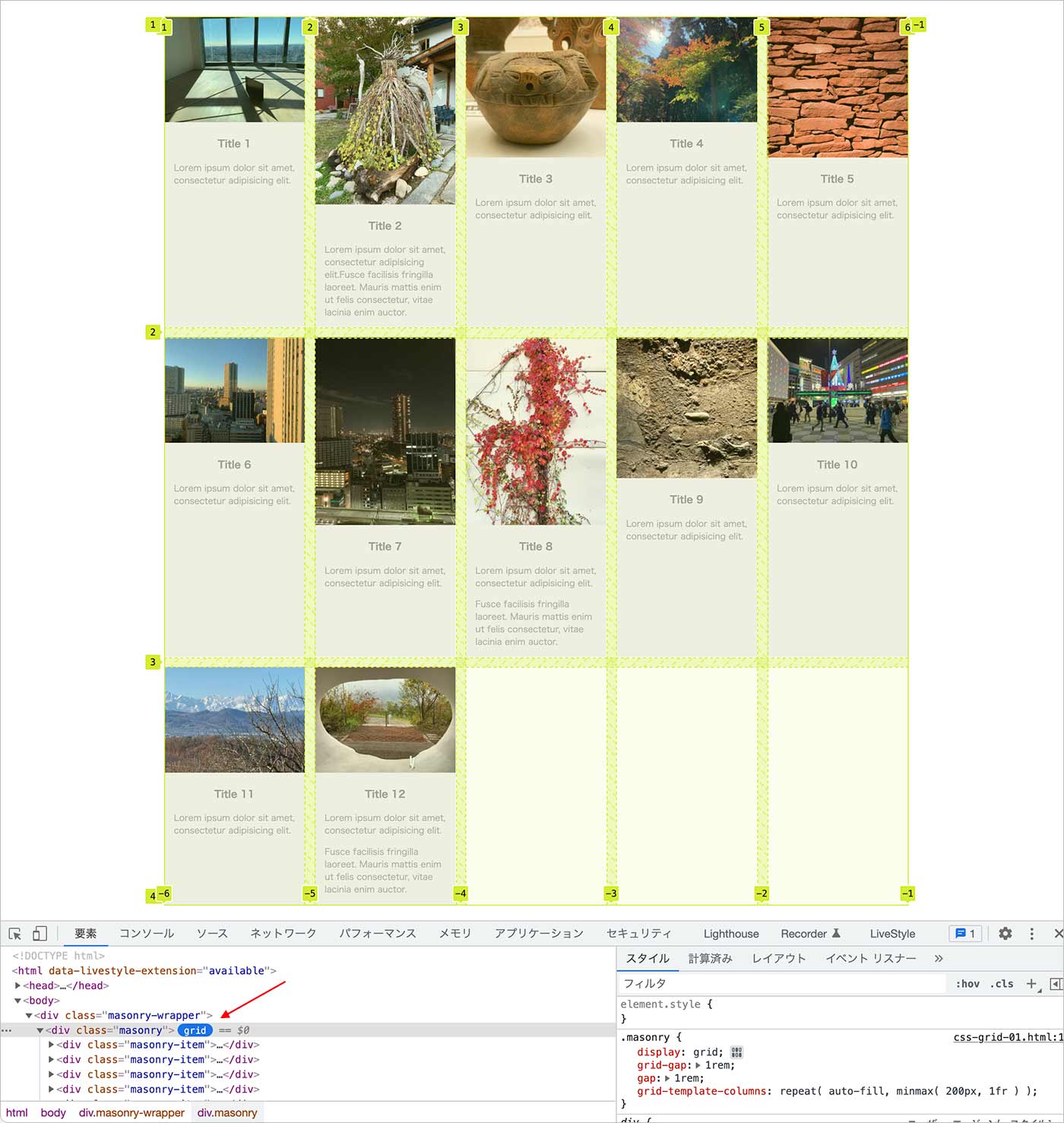
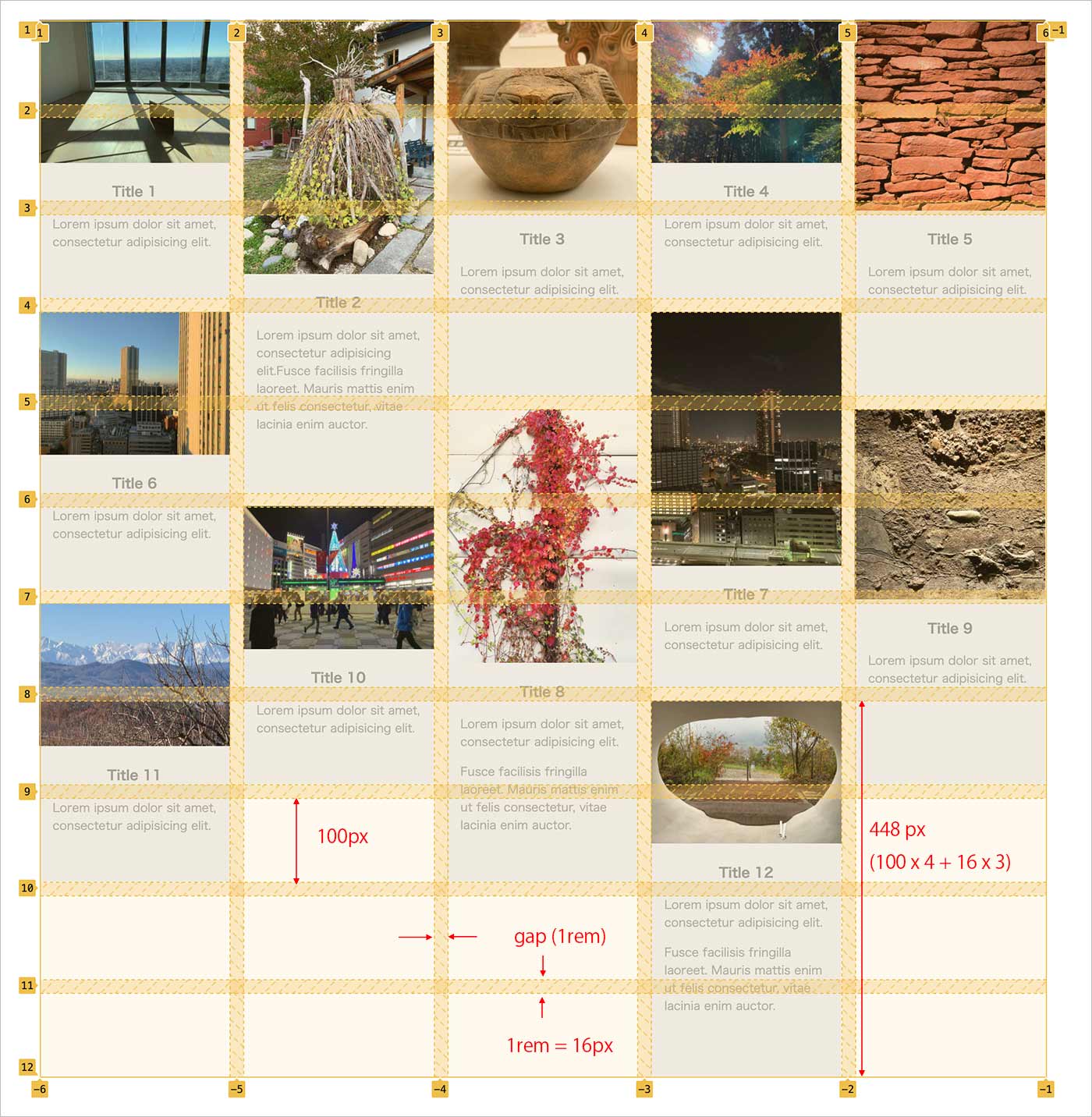
以下はブラウザの幅を1000px以上で表示した際の表示例で、5列 x 3行で表示されています。
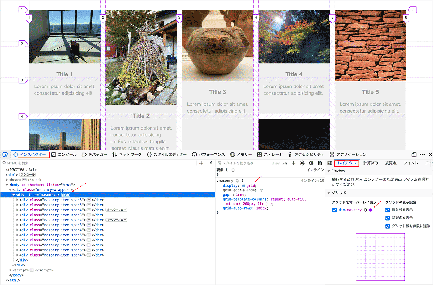
ブラウザのインスペクタを開いてコンテナ要素の横に表示されている「grid」をクリックすると、グリッドのレイアウトを確認することができます。
grid-auto-rows
前述の例では行の高さは指定していなかったので、行の高さはその行の最大の高さのアイテムの値に自動的に調整されています。
grid-auto-rows プロパティを使って自動的に生成される行の高さを指定することができます。
以下のように指定すると、自動的に生成される(暗黙の)行の高さが全て 300px になります。
.masonry {
  display: grid;
  grid-gap: 1rem;
  gap: 1rem;
  grid-template-columns: repeat( auto-fill, minmax( 200px, 1fr ) );
  grid-auto-rows: 300px; /* 自動的に生成される行の高さを指定 */
}
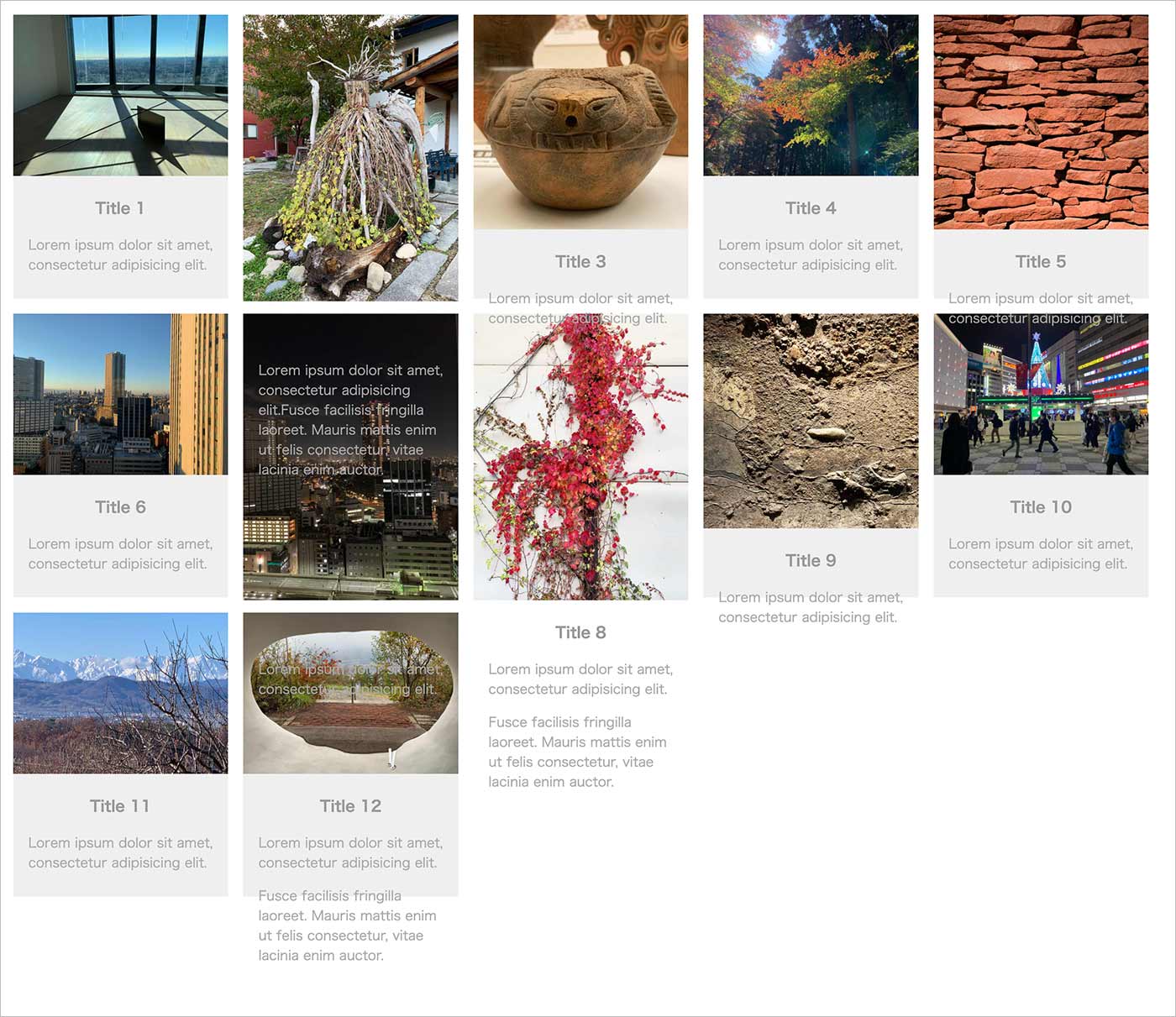
この例の場合、上記のように設定すると以下のように 300px 以上の高さのあるコンテンツははみ出したり、表示できなかったりします。
grid-row-end
grid-row-end は行においてのグリッドアイテムの終了位置を指定するプロパティです。
デフォルトは auto ですが、ライン番号で範囲を指定したり span キーワードを使ってアイテムがまたがる行の数を指定することなどができます。
各コンテンツが一貫した高さである場合、grid-row-end で span キーワードを使って各コンテンツを異なる行数にまたがるように設定することができます。
自動的に生成される行の高さを基準となる行の高さとして grid-auto-rows で指定します。
例えば、grid-auto-rows で基準となる行の高さを 100px として、3つのクラスを作成します。
.masonry {
  display: grid;
  grid-gap: 1rem;
  gap: 1rem;
  grid-template-columns: repeat( auto-fill, minmax( 200px, 1fr ) );
  grid-auto-rows: 100px; /* 自動的に生成される行の高さ(基準となる行の高さ) */
}

.span3 {
   grid-row-end: span 3; /* 3つの行にまたがる→300px */
}
.span4 {
   grid-row-end: span 4; /* 4つの行にまたがる→400px */
}
.span5 {
   grid-row-end: span 5; /* 5つの行にまたがる→500px */
}
コンテンツの高さに応じてクラスを指定します。
<div class="masonry-wrapper">
  <div class="masonry">
    <div class="masonry-item span3"><!-- .span3 を指定して高さを300pxに -->
      <div class="masonry-content"> <img class="thumb" src="images/01.jpg" alt="sample image">
        <h3 class="title">Title 1</h3>
        <div class="desc">
          <p>Lorem ipsum dolor sit amet, consectetur adipisicing elit.</p>
        </div>
      </div>
    </div>
    <div class="masonry-item span5"><!-- .span5 を指定して高さを500pxに -->
      <div class="masonry-content"> <img class="thumb" src="images/02.jpg" alt="sample image">
        <h3 class="title">Title 2</h3>
        <div class="desc">
          <p>Lorem ipsum dolor sit amet, consectetur adipisicing elit.Fusce facilisis fringilla laoreet. Mauris mattis enim ut felis consectetur, vitae lacinia enim auctor. </p>
        </div>
      </div>
    </div>
    <div class="masonry-item span4"><!-- .span4 を指定して高さを400pxに -->
      <div class="masonry-content"> <img class="thumb" src="images/03.jpg" alt="sample image">
        <h3 class="title">Title 3</h3>
        <div class="desc">
          <p>Lorem ipsum dolor sit amet, consectetur adipisicing elit.</p>
        </div>
      </div>
    </div>

    ・・・中略・・・

    <div class="masonry-item span4">
      <div class="masonry-content"> <img class="thumb" src="images/12.jpg" alt="sample image">
        <h3 class="title">Title 12</h3>
        <div class="desc">
          <p>Lorem ipsum dolor sit amet, consectetur adipisicing elit.</p>
          <p>Fusce facilisis fringilla laoreet. Mauris mattis enim ut felis consectetur, vitae lacinia enim auctor. </p>
        </div>
      </div>
    </div>
  </div>
</div>
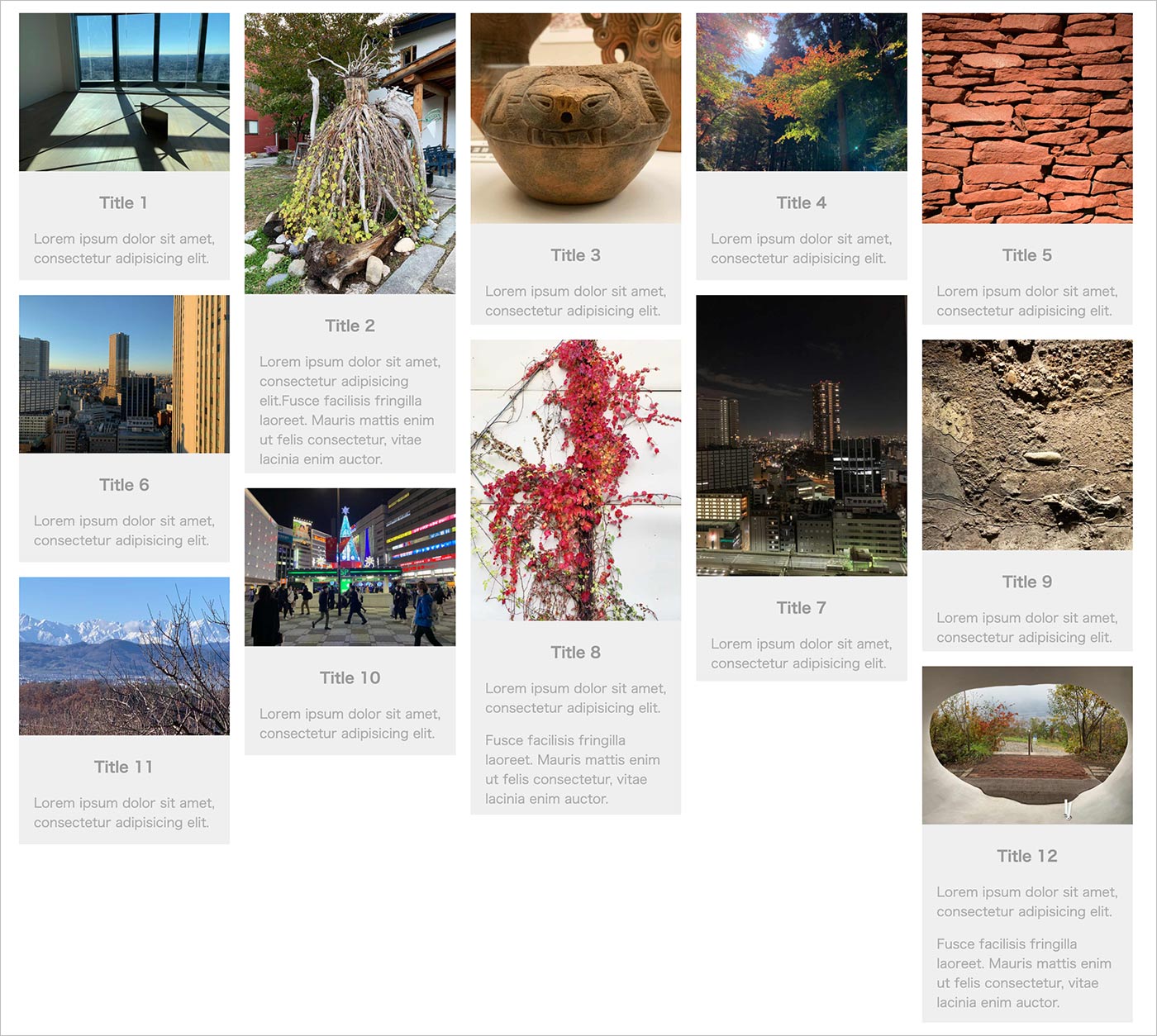
上記の場合、以下のような表示になり、少し Masonry レイアウトに近い感じになります。
ブラウザのインスペクタでグリッドを表示させると以下のようになります。
grid-auto-rows: 100px を指定しているので基準となる行の高さは 100px で、gap が 1rem(16px)なので、例えば .span4 を指定した12番目のコンテンツの高さは以下の場合 448px になっています。
以下はコンテンツを画像のみにした場合の例です。この例の場合、3種類の縦横比の画像を使っているので3つのクラスを作成して指定しています。また、grid-auto-rows と gap は 10px に指定しています。
.masonry {
  display: grid;
  gap: 10px;
  grid-template-columns: repeat( auto-fill, minmax( 200px, 1fr ) );
  grid-auto-rows: 10px;
}
.landscape {
  grid-row-end: span 10;
}
.square {
  grid-row-end: span 14;
}
.portrait {
  grid-row-end: span 18;
}
<div class="masonry-wrapper">
  <div class="masonry">
    <div class="masonry-item landscape">
      <div class="masonry-content"> <img class="thumb" src="images/01.jpg" alt="sample image"> </div>
    </div>
    <div class="masonry-item portrait">
      <div class="masonry-content"> <img class="thumb" src="images/02.jpg" alt="sample image"> </div>
    </div>
    <div class="masonry-item square">
      <div class="masonry-content"> <img class="thumb" src="images/03.jpg" alt="sample image"> </div>
    </div>

    ・・・中略・・・

    <div class="masonry-item landscape">
      <div class="masonry-content"> <img class="thumb" src="images/12.jpg" alt="sample image"> </div>
    </div>
  </div>
</div>
Masonry レイアウトに近い表示になりますが、画面幅により横幅は変化しますが行の高さは一定なので、コンテンツ同士の垂直方向の位置がずれてしまい、あまり実用的ではありません。
また、それぞれのコンテンツのサイズを元にクラスを作成して、それらを個々のアイテムに指定するのも大変です。画像のみを表示する場合は、画像に object-fit を設定すると比較的簡単に CSS のみで Masonry レイアウトを適用できます。
インスペクタでグリッドの情報を表示
Chrome の場合、インスペクタの要素タブで grid をクリックして、右側の「レイアウト」タブを選択して表示されるグリッドの設定オプションで、トラックサイズを表示させたり、オーバーレイの色を変更することなどができます。
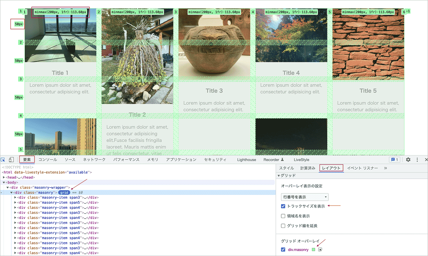
Firefox にも同様の機能があります。トラックサイズは要素にマウスオーバーすると表示されます。
JavaScript で動的に高さを設定
前述の例のように grid-row-end を使ったクラスをコンテンツごとに作成して指定するのはあまり現実的ではありません。
JavaScript を使えば、動的にそれぞれのコンテンツの高さを取得して行の高さを設定することができます。
この場合、CSS では grid-auto-rows の値でコンテンツのサイズを調整できますが、なるべく小さな値(0 も可能)を指定します。
.masonry {
  display: grid;
  grid-gap: 1rem;
  gap: 1rem;
  grid-template-columns: repeat( auto-fill, minmax( 200px, 1fr ) );
  grid-auto-rows: 0; /* 小さな値を指定 */
}
参考にさせていただいたサイト:Masonry style layout with CSS Grid
以下が JavaScritp の例です。
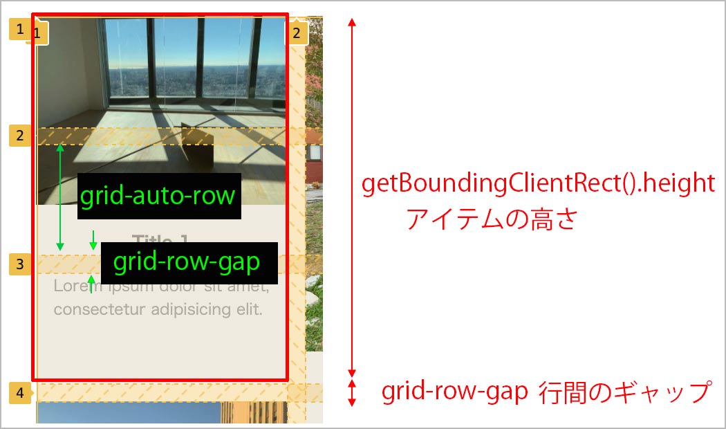
グリッドコンテナの grid-auto-rows と grid-row-gap の値を取得し、個々のグリッドアイテムの高さから grid-row-end プロパティに指定する span の値を算出して、 grid-row-end プロパティを更新するようにしています。
要素のアクティブなスタイルは getComputedStyle() と getPropertyValue() で取得し、グリッドアイテムの高さは getBoundingClientRect() で取得したオブジェクトの height プロパティで取得しています。
//グリッドコンテナを取得
const grid = document.getElementsByClassName('masonry')[0];
//全てのグリッドアイテムを取得
const allItems = document.getElementsByClassName('masonry-item');
//グリッドコンテナの grid-auto-rows の値を取得
const rowHeight = parseInt(window.getComputedStyle(grid).getPropertyValue('grid-auto-rows'));
//グリッドコンテナの grid-row-gap の値を取得
const rowGap = parseInt(window.getComputedStyle(grid).getPropertyValue('grid-row-gap'));

//グリッドアイテムの grid-row-end プロパティを更新(設定)する関数
const resizeGridItem = (item) => {
  //grid-row-end の span に指定する値を算出
  const rowSpan = Math.ceil((item.querySelector('.masonry-content').getBoundingClientRect().height + rowGap) / (rowHeight + rowGap));
  //グリッドアイテムの grid-row-end プロパティを更新(設定)
  item.style.gridRowEnd = 'span ' + rowSpan;
}

//全てのアイテムの grid-row-end プロパティを更新する関数
const resizeAllGridItems = () => {
  for( let i=0; i < allItems.length; i++){
    resizeGridItem(allItems[i]);
  }
}

//リサイズ時に全てのアイテムの grid-row-end プロパティを更新
let timer = false;
window.addEventListener('resize', () => {
  if (timer !== false) {
    clearTimeout(timer);
  }
  timer = setTimeout(function() {
    resizeAllGridItems();
  }, 200);
});

//ロード時に全てのアイテムの grid-row-end プロパティを設定
window.addEventListener('load', () => {
  resizeAllGridItems();
});
グリッドアイテムの grid-row-end プロパティを更新する関数 resizeGridItem の13行目では、アイテムの高さと行間のギャップ(grid-row-gap)、行の高さ(grid-auto-rows)から span に指定する値を算出しています。
「アイテムの高さと行間のギャップを加算した値」を「行の高さと行間のギャップを加算した値」で割った値を切り上げています。
span には整数を指定する必要があるので、Math.ceil で値を切り上げています。
ロードイベントを使って DOM ツリー構築完了後、画像やスタイルシートなどが読み込まれ、読み込みのすべてが完了した時点で、resizeAllGridItems() により全てのアイテムに適切な grid-row-end プロパティを設定していますが、遅延読み込みなどを行っている場合は、コンテンツの高さがうまく取得できない可能性があります(imagesLoaded の利用)。
リサイズイベント
リサイズイベントは発生する頻度が高いので、setTimeout() を使ってユーザーがブラウザのサイズを変更した後に処理を行うようにしています(関連項目:イベント終了時に処理を実行)。
そのため、ブラウザの幅によってはリサイズ後にカクっとした表示になる場合があります。
setTimeout() を使わずに、resizeAllGridItems() を呼び出すこともできますが、その場合、リサイズ中にカクカクした表示になります。
window.addEventListener('resize', () => {
  resizeAllGridItems();
});
行の高さの調整
grid-auto-rows の値を変更することで、行の高さを調整することができます。値を大きくすると余白が大きくなります。
.masonry {
  display: grid;
  grid-gap: 1rem;
  gap: 1rem;
  grid-template-columns: repeat( auto-fill, minmax( 200px, 1fr ) );
  grid-auto-rows: 10px; /* 行の高さを調整 */
}
imagesLoaded の利用
画像要素の loading 属性に lazy を指定したり、遅延読み込みのプラグインを使用している場合などではアイテムのコンテンツの高さを取得できず、レイアウトが崩れる可能性があります。
基本的には loading="lazy" の指定はファーストビューの要素には指定しませんが、この例では機能の確認のためPCなどの画面サイズの大きい場合にファーストビューで表示される画像にも指定しています。
<div class="masonry-wrapper">
  <div class="masonry">
    <div class="masonry-item">
      <div class="masonry-content"> <img class="thumb" src="images/01.jpg" alt="sample image">
        <h3 class="title">Title 1</h3>
        <div class="desc">
          <p>Lorem ipsum dolor sit amet, consectetur adipisicing elit.</p>
        </div>
      </div>
    </div>
    ・・・中略・・・
    <div class="masonry-item">
      <!-- loading="lazy" を指定 -->
      <div class="masonry-content"> <img loading="lazy" class="thumb" src="images/07.jpg" alt="sample image">
        <h3 class="title">Title 7</h3>
        <div class="desc">
          <p>Lorem ipsum dolor sit amet, consectetur adipisicing elit.</p>
        </div>
      </div>
    </div>
    ・・・中略・・・
    <div class="masonry-item">
      <div class="masonry-content"> <img loading="lazy" class="thumb" src="images/12.jpg" alt="sample image">
        <h3 class="title">Title 12</h3>
        <div class="desc">
          <p>Lorem ipsum dolor sit amet, consectetur adipisicing elit.</p>
          <p>Fusce facilisis fringilla laoreet. Mauris mattis enim ut felis consectetur, vitae lacinia enim auctor. </p>
        </div>
      </div>
    </div>
  </div>
</div>
imagesLoaded は画像の読み込みを検出するプラグインで、このプラグインを使って画像の読み込みが完了した時点でコンテンツの高さを取得することができます。
imagesLoaded は IE9+, Android 2.3+, iOS Safari 4+, その他のモダンブラウザで動作し、CDN 経由やダウンロードして読み込むことができます。また npm でインストールして webpack で使うこともできます。
使い方は imagesLoaded を読み込んで、以下の書式で指定した elem(要素)の画像の読み込みが完了した時点で callback に指定した処理を実行することができます。
imagesLoaded( elem, callback )
例えば、以下のように記述すれば、#container(id が container の要素) に含まれる画像の読み込みが完了した時点でコンソールにメッセージを表示します。
imagesLoaded( document.querySelector('#container'), function( instance ) {
  console.log('all images in #container are loaded');
});
imagesLoaded は CDN 経由で読み込むこともダウンロードして読み込むこともできます。また npm でインストールして使用することもできます。
前述の JavaScript を imagesLoaded を使って書き換えると以下のようになります。
imagesLoaded の callback に渡される instance は imagesLoaded のオブジェクトで、.elements[0] で第1引数に指定した要素を取得できます。
<!-- imagesLoaded の読み込み -->
<script src="https://unpkg.com/imagesloaded@4/imagesloaded.pkgd.min.js"></script>
<script>

const grid = document.getElementsByClassName('masonry')[0];
const allItems = document.getElementsByClassName('masonry-item');
const rowHeight = parseInt(window.getComputedStyle(grid).getPropertyValue('grid-auto-rows'));
const rowGap = parseInt(window.getComputedStyle(grid).getPropertyValue('grid-row-gap'));

const resizeGridItem = (item) => {
  const rowSpan = Math.ceil((item.querySelector('.masonry-content').getBoundingClientRect().height + rowGap) / (rowHeight + rowGap));
  item.style.gridRowEnd = 'span ' + rowSpan;
}

const resizeAllGridItems = () => {
  for( let i=0; i < allItems.length; i++){
    resizeGridItem(allItems[i]);
  }
}

let timer = false;
window.addEventListener('resize', () => {
  if (timer !== false) {
    clearTimeout(timer);
  }
  timer = setTimeout(function() {
    resizeAllGridItems();
  }, 200);
});

/* この部分を下記の imagesLoaded を使った記述に変更
window.addEventListener('load', () => {
  resizeAllGridItems();
});
*/

window.addEventListener('load', () => {
  for(i=0; i<allItems.length; i++){
    //個々のアイテムの画像の読み込みを検出
    imagesLoaded( allItems[i], (instance) => {
      //item には個々のアイテムが入る
      const item = instance.elements[0];
      resizeGridItem(item);
    });
  }
});
</script>
もし、上記でもコンテンツの高さがうまく取得できない場合は、resizeAllGridItems() で imagesLoaded を使って以下のように記述すれば改善されるかも知れません。
const grid = document.getElementsByClassName('masonry')[0];
const allItems = document.getElementsByClassName('masonry-item');
const rowHeight = parseInt(window.getComputedStyle(grid).getPropertyValue('grid-auto-rows'));
const rowGap = parseInt(window.getComputedStyle(grid).getPropertyValue('grid-row-gap'));

const resizeGridItem = (item) => {
  const rowSpan = Math.ceil((item.querySelector('.masonry-content').getBoundingClientRect().height + rowGap) / (rowHeight + rowGap));
  item.style.gridRowEnd = 'span ' + rowSpan;
}

const resizeAllGridItems = () => {
  for(i=0; i<allItems.length; i++){
    //毎回画像の読み込みの検出を行ってからアイテムの grid-row-end プロパティを更新
    imagesLoaded( allItems[i], (instance) => {
      const item = instance.elements[0];
      resizeGridItem(item);
    });
  }
}

let timer = false;
window.addEventListener('resize', () => {
  if (timer !== false) {
    clearTimeout(timer);
  }
  timer = setTimeout(function() {
    resizeAllGridItems();
  }, 200);
});

window.addEventListener('load', () => {
  resizeAllGridItems();
});
アニメーションの追加
コンテンツの内容にもよりますが、ページを開く際にチラつくことがあります。
例えば、以下のような CSS アニメーションをアイテムに適用すると少しは気にならないようになるかも知れません(関連項目:CSS アニメーションの追加)。
以下は opacity と transform プロパティを使ったアニメーションです。
/* グリッドアイテム(masonry-item)にアニメーションを追加 */
.masonry-item:nth-child(odd) { /* 奇数番目のアイテム */
  animation: start_animation1 0.4s ease-in-out both;
}
.masonry-item:nth-child(even) { /* 偶数番目のアイテム */
  animation: start_animation2 0.4s ease-in-out both;
}

@keyframes start_animation1 {
  0% {
  transform: translate(50px, 300px);
  opacity: 0;
  }
  100% {
  transform: translate(0, 0);
  opacity: 1;
  }
}

@keyframes start_animation2 {
  0% {
  transform: translate(-50px, 300px);
  opacity: 0;
  }
  100% {
  transform: translate(0, 0);
  opacity: 1;
  }
}
画像のみの例
以下は画像のみの場合の例です。この例では img 要素に masonry-content クラスを指定しています。JavaScritp は前述の例と同じです。
<div class="masonry-wrapper">
  <div class="masonry">
    <div class="masonry-item">
      <img class="masonry-content" src="images/01.jpg" alt="sample image">
    </div>
    <div class="masonry-item">
      <img class="masonry-content" src="images/02.jpg" alt="sample image">
    </div>

    ・・・中略・・・

    <div class="masonry-item">
      <img loading="lazy" class="masonry-content" src="images/23.jpg" alt="sample image">
    </div>
    <div class="masonry-item">
      <img loading="lazy" class="masonry-content" src="images/24.jpg" alt="sample image">
    </div>
  </div>
</div>

<!--	imagesLoaded の読み込み -->
<script src="https://unpkg.com/imagesloaded@4/imagesloaded.pkgd.min.js"></script>
<script>

const grid = document.getElementsByClassName('masonry')[0];
const allItems = document.getElementsByClassName('masonry-item');
const rowHeight = parseInt(window.getComputedStyle(grid).getPropertyValue('grid-auto-rows'));
const rowGap = parseInt(window.getComputedStyle(grid).getPropertyValue('grid-row-gap'));

const resizeGridItem = (item) => {
  const rowSpan = Math.ceil((item.querySelector('.masonry-content').getBoundingClientRect().height + rowGap) / (rowHeight + rowGap));
  item.style.gridRowEnd = 'span ' + rowSpan;
}

const resizeAllGridItems = () => {
  for( let i=0; i < allItems.length; i++){
    resizeGridItem(allItems[i]);
  }
}

let timer = false;
window.addEventListener('resize', () => {
  if (timer !== false) {
    clearTimeout(timer);
  }
  timer = setTimeout(function() {
    resizeAllGridItems();
  }, 200);
});

window.addEventListener('load', () => {
  for(i=0; i<allItems.length; i++){
    imagesLoaded( allItems[i], (instance) => {
      const item = instance.elements[0];
      resizeGridItem(item);
    });
  }
});
</script>
CSS も今までの例とほぼ同じですが、grid-auto-rows に 0 を指定しています。
また、masonry-item クラスの背景色にピンクを設定しています。
* {
  margin: 0;
  padding: 0;
  box-sizing: border-box;
}
img {
  vertical-align: middle;
}
.masonry-wrapper {
  padding: 1.5rem;
  max-width: 1200px;
  margin-right: auto;
  margin-left: auto;
}
.masonry {
  display: grid;
  gap: 10px;  /* grid-auto-rows が 0 の場合、ギャップに 0 は指定できない */
  grid-template-columns: repeat( auto-fill, minmax( 200px, 1fr ) );
  grid-auto-rows: 0; /* 0 を指定 */
}
.masonry-item {
  background-color: pink;
}
.masonry-content {
  max-width: 100%;
}
上記サンプルを確認すると、アイテムによってはピンク色の背景色が見えてしまうものがあります。
これは個々のアイテムの行の高さを JavaScript で設定する際に、span を使って設定しているので、コンテンツの正確な高さを設定しているわけではないためです。
gap を小さな値(例えば 1px)にすれば、それほど気にならないようになります。但し、この例の場合、grid-auto-rows と gap を同時に 0 には指定できません。
以下はギャップを 0 に、grid-auto-rows を 1px に指定したサンプルです。
試してみたこと
以下は画像の高さをアイテムの高さとほぼ同じようにして、img 要素の object-fit プロパティに cover を指定した例です。
.masonry-content {
  max-width: 100%;
  width: 100%;
  object-fit: cover; /* object-fit を指定 */
}
画像の高さをアイテムの高さと全く同じにしてしまうと、今度はギャップが小さすぎてしまったりするので、以下では適当な値(0.7)で調整しています。
前述の例との違いは、10〜16行目を追加した部分のみです。
const grid = document.getElementsByClassName('masonry')[0];
const allItems = document.getElementsByClassName('masonry-item');
const rowHeight = parseInt(window.getComputedStyle(grid).getPropertyValue('grid-auto-rows'));
const rowGap = parseInt(window.getComputedStyle(grid).getPropertyValue('grid-row-gap'));

const resizeGridItem = (item) => {
  const rowSpan = Math.ceil((item.querySelector('.masonry-content').getBoundingClientRect().height + rowGap) / (rowHeight + rowGap));
  item.style.gridRowEnd = 'span ' + rowSpan;
  //環境に合わせて変更する値
  const magicNumber = 0.7;
  //アイテムの高さ(ギャップの値を調整)
  const itemHeight = item.querySelector('.masonry-content').getBoundingClientRect().height + rowGap * magicNumber;
  //画像要素
  const image = item.querySelector('img');
  //画像要素の高さをアイテムの高さ(itemHeight)に設定
  image.style.height = itemHeight + 'px';
}

const resizeAllGridItems = () => {
  for( let i=0; i < allItems.length; i++){
    resizeGridItem(allItems[i]);
  }
}

let timer = false;
window.addEventListener('resize', () => {
  if (timer !== false) {
    clearTimeout(timer);
  }
  timer = setTimeout(function() {
    resizeAllGridItems();
  }, 200);
});

window.addEventListener('load', () => {
  for(i=0; i<allItems.length; i++){
    imagesLoaded( allItems[i], (instance) => {
      const item = instance.elements[0];
      resizeGridItem(item);
    });
  }
});
但し、今度は逆に行間の狭い部分が気になってしまいます。。。
この場合は Masonry プラグインを使うと簡単かも知れません。
また、画像の全体を表示する必要がなければ、grid-auto-flow と object-fit を使う方法や表示される順番を気にする必要がなければ、CSS Multi-column を使う方法もあります。
列幅の指定 grid-column-end
grid-column-end プロパティを使って列の終了位置を指定することができるので、個々のアイテムの列幅を指定することができます。
以下は colx2 というクラスを指定したアイテムの列幅(横幅)を2倍にして表示する例です。この例の場合はきれいには並びませんが、サイズを調整(工夫)すれば面白いレイアウトができるかも知れません。
.masonry {
  display: grid;
  grid-gap: 1rem;
  gap: 1rem;
  grid-template-columns: repeat( auto-fill, minmax( 200px, 1fr ) );
  grid-auto-rows: 10px;
}
.colx2 {
  grid-column-end: span 2; /* 列幅を2倍に */
}
列幅を2倍にする要素にクラス colx2 を指定します。
<div class="masonry-item colx2"><!-- colx2 を指定 -->
  <div class="masonry-content">
    <img class="thumb" src="images/04.jpg" alt="sample image">
    <h3 class="title">Title 4</h3>
    <div class="desc">
      <p>Lorem ipsum dolor sit amet, consectetur adipisicing elit.</p>
    </div>
  </div>
</div>
以下は画像のみの場合の例です。grid-auto-flow に dense を指定して順番に関係なくなるく隙間を埋めるようにしています。
.masonry {
  display: grid;
  gap: 1px;
  grid-template-columns: repeat( auto-fill, minmax( 200px, 1fr ) );
  grid-auto-rows: 0;
  grid-auto-flow: dense; /* dense を指定 */
}
CSS Multi-column
マルチカラムレイアウト(CSS Multi-column Layout)の column-count プロパティを使うと簡単に CSS だけで Masonry レイアウトのような段組のレイアウトを実現できます。
但し、表示される順番が垂直方向になるので、時系列のコンテンツを並べるのには向いていません。
HTML は前述のグリッドの例と同じものを使います。
<div class="masonry-wrapper">
  <div class="masonry">
    <div class="masonry-item">
      <div class="masonry-content"> <img class="thumb" src="images/01.jpg" alt="sample image">
        <h3 class="title">Title 1</h3>
        <div class="desc">
          <p>Lorem ipsum dolor sit amet, consectetur adipisicing elit.</p>
        </div>
      </div>
    </div>
    <div class="masonry-item">
      <div class="masonry-content"> <img class="thumb" src="images/02.jpg" alt="sample image">
        <h3 class="title">Title 2</h3>
        <div class="desc">
          <p>Lorem ipsum dolor sit amet, consectetur adipisicing elit.Fusce facilisis fringilla laoreet. Mauris mattis enim ut felis consectetur, vitae lacinia enim auctor. </p>
        </div>
      </div>
    </div>

    ・・・中略・・・

    <div class="masonry-item">
      <div class="masonry-content"> <img class="thumb" src="images/12.jpg" alt="sample image">
        <h3 class="title">Title 12</h3>
        <div class="desc">
          <p>Lorem ipsum dolor sit amet, consectetur adipisicing elit.</p>
          <p>Fusce facilisis fringilla laoreet. Mauris mattis enim ut felis consectetur, vitae lacinia enim auctor. </p>
        </div>
      </div>
    </div>
  </div>
</div>
<script>
CSS ではメディアクエリを使って画面幅に合わせて column-count を設定し、列間の間隔(ギャップ)は column-gap で指定します。
この例では460px〜767pxでは2列、768px〜1023pxでは3列、1024px〜1239pxでは4列、1240px以上では5列で表示するようにしています。
カラム内の要素(この例の場合、.masonry-item )には display: inline-block を指定して表示がずれないようにし、vertical-align: top でアイテムを垂直方向上端に配置(指定しなくても変わらないかもしれません)します。
.masonry-wrapper {
  padding: 1.5em;
  max-width: 1200px;
  margin-right: auto;
  margin-left: auto;
}
.masonry {
  column-gap: 20px; /* 列間の間隔(ギャップ) */
}
.masonry-item {
  margin-bottom: 30px;
  display: inline-block; /* 必須(表示がずれないように) */
  vertical-align: top; /* アイテムを垂直方向上端に配置 */
}

@media only screen and (min-width: 460px)  {
  .masonry {
   column-count: 2; /* 2段組 */
  }
}

@media only screen and (min-width: 768px) {
  .masonry {
   column-count: 3; /* 3段組 */
  }
}

@media only screen and (min-width: 1024px) {
  .masonry {
   column-count: 4; /* 4段組 */
  }
}

@media only screen and (min-width: 1240px) {
  .masonry {
   column-count: 5; /* 5段組 */
  }
}
画像のみの例
以下は画像のみを表示する例です。この場合、画像要素に masonry-content クラスを指定しています。
<div class="masonry-wrapper">
  <div class="masonry">
    <div class="masonry-item">
      <img class="masonry-content" src="images/01.jpg" alt="sample image">
    </div>
    <div class="masonry-item">
      <img class="masonry-content" src="images/02.jpg" alt="sample image">
    </div>

    ・・・中略・・・

    <div class="masonry-item">
      <img class="masonry-content" src="images/22.jpg" alt="sample image">
    </div>
    <div class="masonry-item">
      <img class="masonry-content" src="images/23.jpg" alt="sample image">
    </div>
    <div class="masonry-item">
      <img class="masonry-content" src="images/24.jpg" alt="sample image">
    </div>
  </div>
</div>
また、column-gap を 10px に、.masonry-item のマージンを 0 にしています。
.masonry-wrapper {
  padding: 1.5em;
  max-width: 1200px;
  margin-right: auto;
  margin-left: auto;
}
.masonry {
  column-gap: 10px; /* 変更 */
}
.masonry-item {
  margin-bottom: 0; /* 変更 */
  display: inline-block;
  vertical-align: top;
}

@media only screen and (min-width: 460px)  {
  .masonry {
   column-count: 2;
  }
}

@media only screen and (min-width: 768px) {
  .masonry {
   column-count: 3;
  }
}

@media only screen and (min-width: 1024px) {
  .masonry {
   column-count: 4;
  }
}

@media only screen and (min-width: 1240px) {
  .masonry {
   column-count: 5;
  }
}
.masonry-item {
  background-color: #efefef;
}
.masonry-content {  /* 追加 */
  max-width: 100%; /* img 要素 */
}
Masonry Layout(CSS Grid Layout Module Level 3)
CSS Masonry Layout は Editor’s Draft で公開されていますが、現時点(2022年2月)で実装されている通常のブラウザはありません。
現時点では Firefox Nightly(開発中の試験版プラットフォーム)でのみしか実装されていませんが、CSS Masonry Layout を使うと以下のようにとても簡単に Masonry レイアウトで表示することができます。
.masonry {
  display: grid;
  grid-gap: 20px;
  grid: masonry / repeat(auto-fit, minmax(200px, 1fr));
}
3行目の grid は一括指定プロパティの書き方で、以下と同じことになります。また、Masonry の場合、repeat(auto-fit) は repeat(auto-fill) として動作するようです(repeat(auto-fit))。
grid-template-rows: masonry;
grid-template-columns: repeat(auto-fit, minmax(200px, 1fr));
前述の例と同じ HTML で上記の CSS を設定するだけで以下のように表示されます。
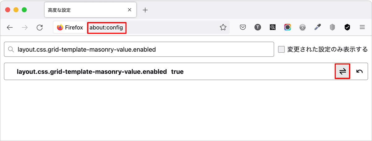
サンプル(※ Firefox Nightly でのみ正しく表示されます)
または通常の Firefox でアドレスバーに about:config と入力して layout.css.grid-template-masonry-value.enabled を true に設定することで Masonry Layout を有効にすることができます。
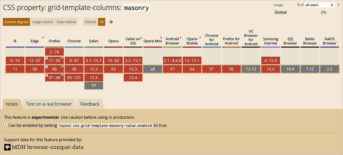
grid-template-columns: masonry のブラウザ対応状況
grid-auto-flow と object-fit
以下は grid-auto-flow: dense と object-fit: cover を使って画像を Masonry レイアウトで表示する例です。今までの例とは異なり、画像全体を表示するのではなく、グリッドアイテムのサイズに合わせて画像を object-fit: cover で画像の縦横比を維持して表示します。また、grid-auto-flow: dense を指定するので表示される順番はアイテムのサイズにより異なってきます。
CSS Grid: Responsive Masonry Layout #1(Saief Al Emon) を参考にさせていただきました。
CSS だけで簡単に画像を Masonry レイアウトで表示することができます。
以下が HTML です。grid-wrappe クラスを指定した div 要素がグリッドのコンテナーになります。
その中に div 要素で囲んだ img 要素を配置し、tall クラスを指定した要素は高さを2倍、wide クラスを指定した要素は幅を2倍、big クラスを指定した要素は高さと幅を2倍で表示します。
<body>
  <div class="grid-wrapper">
    <div class="wide">
      <img src="images/01.jpg" alt="sample image">
    </div>
    <div class="tall">
      <img src="images/02.jpg" alt="sample image">
    </div>
    <div>
      <img src="images/03.jpg" alt="sample image">
    </div>
    <div class="big">
      <img src="images/04.jpg" alt="sample image">
    </div>
    <div>
      <img src="images/05.jpg" alt="sample image">
    </div>
    <div class="wide">
      <img src="images/06.jpg" alt="sample image">
    </div>
    <div class="tall">
      <img src="images/07.jpg" alt="sample image">
    </div>
    <div class="tall">
      <img src="images/08.jpg" alt="sample image">
    </div>
    <div>
      <img src="images/09.jpg" alt="sample image">
    </div>
    <div class="wide">
      <img src="images/10.jpg" alt="sample image">
    </div>
    <div class="wide">
      <img src="images/11.jpg" alt="sample image">
    </div>
    <div class="wide">
      <img src="images/12.jpg" alt="sample image">
    </div>
  </div>
</body>
この場合もレスポンシブになるように grid-template-columns でスクリーンサイズに合わせてカラム数を変更させ、行の基準となる高さを grid-auto-rows で指定してグリッドを作成します。
参考にさせていただいたサンプルでは grid-template-columns に auto-fit が指定されていますが、この例では auto-fill を指定しています。
grid-column は grid-column-end と grid-column-start の一括指定プロパティで、grid-row は grid-row-end と grid-row-start の一括指定プロパティです。
grid-auto-flow に dense を指定して順番に関係なく空いているスペースをできるだけ埋めるようにアイテムを配置するようにしています。この例の場合、ブラウザの幅により隙間ができる場合がありますが、十分な数の何もクラスを指定しない(一番小さい)画像を配置すれば隙間は埋まるようになります。
img 要素には object-fit に cover を指定して画像の縦横比を維持したまま、要素のコンテンツボックス(この場合はグリッドアイテム)に収まるように拡大縮小するようにしています。object-position を省略しているので、デフォルトの 50% 50% が適用され、画像は中央を基準として配置されます。幅と高さには 100% を指定します。
27行目では子(供)セレクタを使っていますが、この場合は子孫セレクタでも同じです。構造に合わせて適切なセレクタを選択します。
* { /* リセット(必要に応じて)*/
  margin: 0;
  padding: 0;
  box-sizing: border-box;
}
img {
  vertical-align: middle;
}

html, body {
  padding: 15px;
}
.grid-wrapper {
  display: grid; /* グリッドコンテナ */
  grid-gap: 10px; /* ギャップの古い指定方法(省略可能) */
  gap: 10px; /* ギャップの指定 */
  grid-template-columns: repeat(auto-fill, minmax(200px, 1fr));
  grid-auto-rows: 240px; /* 行の高さ */
  grid-auto-flow: dense; /* dense アルゴリズム */
}
.grid-wrapper .wide {
  grid-column: span 2; /* または grid-column-end: span 2 */
}
.grid-wrapper .tall {
  grid-row: span 2; /* または grid-row-end: span 2 */
}
.grid-wrapper .big {
  grid-column: span 2; /* または grid-column-end: span 2 */
  grid-row: span 2; /* または grid-row-end: span 2 */
}
.grid-wrapper > div > img { /* または .grid-wrapper div img */
  width: 100%;  /* 100% を指定 */
  height: 100%; /* 100% を指定 */
  object-fit: cover; /* 縦横比を維持してボックスに収まるように拡大縮小 */
  border-radius: 5px;
}
クラス .wide や .big を指定した要素は grid-column でカラムの幅を2倍にし、.tall や .big を指定した要素は grid-row で行の高さを2倍にしています。
| クラス | アイテムの幅 | アイテムの高さ |
|---|---|---|
| 指定なし | 1fr (最小幅 200px) | grid-auto-rows の値(240px) |
| wide | 2fr + gap(最小幅 410px) | grid-auto-rows の値(240px) |
| tall | 1fr (最小幅 200px) | grid-auto-rows の値の2倍 + gap(490px) |
| big | 2fr + gap (最小幅 410px) | grid-auto-rows の値の2倍 + gap(490px) |
画像のタイトルを表示
以下は画像のタイトルを p 要素で表示する例です。
<body>
  <div class="grid-wrapper">
    <div> <img src="images/01.jpg" alt="sample image">
      <p>Photo 1</p>
    </div>
    <div class="tall"> <img src="images/02.jpg" alt="sample image">
      <p>Photo 2</p>
    </div>
    <div> <img src="images/03.jpg" alt="sample image">
      <p>Photo 3</p>
    </div>
    <div class="big"> <img src="images/04.jpg" alt="sample image">
      <p>Photo 4</p>
    </div>
    <div> <img src="images/05.jpg" alt="sample image">
      <p>Photo 5</p>
    </div>
    <div class="wide"> <img src="images/06.jpg" alt="sample image">
      <p>Photo 6</p>
    </div>
    <div class="tall"> <img src="images/07.jpg" alt="sample image">
      <p>Photo 7</p>
    </div>
    <div class="tall"> <img src="images/08.jpg" alt="sample image">
      <p>Photo 8</p>
    </div>
    <div> <img src="images/09.jpg" alt="sample image">
      <p>Photo 9</p>
    </div>
    <div class="wide"> <img src="images/10.jpg" alt="sample image">
      <p>Photo 10</p>
    </div>
    <div class="wide"> <img src="images/11.jpg" alt="sample image">
      <p>Photo 11</p>
    </div>
    <div class="wide"> <img src="images/12.jpg" alt="sample image">
      <p>Photo 12</p>
    </div>
  </div>
</body>
列と行のギャップの指定を分け、行間のギャップ(row-gap)にタイトルの高さを確保しています。
* {
  margin: 0;
  padding: 0;
  box-sizing: border-box;
}
img {
  vertical-align: middle;
}

html, body {
  padding: 15px;
}
.grid-wrapper {
  display: grid;
  row-gap: 2.25rem; /* タイトルの p 要素の高さを確保 */
  column-gap: 10px;
  grid-template-columns: repeat(auto-fill, minmax(200px, 1fr));
  grid-auto-rows: 240px;
  grid-auto-flow: dense;
}
.grid-wrapper > div p {
  color: darkseagreen;
  padding-top: 5px;
  font-size: .75rem;
  text-align: center; /* 中央配置 */
}
.grid-wrapper > div > img {
  width: 100%;
  height: 100%;
  object-fit: cover;
  border-radius: 0px;
}
.grid-wrapper .wide {
  grid-column: span 2;
}
.grid-wrapper .tall {
  grid-row: span 2;
}
.grid-wrapper .big {
  grid-column: span 2;
  grid-row: span 2;
}
ホバー時にタイトルを表示
以下はホバー時にタイトルを表示する例です。HTML は前述の例と同じです。
この例ではグリッドアイテムの display に flex を指定し、justify-content と align-items に center を指定することでタイトルを垂直及び水平方向中央に配置しています。
* {
  margin: 0;
  padding: 0;
  box-sizing: border-box;
}
html, body {
  padding: 15px;
}
.grid-wrapper {
  display: grid;
  gap: 10px;
  grid-template-columns: repeat(auto-fill, minmax(200px, 1fr));
  grid-auto-rows: 240px;
  grid-auto-flow: dense;
}
.grid-wrapper .wide {
  grid-column: span 2;
}
.grid-wrapper .tall {
  grid-row: span 2;
}
.grid-wrapper .big {
  grid-column: span 2;
  grid-row: span 2;
}
.grid-wrapper > div { /* アイテムに flex を指定 */
  display: flex;
  justify-content: center;
  align-items: center;
}
.grid-wrapper > div > img {
  width: 100%;
  height: 100%;
  object-fit: cover;
  border-radius: 4px;
}
.grid-wrapper > div > p {
  position: absolute; /* 絶対配置 */
  color: #fff;
  background-color: rgba(0,0,0,.6);
  padding: 10px;
  opacity: 0;
  transition: opacity 0.4s;
  font-size: .75rem;
}
.grid-wrapper > div:hover > p {
  opacity: 1;
}
figure 要素で表示
以下は HTML のマークアップを figure 要素と figcaption 要素を使い、画像のタイトルをアニメーションで表示する例です。
<div class="grid-wrapper">
  <figure class="wide"> <img src="images/01.jpg" alt="sample image">
    <figcaption>Photo 1</figcaption>
  </figure>
  <figure class="tall"> <img src="images/02.jpg" alt="sample image">
    <figcaption>Photo 2</figcaption>
  </figure>
  <figure> <img src="images/03.jpg" alt="sample image">
    <figcaption>Photo 3</figcaption>
  </figure>
  <figure class="big"> <img src="images/04.jpg" alt="sample image">
    <figcaption>Photo 4</figcaption>
  </figure>
  <figure> <img src="images/05.jpg" alt="sample image">
    <figcaption>Photo 5</figcaption>
  </figure>
  <figure class="wide"> <img src="images/06.jpg" alt="sample image">
    <figcaption>Photo 6</figcaption>
  </figure>
  <figure class="tall"> <img src="images/07.jpg" alt="sample image">
    <figcaption>Photo 7</figcaption>
  </figure>
  <figure class="tall"> <img src="images/08.jpg" alt="sample image">
    <figcaption>Photo 8</figcaption>
  </figure>
  <figure > <img src="images/09.jpg" alt="sample image">
    <figcaption>Photo 9</figcaption>
  </figure>
  <figure class="wide"> <img src="images/10.jpg" alt="sample image">
    <figcaption>Photo 10</figcaption>
  </figure>
  <figure class="wide"> <img src="images/11.jpg" alt="sample image">
    <figcaption>Photo 11</figcaption>
  </figure>
  <figure class="wide"> <img src="images/12.jpg" alt="sample image">
    <figcaption>Photo 12</figcaption>
  </figure>
</div>
CSS ではキャプションを translateY(2rem) で figure 要素の外側に配置し隠しておき、ホバー時にアニメーションで表示するようにしています。
また、画像もホバー時に scale(1.1) で拡大するように transition を設定しています。
関連項目:マウスオーバー時のエフェクト(figcaption 要素を絶対配置)
* {
  margin: 0;
  padding: 0;
  box-sizing: border-box;
}
img {
  vertical-align: middle;
}
html, body {
  padding: 15px;
}
.grid-wrapper {
  display: grid;
  gap: 10px;
  grid-template-columns: repeat(auto-fill, minmax(200px, 1fr));
  grid-auto-rows: 240px;
  grid-auto-flow: dense;
}
.grid-wrapper .wide {
  grid-column: span 2;
}
.grid-wrapper .tall {
  grid-row: span 2;
}
.grid-wrapper .big {
  grid-column: span 2;
  grid-row: span 2;
}
.grid-wrapper > figure {
  position: relative;
  overflow: hidden;
}
.grid-wrapper > figure > img {
  width: 100%;
  height: 100%;
  object-fit: cover;
  border-radius: 4px;
  transition: transform 0.3s; /* 拡大表示のアニメーション */
}
.grid-wrapper > figure > img:hover {
  transform: scale(1.1) ; /* ホバー時に拡大表示 */
}
.grid-wrapper > figure > figcaption {
  position: absolute; /* 絶対配置 */
  bottom: 0;  /* 垂直方向の位置 */
  text-align: center; /* 中央寄せ */
  color: #fff;
  width: 100%;
  background-color: rgba(0,0,0,0.65);
  line-height: 1.8;
  color: #fff;
  transform: translateY(2rem);  /* 垂直方向に 2rem 下に移動して隠しておく */
  transition: transform 0.3s; /* 垂直方向移動のアニメーション */
  font-size: .875rem;
}
.grid-wrapper > figure:hover > figcaption {
  transform: translateY(0px);  /* ホバー時に本来の位置に戻して表示 */
}
ライトボックスを追加
以下は前述のサンプルにライトボックス Luminous Lightbox を追加した例です。
Luminous Lightbox の CSS(luminous-basic.min.css)を head 内で読み込みます(パスは適宜変更)。
<link rel="stylesheet" href="path/to/luminous-basic.min.css">
HTML では img 要素を任意のクラス(この例では luminous)を指定した a 要素で囲み、href に拡大表示する画像を指定します(この例では同じ画像を指定しています)。
<figure class="wide">
  <a class="luminous" href="images/01.jpg">
    <img src="images/01.jpg" alt="sample image">
  </a>
  <figcaption>Photo 1</figcaption>
</figure>
a 要素を追加したので、CSS は子(供)セレクタを使ってた部分を子孫セレクタに変更しています(その他は同じです)。
.grid-wrapper {
  display: grid;
  gap: 10px;
  grid-template-columns: repeat(auto-fill, minmax(200px, 1fr));
  grid-auto-rows: 240px;
  grid-auto-flow: dense;
}
.grid-wrapper .wide {
  grid-column: span 2;
}
.grid-wrapper .tall {
  grid-row: span 2;
}
.grid-wrapper .big {
  grid-column: span 2;
  grid-row: span 2;
}
.grid-wrapper figure {
  position: relative;
  overflow: hidden;
}
.grid-wrapper figure img {  /* 子孫セレクタに変更 */
  width: 100%;
  height: 100%;
  object-fit: cover;
  border-radius: 4px;
  transition: transform 0.3s;
}
.grid-wrapper figure img:hover {  /* 子孫セレクタに変更 */
  transform: scale(1.1);
}
.grid-wrapper figure figcaption {  /* 子孫セレクタに変更 */
  position: absolute;
  bottom: 0;
  text-align: center;
  color: #fff;
  width: 100%;
  background-color: rgba(0,0,0,0.65);
  line-height: 1.8;
  color: #fff;
  transform: translateY(2rem);
  transition: transform 0.3s;
  font-size: .875rem;
}
.grid-wrapper figure:hover figcaption {  /* 子孫セレクタに変更 */
  transform: translateY(0px);
}
Luminous Lightbox の JavaScript(luminous.min.js)を body の閉じタグの前あたりで読み込み、以下のスクリプトを記述します。
この例では a 要素にクラス luminous を指定しているので、21行目の querySelectorAll では .luminous を指定しています。
<script src="path/to/luminous.min.js"></script>
<script>
//figcaption の値をキャプションとして表示するためのオプション
const luminousOpts = {
  caption: (trigger) => {
    //figcaption 要素を取得
    const figCaption = trigger.parentElement.querySelector('figcaption');
    if(figCaption !== null && figCaption.textContent !== '') {
      return figCaption.textContent;
    }else{
      if(trigger.querySelector('img').hasAttribute('alt')) {
        return trigger.querySelector('img').getAttribute('alt');
      }else{
        return '';
      }
    }
  },
}

//Luminous Lightbox の初期化
const luminousGalleryElems = document.querySelectorAll('.luminous');
if( luminousGalleryElems.length > 0 ) {
  new LuminousGallery(luminousGalleryElems, {}, luminousOpts);
}
</script>
</body>
Masonry プラグイン
CSS Grid と JavaScript を使えば、プラグインの Masonry とほぼ同様のことができますが、以下はプラグインの Masonry を使った場合の例です。
このプラグインの最終更新日は 05 Jul 2018 でバージョンは v4.2.2 です。IE10+, Android 4+, Safari for iOS 5+, Firefox 16+, and Chrome 12+ で動作します。
以下は JavaScript を使っていますが、jQuery を使うこともできます。
jQuery を使った Masonry プラグインの使い方は、よろしければ以下のページを参照ください(かなり古い記事でバージョンも現在のものより古い v3.2.1 の時点のものです)。
このプラグインも imagesLoaded プラグインと一緒に使い、画像の読み込みが完了した時点で実行(初期化)するようにします。
Masonry プラグインは CDN 経由やダウンロードして読み込むことができます。また npm でインストールして webpack で使うこともできます(Module loaders)。
以下がサンプルの HTML です(CSS Grid で使用したものと同じです)。masonry クラスを指定した div 要素がグリッドコンテナ、masonry-item クラスを指定した div 要素がグリッドアイテムです。
<div class="masonry-wrapper">
  <div class="masonry">
    <div class="masonry-item">
      <div class="masonry-content"> <img class="thumb" src="images/01.jpg" alt="sample image">
        <h3 class="title">Title 1</h3>
        <div class="desc">
          <p>Lorem ipsum dolor sit amet, consectetur adipisicing elit.</p>
        </div>
      </div>
    </div>
    <div class="masonry-item">
      <div class="masonry-content"> <img class="thumb" src="images/02.jpg" alt="sample image">
        <h3 class="title">Title 2</h3>
        <div class="desc">
          <p>Lorem ipsum dolor sit amet, consectetur adipisicing elit.Fusce facilisis fringilla laoreet. Mauris mattis enim ut felis consectetur, vitae lacinia enim auctor. </p>
        </div>
      </div>
    </div>

    ・・・中略・・・

    <div class="masonry-item">
      <div class="masonry-content"> <img class="thumb" src="images/12.jpg" alt="sample image">
        <h3 class="title">Title 12</h3>
        <div class="desc">
          <p>Lorem ipsum dolor sit amet, consectetur adipisicing elit.</p>
          <p>Fusce facilisis fringilla laoreet. Mauris mattis enim ut felis consectetur, vitae lacinia enim auctor. </p>
        </div>
      </div>
    </div>
  </div>
</div>
この例では masonry-item クラスのグリッドアイテムに固定幅の200pxを指定し、行間のギャップとして margin-bottom: 10px を指定しています。
img {
  display: block;
  max-width: 100%;
  height: auto;
}
.masonry-wrapper {
  padding: 1.5em;
  max-width: 1200px;
  margin-right: auto;
  margin-left: auto;
}
.masonry-item {
  width: 200px;  /* グリッドアイテムの列の幅を指定 */
  margin-bottom: 10px; /* 行間のギャップ */
  background-color: #efefef;
}
.title {
  font-size: 16px;
  color: #999;
  text-align: center;
  margin: .5rem 0;
}
.desc {
  padding: .5rem;
  position: relative;
  overflow: visible;
  color: #aaa;
  font-size: 14px;
}
この例では imagesLoaded と Masonry をダウンロードして body の閉じタグの手間、JavaScript の直前で読み込んでいます。
初期化の際のオプションで、グリッドアイテムのセレクタを itemSelector に指定し、カラム幅を columnWidth に指定しています(必須の指定)。
<script src="src/imagesloaded.pkgd.min.js"></script>
<script src="src/masonry.pkgd.min.js"></script>
<script>
  //グリッドコンテナの要素
  const elem = document.querySelector('.masonry');

  //画像を全て読み込んだら Masonry を初期化
  imagesLoaded( elem, () => {
    // Masonry を初期化
    const msnry = new Masonry( elem, {
      // オプション
      itemSelector: '.masonry-item',  //グリッドアイテムの対象にするセレクタ
      columnWidth: 200, //カラム幅
      gutter: 10, //列間のギャップ(ガター)
      fitWidth: true,  //有効にするとコンテナを中央寄せ
    });
  });
</script>
</body>
上記の JavaScript 部分は以下のように記述してもほぼ同じ結果が得られます。
//グリッドコンテナの要素
const elem = document.querySelector('.masonry');

//Masonry を初期化
const msnry = new Masonry( elem, {
  // オプション
  itemSelector: '.masonry-item',  //グリッドアイテムの対象にするセレクタ
  columnWidth: 200, //カラム幅
  gutter: 10, //ギャップ(ガター)
  fitWidth: true,  //有効にするとコンテナを中央寄せ
});
//画像を全て読み込んだらレイアウトを実行
imagesLoaded( elem ).on( 'progress', () => {
  // それぞれの画像が読み込まれたら Masonry レイアウトを実行
  msnry.layout();
});
このサンプルの場合、columnWidth に指定した固定幅のカラムが画面幅に合わせて(その幅に入るだけ)表示されます。
レスポンシブレイアウト
前述の例の場合、画面幅により表示されるカラム数は変化しますが、列の幅は一定でした。
以下は列の幅も画面幅により変化するようにする例で、CSS Grid と JavaScritp で実装した Masonry レイアウトとほぼ同じです。
HTML は前述のサンプルと同じなので省略します。以下が CSS の前述の例と異なる部分です。
カラムの幅をパーセントで指定します。ギャップの分を考慮して値を小さく指定しています(半分の幅であれば 50% でなく、49% など)。
.masonry-item {
  width: 49%; /* 幅をパーセントで指定(列間のギャップが不要な場合は 50%) */
  margin-bottom: 10px;
  background-color: #efefef;
}

/* メディアクエリで画面幅に応じてカラムの幅を指定 */
@media screen and (min-width: 768px) {
  .masonry-item {
    width: 32%;  /* 列間のギャップが不要な場合は 33.333% */
  }
}
@media screen and (min-width: 962px) {
  .masonry-item {
    width: 24%;  /* 列間のギャップが不要な場合は 25% */
  }
}
@media screen and (min-width: 1200px) {
  .masonry-item {
    width: 19%;   /* 列間のギャップが不要な場合は 20% */
  }
}
以下が JavaScript の部分です。
公式ページのドキュメント(Responsive layouts)では grid-sizer クラスを指定した空の要素を配置して、初期化の際に columnWidth に .grid-sizer を指定するようになっていますが、うまく機能しなかったので以下のようにグリッドアイテムの要素を指定しています。
また、このレイアウトの場合、percentPosition: true を指定する必要があります。
<script src="src/imagesloaded.pkgd.min.js"></script>
<script src="src/masonry.pkgd.min.js"></script>
<script>
  const elem = document.querySelector('.masonry');
  //画像を全て読み込んだら Masonry を初期化
  imagesLoaded( elem, () => {
      const msnry = new Masonry( elem, {
      // オプション
      columnWidth: '.masonry-item', // 列幅にグリッドアイテムの要素を指定
      itemSelector: '.masonry-item',
      gutter: 10,
      percentPosition: true // パーセントを使った配置を有効に
    });
  });

  /* または以下でもほぼ同じ
  const msnry = new Masonry( elem, {
    // オプション
    columnWidth: '.masonry-item',
    itemSelector: '.masonry-item',
    gutter: 10,
    percentPosition: true
  });
  imagesLoaded( elem ).on( 'progress', () => {
    // それぞれの画像が読み込まれたら Masonry レイアウトを実行
    msnry.layout();
  });
  */
</script>
horizontalOrder
オプションの horizontalOrder を true に指定すると、水平方向の左から右の順序をできるだけ維持するようにアイテムを配置します(horizontalOrder)。
const elem = document.querySelector('.masonry');
imagesLoaded( elem, () => {
    const msnry = new Masonry( elem, {
    columnWidth: '.masonry-item',
    itemSelector: '.masonry-item',
    gutter: 10,
    //水平方向の左から右の順序をできるだけ維持
    horizontalOrder: true,
    percentPosition: true
  });
});
一定の幅以下でプラグインを無効化
以下は画面幅が一定の値以下になった際にレイアウトが期待通りにならない場合にプラグインを無効にする例です。
この例では画面幅が 480px 未満の場合は一列で表示し、プラグインを無効化しています。
.masonry-item {
  width: 90%;
  margin-bottom: 10px;
  background-color: #efefef;
}

@media screen and (min-width: 480px) {
  .masonry-item {
    width: 49%;
  }
}
@media screen and (min-width: 768px) {
  .masonry-item {
    width: 32%;
  }
}
@media screen and (min-width: 962px) {
  .masonry-item {
    width: 24%;
  }
}
@media screen and (min-width: 1200px) {
  .masonry-item {
    width: 19%;
  }
}
以下は JavaScript 部分です。
画面幅が 480px 以上であればプラグインを初期化します。また、リサイズ時に画面幅を検出し、480px 未満ですでにプラグインが初期化されていれば destroy() メソッドで無効化し、480px 以上でプラグインがアクティブでない場合はプラグインを初期化しまています。
const elem = document.querySelector('.masonry');
//オプションを別途定義
var masonryOptions = {
  columnWidth: '.masonry-item',
  itemSelector: '.masonry-item',
  gutter: 10,
  percentPosition: true
};
//基準となる最低幅
const min_width = 480;
//プラグインがアクティブかどうか
let isActive = false;
//プラグイン Masonry のインスタンスを代入する変数
let msnry = null;

//画面幅が 480px 以上であればプラグインを初期化
if(window.innerWidth >= min_width) {
  msnry = new Masonry( elem, masonryOptions);
  imagesLoaded( elem ).on( 'progress', () => {
    msnry.layout();
    isActive = true; //プラグインはアクティブ
  });
}

//画面幅によりプラグインを無効化または有効化する関数
const update_masonry = () => {
  // 表示領域の横幅
  const windowWidth = window.innerWidth;
  // プラグインがアクティブで画面幅が 480px 未満の場合
  if ( isActive && windowWidth < min_width ) {
    msnry.destroy();
    isActive = false;
  } else {
    // プラグインがアクティブでない場合
    if(!isActive) {
      msnry = new Masonry( elem, masonryOptions);
      msnry.layout();
      isActive = true;
    }
  }
}

//リサイズ時の処理
let timer = false;
window.addEventListener('resize', () => {
  if (timer !== false) {
    clearTimeout(timer);
  }
  //リサイズ操作が終了した時点で処理を実行
  timer = setTimeout( () => {
    update_masonry();
  }, 200);
});
画像のみの場合
以下は画像のみの場合の例です。HTML は img 要素のみをアイテムの中に配置しています。CSS と JavaScritp は前述の例と同じです。
<div class="masonry-wrapper">
  <div class="masonry">
    <div class="masonry-item">
      <img class="thumb" src="images/01.jpg" alt="sample image">
    </div>
    <div class="masonry-item">
      <img class="thumb" src="images/02.jpg" alt="sample image">
    </div>

    ・・・中略・・・

    <div class="masonry-item">
      <img class="thumb" src="images/24.jpg" alt="sample image">
    </div>
  </div>
</div>
個々のアイテムに列幅を指定
以下は列を固定幅にして特定のアイテムの幅を2倍にするクラスを作成して指定する例です。
この例の場合、標準のアイテムの幅は200pxとして、2倍で表示するアイテムは 200px の2倍と列間のギャップ10pxで410pxとしています。
.masonry-item {
  margin-bottom: 10px; /* 行間のギャップ */
  width: 200px; /* 固定幅を指定 */
  padding: 10px;
  border: 1px solid #eee;
}
.colx2 {
  width: 410px; /* 2倍の幅 */
}
以下が JavaScript です。列間のギャップは gutter で指定しています。
//グリッドコンテナの要素
const elem = document.querySelector('.masonry');
//画像を全て読み込んだら Masonry を初期化
imagesLoaded( elem, () => {
  const msnry = new Masonry( elem, {
    // オプション
    itemSelector: '.masonry-item',  //グリッドアイテムの対象にするセレクタ
    columnWidth: 200, //カラム幅(固定幅)
    gutter: 10, //列間のギャップ
    fitWidth: true,  //有効にするとコンテナを中央寄せ
  });
});
2倍の幅で表示するアイテムには colx2 クラスを追加します。
<div class="masonry-item colx2">
  <img class="thumb" src="images/sample-03.jpg" alt="sample image">
</div>
フィルタリングの追加
フィルタリング(絞り込み・コンテンツフィルター)機能を追加するサンプルです。フィルタリングについての詳細は以下を御覧ください。
関連ページ:CSS でフィルタリング(絞り込み) JavaScript でも
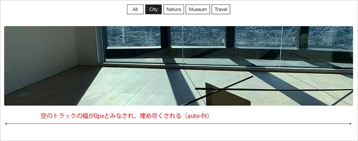
auto-fill と auto-fit
列(トラック)のサイズを設定する grid-template-columns プロパティの値に指定する repeat() 関数の auto-fill と auto-fit には以下のような違いがあります。
例えばフィルタリングの結果が1つだけの場合、auto-fill では以下のように空のトラックが追加されます。
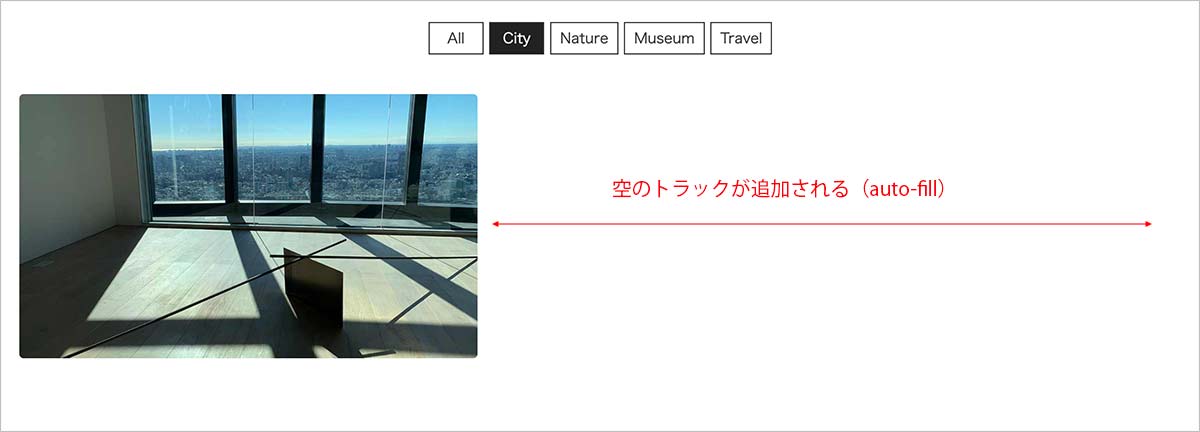
auto-fit の場合は、空のトラックは追加されず以下のように全てが埋め尽くされます。
サンプル1
以下は CSS Grid と JavaScript を使った Masonry レイアウトのサンプルにフィルタリング機能を追加しています。
この例では City、Nature、Museum、Travel という4つのフィルタ項目を設定しています。
以下の2〜15行目がフィルタのマークアップ部分で、その他はグリッドアイテムの要素(.masonry-item)に data-category 属性(フィルタの対象項目)を指定しているのを除けば Masonry レイアウトのサンプルと同じです。
<div class="masonry-wrapper">
  <div class="filter_wrapper"><!-- フィルタ用のマークアップ -->
    <input type="radio" id="all" name="categories" value="all" checked>
    <input type="radio" id="city" name="categories" value="city">
    <input type="radio" id="nature" name="categories" value="nature">
    <input type="radio" id="museum" name="categories" value="museum">
    <input type="radio" id="travel" name="categories" value="travel">
    <ol class="filters">
      <li><label for="all">All</label></li>
      <li><label for="city">City</label></li>
      <li><label for="nature">Nature</label></li>
      <li><label for="museum">Museum</label></li>
      <li><label for="travel">Travel</label></li>
    </ol>
  </div><!-- フィルタ用のマークアップ(ここまで) -->
  <div class="masonry">
    <!-- グリッドアイテム に data-category 属性を追加 -->
    <div class="masonry-item" data-category="city museum">
      <div class="masonry-content"> <img class="thumb" src="images/01.jpg" alt="sample image">
        <h3 class="title">Title 1</h3>
        <div class="desc">
          <p>Lorem ipsum dolor sit amet, consectetur adipisicing elit.</p>
        </div>
      </div>
    </div>
    <div class="masonry-item" data-category="travel">
      <div class="masonry-content"> <img class="thumb" src="images/02.jpg" alt="sample image">
        <h3 class="title">Title 2</h3>
        <div class="desc">
          <p>Lorem ipsum dolor sit amet, consectetur adipisicing elit.Fusce facilisis fringilla laoreet. Mauris mattis enim ut felis consectetur, vitae lacinia enim auctor. </p>
        </div>
      </div>
    </div>

    ・・・中略・・・

    <div class="masonry-item" data-category="travel">
      <div class="masonry-content"> <img loading="lazy" class="thumb" src="images/12.jpg" alt="sample image">
        <h3 class="title">Title 12</h3>
        <div class="desc">
          <p>Lorem ipsum dolor sit amet, consectetur adipisicing elit.</p>
          <p>Fusce facilisis fringilla laoreet. Mauris mattis enim ut felis consectetur, vitae lacinia enim auctor. </p>
        </div>
      </div>
    </div>
  </div>
</div>
フィルタリングの CSS は35〜77行目です。
/* Masonry レイアウト */
.masonry-wrapper {
  padding: 1.5rem;
  max-width: 1200px;
  margin-right: auto;
  margin-left: auto;
}
.masonry {
  display: grid;
  grid-gap: 1rem;
  gap: 1rem;
  grid-template-columns: repeat( auto-fill, minmax( 200px, 1fr ) );
  grid-auto-rows: 10px;
}
.masonry-item {
  background-color: #efefef;
}
.thumb {
  max-width: 100%;
}
.title {
  font-size: 16px;
  color: #999;
  text-align: center;
}
.desc {
  padding: 0 1rem;
  position: relative;
  overflow: visible;
  color: #aaa;
  font-size: 14px;
}

/* フィルタリング用スタイル */
ol {
  list-style: none;
}
a {
  text-decoration: none;
  color: inherit;
}
input[type="radio"] {
  position: absolute;
  left: -9999px;
}
.filters {
  text-align: center;
  margin-bottom: 2rem;
}
.filters * {
  display: inline-block;
}
.filters label {
  text-align: center;
  padding: 0.25rem 0.5rem;
  margin-bottom: 0.25rem;
  min-width: 50px;
  line-height: normal;
  cursor: pointer;
  font-size: 13px;
  transition: background-color 0.5s;
  color: #333;
  background-color: #fff;
  border: 1px solid #333;
}
.filters label:hover {
  background-color: #222;
  color: #fff;
}
[value="all"]:checked ~ .filters [for="all"],
[value="city"]:checked ~ .filters [for="city"],
[value="nature"]:checked ~ .filters [for="nature"],
[value="museum"]:checked ~ .filters [for="museum"],
[value="travel"]:checked ~ .filters [for="travel"] {
  background: #222;
  color: #fff;
}
以下が JavaScript の部分です。imagesLoaded を読み込み、この場合は resizeAllGridItems() でも imagesLoaded を使用するようにしています(imagesLoaded の利用)。
また、フィルタリングの際にグリッドアイテムの高さがうまく取得できない場合があるので、フィルタリングを実行する際の change イベントでも resizeAllGridItems() を実行するようにしています(49行目)。
<!-- imagesLoaded の読み込み -->
<script src="src/imagesloaded.pkgd.min.js"></script>
<script>

const grid = document.getElementsByClassName('masonry')[0];
const allItems = document.getElementsByClassName('masonry-item');
const rowHeight = parseInt(window.getComputedStyle(grid).getPropertyValue('grid-auto-rows'));
const rowGap = parseInt(window.getComputedStyle(grid).getPropertyValue('grid-row-gap'));

const resizeGridItem = (item) => {
  const rowSpan = Math.ceil((item.querySelector('.masonry-content').getBoundingClientRect().height + rowGap) / (rowHeight + rowGap));
  item.style.gridRowEnd = 'span ' + rowSpan;
}

const resizeAllGridItems = () => {
  for(i=0; i<allItems.length; i++){
    //毎回画像の読み込みの検出を行ってからアイテムの grid-row-end プロパティを更新
    imagesLoaded( allItems[i], (instance) => {
      const item = instance.elements[0];
      resizeGridItem(item);
    });
  }
}

let timer = false;
window.addEventListener('resize', () => {
  if (timer !== false) {
    clearTimeout(timer);
  }
  timer = setTimeout(function() {
    resizeAllGridItems();
  }, 200);
});

window.addEventListener('load', () => {
  resizeAllGridItems();
});

//フィルタリング
window.addEventListener('DOMContentLoaded', () => {
  //name 属性が categories の input 要素(ラジオボタン)の集まり(静的な NodeList)を取得
  const input_categories = document.querySelectorAll("input[name=categories]");
  //フィルタのターゲットにグリッドアイテムの要素を指定
  const targetElements = '.masonry-item';
  //全てのグリッドアイテムの要素(フィルタリングの対象)
  const targets = document.querySelectorAll(targetElements);
  //input 要素(ラジオボタン)に change イベントを設定
  for(let input_category of input_categories) {
    input_category.addEventListener('change',(e) => {
      //アイテムの高さを更新
      resizeAllGridItems(); //削除しても問題なければ削除可能?
      for(let target of targets) {
        target.style.setProperty('display', 'block');
      }
      if( e.currentTarget.checked ) {
        if(e.currentTarget.value !== 'all') {
          //data-category 属性にこのラジオボタンの value 属性の値が含まれていないものを全て取得して非表示に
          const not_checked_categories = document.querySelectorAll(targetElements + ':not([data-category~=' + '"' + e.currentTarget.value + '"])');
          for(let not_checked_category of not_checked_categories) {
            not_checked_category.style.setProperty('display', 'none');
          }
        }
      }
    });
  }
});
</script>
CSS アニメーションの追加
CSS に以下を追加するとフィルタリングの際にアニメーションで表示します。但し、現在表示されているアイテムにはアニメーションは適用されません(関連項目:アニメーションの追加)。
/* グリッドアイテム(masonry-item)にアニメーションを追加 */
.masonry-item {
  animation: checked_animation 0.4s ease-in-out both;
}
@keyframes checked_animation {
  0% {
  transform: translate(0, 300px);
  opacity: 0;
  }
  100% {
  transform: translate(0, 0);
  opacity: 1;
  }
}
JavaScript で CSS アニメーションを設定
以下は CSS アニメーションを JavaScript を使って head 内に style 要素を追加して設定する例です。
前述の CSS のアニメーションの追加だけの場合は、現在表示されているアイテムはアニメーションで表示されませんが、以下の場合は JavaScript で animationend イベントでアニメーションのクラスを削除するようにしているので、毎回アニメーションが表示されます。
また、それぞれのアイテムのアニメーションの開始や移動する距離を変更しています。CSS でアイテムごとに設定するのは大変なので、JavaScript を使って設定しています。
HTML と CSS は前述の例と同じです(CSS アニメーションは不要です)。以下が JavaScript です。
アニメーションのルールを作成する関数 returnAnimation の89〜99行目のキーフレーム部分はわかりやすいように改行やスペースを入れていますが、実際に使用する場合は改行やスペースを削除した方が良いかもしれません。
<!--	imagesLoaded の読み込み -->
<script src="src/imagesloaded.pkgd.min.js"></script>
<script>
const grid = document.getElementsByClassName('masonry')[0];
const allItems = document.getElementsByClassName('masonry-item');
const rowHeight = parseInt(window.getComputedStyle(grid).getPropertyValue('grid-auto-rows'));
const rowGap = parseInt(window.getComputedStyle(grid).getPropertyValue('grid-row-gap'));

const resizeGridItem = (item) => {
  const rowSpan = Math.ceil((item.querySelector('.masonry-content').getBoundingClientRect().height + rowGap) / (rowHeight + rowGap));
  item.style.gridRowEnd = 'span ' + rowSpan;
}

const resizeAllGridItems = () => {
  for(i=0; i<allItems.length; i++){
    //毎回画像の読み込みの検出を行ってからアイテムの grid-row-end プロパティを更新
    imagesLoaded( allItems[i], (instance) => {
      const item = instance.elements[0];
      resizeGridItem(item);
    });
  }
}

let timer = false;
window.addEventListener('resize', () => {
  if (timer !== false) {
    clearTimeout(timer);
  }
  timer = setTimeout(function() {
    resizeAllGridItems();
  }, 200);
});

window.addEventListener('load', () => {
  resizeAllGridItems();
});

//フィルタリング
window.addEventListener('DOMContentLoaded', () => {
  //name 属性が categories の input 要素(ラジオボタン)の集まり(静的な NodeList)を取得
  const input_categories = document.querySelectorAll("input[name=categories]");
  //フィルタのターゲットにグリッドアイテムを指定
  const targetElements = '.masonry-item';
  //全てのグリッドアイテムの要素(フィルタリングの対象)
  const targets = document.querySelectorAll(targetElements);
  // NodeList から配列を作成
  targets_array = Array.prototype.slice.call( targets ) ;
  //アニメーションのクラス名の固定部分の文字列
  const animationClassNamePrefix = 'masonry-item-';
  //input 要素(ラジオボタン)に change イベントを設定
  for(let input_category of input_categories) {
    input_category.addEventListener('change',(e) => {
      resizeAllGridItems();
      for(let target of targets) {
        target.style.setProperty('display', 'block');
      }
      if( e.currentTarget.checked ) {
        if(e.currentTarget.value !== 'all') {
          //data-category 属性にこのラジオボタンの value 属性の値が含まれていないものを全て取得して非表示に
          const not_checked_categories = document.querySelectorAll(targetElements + ':not([data-category~=' + '"' + e.currentTarget.value + '"])');
          for(let not_checked_category of not_checked_categories) {
            not_checked_category.style.setProperty('display', 'none');
          }
          //data-category に選択されたラジオボタンの value 属性の値が含まれる .target の要素にアニメーション用のクラスを追加
          const checked_categories = document.querySelectorAll(targetElements + '[data-category~=' + '"' + e.currentTarget.value + '"]');
          for(let checked_category of checked_categories) {
            //この要素が全ての.target の要素の中の何番目かを取得
            const index = targets_array.indexOf( checked_category ) ;
            //取得したインデックスを使ってアニメーション用のクラスを追加
            checked_category.classList.add(animationClassNamePrefix + index);
          }
        }else{
          //選択されたラジオボタンの value 属性の値が All の場合は全ての .target の要素にアニメーションのクラスを追加
          for(let i=0; i<targets.length; i++) {
            //全ての要素にアニメーションのクラスを追加
            targets[i].classList.add(animationClassNamePrefix + i);
          }
        }
      }
    });
  }

  //アニメーション
  const returnAnimation  = (animation_class, animation_name, animation_delay, translate_from_x, translate_from_y) => {
    const animation_rules = `
  .${animation_class} {
    animation: ${animation_name} 0.2s ease-in-out ${animation_delay} both;
  }

  @keyframes ${animation_name} {
    0% {
    transform: translate(${translate_from_x}, ${translate_from_y});
    opacity: 0;
    }
    100%  {
    transform: translate(0, 0);
    opacity: 1;
    }
  }`
    return animation_rules;
  };

  //CSS ルールの文字列の初期化
  let rules = '';
  //ウィンドウ幅
  const ww = window.innerWidth;
  //アニメーションの開始遅延を調整する値(大きくすれば遅延は小さくなる)
  const start_delay_control = 30;
  //transform: translate() の水平方向の初期値
  const x_init_value = 100;
  //transform: translate() の垂直方向の初期値
  const y_init_value = 100;
  //transform: translate() 水平方向を調整する値
  const x_multiple = 10;
  //transform: translate() の垂直方向を調整する値
  const y_multiple = 10;

  for(let i = 0; i < targets.length; i++ ) {
    //要素に指定するアニメーションを用のクラス名
    const animation_class = animationClassNamePrefix + i;
    //アニメーションの名前
    const animation_name = 'checked-animation-' + i;
    //アニメーションの開始遅延(i の値を元に調整。)
    const animation_delay = i/start_delay_control + 's';
    //ウィンドウ幅をその要素の要素の水平方向のオフセット座標で割った値
    const x = ww/targets[i].offsetLeft;
    //translate に指定する x 座標の値の初期値
    let translate_from_x = '0px';
    //上記で取得した x の値が2より大きければに x 座標の値を負の値に
    if(x < 2) {
      translate_from_x = (x_init_value + i * x_multiple) + 'px';
    }else{
      translate_from_x =  '-' + (x_init_value + i * x_multiple) + 'px';
    }
    //translate に指定する y 座標の値
    const translate_from_y = (y_init_value + i * y_multiple) + 'px';
    //アニメーションのクラスを追加
    targets[i].classList.add(animation_class);
    //animationend イベントを設定
    targets[i].addEventListener('animationend', () => {
      // アニメーション終了後にクラスを削除
      targets[i].classList.remove(animation_class);
    });
     //関数 returnAnimation() を使ってルールの文字列を作成(追加)
    rules += `${returnAnimation (animation_class, animation_name, animation_delay, translate_from_x, translate_from_y)}`;
  }
  //style 要素を作成
  const s = document.createElement( 'style' );
  //style 要素にルールを設定
  s.innerHTML = rules;
  //head 要素の末尾に上記で作成した style 要素を追加
  document.getElementsByTagName( 'head' )[ 0 ].appendChild( s );
 });
</script>
上記のアニメーションのルールを作成する関数 returnAnimation のバッククォート部分は以下のように改行やスペースを削除することができます。
const returnAnimation  = (animation_class, animation_name, animation_delay, translate_from_x, translate_from_y) => {
    const animation_rules = `.${animation_class}{animation: ${animation_name} 0.2s ease-in-out ${animation_delay} both;}@keyframes ${animation_name} {0%{transform: translate(${translate_from_x}, ${translate_from_y});opacity: 0;}100%{transform:translate(0, 0);opacity:1;}}`
    return animation_rules;
  };
サンプル2
以下は grid-auto-flow: dense と object-fit: cover を使って画像を Masonry レイアウトで表示する例(ライトボックスを追加したサンプル)にフィルタリング機能を追加した例です。
前述のフィルタリングのサンプルと同じく City、Nature、Museum、Travel という4つのフィルタ項目を設定しています。
また、グリッドアイテムの要素(figure)にフィルタリングの対象を表す target クラスと data-category 属性(フィルタの対象項目)を指定しています。
<div class="filter_wrapper"><!-- フィルタ用のマークアップ(前述の例と同じ) -->
  <input type="radio" id="all" name="categories" value="all" checked>
    <input type="radio" id="city" name="categories" value="city">
    <input type="radio" id="nature" name="categories" value="nature">
    <input type="radio" id="museum" name="categories" value="museum">
    <input type="radio" id="travel" name="categories" value="travel">
    <ol class="filters">
      <li><label for="all">All</label></li>
      <li><label for="city">City</label></li>
      <li><label for="nature">Nature</label></li>
      <li><label for="museum">Museum</label></li>
      <li><label for="travel">Travel</label></li>
    </ol>
</div><!-- フィルタ用のマークアップ(ここまで) -->
<div class="grid-wrapper">
  <!-- グリッドアイテム(figure 要素)に target クラスと data-category 属性を指定 -->
  <figure class="target wide" data-category="city museum">
    <a class="luminous" href="images/01.jpg">
      <img src="images/01.jpg" alt="sample image">
    </a>
    <figcaption>Photo 1</figcaption>
  </figure>
  <figure class="target tall" data-category="travel">
    <a class="luminous" href="images/02.jpg">
      <img src="images/02.jpg" alt="sample image">
    </a>
    <figcaption>Photo 2</figcaption>
  </figure>

  ・・・中略・・・

  <figure class="target wide" data-category="nature travel">
    <a class="luminous" href="images/12.jpg">
      <img src="images/12.jpg" alt="sample image">
    </a>
    <figcaption>Photo 12</figcaption>
  </figure>
</div>
CSS は元のサンプルにフィルタリング用のスタイル(前述のサンプルと同じ内容)を追加しています。
この例ではグリッドコンテナー(.grid-wrapper )に最大幅を指定しています。
* {
  margin: 0;
  padding: 0;
  box-sizing: border-box;
}
html, body {
  padding: 15px;
}
.grid-wrapper {
  display: grid;
  gap: 10px;
  grid-template-columns: repeat(auto-fill, minmax(200px, 1fr));
  grid-auto-rows: 240px;
  grid-auto-flow: dense;
  max-width: 1200px; /* 最大幅を指定 */
  margin: 0 auto;
}
.grid-wrapper .wide {
  grid-column: span 2;
}
.grid-wrapper .tall {
  grid-row: span 2;
}
.grid-wrapper .big {
  grid-column: span 2;
  grid-row: span 2;
}
.grid-wrapper figure {
  position: relative;
  overflow: hidden;
}
.grid-wrapper figure img {
  width: 100%;
  height: 100%;
  object-fit: cover;
  border-radius: 4px;
  transition: transform 0.3s; /* 拡大表示のアニメーション */
}
.grid-wrapper figure img:hover {
  transform: scale(1.1);
}
.grid-wrapper figure figcaption {
  position: absolute; /* 絶対配置 */
  bottom: 0;  /* 垂直方向の位置 */
  text-align: center; /* 中央寄せ */
  color: #fff;
  width: 100%;
  background-color: rgba(0,0,0,0.65);
  line-height: 1.8;
  color: #fff;
  transform: translateY(2rem);  /* 垂直方向に 2rem 下に移動して隠しておく */
  transition: transform 0.3s; /* 垂直方向移動のアニメーション */
  font-size: .875rem;
}
.grid-wrapper figure:hover figcaption {
  transform: translateY(0px);  /* ホバー時に本来の位置に戻して表示 */
}

/* フィルタリング用スタイル(前述の例と同じ) */
ol {
  list-style: none;
}
a {
  text-decoration: none;
  color: inherit;
}
input[type="radio"] {
  position: absolute;
  left: -9999px;
}
.filters {
  text-align: center;
  margin-bottom: 2rem;
}
.filters * {
  display: inline-block;
}
.filters label {
  text-align: center;
  padding: 0.25rem 0.5rem;
  margin-bottom: 0.25rem;
  min-width: 50px;
  line-height: normal;
  cursor: pointer;
  font-size: 13px;
  transition: background-color 0.5s;
  color: #333;
  background-color: #fff;
  border: 1px solid #333;
}
.filters label:hover {
  background-color: #222;
  color: #fff;
}
[value="all"]:checked ~ .filters [for="all"],
[value="city"]:checked ~ .filters [for="city"],
[value="nature"]:checked ~ .filters [for="nature"],
[value="museum"]:checked ~ .filters [for="museum"],
[value="travel"]:checked ~ .filters [for="travel"] {
  background: #222;
  color: #fff;
}
元のサンプルでは Lightbox の初期化の際に渡す luminous クラスを指定した要素を querySelectorAll() で取得していましたが、この場合は、フィルタで選択した際に変更(削除・追加)されたクラスの状態を動的に反映させるため、getElementsByClassName() で HTMLCollection(ライブオブジェクト)を取得して渡しています。
フィルタリング部分では、フィルタが選択された際の input イベントで、選択されていない要素の Lightbox のクラス(.luminous)を削除しています(47〜49行目)。これにより、フィルタが選択された状態で表示されている画像のみが Lightbox での表示対象となります(ライブオブジェクトを渡しているので)。
<script src="../luminous/luminous.min.js"></script>
<script>
const luminousOpts = {
  caption: (trigger) => {
    //figcaption 要素を取得
    const figCaption = trigger.parentElement.querySelector('figcaption');
    if(figCaption !== null && figCaption.textContent !== '') {
      return figCaption.textContent;
    }else{
      if(trigger.querySelector('img').hasAttribute('alt')) {
        return trigger.querySelector('img').getAttribute('alt');
      }else{
        return '';
      }
    }
  },
}

// HTMLCollection(document が変更された時点で自動的に更新されるライブオブジェクト)を取得
const luminousGalleryElems = document.getElementsByClassName('luminous');
if( luminousGalleryElems.length > 0 ) {
  new LuminousGallery(luminousGalleryElems, {}, luminousOpts);
}

//フィルタリング
window.addEventListener('DOMContentLoaded', () => {
  const input_categories = document.querySelectorAll("input[name=categories]");
  //フィルタのターゲットにグリッドアイテム(figure.target)を指定
  const targetElements = '.target';
  //全てのグリッドアイテムの要素(フィルタリングの対象 = figure 要素)
  const targets = document.querySelectorAll(targetElements);
  for(let input_category of input_categories) {
    input_category.addEventListener('change',(e) => {
      for(let target of targets) {
        target.style.setProperty('display', 'block');
        //Lightbox のクラス(.luminous)が削除されていたら追加
        if(!target.querySelector('a').classList.contains('luminous')) {
          target.querySelector('a').classList.add('luminous');
        }
      }
      if( e.currentTarget.checked ) {
        if(e.currentTarget.value !== 'all') {
          const not_checked_categories = document.querySelectorAll(targetElements + ':not([data-category~=' + '"' + e.currentTarget.value + '"])');
          for(let not_checked_category of not_checked_categories) {
            not_checked_category.style.setProperty('display', 'none');
            //対象外の要素の Lightbox のクラス(.luminous)を削除
            if(not_checked_category.querySelector('a').classList.contains('luminous')) {
              not_checked_category.querySelector('a').classList.remove('luminous');
            }
          }
        }
      }
    });
  }
});
</script>
JavaScript で CSS アニメーションを設定
以下は CSS アニメーションを JavaScript を使って head 内に style 要素を追加して設定する例です。
HTML と CSS は前述の例と同じです。
前述の JavaScript に 32〜35行目、58〜65行目、66〜72行目とアニメーションの部分(78〜132行目:サンプル1と同じ)を追加しています。
<script src="../luminous/luminous.min.js"></script>
<script>
const luminousOpts = {
  caption: (trigger) => {
    //figcaption 要素を取得
    const figCaption = trigger.parentElement.querySelector('figcaption');
    if(figCaption !== null && figCaption.textContent !== '') {
      return figCaption.textContent;
    }else{
      if(trigger.querySelector('img').hasAttribute('alt')) {
        return trigger.querySelector('img').getAttribute('alt');
      }else{
        return '';
      }
    }
  },
}

// HTMLCollection(document が変更された時点で自動的に更新されるライブオブジェクト)を取得
const luminousGalleryElems = document.getElementsByClassName('luminous');
if( luminousGalleryElems.length > 0 ) {
  new LuminousGallery(luminousGalleryElems, {}, luminousOpts);
}

//フィルタリング
window.addEventListener('DOMContentLoaded', () => {
  const input_categories = document.querySelectorAll("input[name=categories]");
  //フィルタのターゲットにグリッドアイテム(figure.target)を指定
  const targetElements = '.target';
  //全てのグリッドアイテムの要素(フィルタリングの対象 = figure 要素)
  const targets = document.querySelectorAll(targetElements);
  // NodeList から配列を作成(★追加)
  targets_array = Array.prototype.slice.call( targets ) ;
  //アニメーションのクラス名の固定部分の文字列(★追加)
  const animationClassNamePrefix = 'masonry-item-';

  //input 要素(ラジオボタン)に change イベントを設定
  for(let input_category of input_categories) {
    input_category.addEventListener('change',(e) => {

      for(let target of targets) {
        target.style.setProperty('display', 'block');
        //Lightbox のクラス(.luminous)が削除されていたら追加
        if(!target.querySelector('a').classList.contains('luminous')) {
          target.querySelector('a').classList.add('luminous');
        }
      }
      if( e.currentTarget.checked ) {
        if(e.currentTarget.value !== 'all') {
          const not_checked_categories = document.querySelectorAll(targetElements + ':not([data-category~=' + '"' + e.currentTarget.value + '"])');
          for(let not_checked_category of not_checked_categories) {
            not_checked_category.style.setProperty('display', 'none');
            //対象外の要素の Lightbox のクラス(.luminous)を削除
            if(not_checked_category.querySelector('a').classList.contains('luminous')) {
              not_checked_category.querySelector('a').classList.remove('luminous');
            }
          }
          //data-category に選択されたラジオボタンの value 属性の値が含まれる .target の要素にアニメーション用のクラスを追加(★追加)
          const checked_categories = document.querySelectorAll(targetElements + '[data-category~=' + '"' + e.currentTarget.value + '"]');
          for(let checked_category of checked_categories) {
            //この要素が全ての.target の要素の中の何番目かを取得
            const index = targets_array.indexOf( checked_category ) ;
            //取得したインデックスを使ってアニメーション用のクラスを追加
            checked_category.classList.add(animationClassNamePrefix + index);
          }
        }else{ //(★追加)
          //選択されたラジオボタンの value 属性の値が All の場合は全ての .target の要素にアニメーションのクラスを追加
          for(let i=0; i<targets.length; i++) {
            //全ての要素にアニメーションのクラスを追加
            targets[i].classList.add(animationClassNamePrefix + i);
          }
        }
      }
    });
  }

  //アニメーション
  const returnAnimation  = (animation_class, animation_name, animation_delay, translate_from_x, translate_from_y) => {
    const animation_rules = `.${animation_class}{animation: ${animation_name} 0.2s ease-in-out ${animation_delay} both;}@keyframes ${animation_name} {0%{transform: translate(${translate_from_x}, ${translate_from_y});opacity: 0;}100%{transform:translate(0, 0);opacity:1;}}`
    return animation_rules;
  };

  //CSS ルールの文字列の初期化
  let rules = '';
  //ウィンドウ幅
  const ww = window.innerWidth;
  //アニメーションの開始遅延を調整する値(大きくすれば遅延は小さくなる)
  const start_delay_control = 30;
  //transform: translate() の水平方向の初期値
  const x_init_value = 100;
  //transform: translate() の垂直方向の初期値
  const y_init_value = 100;
  //transform: translate() 水平方向を調整する値
  const x_multiple = 10;
  //transform: translate() の垂直方向を調整する値
  const y_multiple = 10;

  for(let i = 0; i < targets.length; i++ ) {
    //要素に指定するアニメーションを用のクラス名
    const animation_class = animationClassNamePrefix + i;
    //アニメーションの名前
    const animation_name = 'checked-animation-' + i;
    //アニメーションの開始遅延(i の値を元に調整。)
    const animation_delay = i/start_delay_control + 's';
    //ウィンドウ幅をその要素の要素の水平方向のオフセット座標で割った値
    const x = ww/targets[i].offsetLeft;
    //translate に指定する x 座標の値の初期値
    let translate_from_x = '0px';
    //上記で取得した x の値が2より大きければに x 座標の値を負の値に
    if(x < 2) {
      translate_from_x = (x_init_value + i * x_multiple) + 'px';
    }else{
      translate_from_x =  '-' + (x_init_value + i * x_multiple) + 'px';
    }
    //translate に指定する y 座標の値
    const translate_from_y = (y_init_value + i * y_multiple) + 'px';
    //アニメーションのクラスを追加
    targets[i].classList.add(animation_class);
    //animationend イベントを設定
    targets[i].addEventListener('animationend', () => {
      // アニメーション終了後にクラスを削除
      targets[i].classList.remove(animation_class);
    });
     //関数 returnAnimation() を使ってルールの文字列を作成(追加)
    rules += `${returnAnimation (animation_class, animation_name, animation_delay, translate_from_x, translate_from_y)}`;
  }
  //style 要素を作成
  const s = document.createElement( 'style' );
  //style 要素にルールを設定
  s.innerHTML = rules;
  //head 要素の末尾に上記で作成した style 要素を追加
  document.getElementsByTagName( 'head' )[ 0 ].appendChild( s );
});
</script>
78〜81行目の アニメーションのルールを作成する関数 returnAnimation は、改行を入れて見やすくすると以下のようになります(サンプル1のアニメーションと同じ)。
const returnAnimation  = (animation_class, animation_name, animation_delay, translate_from_x, translate_from_y) => {
  const animation_rules = `
.${animation_class} {
  animation: ${animation_name} 0.2s ease-in-out ${animation_delay} both;
}

@keyframes ${animation_name} {
  0% {
  transform: translate(${translate_from_x}, ${translate_from_y});
  opacity: 0;
  }
  100%  {
  transform: translate(0, 0);
  opacity: 1;
  }
}`
  return animation_rules;
};
サンプル3
以下は Masonry プラグインのサンプル(一定の幅以下でプラグインを無効化)にフィルタリング機能を追加した例です。
HTML は元のサンプルにフィルタ用のマークアップを追加しています(サンプル1と同じ)。
<div class="filter_wrapper"><!-- フィルタ用のマークアップ(前述の例と同じ) -->
  <input type="radio" id="all" name="categories" value="all" checked>
    <input type="radio" id="city" name="categories" value="city">
    <input type="radio" id="nature" name="categories" value="nature">
    <input type="radio" id="museum" name="categories" value="museum">
    <input type="radio" id="travel" name="categories" value="travel">
    <ol class="filters">
      <li><label for="all">All</label></li>
      <li><label for="city">City</label></li>
      <li><label for="nature">Nature</label></li>
      <li><label for="museum">Museum</label></li>
      <li><label for="travel">Travel</label></li>
    </ol>
</div><!-- フィルタ用のマークアップ(ここまで) -->
<div class="grid-wrapper">
  <!-- グリッドアイテム(figure 要素)に target クラスと data-category 属性を指定 -->
  <figure class="target wide" data-category="city museum">
    <a class="luminous" href="images/01.jpg">
      <img src="images/01.jpg" alt="sample image">
    </a>
    <figcaption>Photo 1</figcaption>
  </figure>
  <figure class="target tall" data-category="travel">
    <a class="luminous" href="images/02.jpg">
      <img src="images/02.jpg" alt="sample image">
    </a>
    <figcaption>Photo 2</figcaption>
  </figure>

  ・・・中略・・・

  <figure class="target wide" data-category="nature travel">
    <a class="luminous" href="images/12.jpg">
      <img src="images/12.jpg" alt="sample image">
    </a>
    <figcaption>Photo 12</figcaption>
  </figure>
</div>
CSS は元のサンプルの CSS(1〜49行目)にフィルタリング用のスタイル(前述の2つのサンプルと同じ内容)を追加しています。
img {
  display: block;
  max-width: 100%;
  height: auto;
}
.masonry-wrapper {
  padding: 1.5em;
  max-width: 1200px;
  margin-right: auto;
  margin-left: auto;
}
.masonry-item {
  width: 90%;
  margin-bottom: 10px;
  background-color: #efefef;
}
@media screen and (min-width: 480px) {
  .masonry-item {
    width: 49%;
  }
}
@media screen and (min-width: 768px) {
  .masonry-item {
    width: 32%;
  }
}
@media screen and (min-width: 962px) {
  .masonry-item {
    width: 24%;
  }
}
@media screen and (min-width: 1200px) {
  .masonry-item {
    width: 19%;
  }
}
.title {
  font-size: 16px;
  color: #999;
  text-align: center;
  margin: .5rem 0;
}
.desc {
  padding: .5rem;
  position: relative;
  overflow: visible;
  color: #aaa;
  font-size: 14px;
}

/* フィルタリング用スタイル(前述の例と同じ) */
ol {
  list-style: none;
}
a {
  text-decoration: none;
  color: inherit;
}
input[type="radio"] {
  position: absolute;
  left: -9999px;
}
.filters {
  text-align: center;
  margin-bottom: 2rem;
}
.filters * {
  display: inline-block;
}
.filters label {
  text-align: center;
  padding: 0.25rem 0.5rem;
  margin-bottom: 0.25rem;
  min-width: 50px;
  line-height: normal;
  cursor: pointer;
  font-size: 13px;
  transition: background-color 0.5s;
  color: #333;
  background-color: #fff;
  border: 1px solid #333;
}
.filters label:hover {
  background-color: #222;
  color: #fff;
}
[value="all"]:checked ~ .filters [for="all"], [value="city"]:checked ~ .filters [for="city"], [value="nature"]:checked ~ .filters [for="nature"], [value="museum"]:checked ~ .filters [for="museum"], [value="travel"]:checked ~ .filters [for="travel"] {
  background: #222;
  color: #fff;
}
以下が JavaScript の部分です。
前述の2つのサンプルでは、フィルタで選択されたアイテム以外は display : none で非表示にしていますが、この例では Masonry プラグインのメソッド msnry.remove() を使って Masonry からアイテムを削除しています(102行目)。
msnry.remove() でアイテムを削除すると、DOM からそれらの要素は削除されるため、毎回フィルタが選択されたら予め用意したグリッドコンテナのクローンでグリッドを置き換えて元の状態に戻しています。
クローンの作成は cloneNode() を使い、コンテナ要素の置換には replaceChild() を使っています。
詳細はコメントを入れてあります。この方法で良いかどうかは定かではありませんが、一応機能します。
<script src="src/imagesloaded.pkgd.min.js"></script>
<script src="src/masonry.pkgd.min.js"></script>
<script>
//グリッドコンテナの要素(クラス masonry を指定した div 要素)
const elem = document.querySelector('.masonry');
//オプションを別途定義
var masonryOptions = {
  columnWidth: '.masonry-item',
  itemSelector: '.masonry-item',
  gutter: 10,
  percentPosition: true
};
//基準となる最低幅
const min_width = 480;
//プラグインがアクティブかどうか
let isActive = false;
//プラグイン Masonry のインスタンスを代入する変数
let msnry = null;

//画面幅が 480px 以上であればプラグインを初期化
if(window.innerWidth >= min_width) {
  msnry = new Masonry( elem, masonryOptions);
  imagesLoaded( elem ).on( 'progress', () => {
    msnry.layout();
    isActive = true; //プラグインはアクティブ
  });
}

//画面幅によりプラグインを無効化または有効化する関数
const update_masonry = () => {
  // 表示領域の横幅
  const windowWidth = window.innerWidth;
  // プラグインがアクティブで画面幅が 480px 未満の場合
  if ( isActive && windowWidth < min_width ) {
    msnry.destroy();
    isActive = false;
  } else {
    // プラグインがアクティブでない場合
    if(!isActive) {
      msnry = new Masonry( elem, masonryOptions);
      msnry.layout();
      isActive = true;
    }
  }
}

//リサイズ時の処理
let timer = false;
window.addEventListener('resize', () => {
  if (timer !== false) {
    clearTimeout(timer);
  }
  //リサイズ操作が終了した時点で処理を実行
  timer = setTimeout( () => {
    update_masonry();
  }, 200);
});

//フィルタリング
window.addEventListener('DOMContentLoaded', () => {
  const input_categories = document.querySelectorAll("input[name=categories]");
  //フィルタのターゲットにグリッドアイテムを指定
  const targetElements = '.masonry-item';
  //グリッドコンテナのクローン(コピー)を収容する div 要素を作成
  const clone_div = document.createElement('div');
  // id を指定
  clone_div.id = 'clone_div';
  // インラインスタイルで非表示に
  clone_div.style.display = 'none';
  //グリッドコンテナのクローン
  const masonry_clone = document.getElementsByClassName('masonry')[0].cloneNode(true);
  //作成した div 要素にクローンを追加
  clone_div.appendChild(masonry_clone);
  //グリッドコンテナの親要素(.masonry-wrapper)を取得
  const masonry_wrapper = elem.parentElement;
  // または document.getElementsByClassName('masonry-wrapper')[0]; など
  //グリッドコンテナの親要素にクローンを格納した div 要素を追加
  masonry_wrapper.appendChild(clone_div);
  //フィルタの対象の要素(グリッドアイテム)を取得
  const targets = document.querySelectorAll(targetElements);
  //フィルタの項目が選択された際のイベントを登録
  for(let input_category of input_categories) {
    input_category.addEventListener('change',(e) => {
      //グリッドコンテナのクローンをコピー(クローンのクローン)
      const clone_clone = document.querySelector('#clone_div .masonry').cloneNode(true);
     //Masonry を破棄
      msnry.destroy();
      //グリッドコンテナ(.masonry)をクローンに置き換え
      const original_masonry = document.getElementsByClassName('masonry')[0];
      masonry_wrapper.replaceChild(clone_clone, original_masonry);
      // 上記は以下のように記述できるが、HTML の構造が変化すると機能しなくなる
      //masonry_wrapper.replaceChild(clone_clone, masonry_wrapper.firstElementChild.nextElementSibling);
      //コンテナを入れ替えたので再度 Masonry を初期化してレイアウトを実行
      msnry = new Masonry( document.querySelector('.masonry'), masonryOptions);
      imagesLoaded( elem ).on( 'progress', () => {
        msnry.layout();
        isActive = true;
      });
      //フィルタの項目が選択された場合の処理
      if( e.currentTarget.checked ) {
        if(e.currentTarget.value !== 'all') {
          const not_checked_categories = document.querySelectorAll(targetElements + ':not([data-category~=' + '"' + e.currentTarget.value + '"])');
          for(let not_checked_category of not_checked_categories) {
            //選択されていない項目を Masonry から削除
            msnry.remove( not_checked_category );
          }
        }
        //Masonry をレイアウト
        msnry.layout();
      }
    });
  }
});
</script>