Bootstrap4 の使い方(2) Content
Bootstrap のドキュメントを元にしたコンテンツを作成する上での基本的な要素などについての解説やサンプルです。
この他に以下のページもあるのでよろしければご覧ください。
- Layout(Bootstrap の読み込み、グリッドシステム、メディアオブジェクト)
- Content(このページ。Reboot、タイポグラフィ、コード、イメージ、フィギュア、テーブル)
- Components part1(アラート、バッジ、パンくずリスト、ボタン、ドロップダウン、フォーム、インプットグループ、リストグループ、 ページネーション)
- Components part2(カード、表示・非表示切り替え、アコーディオン、ツールチップ、ポップオーバー、モーダル、ナビゲーション、ナビゲーションバー)
- Components part3(カルーセル、スクロールスパイ)
- Utilities
以下で説明している Bootstrap のバージョンは、4.1.3 です。
作成日:2018年11月25日
Reboot
Reboot.css は Bootstrap4 から採用された normalize.css をフォークして開発されたリセット系の CSS で、以下が概要です。(Reboot)
アプローチ
Reboot.css は、Normalize.css をベースに構築された CSS で、追加のスタイリングはクラスの追加で行われます。例えば、table 要素の場合、基本的なスタイルを定義して、必要に応じて後から .table や .table-bordered などのクラスを追加できるようになっています。
以下が Reboot の特徴です。
- 単位に em ではなく rem を使用するためにいくつかのブラウザのデフォルト値を更新
- margin-top を使わない
- ブロック要素の margin には rem を使用
- 可能な限り継承(inherit)を使用して、font 関連のプロパティの宣言を最小限に
ページのデフォルト
html 要素と body 要素は、より良いページ全体のデフォルトを提供するように更新されています。
- *::before や *::after を含むすべての要素に box-sizing : border-box を設定
- html に base font-size は宣言されていませんが、 16pxが想定されています(ブラウザのデフォルト値)
- font-size:1rem が body に適用され、よりアクセスしやすいアプローチを確保しながら、メディアクエリによる簡単なレスポンシブの拡大縮小が可能
- body では、基本的な font-family, line-height, text-align を設定しています。これはフォントの不一致を防ぐために、いくつかのフォーム要素によって継承されます。
- 安全のために body には、デフォルトの背景色(background-color)に #fff を設定
ネイティブ・フォントスタック
デフォルトのウェブフォント(Helvetica Neue、Helvetica、Arial)は Bootstrap 4 で削除され、全てのデバイスと OS で最適なテキスト表示を行うために「ネイティブフォントスタック(Native font stack)」に置き換えられています。
$font-family-sans-serif:
  // Safari for OS X and iOS (San Francisco)
  -apple-system,
  // Chrome < 56 for OS X (San Francisco)
  BlinkMacSystemFont,
  // Windows
  "Segoe UI",
  // Android
  "Roboto",
  // Basic web fallback
  "Helvetica Neue", Arial, sans-serif,
  // Emoji fonts
  "Apple Color Emoji", "Segoe UI Emoji", "Segoe UI Symbol" !default;
この font-family は body 適用され、Bootstrap 全体で自動的にグローバルに継承されます。 グローバルの font-family を切り替えるには、 $font-family-base を更新し、ブートストラップを再コンパイルします。
以下は、_variables.scss からの抜粋です。
$font-family-sans-serif:-apple-system, BlinkMacSystemFont, "Segoe UI", Roboto, "Helvetica Neue", Arial, sans-serif, "Apple Color Emoji", "Segoe UI Emoji", "Segoe UI Symbol", "Noto Color Emoji" !default;

$font-family-monospace:SFMono-Regular, Menlo, Monaco, Consolas, "Liberation Mono", "Courier New", monospace !default;

$font-family-base:$font-family-sans-serif !default;

$font-size-base:1rem !default; // Assumes the browser default, typically `16px`
見出しと段落
すべての見出し要素(h1~h6)と p 要素はリセットされ、 margin-top が削除されています。
見出しには margin-bottom: 0.5rem が設定され、段落には margin-bottom: 1rem が設定されています。
h1, h2, h3, h4, h5, h6 {
  margin-top: 0;
  margin-bottom: 0.5rem;
}

p {
  margin-top: 0;
  margin-bottom: 1rem;
}
| 見出し | サンプル |
|---|---|
| <h1></h1> | h1. Bootstrap heading |
| <h2></h2> | h2. Bootstrap heading |
| <h3></h3> | h3. Bootstrap heading |
| <h4></h4> | h4. Bootstrap heading |
| <h5></h5> | h5. Bootstrap heading |
| <h6></h6> | h6. Bootstrap heading |
リスト
ul、ol、及び dl 要素の全てのリストは、 margin-top は削除され、margin-bottom: 1rem が設定されています。また、ネストされたリストでは、margin-bottom がありません。
ol,
ul,
dl {
  margin-top: 0;
  margin-bottom: 1rem;
}

ol ol,
ul ul,
ol ul,
ul ol {
  margin-bottom: 0;
}
- Lorem ipsum dolor sit amet
- Consectetur adipiscing elit
- Integer molestie lorem at massa
- Facilisis in pretium nisl aliquet
- Nulla volutpat aliquam velit
- Phasellus iaculis neque
- Purus sodales ultricies
- Vestibulum laoreet porttitor sem
- Ac tristique libero volutpat at
- Faucibus porta lacus fringilla vel
- Aenean sit amet erat nunc
- Eget porttitor lorem
- Lorem ipsum dolor sit amet
- Consectetur adipiscing elit
- Integer molestie lorem at massa
- Facilisis in pretium nisl aliquet
- Nulla volutpat aliquam velit
- Faucibus porta lacus fringilla vel
- Aenean sit amet erat nunc
- Eget porttitor lorem
スタイリングの簡素化、階層の明確化、スペーシングの改善のために、定義リスト(dl)のマージンが更新されています。以下のように dd の margin-left を0にリセットし、 margin-bottom: .5rem を追加しています。 また、dt は太字で表示されます。
dt {
  font-weight: 700;
}

dd {
  margin-bottom: .5rem;
  margin-left: 0;
}
- Description lists
- A description list is perfect for defining terms.
- Euismod
- Vestibulum id ligula porta felis euismod semper eget lacinia odio sem.
- Donec id elit non mi porta gravida at eget metus.
- Malesuada porta
- Etiam porta sem malesuada magna mollis euismod.
整形済みテキスト
pre 要素はリセットされ margin-top が削除され、 margin-bottom に対しては rem 単位が使用されています。
pre,
code,
kbd,
samp {
  font-family: SFMono-Regular, Menlo, Monaco, Consolas, "Liberation Mono", "Courier New", monospace;
  font-size: 1em;
}

pre {
  margin-top: 0;
  margin-bottom: 1rem;
  overflow: auto;
  -ms-overflow-style: scrollbar;
}
テーブル
テーブルは、caption、border、text-align などのスタイルが調整されています。ボーダー、パディングなどの追加の変更は、 .table クラスに設定されています。
table {
  border-collapse: collapse;
}

caption {
  padding-top: 0.75rem;
  padding-bottom: 0.75rem;
  color: #6c757d;
  text-align: left;
  caption-side: bottom;
}

th {
  text-align: inherit;
}
| Table heading | Table heading | Table heading | Table heading |
|---|---|---|---|
| Table cell | Table cell | Table cell | Table cell |
| Table cell | Table cell | Table cell | Table cell |
| Table cell | Table cell | Table cell | Table cell |
フォーム
様々なフォーム要素が、よりシンプルな基本スタイルに設定されています。以下が主な変更点です。
- fieldset 要素は、個別のインプットやインプットグループのラッパーとして簡単に使用できるように、border、padding、margin は設定されていません。
- legend 要素は、fieldset 要素と同様、並べ替えの見出しとしても表示されるようにスタイルを変更しています。
- label 要素は、margin を適用できるように、display: inline-block に設定されています。
- input、select、textarea、button 要素は、margin を削除し、line-height:inherit に設定しています。
- textarea 要素は、水平方向のリサイズは多くの場合ページレイアウトを崩す可能性があるので、垂直方向のサイズのみを変更できるように変更されています。
以下の例では、form 要素にボーダーとパディングを設定しています。
<form class="form_sample">
  <fieldset>
    <legend>Example legend</legend>
    <p>
      <label for="input">Example input</label>
      <input id="input" placeholder="Example input" type="text">
    </p>
    <p>
      <label for="select">Example select</label>
      <select id="select">
        <option value="">Choose...</option>
        <optgroup label="Option group 1">
        <option value="">Option 1</option>
        <option value="">Option 2</option>
        <option value="">Option 3</option>
        </optgroup>
        <optgroup label="Option group 2">
        <option value="">Option 4</option>
        <option value="">Option 5</option>
        <option value="">Option 6</option>
        </optgroup>
      </select>
    </p>
    <p>
      <label>
        <input value="" type="checkbox">
        Check this checkbox </label>
    </p>
    <p>
      <label>
        <input name="optionsRadios" id="optionsRadios1" value="option1" checked="" type="radio">
        Option one is this and that </label>
      <label>
        <input name="optionsRadios" id="optionsRadios2" value="option2" type="radio">
        Option two is something else that's also super long to demonstrate the wrapping of these fancy form controls. </label>
      <label>
        <input name="optionsRadios" id="optionsRadios3" value="option3" disabled="" type="radio">
        Option three is disabled </label>
    </p>
    <p>
      <label for="textarea">Example textarea</label>
      <textarea id="textarea" rows="3"></textarea>
    </p>
    <p>
      <label for="date">Example date</label>
      <input id="date" type="date">
    </p>
    <p>
      <label for="time">Example time</label>
      <input id="time" type="time">
    </p>
    <p>
      <label for="output">Example output</label>
      <output name="result" id="output">100</output>
    </p>
    <p>
      <button type="submit">Button submit</button>
      <input value="Input submit button" type="submit">
      <input value="Input button" type="button">
    </p>
    <p>
      <button type="submit" disabled="">Button submit</button>
      <input value="Input submit button" disabled="" type="submit">
      <input value="Input button" disabled="" type="button">
    </p>
  </fieldset>
</form>
address 要素
address 要素は、ブラウザのデフォルトのフォントスタイルを italic から normal にリセットしています。line-height も継承され、margin-bottom: 1rem が追加されています。
address 要素は、最も近い祖先(または全体)の連絡先情報を表示するためのものです。 行を <br> で終了して書式を保持します。
address {
  margin-bottom: 1rem;
  font-style: normal;
  line-height: inherit;
}
<address>
  <strong>Twitter, Inc.</strong><br>
  1355 Market St, Suite 900<br>
  San Francisco, CA 94103<br>
  <abbr title="Phone">P:</abbr> (123) 456-7890
</address>

<address>
  <strong>Full Name</strong><br>
  <a href="mailto:#">first.last@example.com</a>
</address>
1355 Market St, Suite 900
San Francisco, CA 94103
P: (123) 456-7890 Full Name
first.last@example.com
blockquote 要素
blockquote 要素のデフォルトの margin は 1em 40px ですが、他の要素との一貫性のために 0 0 1rem にリセットしています。
<blockquote class="blockquote_sample">
  <p>Lorem ipsum dolor sit amet, consectetur adipiscing elit. Integer posuere erat a ante.</p>
  <footer>Someone famous in <cite title="Source Title">Source Title</cite></footer>
</blockquote>
以下の例では、blockquote 要素にボーダーとパディングを設定しています。
Lorem ipsum dolor sit amet, consectetur adipiscing elit. Integer posuere erat a ante.
abbr 要素
abbr 要素は、段落テキストの中で目立つように基本的なスタイルが設定されています。
abbr[title],
abbr[data-original-title] {
  text-decoration: underline;
  text-decoration: underline dotted;
  cursor: help;
  border-bottom: 0;
}
<p>Nulla <abbr title="attribute">attr</abbr> vitae elit libero, a pharetra augue.</p>
Nulla attr vitae elit libero, a pharetra augue.
summary 要素
summary 要素のデフォルトの cursor は text ですが、それを pointer にリセットして、要素をクリックできることを伝えます。
summary {
  display: list-item;
  cursor: pointer;
}
<details>
  <summary>Some details</summary>
  <p>More info about the details.</p>
</details>

<details>
  <summary>Even more details</summary>
  <p>Here are even more details about the details.</p>
</details>
Some details
More info about the details.
Even more details
Here are even more details about the details.
HTML5 はデフォルトで display: none にスタイル設定された [hidden] という新しいグローバル属性が追加されています。その display の値が誤って上書きされるのを防ぐため、 [hidden] { display: none !important; } を設定しています。[hidden] は IE10 ではサポートされていませんが、CSS の明示的宣言でその問題を回避しています。
[hidden] {
  display: none !important;
}
- jQueryの非互換性
- [hidden] は、jQuery の $(...).hide() および $(...).show() メソッドと互換性がありません。
Typography
以下は、Bootstrap4 のタイポグラフィ(文字の体裁)の解説とサンプルです(Typography)。
グローバル設定
Bootstrap は、基本的な全体の表示、文字の体裁、リンクのスタイルを設定しています。詳細な設定が必要な場合は、テキストユーティリティクラス(textual utility classes)を参照してください。(Global settings)
- 各 OS およびデバイスに最適な font-family を選択するネイティブフォントスタック(native font stack)を使用
- ブラウザのデフォルトのルート font-size(通常は16px)を想定。閲覧者は必要に応じてブラウザのデフォルトをカスタマイズ可能
- body 要素 に適用される文字体裁のベースとして $font-family-base、$font-size-base、$line-height-base を使用
- $link-color で全体の基本的なリンク色(global link color)を設定し :hover 時のみリンクの下線を適用
- body 要素に適用される background-color を設定するには、$body-bg を使用(デフォルトは #fff)
これらのスタイルは _reboot.scss に記述されていて、グローバル変数は _variables.scss で定義されています。$font-size-base は rem で設定する必要があります。
見出し
すべての HTML 見出し(HTML headings)<h1> 〜 <h6>が利用可能です。(Headings)
| 見出し | サンプル |
|---|---|
| <h1></h1> | h1. Bootstrap heading |
| <h2></h2> | h2. Bootstrap heading |
| <h3></h3> | h3. Bootstrap heading |
| <h4></h4> | h4. Bootstrap heading |
| <h5></h5> | h5. Bootstrap heading |
| <h6></h6> | h6. Bootstrap heading |
見出しのフォントスタイルと一致させたいけれど、見出し要素が使用できない場合は、.h1~.h6 クラスを使用することができます。
bootstrap.css には以下のように <h1>~<h6> 要素及び同じ名前のクラスが設定されています。
h1, h2, h3, h4, h5, h6,
.h1, .h2, .h3, .h4, .h5, .h6 {
  margin-bottom: 0.5rem;
  font-family: inherit;
  font-weight: 500;
  line-height: 1.2;
  color: inherit;
}

h1, .h1 {
  font-size: 2.5rem;
}

h2, .h2 {
  font-size: 2rem;
}

h3, .h3 {
  font-size: 1.75rem;
}

h4, .h4 {
  font-size: 1.5rem;
}

h5, .h5 {
  font-size: 1.25rem;
}

h6, .h6 {
  font-size: 1rem;
}
.h1 ~ .h6 を使用すると、普通のテキスト(p 要素や span 要素等)を見出しと同じ表示にすることができます。
<p class="h1">h1. Bootstrap heading</p>
<p class="h2">h2. Bootstrap heading</p>
<p class="h3">h3. Bootstrap heading</p>
<p class="h4">h4. Bootstrap heading</p>
<p class="h5">h5. Bootstrap heading</p>
<p class="h6">h6. Bootstrap heading</p>
h1. Bootstrap heading
h2. Bootstrap heading
h3. Bootstrap heading
h4. Bootstrap heading
h5. Bootstrap heading
h6. Bootstrap heading
また、すべての見出し要素(h1~h6)と p 要素は margin-top が削除されています。(見出しと段落)
見出しのカスタマイズ
見出しにサブタイトルを付けたい場合などは、付属のユーティリティクラスを使用して、セカンダリーテキスト(secondary heading text)を利用すると便利です。
小さく表示する部分を text-muted クラスを付与した small 要素で囲みます。
<h3>Fancy display heading <small class="text-muted">With faded secondary text</small></h3>
Fancy display heading With faded secondary text
表示用見出し
通常の見出し要素は、ページコンテンツの中で最も効果的に機能するように設計されていますが、 見出しが目立つようにする必要がある場合は、より大きな表示用見出し(Display headings)を使用することができます。
<h1 class="display-1">Display 1</h1>
<h1 class="display-2">Display 2</h1>
<h1 class="display-3">Display 3</h1>
<h1 class="display-4">Display 4</h1>
Display 1
Display 2
Display 3
Display 4
bootstrap.css には以下のように定義されています。
.display-1 {
  font-size: 6rem;
  font-weight: 300;
  line-height: 1.2;
}

.display-2 {
  font-size: 5.5rem;
  font-weight: 300;
  line-height: 1.2;
}

.display-3 {
  font-size: 4.5rem;
  font-weight: 300;
  line-height: 1.2;
}

.display-4 {
  font-size: 3.5rem;
  font-weight: 300;
  line-height: 1.2;
}
リード(Lead)
段落を目立たせるには、.lead を追加します。lead クラスは、文字を大きく表示して目立つようにするクラスです。(Lead)
.lead {
  font-size: 1.25rem;
  font-weight: 300;
}
<p class="lead">
  Vivamus sagittis lacus vel augue laoreet rutrum faucibus dolor auctor. Duis mollis, est non commodo luctus.
</p>
Vivamus sagittis lacus vel augue laoreet rutrum faucibus dolor auctor. Duis mollis, est non commodo luctus.
インラインテキスト要素
以下は、一般的なインライン HTML5 要素のスタイルです。(Inline text elements)
<p>You can use the mark tag to <mark>highlight</mark> text.</p>
<p><del>This line of text is meant to be treated as deleted text.</del></p>
<p><s>This line of text is meant to be treated as no longer accurate.</s></p>
<p><ins>This line of text is meant to be treated as an addition to the document.</ins></p>
<p><u>This line of text will render as underlined</u></p>
<p><small>This line of text is meant to be treated as fine print.</small></p>
<p><strong>This line rendered as bold text.</strong></p>
<p><em>This line rendered as italicized text.</em></p>
You can use the mark tag to highlight text.
This line of text is meant to be treated as deleted text.
This line of text is meant to be treated as no longer accurate.
This line of text is meant to be treated as an addition to the document.
This line of text will render as underlined
This line of text is meant to be treated as fine print.
This line rendered as bold text.
This line rendered as italicized text.
.mark と .small クラスも用意されていて、<mark> と <small> と同じスタイルを適用し、タグがもたらす望ましくない影響を避けることができます。
また、上記には記載されていませんが、HTML5 の<b>と<i>を自由に使用することができます。 <b>は、重要性を伝えることなく単語やフレーズを強調表示するためのもので、 <i>は音声、技術用語などが対象になります。
テキストユーティリティ
テキストの整列、変換、スタイル、太さ、色はテキストユーティリティ(text utilities)とカラーユーティリティ(color utilities)で変更することができます 。
abbr 要素
abbr 要素は長い単語や語句の略語(省略/Abbreviation)を示す要素で、title 属性と組み合わせて使います。title 属性には、略語や頭字語の正式な名称を指定します。title 属性を指定した場合、一般的なブラウザではマウスカーソルを乗せた際にツールチップとして表示されます。
HTML4.01 では、略語と頭字語(acronym)を別の要素(acronym 要素)として区別していましたが、HTML5 ではどちらも abbr 要素で表すように変更されています。
Bootstrap では以下のように略語が点線の下線付きで表示され、マウスオーバーすると title 属性で指定した文字列が表示されます。少し小さいフォントサイズで表示するには .initialism を追加します。(Abbreviations)
<p><abbr title="attribute">attr</abbr></p>
<p><abbr title="HyperText Markup Language" class="initialism">HTML</abbr> is fun!</p>
attr
HTML is fun!
blockquote 要素
文章内に別のソースからコンテンツを引用する場合、引用符として <blockquote class="blockquote"> で囲みます。(Blockquotes)
<blockquote class="blockquote">
  <p class="mb-0">Lorem ipsum dolor sit amet, consectetur adipiscing elit. Integer posuere erat a ante.</p>
</blockquote>
Lorem ipsum dolor sit amet, consectetur adipiscing elit. Integer posuere erat a ante.
引用元の表示
引用元を示すには <footer class="blockquote-footer"> を追加し、<cite> で引用元の名前を囲みます。
<blockquote class="blockquote">
  <p class="mb-0">Lorem ipsum dolor sit amet, consectetur adipiscing elit. Integer posuere erat a ante.</p>
  <footer class="blockquote-footer">Someone famous in <cite title="Source Title">Source Title</cite></footer>
</blockquote>
Lorem ipsum dolor sit amet, consectetur adipiscing elit. Integer posuere erat a ante.
blockquote の配置
blockquote の配置を変更するには、必要に応じてテキストユーティリティ(text utilities)を使用します。
<blockquote class="blockquote text-center">
  <p class="mb-0">Lorem ipsum dolor sit amet, consectetur adipiscing elit. Integer posuere erat a ante.</p>
  <footer class="blockquote-footer">Someone famous in <cite title="Source Title">Source Title</cite></footer>
</blockquote>
Lorem ipsum dolor sit amet, consectetur adipiscing elit. Integer posuere erat a ante.
<blockquote class="blockquote text-right">
  <p class="mb-0">Lorem ipsum dolor sit amet, consectetur adipiscing elit. Integer posuere erat a ante.</p>
  <footer class="blockquote-footer">Someone famous in <cite title="Source Title">Source Title</cite></footer>
</blockquote>
Lorem ipsum dolor sit amet, consectetur adipiscing elit. Integer posuere erat a ante.
リスト
通常のリストは「Reboot/リスト」を参照ください。
Unstyled
リストに list-unstyled クラスを指定すると、デフォルトの list-style と左マージンを削除します(直下の子のみ)。これは直下の子リストアイテムにのみに適用されます。必要に応じて、入れ子のリストにもクラスを追加する必要があります。(Unstyled)
<ul class="list-unstyled">
  <li>Lorem ipsum dolor sit amet</li>
  <li>Consectetur adipiscing elit</li>
  <li>Integer molestie lorem at massa</li>
  <li>Facilisis in pretium nisl aliquet</li>
  <li>Nulla volutpat aliquam velit
    <ul>
      <li>Phasellus iaculis neque</li>
      <li>Purus sodales ultricies</li>
      <li>Vestibulum laoreet porttitor sem</li>
      <li>Ac tristique libero volutpat at</li>
    </ul>
  </li>
  <li>Faucibus porta lacus fringilla vel</li>
  <li>Aenean sit amet erat nunc</li>
  <li>Eget porttitor lorem</li>
</ul>
- Lorem ipsum dolor sit amet
- Consectetur adipiscing elit
- Integer molestie lorem at massa
- Facilisis in pretium nisl aliquet
- Nulla volutpat aliquam velit
- Phasellus iaculis neque
- Purus sodales ultricies
- Vestibulum laoreet porttitor sem
- Ac tristique libero volutpat at
- Faucibus porta lacus fringilla vel
- Aenean sit amet erat nunc
- Eget porttitor lorem
インラインリスト(横並びリスト)
インラインリストは、リストのビュレットを削除し、最後の要素以外に右マージンを適用します。2つのクラス(.list-inline と .list-inline-item)を組み合わせて使用します。(Inline)
.list-inline {
  padding-left: 0;
  list-style: none;
}
.list-inline-item {
  display: inline-block;
}
.list-inline-item:not(:last-child) {
  margin-right: 0.5rem;
}
<ul class="list-inline">
  <li class="list-inline-item">Lorem ipsum</li>
  <li class="list-inline-item">Phasellus iaculis</li>
  <li class="list-inline-item">Nulla volutpat</li>
</ul>
- Lorem ipsum
- Phasellus iaculis
- Nulla volutpat
水平定義リスト
グリッドシステムの定義済みクラスを使用して、用語(terms)と説明(descriptions)を水平方向に配置することができます。
長い用語の場合は、必要に応じてに .text-truncate クラスを追加してテキストを省略符号を使って短縮することができます。(Description list alignment)
<dl class="row">
  <dt class="col-sm-3">Description lists</dt>
  <dd class="col-sm-9">A description list is perfect for defining terms.</dd>

  <dt class="col-sm-3">Euismod</dt>
  <dd class="col-sm-9">
    <p>Vestibulum id ligula porta felis euismod semper eget lacinia odio sem nec elit.</p>
    <p>Donec id elit non mi porta gravida at eget metus.</p>
  </dd>

  <dt class="col-sm-3">Malesuada porta</dt>
  <dd class="col-sm-9">Etiam porta sem malesuada magna mollis euismod.</dd>

  <dt class="col-sm-3 text-truncate">Truncated term is truncated</dt>
  <dd class="col-sm-9">Fusce dapibus, tellus ac cursus commodo, tortor mauris condimentum nibh, ut fermentum massa justo sit amet risus.</dd>

  <dt class="col-sm-3">Nesting</dt>
  <dd class="col-sm-9">
    <dl class="row">
      <dt class="col-sm-4">Nested definition list</dt>
      <dd class="col-sm-8">Aenean posuere, tortor sed cursus feugiat, nunc augue blandit nunc.</dd>
    </dl>
  </dd>
</dl>
- Description lists
- A description list is perfect for defining terms.
- Euismod
-
Vestibulum id ligula porta felis euismod semper eget lacinia odio sem nec elit.
Donec id elit non mi porta gravida at eget metus.
- Malesuada porta
- Etiam porta sem malesuada magna mollis euismod.
- Truncated term is truncated
- Fusce dapibus, tellus ac cursus commodo, tortor mauris condimentum nibh, ut fermentum massa justo sit amet risus.
- Nesting
-
- Nested definition list
- Aenean posuere, tortor sed cursus feugiat, nunc augue blandit nunc.
レスポンシブ・タイポグラフィ
レスポンシブ・タイポグラフィとは、メディアクエリの範囲内でルート要素の font-size を調整することで、テキストやコンポーネントを拡大縮小することです。Bootstrap ではこれを実装していませんが、必要に応じて簡単に追加することが可能です。(Responsive typography)
以下は、その一例です(Sass のミックスインを利用しています)。任意の font-size とメディアクエリーを選択してください。
html {
  font-size: 1rem;
}

@include media-breakpoint-up(sm) {
  html {
    font-size: 1.2rem;
  }
}

@include media-breakpoint-up(md) {
  html {
    font-size: 1.4rem;
  }
}

@include media-breakpoint-up(lg) {
  html {
    font-size: 1.6rem;
  }
}
コード(Code)
Bootstrap でインラインおよびマルチラインブロックのコードを表示するための解説とサンプルです(Code)。
インラインコード
埋め込むコードを <code> で囲みます。HTMLタグの< >はエスケープする必要があります。(code 要素)
<p>For example, <code><section></code> should be wrapped as inline.</p>
以下は上記の表示例です。
For example, <section> should be wrapped as inline.
以下は、bootstrap.css に設定されているスタイルです。
pre,
code,
kbd,
samp {
  font-family: SFMono-Regular, Menlo, Monaco, Consolas, "Liberation Mono", "Courier New", monospace;
  font-size: 1em;
}

code {
  font-size: 87.5%;
  color: #e83e8c;
  word-break: break-word;
}

a > code {
  color: inherit;
}

pre code {
  font-size: inherit;
  color: inherit;
  word-break: normal;
}
マルチラインブロックのコード
複数行にわたるコードの場合は全体を、 <pre> で囲みます。インラインコードと同様に HTMLタグの< >はエスケープする必要があります。
<pre><code><p>Sample text here...</p> <p>And another line of sample text here...</p> </code></pre>
以下は上記の表示例です。
<p>Sample text here...</p>
<p>And another line of sample text here...</p>
.pre-scrollable クラスを指定すると、max-height を 340px にして Y 軸(垂直)方向にスクロールバーを表示します。
.pre-scrollable {
  max-height: 340px;
  overflow-y: scroll;
}
変数
変数を表示するには、 <var> タグを使用します。 (var 要素)
<var>y</var> = <var>m</var><var>x</var> + <var>b</var>
以下は上記の表示例です。
y = mx + bユーザー入力
キーボードなどからのユーザー入力は、<kbd> タグを使用します。(kbd 要素)
<p>To switch directories, type <kbd>cd</kbd> followed by the name of the directory.<br>
To edit settings, press <kbd><kbd>ctrl</kbd> + <kbd>,</kbd></kbd></p>
以下は上記の表示例です。
To switch directories, type cd followed by the name of the directory.
To edit settings, press ctrl + ,
bootstrap.css に以下のようなスタイルが設定されています。
pre,
code,
kbd,
samp {
  font-family: SFMono-Regular, Menlo, Monaco, Consolas, "Liberation Mono", "Courier New", monospace;
  font-size: 1em;
}

kbd {
  padding: 0.2rem 0.4rem;
  font-size: 87.5%;
  color: #fff;
  background-color: #212529;
  border-radius: 0.2rem;
}

kbd kbd {
  padding: 0;
  font-size: 100%;
  font-weight: 700;
}
サンプル出力
プログラムからのサンプル出力を表示するには、<samp> タグを使用します。等幅フォントで表示されます。(samp 要素)
<p><samp>This text is meant to be treated as sample output from a computer program.</samp></p>
以下は上記の表示例です。
This text is meant to be treated as sample output from a computer program.
以下は p 要素のみの場合の表示例です。
This text is meant to be treated as sample output from a computer program.
bootstrap.css に以下のようなスタイルが設定されています。
pre,
code,
kbd,
samp {
  font-family: SFMono-Regular, Menlo, Monaco, Consolas, "Liberation Mono", "Courier New", monospace;
  font-size: 1em;
}
イメージ(Images)
画像のスタイルや画像をレスポンシブに対応する(親要素よりも大きくならないようにする)ための解説とサンプルです。全てクラスを使って指定します。(Images)
レスポンシブイメージ
img 要素に img-fluid クラスを指定すると max-width: 100%; と height: auto; が適用され、親要素の大きさに従って画像のサイズが伸縮します。bootstrap.css に以下のようなスタイルが設定されています。
.img-fluid {
  max-width: 100%;
  height: auto;
}
以下は img 要素に img-fluid クラスを指定して画像(1200px X 800px)を親要素の幅に合わせて表示する例です。
<p><img src="../images/img_01.jpg" class="img-fluid" alt="..."></p>
- IE10 の SVG 画像
- Internet Explorer 10 で SVG 画像に .img-fluid を指定すると、正しく表示されません(不均衡なサイズになります)。これを修正するには、width: 100% \9; を追加設定する必要がありますが、それにより他の画像フォーマットが正しいサイズで表示されなくなります。このため、Bootstrap では、この修正を自動的に適用していません。
画像のサムネイル
img 要素に img-thumbnail クラスを指定すると角丸の 1px のボーダー(枠線)を表示します。(ボーダーは border-radius utilitie でも指定できます)。
<p><img src="../images/img_02.jpg" class="img-thumbnail" alt="..."></p>
bootstrap.css に以下のようなスタイルが設定されています。
.img-thumbnail {
  padding: 0.25rem;
  background-color: #fff;
  border: 1px solid #dee2e6;
  border-radius: 0.25rem;
  max-width: 100%;
  height: auto;
}
画像の整列・配置
helper float classes や text alignment classe を利用して画像を配置・整列することができます。
以下は、画像要素に float-left と float-right クラスを指定してそれぞれ左寄せ、右寄せする例です。
<div class="clearfix">
  <img src="../images/03.jpg" class="float-left" alt="...">
  <img src="../images/03.jpg" class="float-right rounded" alt="...">
</div>

レスポンシブ用のフロートのクラス float-{breakpoint}-left/right もあります。(Float)
また、block-level の画像は margin utility class を使って中央配置することもできます。
以下は、画像要素に mx-auto と d-block クラスを指定して中央寄せする例です。
<p><img src="../images/03.jpg" class="mx-auto d-block rounded-circle" alt="..."></p>
.mx-auto と .d-block には、以下が設定されています。
.mx-auto {
  margin-right: auto !important;
  margin-left: auto !important;
}

.d-block {
  display: block !important;
}
画像の角丸表示は border-radius utilitie を利用しています。
以下は、画像の親要素の div 要素に text alignment classe の text-center クラスを指定して中央寄せする例です。
<div class="text-center">
  <img src="../images/03.jpg" class="img-thumbnail" alt="...">
</div>
picture 要素
picture 要素を使って source 要素に複数の画像ファイルを指定する場合、picture 要素に に対してではなく、img 要素に対して .img-* クラスを指定します。
<picture>
  <source media="(min-width: 980px)" srcset="../images/img_04_980.jpg">
  <source media="(min-width: 640px)" srcset="../images/img_04_640.jpg">
  <img src="../images/img_04_320.jpg" class="img-fluid img-thumbnail" alt="...">
</picture>

フィギュア(Figures)
キャプション付きの画像などのコンテンツを表示する場合は、figure 要素を使用することができます。(Figures)
Bootstrap で用意されている、.figure や .figure-img、.figure-caption クラスを使用することで figure 要素に基本的なスタイルを設定することができます。
レスポンシブに対応するには、画像要素に .img-fluid クラスを指定する必要があります。
.figure や .figure-img、.figure-caption クラスには、以下が設定されています。
.figure {
  display: inline-block;
}

.figure-img {
  margin-bottom: 0.5rem;
  line-height: 1;
}

.figure-caption {
  font-size: 90%;
  color: #6c757d;
}
また、figure 及び figcaption 要素には以下が設定されています。
article, aside, figcaption, figure, footer, header, hgroup, main, nav, section {
  display: block;
}

figure {
  margin: 0 0 1rem;
}
以下は、figure 要素に .figure クラスを、img 要素に .figure-img と .img-fluid、rounded クラスを、figcaption 要素に .figure-caption クラスを指定した例です。
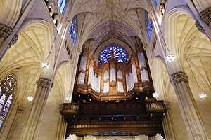
<figure class="figure">
  <h4>ミッドタウンの教会</h4>
  <p>ロックフェラーセンターの近くにセント・パトリック寺院があります。</p>
  <img src="../images/img_02.jpg" class="figure-img img-fluid rounded" alt="...">
  <figcaption class="figure-caption">セント・パトリック大聖堂の内部</figcaption>
</figure>
ミッドタウンの教会
ロックフェラーセンターの近くにセント・パトリック寺院があります。
キャプションの位置
figure のキャプション(figcaption)の位置は、 text utilities を使って簡単に変更することができます。
<figure class="figure">
  <img src="../images/img_02.jpg" class="figure-img img-fluid img-thumbnail" alt="...">
  <figcaption class="figure-caption text-right">セント・パトリック大聖堂の内部(右寄せ)</figcaption>
</figure>
テーブル(Tables)
Bootstrap では、用意されたクラスを指定することでテーブルレイアウト(表組み)のスタイルを変更することができます。(Tables)
table 要素に基本クラスの .table を追加し、必要に応じて用意されているクラスを追加することで、簡単にテーブルの表示をカスタマイズすることができます。
基本のテーブル
table 要素に基本クラスの .table を追加します。ネストされたテーブルは、親のテーブルと同じスタイルが継承されます。
<table class="table">
  <thead>
    <tr>
      <th scope="col">#</th>
      <th scope="col">First</th>
      <th scope="col">Last</th>
      <th scope="col">Handle</th>
    </tr>
  </thead>
  <tbody>
    <tr>
      <th scope="row">1</th>
      <td>Mark</td>
      <td>Otto</td>
      <td>@mdo</td>
    </tr>
    <tr>
      <th scope="row">2</th>
      <td>Jacob</td>
      <td>Thornton</td>
      <td>@fat</td>
    </tr>
    <tr>
      <th scope="row">3</th>
      <td>Larry</td>
      <td>the Bird</td>
      <td>@twitter</td>
    </tr>
  </tbody>
</table>
上記のように、table 要素に table クラスを指定すると以下のようなシンプルなテーブル表示になります。
| # | First | Last | Handle |
|---|---|---|---|
| 1 | Mark | Otto | @mdo |
| 2 | Jacob | Thornton | @fat |
| 3 | Larry | the Bird |
.table-dark クラスを追加すると、黒い背景色のテーブルになります。
<table class="table table-dark">
  <thead>
    <tr>
      <th scope="col">#</th>
      <th scope="col">First</th>
      <th scope="col">Last</th>
      <th scope="col">Handle</th>
    </tr>
  </thead>
  <tbody>
    <tr>
      <th scope="row">1</th>
      <td>Mark</td>
      <td>Otto</td>
      <td>@mdo</td>
    </tr>
    <tr>
      <th scope="row">2</th>
      <td>Jacob</td>
      <td>Thornton</td>
      <td>@fat</td>
    </tr>
    <tr>
      <th scope="row">3</th>
      <td>Larry</td>
      <td>the Bird</td>
      <td>@twitter</td>
    </tr>
  </tbody>
</table>
| # | First | Last | Handle |
|---|---|---|---|
| 1 | Mark | Otto | @mdo |
| 2 | Jacob | Thornton | @fat |
| 3 | Larry | the Bird |
thead オプション
thead 要素に、.thead-light または .thead-dark クラスを指定することで、背景色を変更することができます。(Table head option)
以下は、thead 要素に、.thead-dark クラスを指定した例です。
<table class="table">
  <thead class="thead-dark">
    <tr>
      <th scope="col">#</th>
      <th scope="col">First</th>
      <th scope="col">Last</th>
      <th scope="col">Handle</th>
    </tr>
  </thead>
  <tbody>
    <tr>
      <th scope="row">1</th>
      <td>Mark</td>
      <td>Otto</td>
      <td>@mdo</td>
    </tr>
   ・・・中略・・・
  </tbody>
</table>
| # | First | Last | Handle |
|---|---|---|---|
| 1 | Mark | Otto | @mdo |
| 2 | Jacob | Thornton | @fat |
| 3 | Larry | the Bird |
以下は、thead 要素に、.thead-light クラスを指定した例です。
<table class="table">
  <thead class="thead-light">
    <tr>
      <th scope="col">#</th>
      <th scope="col">First</th>
      <th scope="col">Last</th>
      <th scope="col">Handle</th>
    </tr>
  </thead>
  <tbody>
    <tr>
      <th scope="row">1</th>
      <td>Mark</td>
      <td>Otto</td>
      <td>@mdo</td>
    </tr>
   ・・・中略・・・
  </tbody>
</table>
| # | First | Last | Handle |
|---|---|---|---|
| 1 | Mark | Otto | @mdo |
| 2 | Jacob | Thornton | @fat |
| 3 | Larry | the Bird |
ストライプテーブル
table 要素に .table クラスと .table-striped クラスを指定すると、1行間隔で行の背景色を変えることができます。(Striped rows)
<table class="table table-striped">
  <tr>
    <th scope="col">#</th>
    <th scope="col">First</th>
    <th scope="col">Last</th>
    <th scope="col">Handle</th>
  </tr>
  <tr>
    <th scope="row">1</th>
    <td>Mark</td>
    <td>Otto</td>
    <td>@mdo</td>
  </tr>
  <tr>
    <th scope="row">2</th>
    <td>Jacob</td>
    <td>Thornton</td>
    <td>@fat</td>
  </tr>
  <tr>
    <th scope="row">3</th>
    <td>Larry</td>
    <td>the Bird</td>
    <td>@twitter</td>
  </tr>
</table>
| # | First | Last | Handle |
|---|---|---|---|
| 1 | Mark | Otto | @mdo |
| 2 | Jacob | Thornton | @fat |
| 3 | Larry | the Bird |
ヘッダー部分とデータ部分に分けない場合、表全体がデータ部分と見なされ、見出しの行にも背景色が付いてしまいます(上記の例)。
※見出しの行に背景色を付けないようにするには、表をヘッダー部分(thead)とデータ部分(tbody)に分ける必要があります。必要に応じてフッター部分(tfoot)にも分けます。
<table class="table table-striped">
  <thead>
    <tr>
      <th scope="col">#</th>
      <th scope="col">First</th>
      <th scope="col">Last</th>
      <th scope="col">Handle</th>
    </tr>
  </thead>
  <tbody>
    <tr>
      <th scope="row">1</th>
      <td>Mark</td>
      <td>Otto</td>
      <td>@mdo</td>
    </tr>
    <tr>
      <th scope="row">2</th>
      <td>Jacob</td>
      <td>Thornton</td>
      <td>@fat</td>
    </tr>
    <tr>
      <th scope="row">3</th>
      <td>Larry</td>
      <td>the Bird</td>
      <td>@twitter</td>
    </tr>
  </tbody>
</table>
| # | First | Last | Handle |
|---|---|---|---|
| 1 | Mark | Otto | @mdo |
| 2 | Jacob | Thornton | @fat |
| 3 | Larry | the Bird |
table-dark クラスを追加すると背景色が黒のストライプテーブルになります。
<table class="table table-striped table-dark">
  <thead>
    <tr>
      <th scope="col">#</th>
      <th scope="col">First</th>
      <th scope="col">Last</th>
      <th scope="col">Handle</th>
    </tr>
  </thead>
  <tbody>
    <tr>
      <th scope="row">1</th>
      <td>Mark</td>
      <td>Otto</td>
      <td>@mdo</td>
    </tr>
   ・・・中略・・・
  </tbody>
</table>
| # | First | Last | Handle |
|---|---|---|---|
| 1 | Mark | Otto | @mdo |
| 2 | Jacob | Thornton | @fat |
| 3 | Larry | the Bird |
ボーダー付きテーブル
table 要素に table クラスと table-bordered クラスを指定すれば、枠線(ボーダー)を付けることができます。table-striped や table-dark クラスも同時に指定できます。(Bordered table)
<table class="table table-bordered">
  <thead>
    <tr>
      <th scope="col">#</th>
      <th scope="col">First</th>
      <th scope="col">Last</th>
      <th scope="col">Handle</th>
    </tr>
  </thead>
  <tbody>
    <tr>
      <th scope="row">1</th>
      <td>Mark</td>
      <td>Otto</td>
      <td>@mdo</td>
    </tr>
    <tr>
      <th scope="row">2</th>
      <td>Jacob</td>
      <td>Thornton</td>
      <td>@fat</td>
    </tr>
    <tr>
      <th scope="row">3</th>
      <td colspan="2">Larry the Bird</td>
      <td>@twitter</td>
    </tr>
  </tbody>
</table>
| # | First | Last | Handle |
|---|---|---|---|
| 1 | Mark | Otto | @mdo |
| 2 | Jacob | Thornton | @fat |
| 3 | Larry the Bird | ||
ボーダーなしテーブル
table 要素に table クラスと table-borderless クラスを指定すると、枠線(ボーダー)なしのテーブルを作成することができます。table-striped や table-dark クラスも同時に指定できます。(Borderless table)
<table class="table table-borderless">
  <thead>
    <tr>
      <th scope="col">#</th>
      <th scope="col">First</th>
      <th scope="col">Last</th>
      <th scope="col">Handle</th>
    </tr>
  </thead>
  <tbody>
    <tr>
      <th scope="row">1</th>
      <td>Mark</td>
      <td>Otto</td>
      <td>@mdo</td>
    </tr>
    <tr>
      <th scope="row">2</th>
      <td>Jacob</td>
      <td>Thornton</td>
      <td>@fat</td>
    </tr>
    <tr>
      <th scope="row">3</th>
      <td colspan="2">Larry the Bird</td>
      <td>@twitter</td>
    </tr>
  </tbody>
</table>
| # | First | Last | Handle |
|---|---|---|---|
| 1 | Mark | Otto | @mdo |
| 2 | Jacob | Thornton | @fat |
| 3 | Larry the Bird | ||
ホバー効果付きテーブル
table 要素に table クラスと table-hover クラスを指定すると、テーブルの行にマウスオーバーしたときのエフェクト(行に背景色を付ける)を追加できます。(Hoverable rows)
table-bordered や table-borderless、table-dark も同時に指定することができます。
<table class="table table-hover">
  <thead>
    <tr>
      <th scope="col">#</th>
      <th scope="col">First</th>
      <th scope="col">Last</th>
      <th scope="col">Handle</th>
    </tr>
  </thead>
  <tbody>
    <tr>
      <th scope="row">1</th>
      <td>Mark</td>
      <td>Otto</td>
      <td>@mdo</td>
    </tr>
    <tr>
      <th scope="row">2</th>
      <td>Jacob</td>
      <td>Thornton</td>
      <td>@fat</td>
    </tr>
    <tr>
      <th scope="row">3</th>
      <td colspan="2">Larry the Bird</td>
      <td>@twitter</td>
    </tr>
  </tbody>
</table>
| # | First | Last | Handle |
|---|---|---|---|
| 1 | Mark | Otto | @mdo |
| 2 | Jacob | Thornton | @fat |
| 3 | Larry the Bird | ||
小さめのテーブル
table-sm クラスを指定すると、セルのパディングを半分に設定した小さめのテーブルを作成することができます。(Small table)
table-bordered や table-borderless、table-dark、table-hover も同時に指定することができます。
<table class="table table-sm">
  <thead>
    <tr>
      <th scope="col">#</th>
      <th scope="col">First</th>
      <th scope="col">Last</th>
      <th scope="col">Handle</th>
    </tr>
  </thead>
  <tbody>
    <tr>
      <th scope="row">1</th>
      <td>Mark</td>
      <td>Otto</td>
      <td>@mdo</td>
    </tr>
    <tr>
      <th scope="row">2</th>
      <td>Jacob</td>
      <td>Thornton</td>
      <td>@fat</td>
    </tr>
    <tr>
      <th scope="row">3</th>
      <td colspan="2">Larry the Bird</td>
      <td>@twitter</td>
    </tr>
  </tbody>
</table>
| # | First | Last | Handle |
|---|---|---|---|
| 1 | Mark | Otto | @mdo |
| 2 | Jacob | Thornton | @fat |
| 3 | Larry the Bird | ||
行やセルの背景色
テーブルの行(tr)やセル(td, th)にクラスを指定することで背景色を付けることができます。予め用意されているクラスの色は以下になります。(Contextual classes)
| クラス | 背景色(通常時) | 背景色(マウスオーバー時) |
|---|---|---|
| なし(デフォルト) | transparent | rgba(0, 0, 0, 0.075) |
| table-active | rgba(0, 0, 0, 0.075) | rgba(0, 0, 0, 0.075) |
| table-primary | #b8daff | #9fcdff |
| table-secondary | #d6d8db | #c8cbcf |
| table-success | #c3e6cb | #b1dfbb |
| table-danger | #f5c6cb | #f1b0b7 |
| table-warning | #ffeeba | #ffe8a1 |
| table-info | #bee5eb | #abdde5 |
| table-light | #fdfdfe | #ececf6 |
| table-dark | #c6c8ca | #b9bbbe |
<!-- tr 要素(行)に設定する場合 -->
<tr class="table-active">...</tr>
<tr class="table-primary">...</tr>
<tr class="table-secondary">...</tr>
<tr class="table-success">...</tr>
<tr class="table-danger">...</tr>
<tr class="table-warning">...</tr>
<tr class="table-info">...</tr>
<tr class="table-light">...</tr>
<tr class="table-dark">...</tr>
列(col、colgroup 要素)に指定することもできます。
<table class="table table-bordered">
<colgroup>
<col class="table-primary">
</colgroup>
<colgroup class="table-success">
<col>
</colgroup>
<colgroup class="table-danger">
<col>
</colgroup>
<tr>
<th>要素名</th>
<th>概要</th>
<th>備考</th>
</tr>
<tr>
<td>col </td>
<td>同じ列に属するセル(td 要素)を一まとまりの要素として扱う</td>
<td>空要素。XHTMLの場合は /> で閉じます</td>
</tr>
<tr>
<td>colgroup </td>
<td>col 要素をグループ化する</td>
<td>列の構造的なグループ化のために使用</td>
</tr>
</table>
| 要素名 | 概要 | 備考 |
|---|---|---|
| col | 同じ列に属するセル(td 要素)を一まとまりの要素として扱う | 空要素。XHTMLの場合は /> で閉じます |
| colgroup | col 要素をグループ化する | 列の構造的なグループ化のために使用 |
セルに設定する場合
<!-- td または th 要素(セル)に設定する場合 -->
<tr>
  <td class="table-active">...</td>
  <td class="table-primary">...</td>
  <td class="table-secondary">...</td>
  <td class="table-success">...</td>
  <td class="table-danger">...</td>
  <td class="table-warning">...</td>
  <td class="table-info">...</td>
  <td class="table-light">...</td>
  <td class="table-dark">...</td>
</tr>
| table-active | table-primary | table-secondary |
| table-success | table-danger | table-warning |
| table-info | table-light | table-dark |
.table-dark クラスのテーブルには、前述の背景色クラスの指定はできませんが、text/background utilities を利用して背景色(.bg-primary など)を設定することが可能です。
<table class="table table-dark">
  <thead>
    <tr>
      <th scope="col">#</th>
      <th scope="col">Heading</th>
      <th scope="col">Heading</th>
    </tr>
  </thead>
  <tbody>
    <tr class="bg-primary">
      <th scope="row">1</th>
      <td>Cell</td>
      <td>Cell</td>
    </tr>
    <tr>
      <th scope="row">2</th>
      <td>Cell</td>
      <td>Cell</td>
    </tr>
    <tr class="bg-success">
      <th scope="row">3</th>
      <td>Cell</td>
      <td>Cell</td>
    </tr>
    <tr>
      <th scope="row">4</th>
      <td>Cell</td>
      <td>Cell</td>
    </tr>
    <tr class="bg-info">
      <th scope="row">5</th>
      <td>Cell</td>
      <td>Cell</td>
    </tr>
    <tr>
      <th scope="row">6</th>
      <td>Cell</td>
      <td>Cell</td>
    </tr>
    <tr class="bg-warning">
      <th scope="row">7</th>
      <td>Cell</td>
      <td>Cell</td>
    </tr>
    <tr>
      <th scope="row">8</th>
      <td>Cell</td>
      <td>Cell</td>
    </tr>
    <tr class="bg-danger">
      <th scope="row">9</th>
      <td>Cell</td>
      <td>Cell</td>
    </tr>
  </tbody>
</table>
| # | Heading | Heading |
|---|---|---|
| 1 | Cell | Cell |
| 2 | Cell | Cell |
| 3 | Cell | Cell |
| 4 | Cell | Cell |
| 5 | Cell | Cell |
| 6 | Cell | Cell |
| 7 | Cell | Cell |
| 8 | Cell | Cell |
| 9 | Cell | Cell |
スクリーンリーダーなどの支援技術への配慮
色を使って意味を伝える方法では、スクリーンリーダーなどを利用しているユーザーにはその意味が伝わりません。色で示されている情報が可視テキストなどで、コンテンツ自体から明らかであるか、または .sr-only クラスなどを利用して追加の代替手段を検討することが推奨されています。
以下は、.sr-only クラスの設定です。スクリーンリーダには読み上げられますが、画面には表示しないように設定されています。
.sr-only {
  position: absolute;
  width: 1px;
  height: 1px;
  padding: 0;
  overflow: hidden;
  clip: rect(0, 0, 0, 0);
  white-space: nowrap;
  border: 0;
}
キャプション
bootstrap のテーブルでキャプションを指定すると、表の左下に表示されます。キャプションを指定することで、スクリーンリーダーなどを使用しているユーザーにその表の内容を伝えることができ、ユーザーがその内容を読むかどうかの判断に利用することができます。(Captions)
bootstrap.css (bootstrap-reboot.css) に以下が設定されています。
caption {
  padding-top: 0.75rem;
  padding-bottom: 0.75rem;
  color: #6c757d;
  text-align: left;  /* 左寄せ */
  caption-side: bottom; /* 下に配置 */
}
<table class="table">
  <caption>List of users(キャプション)</caption>
  <thead>
    <tr>
      <th scope="col">#</th>
      <th scope="col">First</th>
      <th scope="col">Last</th>
      <th scope="col">Handle</th>
    </tr>
  </thead>
  <tbody>
    <tr>
      <th scope="row">1</th>
      <td>Mark</td>
      <td>Otto</td>
      <td>@mdo</td>
    </tr>
    <tr>
      <th scope="row">2</th>
      <td>Jacob</td>
      <td>Thornton</td>
      <td>@fat</td>
    </tr>
    <tr>
      <th scope="row">3</th>
      <td>Larry</td>
      <td>the Bird</td>
      <td>@twitter</td>
    </tr>
  </tbody>
</table>
| # | First | Last | Handle |
|---|---|---|---|
| 1 | Mark | Otto | @mdo |
| 2 | Jacob | Thornton | @fat |
| 3 | Larry | the Bird |
レスポンシブテーブル
table-responsive クラスを付与した div 要素(div class="table-responsive")で table クラスを付与した table 要素を囲むと、全てのビューポートでテーブルをレスポンシブ対応にできます。(Responsive tables)
または、ブレークポイントの最大値を選択して table-responsive{-sm|-md|-lg|-xl} クラスを指定すると、そのブレークポイントまでレスポンシブになります(そのブレークポイント以降は、テーブルは通常通り表示され、水平方向のスクロールが発生しません)。
bootstrap のレスポンシブテーブルは、コンテンツが画面幅を超えると、スクロールバーを表示するタイプのものです。(参考:テーブルのレスポンシブ対応)
常にレスポンシブにする場合
全てのブレークポイントにわたって、レスポンシブに対応するためには .table-responsive を指定します。
セル内で文字を折り返したくない場合は、table 要素に text-nowrap クラスを追加します。
<div class="table-responsive">
  <table class="table">
    <thead>
      <tr>
        <th scope="col">#</th>
        <th scope="col">Heading</th>
        ・・・中略・・・
        <th scope="col">Heading</th>
      </tr>
    </thead>
    <tbody>
      <tr>
        <th scope="row">1</th>
        <td>Cell</td>
        ・・・中略・・・
      </tr>
    </tbody>
  </table>
</div>
| # | Heading | Heading | Heading | Heading | Heading | Heading | Heading | Heading | Heading |
|---|---|---|---|---|---|---|---|---|---|
| 1 | Cell | Cell | Cell | Cell | Cell | Cell | Cell | Cell | Cell |
| 2 | Cell | Cell | Cell | Cell | Cell | Cell | Cell | Cell | Cell |
| 3 | Cell | Cell | Cell | Cell | Cell | Cell | Cell | Cell | Cell |
ブレークポイントを指定する場合
特定のブレークポイントまでレスポンシブテーブルにする場合は、table-responsive{-sm|-md|-lg|-xl} クラスを使用します。そのブレークポイント以降は、通常表示されます。
以下は、table-responsive-lg を指定した例で、デフォルトでは 992px までレスポンシブになります。
<div class="table-responsive-lg">
  <table class="table">
        ・・・中略・・・
  </table>
</div>
| # | Heading | Heading | Heading | Heading | Heading | Heading | Heading | Heading | Heading |
|---|---|---|---|---|---|---|---|---|---|
| 1 | Cell | Cell | Cell | Cell | Cell | Cell | Cell | Cell | Cell |
| 2 | Cell | Cell | Cell | Cell | Cell | Cell | Cell | Cell | Cell |
| 3 | Cell | Cell | Cell | Cell | Cell | Cell | Cell | Cell | Cell |