 Compass/SASS を使ったアニメーションのミックスイン
2014年3月27日
アニメーションのミックスインを探していたら見つけた Compass/SASS を使ったアニメーションのミックスインに関するメモ。 Compass/SASS は最近始めたばかりなのでこの方法が正しいかは不明だが一応やりたいことはできているみたい。
追記
Sass 記法で書かれているものとは別に Scss でかかれているもの(animate.scss)も見つかったので追加。(2014年3月31日)
Animate Mixin for Compass/SASS
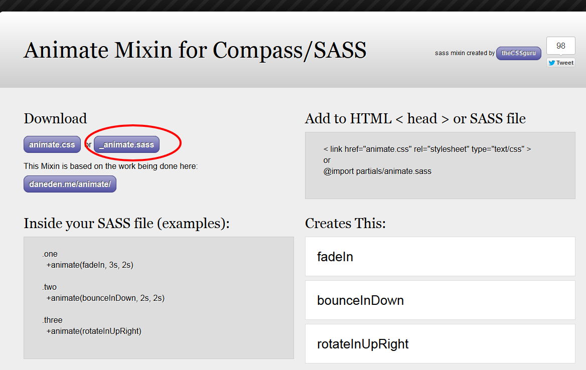
以下のサイト上部の「Download」のところの「_animate.sass」をクリックするとコードが表示されるのでコピーして保存。
Animate Mixin for Compass/SASS
_animate.sass
//Animate Mixin Plugin

=animate($name: fadeIn, $duration: 1s, $delay: .2s, $function: ease, $mode: both)
  +experimental(animation, $name $duration $delay $function $mode)


//KeyFrame Defaults (pre-made don't edit)

@-webkit-keyframes fadeIn
  0%
    opacity: 0
  100%
    opacity: 1

@-webkit-keyframes fadeOut
  0%
    opacity: 1
  100%
    opacity: 0

@-webkit-keyframes fadeInUp
  0%
    opacity: 0
    -webkit-transform: translateY(20px)
  100%
    opacity: 1
    -webkit-transform: translateY(0)

@-webkit-keyframes fadeOutUp
  0%
    opacity: 1
    -webkit-transform: translateY(0)
  100%
    opacity: 0
    -webkit-transform: translateY(-20px)
・・・省略・・・
Compass の「experimental」というミックスインを使用しているので Compass のインポートを追加。(必要に応じて @charset ‘UTF-8’ も指定。日本語のコメントなど入れる場合)
Scss ではなく Sass の記法で記述する必要がある。
Sass の記法に関しては以下のサイトを参考にさせていただきました。
【ズボンを脱ごう】SassのSASS記法の魅力【カッコイイ】
- インデントでブロックを表す
- 波括弧 {} がない
- セミコロン ; がない
- : の後にスペースが必須
- @mixin → =
- @include → +
- 拡張子が.sass
@charset 'UTF-8'
@import 'compass'

//Animate Mixin Plugin: http://thecssguru.freeiz.com/animate/

=animate($name: fadeIn, $duration: 1s, $delay: .2s, $function: ease, $mode: both)
  +experimental(animation, $name $duration $delay $function $mode)

//KeyFrame Defaults (pre-made don't edit)

@-webkit-keyframes fadeIn
  0%
    opacity: 0
  100%
    opacity: 1
・・・省略・・・
あとは使いたいアニメーションのパラメータを指定して書き出すようにする。
例えば「fadeIn」「tada」を使いたい場合は以下のように記述(クラス名はアニメーションの名前と同じである必要はない)。
.fadeIn
  +animate(fadeIn, $duration: 1s, $delay: .5s)

.tada
  +animate(tada, $duration: 1s, $delay: 0s, $function: ease-in)
パラメータ
$name(第1パラメータ):キーフレーム名
$duration:アニメーションしている時間の長さ
$delay :アニメーションを開始するまでの時間
$function :アニメーションの速度変化(ease, linear, ease-in, ease-out, ease-in-out)
$mode:遅延時間と再生後の表示状態(none,forwards, backwards, both)
コンパイル後
.fadeIn {
  -webkit-animation: fadeIn 1s 0.5s ease both;
  -moz-animation: fadeIn 1s 0.5s ease both;
  -ms-animation: fadeIn 1s 0.5s ease both;
  -o-animation: fadeIn 1s 0.5s ease both;
  animation: fadeIn 1s 0.5s ease both;
}

.tada {
  -webkit-animation: tada 1s 0s ease-in both;
  -moz-animation: tada 1s 0s ease-in both;
  -ms-animation: tada 1s 0s ease-in both;
  -o-animation: tada 1s 0s ease-in both;
  animation: tada 1s 0s ease-in both;
}

@-webkit-keyframes fadeIn {
  0% {
    opacity: 0;
  }

  100% {
    opacity: 1;
  }
}
・・・省略・・・
いろいろなアニメーションが記載されているので、コンパイルされる CSS はやや大きいサイズになるので必要なものだけを選択するなど検討したほうが良いかもしれない。
「http://daneden.github.io/animate.css/」を元に作られているようだが、簡単にパラメータを設定できるのが便利。
でも場合によっては「http://daneden.github.io/animate.css/」の方が使いやすいかもしれない。
全て(?)のベンダープレフィックスが付いているみたいだけど、現時点でいったいどれが必要なのか?以下のサイトによると、animation は「-webkit-のベンダー識別子のみ残しておく必要がある」とのこと。
このサイトではヘッダー部分の丸いロゴにマウスオーバーするとクラスを追加してアニメーション(rotateIn)を行うように設定してみた。
animate.sass
@import 'compass'

=animate($name: fadeIn, $duration: 1s, $delay: .2s, $function: ease, $mode: both)
  +experimental(animation, $name $duration $delay $function $mode)

.rotateIn
  +animate(rotateIn, $duration: 1s, $delay: .2s, $mode: none)

//KeyFrame Defaults (pre-made don't edit)

@-webkit-keyframes fadeIn
  0%
    opacity: 0
  100%
    opacity: 1
・・・省略・・・
animate.css (コンパイル結果)
.rotateIn {
  -webkit-animation: rotateIn 1s 0.2s ease none;
  -moz-animation: rotateIn 1s 0.2s ease none;
  -ms-animation: rotateIn 1s 0.2s ease none;
  -o-animation: rotateIn 1s 0.2s ease none;
  animation: rotateIn 1s 0.2s ease none;
}

@-webkit-keyframes fadeIn
  0%
    opacity: 0
  100%
    opacity: 1

・・・省略・・・

@-webkit-keyframes rotateIn {
  0% {
    -webkit-transform-origin: center center;
    -webkit-transform: rotate(-200deg);
    opacity: 0.5;
  }

  100% {
    -webkit-transform-origin: center center;
    -webkit-transform: rotate(0);
    opacity: 1;
  }
}

・・・省略・・・

@-moz-keyframes rotateIn {
  0% {
    -moz-transform-origin: center center;
    -moz-transform: rotate(-200deg);
    opacity: 0.5;
  }

  100% {
    -moz-transform-origin: center center;
    -moz-transform: rotate(0);
    opacity: 1;
  }
}

・・・省略・・・
「rotateIn」の部分のみを抽出して、CSS に追加。(実際には、0% のときの opacity を 0.5 に変更)
CSS への追加部分
.rotateIn {
  -webkit-animation: rotateIn 1s 0.2s ease none;
  -moz-animation: rotateIn 1s 0.2s ease none;
  -ms-animation: rotateIn 1s 0.2s ease none;
  -o-animation: rotateIn 1s 0.2s ease none;
  animation: rotateIn 1s 0.2s ease none;
}

@-webkit-keyframes rotateIn {
  0% {
    -webkit-transform-origin: center center;
    -webkit-transform: rotate(-200deg);
    opacity: 0.5;
  }

  100% {
    -webkit-transform-origin: center center;
    -webkit-transform: rotate(0);
    opacity: 1;
  }
}

@-moz-keyframes rotateIn {
  0% {
    -moz-transform-origin: center center;
    -moz-transform: rotate(-200deg);
    opacity: 0.5;
  }

  100% {
    -moz-transform-origin: center center;
    -moz-transform: rotate(0);
    opacity: 1;
  }
}

@-ms-keyframes rotateIn {
  0% {
    -ms-transform-origin: center center;
    -ms-transform: rotate(-200deg);
    opacity: 0.5;
  }

  100% {
    -ms-transform-origin: center center;
    -ms-transform: rotate(0);
    opacity: 1;
  }
}

@keyframes rotateIn {
  0% {
    transform-origin: center center;
    transform: rotate(-200deg);
    opacity: 0.5;
  }

  100% {
    transform-origin: center center;
    transform: rotate(0);
    opacity: 1;
  }
}
jQuery に以下を記述。
jQuery
jQuery(document).ready(function($) {
  $('#logo span').mouseover(function(event) {
    $(this).removeClass().addClass('rotateIn').one('webkitAnimationEnd mozAnimationEnd MSAnimationEnd oanimationend animationend', function(){
$(this).removeClass(); });
  });
});
jQuery を使わず、CSS に以下を記述してもアニメーションは行われるが、この場合、マウスアウトするとアニメーションがすぐに停止するので、あまりスムーズではない。
#logo span:hover {
  -webkit-animation: rotateIn 1s 0.2s ease none;
  -moz-animation: rotateIn 1s 0.2s ease none;
  -ms-animation: rotateIn 1s 0.2s ease none;
  -o-animation: rotateIn 1s 0.2s ease none;
  animation: rotateIn 1s 0.2s ease none;
}
サンプルのソース(CSS は上記の手順で必要なアニメーションを指定して、コンパイル。面倒なので全てのアニメーションのキーフレームが書き出されているので大きいため省略。)
HTML
<div id="animate-list">
  <p>fadeIn</p>
  <p>bounceIn</p>
  <p>shake</p>
  <p>rotateIn</p>
  <p>rotateInDownLeft</p>
  <p>tada</p>
  <p>rotateOutUpLeft</p>
</div>
jQuery
<script>
jQuery(function($){

  $('#animate-list p').click(function(event) {
    $(this).removeClass().addClass($(this).text()).one('webkitAnimationEnd mozAnimationEnd MSAnimationEnd oanimationend animationend', function(){
$(this).removeClass(); });
  });

});
</script>
jackilyn / animate.scss forked from daneden/animate.css
こちらの方が「Animate Mixin for Compass/SASS」よりアニメーションが少し多いかもしれない。(または、異なる名前のものがあるだけかも。未確認)
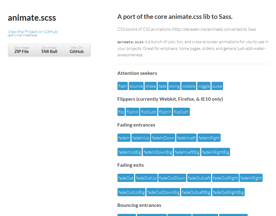
以下のサイトの右側の「Download」をクリックしてダウンロード。上の画像のアニメーションの種類を確認するには、ページ上部の「A port of the core animate.css lib to Sass. http://jackilyn.github.com/animate.scss/」のリンクをクリック。
https://github.com/jackilyn/animate.scss
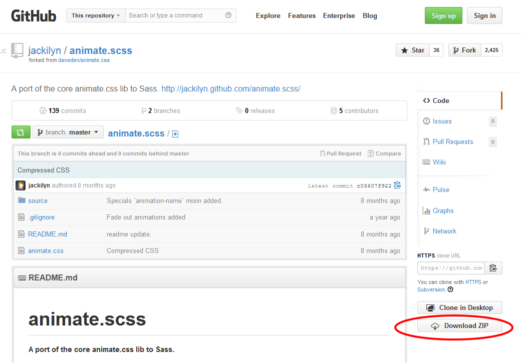
解凍すると「animate.scss-master」というフォルダの中に「source」というフォルダがあり、その中にミックスインのファイルが入っているのでそのフォルダごと適当なところに配置。
適当な Scss ファイル(この例では my_animation.scss)を作成して「source」フォルダの中の「animate.scss」をインポート。
my_animation.scss
@import "source/animate";
この時点で、全てのデフォルトのアニメーションの記述が「my_animation.css(CSS)」に書き込まれる。
デフォルトの値は「animate.scss」の冒頭に以下のように記述されている。
$duration: 1s;
$delay: .2s;
$function: ease;
$fill: both;
$visibility: hidden;
これらを変更したい場合は、以下のように記述するとそれが「my_animation.css(CSS)」に書きだされる。
「tada」と「swing」をデフォルトとは異なる設定で書き出す例(クラス名は自分で適当に付けられるが、ここでは同じ名前にしている。)
@import "source/animate";

$duration: 1.2s;
$function: ease-in-out;
.tada {
  @include tada($duration, $delay, $function, $fill, $visibility);
}

$duration: 1.5s;
$function: ease-out;
.swing {
  @include swing($duration, $delay, $function, $fill, $visibility);
}
「my_animation.css(CSS)」の最後に以下のように書き出されている。
.tada {
  -webkit-animation-name: tada;
  -moz-animation-name: tada;
  -ms-animation-name: tada;
  -o-animation-name: tada;
  animation-name: tada;
  -webkit-animation-duration: 1.2s;
  -moz-animation-duration: 1.2s;
  -ms-animation-duration: 1.2s;
  -o-animation-duration: 1.2s;
  animation-duration: 1.2s;
  -webkit-animation-delay: 0.2s;
  -moz-animation-delay: 0.2s;
  -ms-animation-delay: 0.2s;
  -o-animation-delay: 0.2s;
  animation-delay: 0.2s;
  -webkit-animation-timing-function: ease-in-out;
  -moz-animation-timing-function: ease-in-out;
  -ms-animation-timing-function: ease-in-out;
  -o-animation-timing-function: ease-in-out;
  animation-timing-function: ease-in-out;
  -webkit-animation-fill-mode: both;
  -moz-animation-fill-mode: both;
  -ms-animation-fill-mode: both;
  -o-animation-fill-mode: both;
  animation-fill-mode: both;
  -webkit-backface-visibility: hidden;
  -moz-backface-visibility: hidden;
  -ms-backface-visibility: hidden;
  -o-backface-visibility: hidden;
  backface-visibility: hidden;
}

.swing {
  -webkit-transform-origin: top center;
  -moz-transform-origin: top center;
  -ms-transform-origin: top center;
  -o-transform-origin: top center;
  transform-origin: top center;
  -webkit-animation-name: swing;
  -moz-animation-name: swing;
  -ms-animation-name: swing;
  -o-animation-name: swing;
  animation-name: swing;
  -webkit-animation-duration: 1.5s;
  -moz-animation-duration: 1.5s;
  -ms-animation-duration: 1.5s;
  -o-animation-duration: 1.5s;
  animation-duration: 1.5s;
  -webkit-animation-delay: 0.2s;
  -moz-animation-delay: 0.2s;
  -ms-animation-delay: 0.2s;
  -o-animation-delay: 0.2s;
  animation-delay: 0.2s;
  -webkit-animation-timing-function: ease-out;
  -moz-animation-timing-function: ease-out;
  -ms-animation-timing-function: ease-out;
  -o-animation-timing-function: ease-out;
  animation-timing-function: ease-out;
  -webkit-animation-fill-mode: both;
  -moz-animation-fill-mode: both;
  -ms-animation-fill-mode: both;
  -o-animation-fill-mode: both;
  animation-fill-mode: both;
  -webkit-backface-visibility: hidden;
  -moz-backface-visibility: hidden;
  -ms-backface-visibility: hidden;
  -o-backface-visibility: hidden;
  backface-visibility: hidden;
}
この CSS ファイル(127kbぐらい)をそのまま使用してもいいし、必要なアニメーションのみをコピーして使用することも可能。
以下は「swing」というアニメーションのみをコピーした場合。
.swing {
  -webkit-transform-origin: top center;
  -moz-transform-origin: top center;
  -ms-transform-origin: top center;
  -o-transform-origin: top center;
  transform-origin: top center;
  -webkit-animation-name: swing;
  -moz-animation-name: swing;
  -ms-animation-name: swing;
  -o-animation-name: swing;
  animation-name: swing;
  -webkit-animation-duration: 1.5s;
  -moz-animation-duration: 1.5s;
  -ms-animation-duration: 1.5s;
  -o-animation-duration: 1.5s;
  animation-duration: 1.5s;
  -webkit-animation-delay: 0.2s;
  -moz-animation-delay: 0.2s;
  -ms-animation-delay: 0.2s;
  -o-animation-delay: 0.2s;
  animation-delay: 0.2s;
  -webkit-animation-timing-function: ease-out;
  -moz-animation-timing-function: ease-out;
  -ms-animation-timing-function: ease-out;
  -o-animation-timing-function: ease-out;
  animation-timing-function: ease-out;
  -webkit-animation-fill-mode: both;
  -moz-animation-fill-mode: both;
  -ms-animation-fill-mode: both;
  -o-animation-fill-mode: both;
  animation-fill-mode: both;
  -webkit-backface-visibility: hidden;
  -moz-backface-visibility: hidden;
  -ms-backface-visibility: hidden;
  -o-backface-visibility: hidden;
  backface-visibility: hidden;
}

@-webkit-keyframes swing {
  20%, 40%, 60%, 80%, 100% {
    -webkit-transform-origin: top center;
  }

  20% {
    -webkit-transform: rotate(15deg);
  }

  40% {
    -webkit-transform: rotate(-10deg);
  }

  60% {
    -webkit-transform: rotate(5deg);
  }

  80% {
    -webkit-transform: rotate(-5deg);
  }

  100% {
    -webkit-transform: rotate(0deg);
  }
}

@-moz-keyframes swing {
  20% {
    -moz-transform: rotate(15deg);
  }

  40% {
    -moz-transform: rotate(-10deg);
  }

  60% {
    -moz-transform: rotate(5deg);
  }

  80% {
    -moz-transform: rotate(-5deg);
  }

  100% {
    -moz-transform: rotate(0deg);
  }
}

@-ms-keyframes swing {
  20% {
    -ms-transform: rotate(15deg);
  }

  40% {
    -ms-transform: rotate(-10deg);
  }

  60% {
    -ms-transform: rotate(5deg);
  }

  80% {
    -ms-transform: rotate(-5deg);
  }

  100% {
    -ms-transform: rotate(0deg);
  }
}

@-o-keyframes swing {
  20% {
    -o-transform: rotate(15deg);
  }

  40% {
    -o-transform: rotate(-10deg);
  }

  60% {
    -o-transform: rotate(5deg);
  }

  80% {
    -o-transform: rotate(-5deg);
  }

  100% {
    -o-transform: rotate(0deg);
  }
}

@keyframes swing {
  20% {
    transform: rotate(15deg);
  }

  40% {
    transform: rotate(-10deg);
  }

  60% {
    transform: rotate(5deg);
  }

  80% {
    transform: rotate(-5deg);
  }

  100% {
    transform: rotate(0deg);
  }
}
ホバー時にこのアニメーションを実行するには jQuery に以下のように記述。
$('#some_elem').mouseover(function(event) {
    $(this).removeClass().addClass('swing').one('webkitAnimationEnd mozAnimationEnd MSAnimationEnd oanimationend animationend', function(){
$(this).removeClass(); });
  });
New Web 制作リファレンス