CSS 擬似要素 ::before ::after
CSS の擬似要素 ::before と ::after の使い方やサンプルをまとめて掲載しています。
基本的な擬似要素の使い方や ::before や ::after で画像や SVG、ユニコード(絵文字)、図形を表示する方法、斜めの背景の設定や疑似要素で矢印や三角形のアイコン、吹き出しを作成して表示する方法、counter() 関数を使った自動ナンバリング(CSS カウンター)などについて。
作成日:2023年4月5日
::before と ::after
::before は対象の要素の最初の子要素として擬似要素(CSS で生成される要素のようなもの)を追加し、::after は対象の要素の最後の子要素として擬似要素を追加します。
例えば、以下のような before-after というクラスを指定した p 要素を記述し、
<p class="before-after">Sample Text</p>
以下のように before-after クラスに ::before と ::after を指定すると、
.before-after::before {
  content:'::before で追加';
  margin-right: 1rem;
  color: blue;
}

.before-after::after {
  content:'::after で追加';
  margin-left: 1rem;
  color: red;
}
::before と ::after で生成された疑似要素が p 要素の子要素として追加され、以下のように表示されます。
Sample Text
ブラウザのデベロッパーツールで確認すると以下のように CSS の ::before と ::after で生成された擬似要素が子要素として挿入されています。
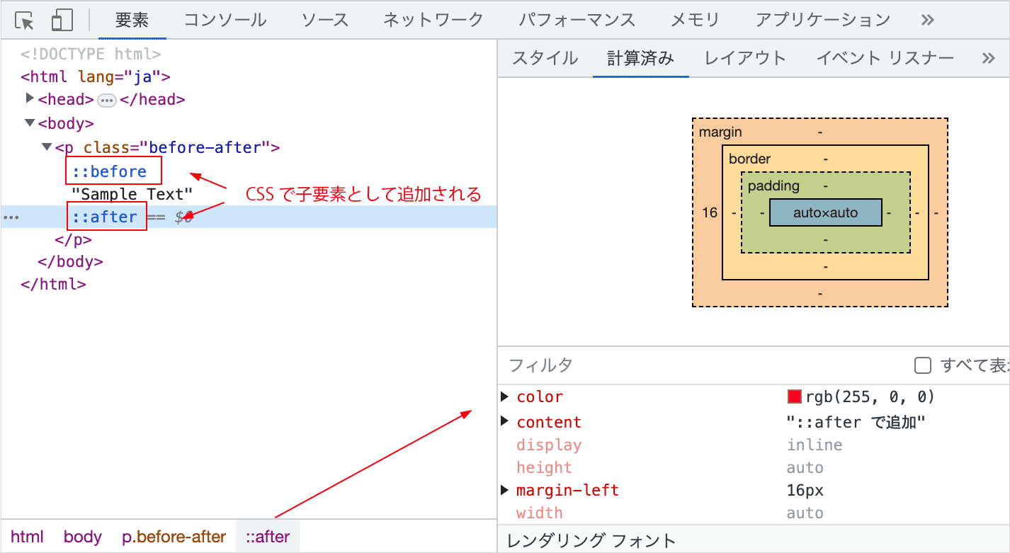
::before や ::after で content プロパティを使って表示したテキストや画像は HTML 文として認識されない(DOM には含まれない)ので、ブラウザ上で選択したり、コピーすることはできません。
また、::before や ::after で生成されたコンテンツはアクセシビリティツリーでは表現されず、支援技術とブラウザーの組み合わせによってはアナウンスされないことがあります。
そのため、そのコンテンツがページの目的を理解する上で重要な情報を含んでいる場合は、通常の HTML 要素で記述するのが適切です。
逆に言うと、擬似要素で挿入した文字は HTML 文として認識されないため、SEO 的なことなどを気にせずに装飾的な目的で使用することができます。
img 要素など置換要素には適用されない
また、::before と ::after によって作成される擬似要素は要素の整形ボックスに含まれるため、 <img> や <br> のような置換要素に指定しても適用されません。
基本的な使い方
以下は ::before と ::after の基本的な書き方です。要素やクラス名などのセレクタの後に ::before または ::after を記述します。
::before と ::after の違いは、擬似要素を追加する位置が異なるだけで使い方は同じです。::before は対象となる要素のコンテンツの直前に要素を追加するのに対し、::after は直後に要素を追加します。
また、CSS3 から擬似要素の指定には2つのコロンを使用します(互換性のため、多くのブラウザはダブルコロン、シングルコロンの両方の書き方をサポートしています)。
セレクタ::before {
  content: 値;
  /* 必要に応じて疑似要素に適用するスタイルを指定 */
}

セレクタ::after {
  content: 値;
  /* 必要に応じて疑似要素に適用するスタイルを指定 */
}
::before や ::after で指定するスタイルには content プロパティを設定します。
また、挿入される疑似要素の display プロパティの初期値は inline なので、必要に応じて変更します。
content プロパティ
content は ::before や ::after(または ::marker)疑似要素で、生成するコンテンツを指定(挿入)する際に使用するプロパティで、 ::before や ::after を使用する場合には必ず指定します。
content の値には疑似要素で表示するテキストや画像などのコンテンツを指定することができます。
また、content の値に空の文字列を指定して疑似要素の領域を確保して、背景画像を設定したり、width や height で図形や線を作成して表示したり、border を使って三角形を表示したりすることもできます。
content プロパティには以下のような値を指定することができます。
- 文字列
-
テキストや記号などを表示する場合は、
contentの値として表示したい文字列をクォーテーションで囲んで記述します。クォーテーションはシングル(')でもダブル(")でもかまいません。ユニコード文字などの特殊文字を指定する際はバックスラッシュ
\でエスケープします。図形などを挿入する場合は、空文字(
""または'')を指定します。
- 画像
-
画像を表示する場合は、
contentの値に url() 関数で画像のパスを指定することができます。また、
contentの値に空文字(""または'')を指定して、backgroundプロパティなどを使って背景画像として表示することもできます。
- attr()
-
attr() 関数を使って、要素の属性値を表示することができます。attr() 関数の前後に任意の文字列を指定することもできます。
- counter()
-
counter() 関数を使用して自動的に要素に番号を表示することができます。その際に counter() 関数の前後に任意の文字列を指定することもできます(CSS カウンター)。
- open-quote | close-quote
-
open-quote や close-quote を指定すると、引用符を挿入することができます。引用符の種類は quotes プロパティで指定することができます。
テキストを表示
以下は ::before を使って、check クラスを指定した要素(.check)のコンテンツの前に「check!」というテキストを表示する例です。
::before や ::after で content プロパティを使って表示したテキストや画像は HTML 文として認識されないので装飾目的で使用します。以下の場合「check!」というテキストは、検索エンジンや画面リーダーからはアクセスできません。
<p class="check">Sample Text</p>
対象の要素(疑似要素を指定する要素)とは別に挿入される要素のサイズや色などのスタイルを設定することができます。指定しない場合は、対象の要素のスタイルが適用されます。
また、この例のように横並びで表示する場合、対象の要素と挿入される要素のサイズが異る場合は、必要に応じて垂直方向の位置を調整します。
p.check {
  font-size: 20px;
}

.check::before {
  content: 'check!';
  display: inline-block;  /* 必要に応じて */
  padding: .5rem;
  margin-right: .5rem;  /* コンテンツとの距離 */
  background-color: #5988BF;
  color: #fff;
  border-radius: 50%;
  font-size: 12px;   /* サイズを指定 */
  vertical-align: bottom;   /* 垂直方向の位置の調整 */
}
Sample Text
以下は ::after を使ってコンテンツの後に「check!」というテキストを表示する例です。
.check-after {
  font-size: 20px;
}
.check-after::after {
  content: 'check!';
  display: inline-block;
  padding: .5rem;
  margin-left: .5rem;  /* コンテンツとの距離(左側をあける) */
  background-color: #5988BF;
  color: #fff;
  border-radius: 50%;
  font-size: 12px;
  vertical-align: bottom;
}
Sample Text
挿入するテキストを改行
挿入するテキストを改行するには、対象の要素(疑似要素を指定する要素)に white-space : pre を指定し、改行したい位置で \A を記述します。
長いテキストを挿入する場合、自動で折り返すには対象の要素に white-space:pre-wrap を指定します。
<p class="check2">Sample Text</p>
p.check2 {
  font-size: 18px;
  white-space: pre;  /* 対象の要素に white-space:pre を指定 */
}

.check2::before {
  content: 'check!\A必見';  /* 改行したい位置で \A を記述*/
  display: inline-block;
  text-align: center;
  padding: .5rem;
  margin-right: .5rem;
  background-color: #5988BF;
  color: #fff;
  font-size: 12px;
  vertical-align: middle;
}
Sample Text
以下は挿入したテキストの最後に \A を記述して改行させる例です。疑似要素に display: block を指定して改行させることもできますが、その場合、width を指定しないと親要素の幅いっぱいに広がります(それが良い場合もあります)。
<p class="check3">Sample Text</p>
この例では、::after で挿入する要素に display: block を指定して改行しています。content の先頭に \A を記述して改行することもできますが、その場合、何故か背景色がコンテンツ部分に残ってしまうので、ブロック要素として改行しています。
p.check3 {
  font-size: 18px;
  white-space:pre;  /* 対象の要素に white-space:pre を指定 */
}

.check3::before {
  content: 'check!\A';  /* 改行したい位置で \A を記述 */
  text-align: center;
  padding: .5rem;
  background-color: #5988BF;
  color: #fff;
  font-size: 12px;
  vertical-align: top;
}

.check3::after {
  content: '必見';
  display: block;  /* block を指定 */
  margin-top: 5px;
  width: 3rem;  /* 幅を指定 */
  text-align: center;
  padding: .25rem .5rem;
  background-color: #bf5959;
  color: #fff;
  font-size: 12px;
}
Sample Text
絶対配置して表示
挿入した疑似要素を絶対配置することで、任意の位置に表示することができます。
以下は ::before を使って「Notice」というテキストを絶対配置して表示する例です。絶対配置する場合、表示上任意の場所に配置できるので、以下は::before の代わりに ::after を使っても同じです。
疑似要素で挿入されたテキスト(この場合、Notice)はブラウザや検索エンジンには認識されないので、装飾的な目的で使用します。
<div class="notice">
  <h3>お知らせ</h3>
  <p>Lorem ipsum dolor sit amet consectetur adipisicing elit....</p>
</div>
対象の要素は疑似要素を絶対配置するための基準とするように position: relative を指定します。
この例では対象の要素の幅を 50% として、border で枠線を表示しています。
疑似要素で表示するテキストは絶対配置して、対象の要素の枠線の上に水平方向中央になるように指定しています。また、背景色と左右のパディングを指定してその部分の背後に枠線が見えないようにしています。
.notice {
  border: 1px solid #dfb5b5;
  padding: 20px;
  margin: 50px 0;
  position: relative;   /* 絶対配置の基準とする */
  width: 50%;
}

.notice::before {
  content: 'Notice';
  position:absolute;  /* 絶対配置 */
  top: -10px;  /* 垂直方向の位置の調整 */
  left: 50%;  /* 水平方向中央揃え */
  margin-right: -50%;  /* 水平方向中央揃え */
  transform: translateX(-50%) ;  /* 水平方向中央揃え */
  background-color: #fff;
  padding: 0 20px;
  color: #a45252;
  font-size: 16px;  /* テキストのサイズ */
}

.notice h3 {
  font-size: 16px;
  text-align: center;
}
お知らせ
Lorem ipsum dolor sit amet consectetur adipisicing elit. Eos illo iste commodi modi quibusdam ab eveniet harum eius placeat in ullam natus dignissimos ipsa omnis facere qui, reprehenderit quas excepturi.
絶対配置を使って表示する場合、コンテンツの前と後ろということはなくなるので、::before でも ::after でも同じ結果になります。
テキストの代わりに画像を表示することもできます。
attr() 関数の利用
attr() 関数を擬似要素で使用すると擬似要素を作る元になった要素の属性値を受け取って、その値を利用することができます。
content プロパティの値に attr() を使って、引数に指定した属性の値を出力することができます。
以下の例では、対象の要素に独自データ属性 data-text を指定しています(表示するテキストは HTML 文として認識されません)。
<div class="pe-box" data-text="NEW">
  <p>Lorem ipsum dolor sit amet consectetur adipisicing elit..</p>
</div>
<div class="pe-box" data-text="UPDATE">
  <p>Magnam neque explicabo quasi culpa nisi quod placeat ...</p>
</div>
attr() の引数に属性名(data-text)を指定して、data-text 属性の値と追加の文字 " !" を表示するようにしています。
.pe-box {
  background-color: #efefef;
  margin-bottom: 30px;
  max-width: 600px;
}
.pe-box p{
  padding: 1rem;
}
.pe-box::before {
  content: attr(data-text) " !";   /* attr() の引数に属性名を指定 */
  display: inline-block;
  padding: 2px 5px;
  margin-bottom: .5rem;
  font-size: 12px;
  font-weight: bold;
  color: #ffffff;
  background-color: #ec6741;
}
Lorem ipsum dolor sit amet consectetur adipisicing elit. Eum, repellendus accusamus iure, error aliquid sed ducimus quod id, velit corrupti nesciunt repudiandae facere numquam molestias odio optio voluptatem veniam voluptates?
Magnam neque explicabo quasi culpa nisi quod placeat perferendis enim vel quibusdam numquam quis, delectus qui reiciendis consequuntur eveniet magni fugiat? Quam, officiis officia porro excepturi qui facilis tempora facere.
画像のリンクに URL を表示
以下はリンクを設定した画像にマウスオーバーすると、attr() 関数を使って a 要素の title 属性に記述されたテキストを表示する例です。
<div class="image-link">
  <a class="title-link" href="https://example.com/" title="Visit: https://example.com" target="_blank" rel="noopener">
    <img src="sample.jpg" width="600" height="398" alt="">
  </a>
</div>
この例では title 属性の値を表示していますが、単に URL のみを表示するのであれば、content: attr(href) としたり、前後に固定の文字列を指定して content: "Visit: " attr(href); などとすることもできます。
また、疑似要素は初期状態では opacity: 0 を指定して非表示にし、:hover 時に opacity: 1 にして表示します。その際に transition を使って 0.3 秒で表示するようにしています。
.image-link img {
  max-width: 300px;
  aspect-ratio: 16/9;  /* 画像を 16:9 で表示 */
  width: 100%;
  height: auto;
  object-fit: cover;
}

.title-link {
  position: relative;  /* 疑似要素の絶対配置の基準に */
}

.title-link::before {
  content: attr(title);  /* attr() の引数に title 属性を指定 */
  position: absolute;  /* 絶対配置 */
  width: 90%;
  text-align: center;  /* 文字の中央寄せ */
  top: -7rem;   /* 垂直方向の位置の調整 */
  left: 50%;  /* 疑似要素の中央寄せ */
  transform: translateX(-50%);  /* 疑似要素の中央寄せ */
  color: #fff;
  background-color: rgba(0, 0, 0, .3);
  padding: .25rem;
  opacity: 0;
  transition: opacity .3s;  /* トランジションで表示 */
}

.title-link:hover::before {
  opacity: 1;
}
画像は aspect-ratio を使って 16:9 で表示しています。
上記のサンプルはリンクをクリックしても実際には移動しません。
以下を上記の CSS に追加すると、ホバー時に ::after で SVG のアイコンを表示します。
.title-link::after {
  content: "";
  position:absolute;
  top: -6.5rem;
  right: 10%;
  display: inline-block;
  height: 16px;
  width: 16px;
  margin-left: 10px;
  background-repeat: no-repeat;
  background-image: url("data:image/svg+xml,%3Csvg xmlns='http://www.w3.org/2000/svg' fill='white' class='bi bi-box-arrow-up-right' viewBox='0 0 16 16'%3E%3Cpath fill-rule='evenodd' d='M8.636 3.5a.5.5 0 0 0-.5-.5H1.5A1.5 1.5 0 0 0 0 4.5v10A1.5 1.5 0 0 0 1.5 16h10a1.5 1.5 0 0 0 1.5-1.5V7.864a.5.5 0 0 0-1 0V14.5a.5.5 0 0 1-.5.5h-10a.5.5 0 0 1-.5-.5v-10a.5.5 0 0 1 .5-.5h6.636a.5.5 0 0 0 .5-.5z'/%3E%3Cpath fill-rule='evenodd' d='M16 .5a.5.5 0 0 0-.5-.5h-5a.5.5 0 0 0 0 1h3.793L6.146 9.146a.5.5 0 1 0 .708.708L15 1.707V5.5a.5.5 0 0 0 1 0v-5z'/%3E%3C/svg%3E");
  opacity: 0;
  transition: opacity .3s;
}

.title-link:hover::after {
  opacity: 1;
}
上記のサンプルはリンクをクリックしても実際には移動しません。
画像の親要素の属性の値を表示
以下は画像要素を div 要素で囲んで、その div 要素に設定した data-title 属性の値をマウスオーバー時に表示する例です。表示されるテキストは HTML としては認識されません。
画像にマウスオーバーした際に img 要素の alt 属性の値を content と attr() で出力できれば良いのですが、img 要素に直接 ::before や ::after を設定しても適用されません。
<div class="pop-title" data-title="蓮の花">
  <img src="sample.jpg" width="900" height="675" alt="緑の葉を背景にした白い蓮の花">
</div>
.pop-title {
  max-width: 300px;
  aspect-ratio: 4/3;  /* 画像を 4:3 で表示 */
  position: relative;  /* 疑似要素の絶対配置の基準に */
}

.pop-title img {
  width: 100%;
  height: 100%;
  object-fit: cover;
  display: block;
}

.pop-title::before {
  content: attr(data-title);  /* attr() の引数に data-title 属性を指定 */
  position: absolute;  /* 絶対配置 */
  text-align: center;  /* 文字の中央寄せ */
  bottom: 0;   /* 垂直方向の位置の調整 */
  left: 0;  /* 親要素の幅いっぱいに表示 */
  right: 0;  /* 親要素の幅いっぱいに表示 */
  color: #fff;
  background-color: rgba(0, 0, 0, .6);
  padding: .25rem 0;
  opacity: 0;  /* 非表示 */
  transform: translateY(1.5rem);
  transition: opacity .4s, transform .2s;  /* トランジションを設定 */
}

/* ホバー時に表示 */
.pop-title:hover::before {
  opacity: 1;
  transform: translateY(0);
}

関連項目:マウスオーバー時のエフェクト
ユニコード文字(Unicode)を表示
content プロパティにユニコード文字(Unicode)を指定することもできます。
但し、ユニコードを使う場合は16進数の Unicode 値をバックスラッシュ \ でエスケープします。
以下は ❝ と ❞ に該当する Unicode 値(275D と 275E)をテキストの前後に挿入する例です。
<p class="dq_unicode">Sample Text</p>
.dq_unicode {
  font-size: 22px;
  color: #a78b03;
}
.dq_unicode::before {
  content:'\275D';  /* Unicode 値をバックスラッシュでエスケープ */
  color:#73b48f;
  margin-right: .5rem;
  font-size: 36px;
}
.dq_unicode::after {
  content:'\275E';  /* Unicode 値バックスラッシュでエスケープ */
  color:#73b48f;
  margin-left: .5rem;
  font-size: 36px;
}
Sample Text
以下は挿入する要素を絶対配置して、top や left などで位置を調整する例です。
Lorem ipsum dolor sit amet consectetur adipisicing elit. Eos illo iste commodi modi quibusdam ab eveniet harum eius placeat in ullam natus dignissimos ipsa omnis facere qui, reprehenderit quas excepturi.
<blockquote>
  <p>Lorem ipsum dolor sit amet consectetur adipisicing elit...</p>
</blockquote>
挿入する要素を絶対配置する場合、対象の要素が配置の基準となるように position プロパティに relative を指定します。
blockquote {
  position: relative;  /* 疑似要素の配置の基準となるように relative を指定 */
  background: #dce2f6;
  padding: 2rem ;
  display: inline-block;
  border-radius: 6px;
  max-width: 520px;
}

blockquote::before {
  position: absolute;   /* 絶対配置 */
  content: '\275D';
  top: 0px;     /* 位置を調整 */
  left: 10px;   /* 位置を調整 */
  color: #97a4c7;
  font-size: 1.8em;  /* サイズを調整 */
}
blockquote::after {
  position: absolute;   /* 絶対配置 */
  content: '\275E';
  bottom:0px;     /* 位置を調整 */
  right: 10px;    /* 位置を調整 */
  color: #97a4c7;
  font-size: 1.8em;  /* サイズを調整 */
}
ユニコードのチャート:Unicode 15.0 Character Code Charts
UNICODE Characters for SYMBL.CC
Font Awesome のアイコンを表示
Font Awesome を読み込んでいる場合は、ほぼ同様の方法で Font Awesome のアイコンを表示することができます。
関連ページ:Font Awesome 5 を疑似要素で使う
画像を表示
::before や ::after で content の値に url() 関数を使って画像のパスを指定することで、疑似要素として画像を表示させることができます。
<p class="js-logo">JavaScript Unofficial Logo</p>
.js-logo::before {
  content: url(../images/logo.png);  /* url() 関数を使って画像のパスを指定 */
  margin-right: 20px;  /* 画像の右側のスペース */
}
挿入される要素の display プロパティの初期値は inline なので、この例の場合、インライン(横並び)で表示されます。画像の後に改行する場合は、display: block を指定します。
JavaScript Unofficial Logo
::after を使えば、コンテンツの後ろに画像を表示することができます。
.js-logo::after {
  content: url(../images/logo.png);
  margin-left: 20px;  /* 画像の左側のスペース */
}
JavaScript Unofficial Logo
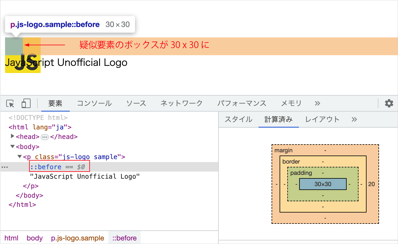
疑似要素の画像のサイズを変更
content に url() を使って画像のパスを指定して画像を表示する場合、width や height を使って疑似要素に挿入された画像のサイズを変更することができません。
疑似要素の display を block や inline-block に設定して、width と height を設定できますが、この width と height は疑似要素自体のボックスの幅と高さに適用されます(ボックス内にある画像のサイズは変更できません)。
.js-logo::before {
  content: url(../images/logo.png);
  margin-right: 20px;
  display: block;  /* ブロックに */
  height: 30px;  /* 高さを指定(画像の高さではなく擬似要素のブロックの高さ) */
  width: 30px;  /* 幅を指定(画像の幅ではなく擬似要素のブロックの幅) */
}
上記を記述すると、擬似要素のボックスの幅と高さは変更されますが、画像の大きさはそのままなので以下のように表示されます。
画像のサイズを transform: scale() を使って拡大・縮小することができますが、 scale() は比率を指定する必要があり、また位置の調整をする必要もあるので面倒です。
以下は scale() を使って画像を縮小して表示する例です。
<p class="js-logo">JavaScript Unofficial Logo</p>
.js-logo {
  position: relative;   /* 疑似要素の配置の基準とするように relative を指定 */
  padding-left: 40px;   /* 画像を表示する領域を確保 */
}
.js-logo:before {
  content: url(../images/logo.png);
  transform: scale(0.5);   /* 画像のサイズを変更 */
  position: absolute;   /* 絶対配置に */
  top: -20px;   /* 位置の調整 */
  left: -15px;  /* 位置の調整 */
}
JavaScript Unofficial Logo
画像のサイズを変更する必要がなければ content に url() を使って画像を表示するのが簡単ですが、画像のサイズを調整する必要がある場合は背景画像として表示するのが簡単です。
背景画像として表示
content の値を空('' または "")にして、display を inline-block または block にし、width と height を設定すると、擬似要素で指定された幅と高さの空のボックス(領域)を作成することができます。
<p class="box-sample">Sample Text</p>
.box-sample::before {
  content: '';    /* 値を空に */
  display: inline-block;  /* inline-block または block */
  width: 30px;    /* 幅を指定 */
  height: 30px;   /* 高さを指定 */
  margin-right: 10px;
  background-color: pink;
}
Sample Text
このボックスに背景画像を指定することで、サイズを調整できる画像を表示することができます。
以下は疑似要素で画像を背景画像として表示する例です。
<p class="js-logo-bg">JavaScript Unofficial Logo</p>
content の値を空にして、コンテンツと画像を横並びにする場合は display を inline-block に、改行する場合は block に指定します。
background-image に背景画像のパスを url() で指定し、「繰り返しなし」にするように background-repeat に no-repeat を指定します。
表示する画像の幅と高さを width と height で指定します。
background-size で contain を指定すると width と height で指定した疑似要素の領域に画像全体が収まるよう拡大・縮小されます。
display: inline-block を指定して横並びにしている場合は、必要に応じて vertical-align で垂直方向の位置を揃えます。
.js-logo-bg::before {
  content: '';    /* 値を空に */
  display: inline-block;  /* inline-block または block */
  background-image: url(../images/logo.png);  /* 背景画像を指定 */
  background-repeat: no-repeat;  /* 繰り返しなし */
  background-size: contain;  /* 画像全体が収まるよう拡大・縮小 */
  vertical-align: middle;  /* 横並びの場合の垂直方向の位置の調整 */
  width: 30px;  /* 表示する画像の幅 */
  height: 30px;  /* 表示する画像の高さ */
  margin-right: 10px;
}
JavaScript Unofficial Logo
疑似要素で表示する画像もレスポンシブに
上記の例のようなコンテンツのテキストの横に画像を配置する場合、ブレークポイントによりテキストのサイズが変わるのであれば、必要に応じてメディアクエリなどで画像のサイズも合わせて変更(調整)するようにします。
絶対配置で任意の位置に表示
対象の要素に position: relative を指定し、疑似要素を絶対配置にして任意の位置に画像を表示することができます。
<div class="flower-box">
  <p>Lorem ipsum dolor sit amet consectetur adipisicing elit....</p>
</div>
この例の場合も、画像のサイズを調整するため、背景画像として表示しています。
疑似要素は絶対配置にして、top で垂直方向の位置を調整しています。14〜16行目は水平方向中央に配置するための指定です。
この例で使用している以下の画像は 4:3 の縦横比なので表示領域は height と width に 80px を指定して正方形にし、background-size に cover を指定して正方形に収まるようにトリミングしています。
また、画像の花の部分が中央ではないので、background-position に 30% を指定して水平方向の位置を調整しています。花が中央にある正方形の画像を使用すれば、background-size と background-position に指定は不要です。
.flower-box {
  border: 1px solid #a1c9b2;
  padding: 20px;
  position: relative;   /* 絶対配置の基準とする */
  width: 50%;
  background-color: #ecfbf3;
}

.flower-box::before {
  content: '';    /* 値を空に */
  position:absolute;  /* 絶対配置 */
  display: inline-block;  /* inline-block または block */
  top: -40px;  /* 垂直方向の位置の調整 */
  left: 50%;  /* 水平方向中央揃え */
  margin-right: -50%;  /* 水平方向中央揃え */
  transform: translateX(-50%) ;  /* 水平方向中央揃え */
  background-image: url(../images/flower.jpg);  /* 背景画像を指定 */
  background-repeat: no-repeat;  /* 繰り返しなし */
  background-size: cover;  /* ボックスに収まるようにトリミング */
  background-position: 30%;  /* 画像の位置の調整 */
  height: 80px;
  width: 80px;
  border-radius: 50%;  /* 円形に表示 */
  border: 1px solid #a1c9b2;
}

.flower-box p {
  margin-top: 40px;  /* 画像にかぶらないように */
}
Lorem ipsum dolor, sit amet consectetur adipisicing elit. Vero, itaque ea praesentium vel, eum magni earum quibusdam veniam iure quia nulla quis. Ab, repudiandae maiores consectetur et ad ducimus assumenda.
svg を表示
::before や ::after を使って svg 要素を表示することができます。
画像と同様、content に url() 関数を使って指定する方法と、background-image に url() 関数を使って指定する方法があります。
svg 要素の場合、 url() 関数にデータ URL スキームを使って svg 要素のデータを埋め込んで表示することができます。svg 要素を埋め込む場合は、以下のような形式になります。
svg 要素のマークアップを URI エンコードするには「SVG エスケープツール」などを使うと簡単です。
url("data:image/svg+xml, URI エンコードした svg 要素のマークアップ")
以下は WordPress のアイコンの svg を表示する例です。
<p class="wp">sample text</p>
この例では content に url() 関数を使って svg 要素のデータを埋め込んで表示しています。
svg の場合、表示する svg 画像のサイズは、svg 要素のデータ(12行目)の width と height で指定することができます(以下では width='24' height='24' で 24 を指定。px は付けない)。
色は fill 属性の値に指定することができます。fill='%230073aa' の %23 は # をエンコードした値です。
.wp {
  font-size: 22px;
  color: #aa8800;
}
.wp::before {
  position: relative; /* 位置 right を指定するために設定 */
  right:10px; /* 位置(テキストとの距離)を調整 */
  display: inline-block;  /* 横並び(インライン) */
  vertical-align: -5px;  /* 垂直方向の調整 */
  margin-left: 1rem;  /* 左端の位置の調整 */
  /* content の値に url() を使ってデータ URL スキームで svg のデータを埋め込んで表示 */
  content: url("data:image/svg+xml,%3Csvg xmlns='http://www.w3.org/2000/svg' width='24' height='24' fill='%230073aa' viewBox='0 0 16 16'%3E  %3Cpath d='M12.633 7.653c0-.848-.305-1.435-.566-1.892l-.08-.13c-.317-.51-.594-.958-.594-1.48 0-.63.478-1.218 1.152-1.218.02 0 .039.002.058.003l.031.003A6.838 6.838 0 0 0 8 1.137 6.855 6.855 0 0 0 2.266 4.23c.16.005.313.009.442.009.717 0 1.828-.087 1.828-.087.37-.022.414.521.044.565 0 0-.371.044-.785.065l2.5 7.434 1.5-4.506-1.07-2.929c-.369-.022-.719-.065-.719-.065-.37-.022-.326-.588.043-.566 0 0 1.134.087 1.808.087.718 0 1.83-.087 1.83-.087.37-.022.413.522.043.566 0 0-.372.043-.785.065l2.48 7.377.684-2.287.054-.173c.27-.86.469-1.495.469-2.046zM1.137 8a6.864 6.864 0 0 0 3.868 6.176L1.73 5.206A6.837 6.837 0 0 0 1.137 8z'/%3E  %3Cpath d='M6.061 14.583 8.121 8.6l2.109 5.78c.014.033.03.064.049.094a6.854 6.854 0 0 1-4.218.109zm7.96-9.876c.03.219.047.453.047.706 0 .696-.13 1.479-.522 2.458l-2.096 6.06a6.86 6.86 0 0 0 2.572-9.224z'/%3E  %3Cpath fill-rule='evenodd' d='M0 8c0-4.411 3.589-8 8-8 4.41 0 8 3.589 8 8s-3.59 8-8 8c-4.411 0-8-3.589-8-8zm.367 0c0 4.209 3.424 7.633 7.633 7.633 4.208 0 7.632-3.424 7.632-7.633C15.632 3.79 12.208.367 8 .367 3.79.367.367 3.79.367 8z'/%3E%3C/svg%3E");
}
sample text
背景画像として表示
svg を背景画像として表示することもできます。
背景画像として表示する場合は、画像の場合と同様、content の値を空にして、background-image に url() 関数を使って svg 要素のデータを埋め込み、width と height で表示するサイズを指定します。
そして、疑似要素の領域に縦横比を保持したまま svg 全体が収まるように background-size: contain を指定します(svg 要素に width と height が記述されていない場合は省略できます)。
以下では transform: rotate() を使ったホバー時の transition アニメーションも設定しています。
.icon-facebook::before {
  content: ""; /* 値を空に */
  display: inline-block;
  height: 30px;  /* 表示する高さ */
  width: 30px; /* 表示する幅 */
  background-repeat: no-repeat; /* 繰り返しなし */
  background-size: contain; /* 疑似要素の領域に svg 全体が収まるよう拡大・縮小 */
  background-image: url("data:image/svg+xml,%3Csvg xmlns='http://www.w3.org/2000/svg' width='16' height='16' fill='%233854EE' class='bi bi-facebook' viewBox='0 0 16 16'%3E  %3Cpath d='M16 8.049c0-4.446-3.582-8.05-8-8.05C3.58 0-.002 3.603-.002 8.05c0 4.017 2.926 7.347 6.75 7.951v-5.625h-2.03V8.05H6.75V6.275c0-2.017 1.195-3.131 3.022-3.131.876 0 1.791.157 1.791.157v1.98h-1.009c-.993 0-1.303.621-1.303 1.258v1.51h2.218l-.354 2.326H9.25V16c3.824-.604 6.75-3.934 6.75-7.951z'/%3E%3C/svg%3E");
  transition: transform 0.3s ease-in; /* transition アニメーション */
}

/* ホバー時の transition アニメーション */
.icon-facebook:hover::before {
  transform: rotate(360deg);
}
<a href="#"><i class="icon-facebook"></i></a>
疑似要素を使って svg を表示する方法の詳細は以下を御覧ください。
線や図形を表示
::before や ::after を使って線や図形を表示することができます。
線や図形を表示するだけであれば、content プロパティの値には空の文字列を指定します。
以下は ::before で正方形を、::after で線(長方形)を疑似要素を適用する要素の前後に表示する例です。
線は実際は、幅 20px 高さ 2px の長方形で表示しています。
::before や ::after の display の初期値は inline なので width と height を設定するために inline から inline-block に変更しています。
/* 正方形を表示 */
.square::before {
  content: ''; /* 空文字列を指定 */
  display: inline-block; /* width と height を設定するために inline から変更 */
  width: 10px;
  height: 10px;
  background-color: red;
  margin-right: 5px;
}

/* 線(実際は長方形)を表示 */
.square::after {
  content: ''; /* 空文字列を指定 */
  display: inline-block;
  width: 20px;
  height: 2px;
  background-color: red;
  margin-left: 5px;
  vertical-align: middle;
}
<p class="square">square</p>
::before で要素の前に正方形が、::after で要素の後ろに線(長方形)が表示されます。
square
絶対配置
疑似要素で図形などを表示する場合、任意の位置に絶対配置で表示することが多いです。
疑似要素を絶対配置する場合、疑似要素を適用する要素に position: relative を指定して、絶対配置する疑似要素の基準とし、位置は top, bottom, left, right で指定することができます。
以下は塗りつぶした円と枠線で描いた円を対象の要素の前後に表示する例です。
対象の要素の前後に表示するため、対象の要素の長さがコンテンツの量により伸縮するように display: inline-block を指定しています。そして疑似要素を配置するスペースをパディングで確保しています。
また、垂直方向中央に配置するため、top: 0 と bottom: 0、margin: auto 0 を指定しています(絶対配置と中央揃え)。
/* 疑似要素を適用する要素 */
.circles {
  position: relative; /* 絶対配置の基準とする */
  display: inline-block; /* コンテンツの量により伸縮 */
  padding: 0 24px; /* 疑似要素を配置するスペース */
}

.circles::before {
  content: ''; /* 空文字列を指定 */
  position: absolute; /* 絶対配置 */
  width: 16px;
  height: 16px;
  left: 0; /* 左端から配置 */
  top: 0;
  bottom:0;
  margin: auto 0;
  background-color: red; /* 背景色を指定 */
  border-radius: 50%; /* 角丸 50% で円形に */
}

.circles::after {
  content: ''; /* 空文字列を指定 */
  position: absolute; /* 絶対配置 */
  width: 16px;
  height: 16px;
  right: 0; /* 右端から配置 */
  top: 0;
  bottom:0;
  margin: auto 0;
  border: 2px solid red;
  box-sizing: border-box; /* 枠線を指定 */
  border-radius: 50%;
}
<p class="circles">circles</p>
circles
border
border を使って線や図形を作成することもできます。
以下は絶対配置した疑似要素に幅と高さを設定して、ボーダーを使って線を描画する例です。
::before の border-top と border-bottom で水平方向の線を、::after の border-left と border-right で垂直方向の線を transform: skewX() で傾斜させて描画しています。
.lines {
  position: relative;
  display: inline-block;
  padding-left: 30px;   /* 疑似要素のスペース */
}
.lines::before {
  content: '';
  position: absolute;
  top: 0;
  bottom: 0;
  margin: auto;
  width: 20px;
  height: 8px;
  left: 0;
  border-top: 2px solid #f356cf;
  border-bottom: 2px solid #3d68f4;
}

.lines::after {
  content: '';
  position: absolute;
  top: 0;
  bottom: 0;
  margin: auto;
  width: 8px;
  height: 20px;
  left: 5px;
  border-left: 2px solid #29ac41;
  border-right: 2px solid #b89825;
  transform: skewX(-20deg);   /* 傾斜 */
}
<p class="lines">border で線を描画</p>
以下のように表示されます。
border で線を描画
以下は疑似要素を挿入する要素(.plus-btn)を + 印のボタンとする例です。
::before と :after 疑似要素では border-top で線を描画し、:after 疑似要素は90度回転させています。
この場合、線の長さは親要素の幅と疑似要素の left と right により調整します。
.button > i {
  position: relative;
  vertical-align: middle;
  top: -3px;  /* i 要素の位置の調整 */
}

/* ボタン */
.plus-btn {
  position: relative;
  display: inline-block;
  width: 40px;
  height: 40px;
  border: 1px solid #999;
  margin-right: .5rem;
}

/* 疑似要素で + を作成 */
.plus-btn::before,
.plus-btn::after {
  content: '';
  position: absolute;
  top: calc(50% - 2px);
  left: 8px;
  right: 8px;
  border-top: 4px solid #666;
}

.plus-btn::after {
  transform: rotate(90deg);
}
<p class="button"><i class="plus-btn"></i>Plus Button</p>
下線のアニメーション
以下は要素にマウスオーバーすると下線を表示する transition アニメーションの例です。
下線は疑似要素で width と height で表示し、初期状態では width を 0 にしておきます。transition を設定して、ホバー時(:hover)に width を 100% に変更することでアニメーションします。
<p><a class="underline" href="#">Lorem ipsum dolor sit amet</a></p>
.underline:hover::after と記述することで .underline を :hover した際の ::after を指定しています。
.underline {
  padding-bottom: 2px;
  position: relative; /* 絶対配置の基準とする */
  text-decoration: none; /* リンクに表示される下線を非表示に */
  color:darkcyan;
}
.underline::after {
  content: ''; /* 値を空に */
  width: 0%; /* 下線の幅(初期状態は 0) */
  height: 2px; /* 下線の高さ */
  background-color:lightsalmon; /* 下線の色 */
  position: absolute; /* 絶対位置 */
  bottom: 0; /* 下線の位置 */
  left: 0; /* 下線の位置 */
  transition: width .3s; /* transition の設定 */
}

/* ホバー時に線の長さ(width)を 100% に */
.underline:hover::after {
  width: 100%;
}
border でアニメーション
前述の例では下線を width と height で表示しましたが、border を使って表示することもできます。
border を使うと、border-style で線のスタイルを指定することができます。
border-bottom の代わりに border-top を指定すれば、対象の要素の上に線が表示されます。
また、疑似要素を垂直方向中央揃えするため、top: 0 と bottom: 0、margin: auto 0 を指定しています。
.underline {
  position: relative; /* 絶対配置の基準とする */
  display: inline-block; /* コンテンツの量により伸縮 */
  text-decoration: none; /* リンクに表示される下線を非表示に */
  color:indigo;
}

.underlin::before {
  content: ''; /* 空文字列を指定 */
  position: absolute; /* 絶対配置 */
  top: 0;
  bottom:0;
  margin: auto 0;
  border-bottom: 2px double hotpink;
  width: 0;
  transition: width 0.3s;
}

.underlin:hover::before {
  width: 100%;
}
オーバーレイ
::before や ::after を使うと、画像やビデオに単色やグラデーションの半透明のオーバーレイを表示することができます。
画像要素(img)には ::before や ::after は適用できないので、画像を div 要素でラップして、その要素に ::before や ::after を設定します。
<div class="overlay">
  <img src="images/sample.jpg" width="600" height="398" alt="beach">
</div>
以下では ::before と ::after の両方を使って2つのオーバーレイを配置しています。top, left, right, bottom に 0 を指定すれば、画像全体を覆います。
また、background-color の代わりに background-image や background で linear-gradient などを指定してグラデーションのオーバーレイにすることもできます。
.overlay {
  position:relative;  /* 絶対配置の基準 */
  width: 70%;
  max-width: 320px;
}
.overlay img {
  max-width: 100%;
  height: auto;
  display: block;
}
.overlay::before {
  content: '';
  position: absolute;  /* 絶対配置 */
  top: 15px;  /* 上端からの位置 */
  left: 15px;  /* 左端からの位置 */
  right: 15px;  /* 右端からの位置 */
  bottom: 15px;  /* 下端からの位置 */
  background-color: rgba(161, 9, 9, 0.25);
}

.overlay::after {
  content: '';
  position: absolute;  /* 絶対配置の基準 */
  top: 35px;
  left: 35px;
  right: 35px;
  bottom: 35px;
  background-color: rgba(128, 161, 9, 0.25);
}
以下は background を使ったグラデーションパターンのオーバーレイの例です。
.overlay {
  position:relative;  /* 絶対配置の基準 */
  width: 70%;
  max-width: 320px;
}
.overlay img {
  max-width: 100%;
  height: auto;
  display: block;
}
.overlay::before {
  content: '';
  position: absolute;  /* 絶対配置 */
  top: 0;
  left: 0;
  right: 0;
  bottom: 0;
  background:
    linear-gradient(315deg, transparent 75%, #d45d55 0) -10px 0,
    linear-gradient(45deg, transparent 75%, #d45d55 0) -10px 0,
    linear-gradient(135deg, #a7332b 50%, transparent 0) 0 0,
    linear-gradient(45deg, #6a201b 50%, #561a16 0) 0 0 #561a16;
  background-size: 20px 20px;
  opacity: .2  /* パターン全体を半透明に */
}
グラデーションパターンは、css background pattern などで検索すると色々と見つかります。
- CSS3 Patterns Gallery
- Background Patterns, Simplified by Conic Gradients
- CSS Background Patterns
- Complex patterns using CSS gradients
以下はホバー時にオーバーレイの透明度をトランジションで変更する例です。
<div class="overlay-anim sample">
  <img src="images/sample.jpg" width="600" height="398" alt="">
  <div class="caption">
    <h3>Beach</h3>
    <p>Lorem ipsum dolor sit amet consectetur.</p>
  </div>
</div>
以下では .overlay::before に width: 100%; height: 100%; としていますが、前述の例のように right: 0; bottom: 0; としても同じです。
.overlay {
  position:relative;  /* 絶対配置の基準 */
  width: 70%;
  max-width: 320px;
}
.overlay img {
  width: 100%;
}
.overlay::before {
  content: '';
  position: absolute;  /* 絶対配置 */
  top: 0;
  left: 0;
  width: 100%;  /* または right: 0;  */
  height: 100%;  /* または bottom: 0;  */
  background-color: rgba(0, 0, 0, 0.35);
  transition: background-color 1s;  /* トランジション */
}

/* ホバー時のオーバーレイ */
.overlay:hover::before {
  background-color: rgba(0, 0, 0, 0.1);
}

.overlay .caption {
  position: absolute;
  top: 50%;
  left: 50%;
  margin-right: -50%;
  transform: translate(-50%, -50%);
  color: #fff;
  text-align: center;
}
Beach
Lorem ipsum dolor sit amet consectetur.
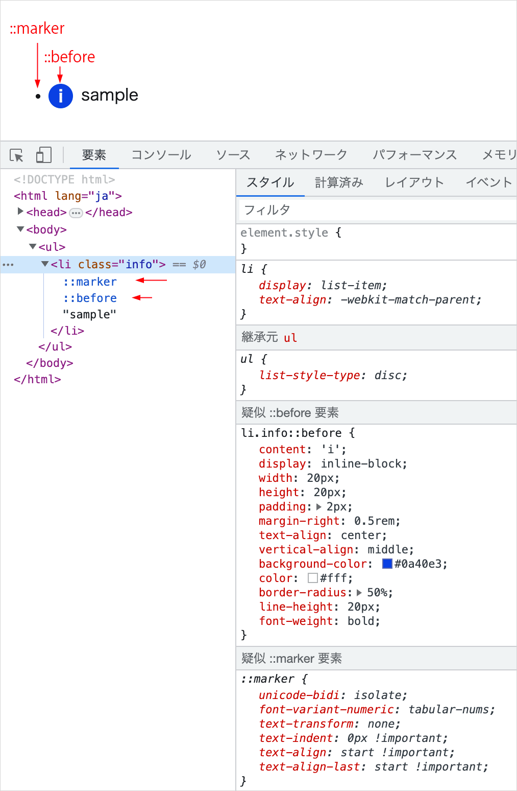
li 要素(リスト項目)
li 要素や summary 要素はデフォルトで display: list-item となっていて、::marker 疑似要素が自動的に挿入されて list-style-type で指定されたアイコン(マーカー)が表示されます。
以下は list-style-type:circle を指定した例です。list-style-type に circle を指定しているので項目の前に白丸のマーカーが表示されます。
<ul style="list-style-type:circle; font-size: 20px;">
  <li>list item</li>
</ul>
- list item
li 要素などの display: list-item の要素に ::before 疑似要素を挿入すると、::marker 疑似要素の後に挿入されて表示されます。
li.info::before {
  content: 'i';
  display: inline-block;
  width: 20px;
  height: 20px;
  padding: 2px;
  margin-right: .5rem;
  text-align: center;
  vertical-align: middle;
  background-color: #0a40e3;
  color: #fff;
  border-radius: 50%;
  line-height: 20px; /* i の文字の垂直方向の位置調整(必要に応じて変更)  */
  font-weight: bold;
  position: relative; /* 必要に応じて relative を指定して bottom などで位置の調整 */
  bottom: 2px;
}
<ul>
  <li class="info">sample</li>
</ul>
上記は以下のように表示されます。
list-style-type: none
マーカーを非表示にするには、li 要素(またはその親の ul や ol 要素)で list-style-type に none を指定します。
li.info {
  list-style-type: none;
}
- sample
絶対配置
デフォルトでは ::marker 疑似要素の後に ::before 疑似要素は挿入されますが、::before 疑似要素を絶対配置すれば任意の位置に表示できます。
以下の場合、::before 疑似要素を絶対配置して、マーカーの位置の上に表示するようにしています。
li.info {
  position: relative; /* 絶対配置の基準 */
  padding-left: .5rem;
  list-style-type: none;  /* この場合は指定しなくても擬似要素の下になって見えない */
}

li.info::before {
  content: 'i';
  position: absolute; /* 絶対配置 */
  left: -1.5rem; /* 位置の調整 */
  top: 0;
  bottom: 0;
  margin: auto  0 ;
  width: 20px;
  height: 20px;
  padding: 2px;
  text-align: center;
  background-color: #0a40e3;
  color: #fff;
  border-radius: 50%;
  line-height: 16px; /* 必要に応じて変更(要素の文字サイズなどによる)  */
  font-weight: bold;
}
- sample
以下は疑似要素で挿入したユニコードのアイコンの色を :nth-child() を使って順番によって変える例です。
ul.star {
  list-style-type: none; /* デフォルトのマーカーを非表示に */
  padding-left: 0;
}

ul.star li::before {
  content:'\2606';  /* 星マークのユニコード */
  margin-right: .5rem;
}

ul.star li:nth-child(5n)::before {
  color: blue;
}
ul.star li:nth-child(5n+1)::before {
  color: red;
}
ul.star li:nth-child(5n+2)::before {
  color: green;
}
ul.star li:nth-child(5n+3)::before {
  color: orange;
}
ul.star li:nth-child(5n+4)::before {
  color: hotpink
}
<ul class="star">
  <li>sample</li>
  ・・・中略・・・
  <li>sample</li>
</ul>
- sample
- sample
- sample
- sample
- sample
- sample
- sample
- sample
- sample
- sample
縦横比を保持するボックス
::before で作成した疑似要素に % で設定した padding-top または padding-bottom を指定して特定の縦横比のボックス(パディング領域)を設定することができます。
このパディング領域に子要素を絶対配置することで、その要素を特定の縦横比で表示することができます。
padding をパーセンテージ(%)で指定する場合、親要素の幅に対するパーセンテージになることを利用する手法で、パディングハックなどと呼ばれます。
※(注) aspect-ratio プロパティを使用すれば同じことが簡単にでき、マークアップも明瞭になります。
以下は 16:9 のアスペクト比(縦横比)のボックスの例です。
親要素 .box-16x9 に ::before で擬似要素を設定します。
<div class="box-16x9">
  <div class="box-inner"></div>
</div>
疑似要素では、content に空文字列("")を設定して、display を block や inline-block に指定します。
padding-top(または padding-bottom)を指定することで、疑似要素の対象の要素(.box-16x9)の幅を基準にした縦横比のボックスを生成します。
そこに子要素(.box-inner)を絶対配置することで指定した縦横比で表示されます。
縦横比を表す値は height ÷ width x 100% で算出します(4:3 の場合は 3 ÷ 4 x 100% = 75%)。
.box-16x9 {
  position: relative; /* 子要素(.box-inner)を配置する基準とする */
  overflow: hidden;
  width: 50%;
}

.box-16x9::before {
  content: "";  /* 空 */
  display: block;  /* block や inline-block を指定 */
  padding-top: 56.25%;  /* 16:9 のアスペクト比(9 ÷ 16 x 100%) */
}

.box-inner {
  position: absolute; /* 絶対配置 */
  top: 0;
  left: 0;
  width: 100%;  /* 幅 100% */
  height: 100%;  /* 高さ 100% */
  background-color: #7aac81;
}
以下のボックスはブラウザの幅を変更しても縦横比は保持されます。
異なる縦横比の画像を表示
子要素(.box-inner)に異なる縦横比の img 要素を指定すると、画像は歪んで表示されてしまいます。
異なる縦横比の画像を表示する場合は、object-fit に cover を指定することで、要素のコンテンツボックスに収まるようにトリミングされるので、画像の縦横比を維持したまま表示することができます。
<div class="box-16x9">
  <img class="box-inner" src="../images/cat.jpg" alt="cat in the yard">
</div>
以下の1〜18行目のスタイルは前述の CSS と同じです。
.box-16x9 {
  position: relative;
  overflow: hidden;
  width: 50%;
}
.box-16x9::before {
  content: "";
  display: block;
  padding-top: 56.25%;
}
.box-inner {
  position: absolute;
  top: 0;
  left: 0;
  width: 100%;
  height: 100%;
  background-color: #7aac81; /* 不要であれば削除 */
}

/* 画像用のスタイルの追加  */
img.box-inner {
  object-fit: cover;
}

疑似要素で斜めの背景を設定
斜めの背景を作成する方法は色々ありますが、以下は transform: skewY() と疑似要素を使った例です。
.regular-bg の要素には背景色を指定せず、.skew-bg の要素に斜めの背景を設定します。
<div class="regular-bg">
  <div class="content">
    <p>Lorem ipsum dolor sit amet consectetur adipisicing elit...</p>
  </div>
</div>
<div class="skew-bg">
  <div class="content">
    <p>Quasi vero pariatur incidunt quae fugit voluptatem ea..</p>
  </div>
</div>
<div class="regular-bg">
  <div class="content">
    <p>Amet quae iure est quisquam dolorum eveniet similique sint..</p>
  </div>
</div>
<div class="skew-bg">
  <div class="content">
    <p>Eligendi, autem? Sunt iusto ex eius dignissimos esse inventore..</p>
  </div>
</div>
.skew-bg の要素には position: relative を指定して斜めの背景を設定する疑似要素の配置の基準とし、疑似要素は絶対配置にして top, right, bottom, left の各プロパティの値を0に設定することで領域全体に背景色を設定します。
また、.skew-bg の要素にはある程度のパディングが必要です(値は斜めにする角度により調整します)。
斜めにする角度は transform: skewY() で指定します。
必要に応じて全体の外側の要素(.skew-bg と .regular-bg の親要素)に overflow:hidden を指定します。
疑似要素は対象の要素より前になるので、背景色の設定により対象の要素のコンテンツが隠れないように z-index: -1を指定します。
.regular-bg {
  width: 100%;
  position: relative; /* 省略可能 */
  padding-top: 20px;
}

.skew-bg {
  width: 100%;
  position: relative;  /* 疑似要素の配置の基準 */
  padding: 30px 0;
  margin: 20px 0;
}

.skew-bg p {
  color: #eee;
}

.skew-bg::before {
  content: '';  /* 空を指定 */
  position: absolute;  /* 絶対配置 */
  top: 0;     /* 0に設定 */
  bottom: 0;  /* 0に設定 */
  left: 0;    /* 0に設定 */
  right: 0;   /* 0に設定 */
  background-color: #405673;
  transform: skewY(-2deg);   /* 斜めにする角度を指定 */
  z-index: -1;   /* コンテンツが隠れないように */
}
Lorem ipsum dolor sit amet consectetur adipisicing elit. Dolorum excepturi omnis beatae ratione eum iste voluptate facilis dolores praesentium eos enim, fugiat sint obcaecati consectetur dignissimos unde! Vel, mollitia dolorem.
Quasi vero pariatur incidunt quae fugit voluptatem ea minima quaerat, nam corporis in magnam dolore velit quis sunt magni repudiandae sapiente. Mollitia atque commodi beatae accusantium amet velit placeat deleniti!
Amet quae iure est quisquam dolorum eveniet similique sint. Sapiente perspiciatis aspernatur, non corrupti eos quia iste quos dolores, delectus, suscipit asperiores? Ex, officiis expedita. Illo nostrum modi impedit facilis.
Eligendi, autem? Sunt iusto ex eius dignissimos esse inventore recusandae, consequuntur blanditiis velit beatae numquam voluptatibus eos labore quam dolorem, quae eum saepe vel est animi doloremque facilis! Quod, magni.
疑似要素を使わないで以下のように記述することもできます。skewY(-2deg) により全体に傾斜が適用されるので、文字などのコンテンツを skewY(2deg) で戻しています。
.regular-bg {
  width: 100%;
  padding-top: 20px;
}

.skew-bg {
  width: 100%;
  padding: 30px 0;
  margin: 20px 0;
  transform: skewY(-2deg);
  background-color: #405673;
}

.skew-bg .content {
  color: #eee;
  transform: skewY(2deg);  /* 傾斜を戻す */
}
以下は前述の疑似要素を使った例に追加のスタイルを設定して、背景の下側だけを斜めにする例です。
コメントが付いている部分が追加の指定です。
擬似要素を skewY() で傾斜を付けて、translateY() で上方向に移動させ、overflow: hidden で上側の斜めの部分を非表示にしています。
transform 関数は半角スペースで区切って記述して、複数の変形処理を適用することができます。
必要に応じて padding の値を調整します。
.regular-bg {
  width: 100%;
  position: relative;
  padding-top: 20px;
}

.skew-bg {
  width: 100%;
  padding: 30px 0;
  position: relative;
  margin: 20px 0;
  overflow: hidden;  /* 追加で指定 */
}

.skew-bg p {
  color: #eee;
}

.skew-bg::before {
  content: '';
  position: absolute;
  top: 0;
  bottom: 0;
  left: 0;
  right: 0;
  background-color: #405673;
  transform: skewY(-2deg) translateY(-20px);  /* translateY() で上方向に移動 */
  z-index: -1;
}
Lorem ipsum dolor sit amet consectetur adipisicing elit. Dolorum excepturi omnis beatae ratione eum iste voluptate facilis dolores praesentium eos enim, fugiat sint obcaecati consectetur dignissimos unde! Vel, mollitia dolorem.
Quasi vero pariatur incidunt quae fugit voluptatem ea minima quaerat, nam corporis in magnam dolore velit quis sunt magni repudiandae sapiente. Mollitia atque commodi beatae accusantium amet velit placeat deleniti!
Amet quae iure est quisquam dolorum eveniet similique sint. Sapiente perspiciatis aspernatur, non corrupti eos quia iste quos dolores, delectus, suscipit asperiores? Ex, officiis expedita. Illo nostrum modi impedit facilis.
Eligendi, autem? Sunt iusto ex eius dignissimos esse inventore recusandae, consequuntur blanditiis velit beatae numquam voluptatibus eos labore quam dolorem, quae eum saepe vel est animi doloremque facilis! Quod, magni.
※ 上記の例の場合、斜めにする角度と全体の幅によっては(幅が大きいと)斜めの部分が途中で直線になってしまう可能性があり、パディングを大きく取らないとならないかも知れません。
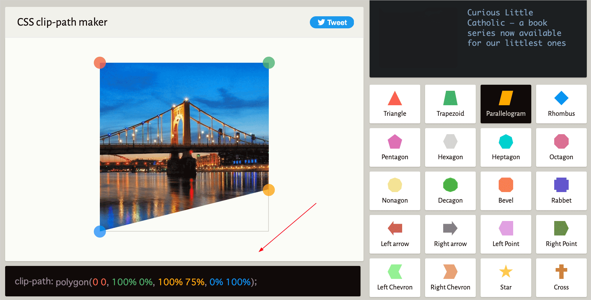
そのような場合は疑似要素で設定するのではなく、CSS clip-path を利用することができます。
clip-path: polygon() で4つの頂点の位置を指定して、その範囲に背景色を指定するだけです。
但し、clip-path は IE ではサポートされていません。また、念の為ベンダープレフィックスを指定します。
.skew-bg {
  -webkit-clip-path: polygon(0 0, 100% 0, 100% 75%, 0 100%); /*ベンダープレフィックス*/
  clip-path: polygon(0 0, 100% 0, 100% 75%, 0 100%);
  background-color:#405673;
  color:#eee;
  padding: 30px 0;
  margin: 20px 0;
}
Lorem ipsum dolor sit amet consectetur adipisicing elit. Dolorum excepturi omnis beatae ratione eum iste voluptate facilis dolores praesentium eos enim, fugiat sint obcaecati consectetur dignissimos unde! Vel, mollitia dolorem.
Quasi vero pariatur incidunt quae fugit voluptatem ea minima quaerat, nam corporis in magnam dolore velit quis sunt magni repudiandae sapiente. Mollitia atque commodi beatae accusantium amet velit placeat deleniti!
Amet quae iure est quisquam dolorum eveniet similique sint. Sapiente perspiciatis aspernatur, non corrupti eos quia iste quos dolores, delectus, suscipit asperiores? Ex, officiis expedita. Illo nostrum modi impedit facilis.
Eligendi, autem? Sunt iusto ex eius dignissimos esse inventore recusandae, consequuntur blanditiis velit beatae numquam voluptatibus eos labore quam dolorem, quae eum saepe vel est animi doloremque facilis! Quod, magni.
頂点の位置は CSS clip-path ジェネレーター(clippy)を利用すると簡単に値を取得できます。
以下は反対方向に傾斜した背景を ::after を使って追加する例です。この例では外側にも背景色を設定するために .skew-bg-wrapper を追加しています。
<div class="skew-bg-wrapper">
  <div class="skew-bg">
    <div class="content">
      <p>Lorem ipsum dolor sit amet consectetur adipisicing elit...</p>
    </div>
  </div>
</div>
外側の .skew-bg-wrapper に背景色を設定するには、この場合、position: relative を指定し、z-index に auto 以外を設定します。
.skew-bg-wrapper {
  background-color: #cad4f0;
  position: relative;
  z-index: 0;
}

.skew-bg {
  width: 100%;
  position: relative;
  padding: 50px 0;
  margin: 50px 0;
}

.skew-bg p {
  color: #eee;
  padding: 2rem;
}

.skew-bg::before {
  content: '';
  position: absolute;
  top: 0;
  bottom: 0;
  left: 0;
  right: 0;
  background-color: #05234a;
  transform: skewY(-3deg);
  z-index: -1;
}
/* 反対方向に傾斜した背景を追加 */
.skew-bg::after {
  content: '';
  position: absolute;
  top: 0;
  bottom: 0;
  left: 0;
  right: 0;
  background-color: #05234a;
  transform: skewY(3deg);
  z-index: -1;
}
Lorem ipsum dolor sit amet consectetur adipisicing elit. Dolorum excepturi omnis beatae ratione eum iste voluptate facilis dolores praesentium eos enim, fugiat sint obcaecati consectetur dignissimos unde! Vel, mollitia dolorem.
水平方向に分割
以下は水平方向に分割した斜めの背景の例です。
<div class="skew-hr-bg">
  <div class="content">
    <p>Lorem, ipsum dolor sit amet consectetur adipisicing elit...</p>
    <p>Voluptates deserunt repellat dicta ducimus eum expedita...</p>
  </div>
</div>
対象の要素に背景色を設定し、絶対配置する疑似要素の基準となるように position: relative を指定し、z-index に auto 以外を設定します。
また、疑似要素で設定する斜めの背景は左方向に移動させるので、はみ出した部分を非表示にするため overflow: hidden を指定します。
疑似要素の背景は絶対配置して skewX() で傾斜を付けて translateX() で左方向に移動させます。
.skew-hr-bg {
  position: relative; /* 疑似要素の基準 */
  z-index: 0; /* auto 以外を設定 */
  overflow: hidden;   /* 左方向に移動してはみ出す部分を非表示 */
  background-color: #8296b1;
  min-height: 200px;
  padding: 50px 20px;
  color: #efefef;
}

.skew-hr-bg::before {
  content: ''; /* 空 */
  position: absolute;  /* 絶対配置 */
  top: 0;     /* 0に設定 */
  bottom: 0;   /* 0に設定 */
  left: 0;     /* 0に設定 */
  right: 0;    /* 0に設定 */
  background-color: #05234a;
  transform: skewX(-30deg) translateX(-50%); /* translateX() で左方向に移動 */
  z-index: -1;   /* コンテンツが隠れないように */
}
Lorem, ipsum dolor sit amet consectetur adipisicing elit. Nemo perspiciatis dolores reiciendis vitae asperiores, beatae hic. Sit ipsum minus, reprehenderit nam officia explicabo placeat ex impedit necessitatibus porro asperiores sapiente?
Voluptates deserunt repellat dicta ducimus eum expedita debitis incidunt odio aut voluptatibus. Quia dicta, et hic expedita voluptas ratione perspiciatis, necessitatibus, praesentium officiis atque delectus soluta. Velit ipsum quae quas!
上記では疑似要素を使って設定しましたが、background: linear-gradient を使っても設定できます。
以下は上記とほぼ同じ結果になります。グラデーションの開始色と終了色を同じ色を指定して2色の背景にし、角度を設定しています。
.skew-hr-bg2{
  background: linear-gradient(
    -60deg,  /* 角度 */
    #8296b1 0%,  /* 開始色 */
    #8296b1 50%,  /* 終了色 */
    #05234a 50%,  /* 開始色 */
    #05234a 100%  /* 終了色 */
  );
  min-height: 200px;
  padding: 50px 20px;
  color: #efefef;
}
疑似要素で矢印や三角形を表示
シンプルな矢印や三角形のアイコンは、画像やアイコンフォントを使用しなくても CSS で作成して疑似要素で表示することができます。
三角形の作成
三角形は border プロパティを使って作成することができます。
以下は div 要素を使った width と height が 100px で各 border の幅(border-width)が 30px のボックスです。インライン要素に適用する場合は display: inline-block を指定します(以降では省略)。
<div class="box"></div>
.box {
  border-top: 30px solid #fbf579;
  border-right: 30px solid #005995;
  border-bottom: 30px solid #fa625f;
  border-left: 30px solid #600473;
  width: 100px;
  height: 100px;
  box-sizing: border-box;
  display: inline-block; /* インライン要素に適用する場合は指定 */
}
各 border の接する部分が斜めになっていますが、この斜めの部分を利用して三角形を作成します。
以下のようにボックスの width と height を 0 にすると4つの三角形で構成されています。
.box {
  border-top: 50px solid #fbf579;  /* border-width の値を 50px に変更しています */
  border-right: 50px solid #005995;
  border-bottom: 50px solid #fa625f;
  border-left: 50px solid #600473;
  width: 0;
  height: 0;
}
1つの border を残して、他を見えなく(色を透明に)すると三角形として表示することができます。
<div class="triangle"></div>
border の色(border-color)に transparent を指定することで透明にすることができます。
以下は border-bottom のみを表示して上向きの三角形を表示します。
.triangle {
  border-top: 50px solid transparent;; /* border-top の色を透明に */
  border-right: 50px solid transparent; /* border-right の色を透明に */
  border-left: 50px solid transparent; /* border-left の色を透明に */
  border-bottom: 50px solid #fa625f;
  width: 0;
  height: 0;
  background-color: #ddd; /* わかりやすいように背景色を指定 */
}
上記は以下のように記述することができます。
.triangle {
  border: 50px solid transparent; /* すべての border の色を透明に */
  border-bottom: 50px solid #fa625f; /* border-bottom の色を指定 */
  width: 0;
  height: 0;
  background-color: #ddd; /* わかりやすいように背景色を指定 */
}
但し、この場合、border-top: 50px としているので、透明ですが上部に border-top に指定した 50px のスペースが作られています(わかりやすいように背景色を指定しています)。
以下のように border-top を指定しなければ、上部のスペースは作成されません。
.triangle {
  border-right: 50px solid transparent;
  border-left: 50px solid transparent;
  border-bottom: 50px solid #fa625f;
  width: 0;
  height: 0;
  background-color: #ddd; /* わかりやすいように背景色を指定 */
}
上記の底辺の右側の部分の border-right の記述を削除すると、以下のように左半分の三角形になります。
.triangle1-3 {
  margin: 40px 0;
  border-bottom: 50px solid #fa625f;
  border-left: 50px solid transparent;
  display: inline-block;
  background-color: #ddd; /* わかりやすいように背景色を指定 */
}
border-top と border-right のみを表示して同じ色を指定すると、右上向きの三角形を表示できます。
.triangle {
  border: 50px solid transparent;
  border-top: 50px solid #005995;    /* 同じ色を指定 */
  border-right: 50px solid #005995;  /* 同じ色を指定 */
  width: 0;
  height: 0;
}
border-bottom のみを透明にして、他の border に同じ色を設定すると、以下のようにリボンのような形状になります。
.triangle {
  border: 50px solid #005995; /* すべての border の色を青に */
  border-bottom: 50px solid transparent; /* border-bottom の色を透明に */
  width: 0;
  height: 0;
}
三角形の底辺と高さ
例えば、以下の赤い上向きの三角形の底辺の長さは「border-left-width + border-right-width」で高さは「border-bottom-width」になります。
各 border-width が 50px の場合、三角形の底辺の長さは 100px で、高さは 50px になります。
以下の上向きの三角形の場合、border-left-width と border-right-width の値が等しければ2等辺三角形になります。
正三角形の底辺と高さ
正三角形の高さは √3 * 底辺の長さ / 2 で求められ、√3 は約1.732 です。
上向きの三角形を正三角形にするには、border-left-width と border-right-width が共に 50px の場合、
border-bottom-width を 1.732 * (50px + 50px) / 2 により 86.6px にすれば良いことになります。
以下は底辺(border-left + border-right)が 100px の上向きの正三角形の例です。
.triangle {
  border-left: 50px solid transparent;
  border-right: 50px solid transparent;
  border-bottom: 86.6px solid #fa625f;
  width: 0;
  height: 0;
}
上記の場合、正三角形にするには、border-right と border-left に等しい値を指定する必要があるので、その値を 1.732 倍した値を高さ(border-bottom)に指定すれば良いことになります。
.triangle {
  border-left: 50px solid transparent;
  border-right: 50px solid transparent;
  border-bottom: calc(50px * 1.732) solid #fa625f;  /* calc() を使って算出 */
  width: 0;
  height: 0;
}
以下は底辺(border-top + border-bottomt)が 100px の右向きの正三角形の例です。
.triangle {
  border-left: calc(50px * 1.732) solid #600473;
  border-top: 50px solid transparent;
  border-bottom: 50px solid transparent;
  width: 0;
  height: 0;
}
CSS Triangle ジェネレーター
CSS で三角形を作成するコードを生成してくれる CSS Triangle ジェネレーターもあるので利用することができます。「CSS Triangle Generator」などで検索すると色々とでてきます。
border プロパティの指定方法
今までの例では主に border-top、border-left、border-left、border-bottom を使った一括指定(ショートハンド)を利用しましたが、border プロパティの指定方法にはこの他に、border-width、border-style、border-color を使った一括指定もあります。
以下は、前述の右向きの正三角形を border-width、border-style、border-color で記述した例です。
.triangle {
  border-style: solid;
  border-width: 50px 0 50px 86.6px;
  border-color: transparent transparent transparent #600473;
  width: 0px;
  height: 0px;
}
また、上記は以下のように border を使った一括指定と組み合わせて記述することもできます。
border-right-width: 0 を指定しないと、この場合は右側に 50px のスペースができます。
.triangle {
  border: 50px solid transparent;
  border-left: 86.6px solid #600473;
  border-right-width: 0;
  width: 0px;
  height: 0px;
}
矢印の作成
「>」のような矢印のアイコンは、四角形の隣り合った2辺の border を使って作成することができます。
大きさは width と height で、線の太さは border-width で調整します。
.arrow {
  width: 100px;   /* 辺の長さ */
  height: 100px;  /* 辺の長さ */
  border-top: 20px solid #005995;  /* 線の太さと種類と色 */
  border-right: 20px solid #005995;  /* 線の太さと種類と色 */
  display: inline-block;
}
transform: rotate() を使って回転します。
.arrow {
  width: 100px;
  height: 100px;
  border-top: 20px solid #005995;
  border-right: 20px solid #005995;
  display: inline-block;
  transform: rotate(45deg);  /* 右45度回転 */
}
width と height や、border-width と rotate() の値を調整すれば、チェックマークのようなアイコンも作成できます。
.check-mark {
  width: 100px;
  height: 70px;  /* 短く指定 */
  border-top: 12px solid #005995;  /* 細く指定 */
  border-right: 20px solid #005995;
  display: inline-block;
  transform: rotate(135deg); /* 右135度回転 */
}
疑似要素で表示
三角形や矢印などのアイコンを疑似要素の ::before または ::after を使って表示することができます。
アイコンを表示する方法は色々ありますが、基本的には対象の要素に position: relative を指定して挿入する疑似要素の配置の基準とし、パディングを設定してアイコンを挿入するスペースを確保します。
::before または ::after では position: absolute で挿入するアイコンを絶対配置にして、top, bottom, left, right を使って位置を調整し、border などを使ってアイコンを作成して挿入します。
絶対配置と中央揃え(参考)
例えば、絶対配置した疑似要素(height の指定が必要)に top: 0 と bottom: 0、margin: auto 0 を指定することで、垂直方向に中央配置することができます(アイコンなどを揃える際に使うと便利です)。
疑似要素に限らず、position: absolute を指定した要素に margin: auto を指定すると、margin は無効になりますが、全てのポジション(top, bottom, left, right)に 0(または auto 以外の同じ値)を指定することで中央に配置することができます(※ width と height の指定が必要)。
<div class="foo">
  <div class="bar"></div>
</div>
.foo {
  position: relative;
  width: 240px;
  height: 160px;
  border: 1px solid #ccc;
  background-color: #dfe9f5;
}
.bar {
  position:absolute; /* 絶対配置 */
  width: 50px; /* 幅を指定 */
  height: 50px; /* 高さを指定 */
  background-color: #7aac81;
  margin: auto; /* 中央寄せ */
  top: 0; ;  /* 垂直方向中央寄せのための指定 */
  bottom: 0; /* 垂直方向中央寄せのための指定 */
  right: 0;  /* 水平方向中央寄せのための指定 */
  left: 0;   /* 水平方向中央寄せのための指定 */
}
関連ページ:CSS で要素を中央寄せする方法
三角形のアイコンを表示
以下は triangle-right というクラスを指定した要素の左側に三角形のアイコンを挿入する例です。
Sample Text
<p class="triangle-right">Sample Text</p>
疑似要素(アイコン)を挿入する要素(triangle-right クラスを指定した要素)には、position: relative を指定して挿入する疑似要素の配置の基準にします。
また、疑似要素のアイコンを挿入するスペースを左側に確保するため padding-left を指定します。この例では値に 20px を指定して、表示するアイコンの右側に少しスペースができるようにしていますが、必要に応じて調整します。
.triangle-right {
  position: relative;  /* 挿入する疑似要素の配置の基準に */
  padding-left: 20px;  /* アイコンのスペース */
}
::before または ::after を使ってアイコンを挿入します。
content は空にして、position: absolute で絶対配置にし、top、bottom、left で位置を調整します。
この例では、top: 0 と bottom: 0、及び margin: auto 0 を指定して、垂直方向中央配置しています。
8〜12行目は三角形のアイコンの指定です。右向きの三角形なので border-left に色と幅を指定しています。この例では、正三角形にするために border-left の幅を calc(8px * 1.732) としていますが、正三角形にする必要はありません(矢印とする場合は、正三角形でないほうが良いかも知れません)。
三角形の大きさはそれぞれの border の幅の値で調整することができます。
width と height は 0 にします。
.triangle-right::before {
  content: "";   /* content は空を指定 */
  position: absolute;   /* 絶対配置 */
  top: 0;    /* 位置の指定(必要に応じて調整) */
  bottom: 0; /* 位置の指定(必要に応じて調整)*/
  left: 0;   /* 位置の指定(必要に応じて調整)*/
  margin: auto 0; /* 垂直方向中央配置(top: 0 と bottom: 0 と合わせて) */
  border-left: calc(8px * 1.732) solid #139563; /* 右向きの三角形の高さと色 */
  border-top: 8px solid transparent; /* 右向きの三角形の底辺の半分 */
  border-bottom: 8px solid transparent; /* 右向きの三角形の底辺の半分 */
  width: 0;
  height: 0;
}
上記の8〜10行目は以下のように記述することもできます。
border-style: solid;
border-width: 8px 0 8px calc(8px * 1.732);
border-color: transparent transparent transparent #139563;
以下はテキストの右側にアイコンを表示する例です。
.triangle-right2 {
  position: relative;
  padding-right: 24px;  /* アイコンのスペースを右側に */
  display: inline-block;  /* 必要に応じて */
}

.triangle-right2::before {
  content: "";
  position: absolute;
  top: 0;
  bottom: 0;
  right: 0;  /* 右端に挿入 */
  margin: auto 0;
  border-right: calc(8px * 1.732) solid #139563;  /* 左向きの三角形 */
  border-top: 8px solid transparent;
  border-bottom: 8px solid transparent;
  width: 0;
  height: 0;
}
Sample Text
背景付きの三角形のアイコン( )
以下は ::before を使って背景を設定し、::after でアイコンを挿入しています。
また、両方の疑似要素は top: 0、bottom: 0 と margin: auto 0 を指定して、垂直方向中央揃えしています。
.triangle-right-circle {
  position: relative;
  padding-left: 22px;
}

.triangle-right-circle::before {
  content: "";
  position: absolute;
  top: 0;
  bottom: 0;
  left: 0;
  margin: auto 0;   /* 垂直方向中央揃え */
  width: 18px;  /* 背景の幅 */
  height: 18px; /* 背景の高さ */
  background-color: #7aac81;
  border-radius: 50%;
}

.triangle-right-circle::after {
  content: "";
  position: absolute;
  top: 0;
  bottom: 0;
  left: 6px;   /* 位置の調整 */
  margin: auto 0;   /* 垂直方向中央揃え */
  border-left: calc(5px * 1.732) solid #fff;
  border-top: 5px solid transparent;
  border-bottom: 5px solid transparent;
  width: 0;
  height: 0;
}
<p class="triangle-right-circle">Sample Text</p>
Sample Text
三角形を使った矢印のアイコン( )
以下は ::before で width と height を使って矢印の棒の部分を作成して挿入し、::after で三角形のアイコンを挿入しています。
.triangle-arrow {
  position: relative;
  padding-left: 24px;
}

/* 矢印の棒の部分 */
.triangle-arrow::before {
  content: "";
  position: absolute;
  top: 0;
  bottom: 0;
  left: 0;
  margin: auto 0; /* top: 0、bottom: 0 と共に指定して垂直方向中央揃え */
  width: 8px;  /* 棒の部分の幅 */
  height: 5px; /* 棒の部分の高さ */
  background-color: #7aac81;
}

/* 三角形のアイコン */
.triangle-arrow::after {
  content: "";
  position: absolute;
  top: 0;
  bottom: 0;
  left: 8px;   /* 左側に棒を配置するための位置の調整 */
  margin: auto 0; /* top: 0、bottom: 0 と共に指定して垂直方向中央揃え */
  border-left: 10px solid #7aac81; /* 三角形の高さを調整 */
  border-top: 8px solid transparent;
  border-bottom: 8px solid transparent;
  width: 0;
  height: 0;
}
<p class="triangle-arrow">Sample Text</p>
Sample Text
以下は border-top と border-right で作成する右上向きの三角形を使った例です。
.triangle-arrow2 {
  position: relative;
  margin-bottom: 30px;  /* アイコンを配置するスペース(必要に応じて) */
}

/* 矢印の棒の部分 */
.triangle-arrow2::before {
  content: "";
  position: absolute;
  top: 28px;  /* 位置の調整 */
  bottom: 0;
  left: 3px;  /* 位置の調整 */
  width: 14px; /* 棒の幅 */
  height: 6px; /* 棒の高さ */
  background-color: #005995;
  transform: rotate(-45deg); /* 棒を回転 */
}

/* 三角形のアイコン */
.triangle-arrow2::after {
  content: "";
  position: absolute;
  top: 20px; /* 位置の調整 */
  bottom: 0;
  left: 5px;  /* 位置の調整(左側に棒を配置) */
  border: 8px solid transparent;
  border-top: 8px solid #005995; /* 同じ色を指定 */
  border-right: 8px solid #005995; /* 同じ色を指定 */
  width: 0;
  height: 0;
}
<p class="triangle-arrow2">Sample Text</p>
Sample Text
skew() で変形
以下は上向きと下向きの2つの三角形に skewX() で傾斜をつけて作成したアイコンです。
傾斜を付けるともとの位置からずれるので、必要に応じて位置を調整します。
.triangle-skew {
  position: relative;  /* 挿入する疑似要素の配置の基準に */
  padding-left: 30px;  /* アイコンのスペース */
}

.triangle-skew::before {
  content: "";   /* content は空を指定 */
  position: absolute;   /* 絶対配置 */
  top: -13px;
  bottom: 0;
  left: 7px;
  margin: auto 0;
  border-bottom: 12px solid #005eff; /* 上向きの三角形の高さと色 */
  border-left: 8px solid transparent;
  border-right: 8px solid transparent;
  width: 0;
  height: 0;
  transform: skewX(-55deg); /* skew で傾斜 */
}

.triangle-skew::after {
  content: "";   /* content は空を指定 */
  position: absolute;   /* 絶対配置 */
  top: 13px;
  bottom: 0;
  left: 7px;
  margin: auto 0;
  border-top: 12px solid #e30675; /* 下向きの三角形の高さと色 */
  border-left: 8px solid transparent;
  border-right: 8px solid transparent;
  width: 0;
  height: 0;
  transform: skewX(55deg); /* skew で傾斜 */
}
<p class="triangle-skew">Sample Text</p>
Sample Text
矢印のアイコンを表示
「く」の字型の矢印のアイコンを表示する例です。
表示方法は、基本的には前述の三角形のアイコンを表示する方法と同じです。
各辺(線)の長さは width と height で、線の太さは border-top と border-right で設定します。
線の色は border-top と border-right でそれぞれに設定できるので、異なる色を指定することもできます。
.arrow-right {
  position: relative;  /* 挿入する疑似要素の配置の基準に */
  padding-left: 20px;  /* アイコンのスペース */
}

.arrow-right::before {
  content: "";   /* content は空を指定 */
  position: absolute;   /* 絶対配置 */
  top: 0;
  bottom: 0;
  left: 0;
  margin: auto 0; /* top: 0、bottom: 0 と共に指定して垂直方向中央揃え */
  width: 12px;   /* 辺の長さ */
  height: 12px;  /* 辺の長さ */
  border-top: 3px solid #005995;  /* 線の太さと種類と色 */
  border-right: 3px solid #005995;  /* 線の太さと種類と色 */
  transform: rotate(45deg);  /* 45度回転 */
}
<p class="arrow-right">Sample Text</p>
Sample Text
以下は矢印アイコン( )の共通部分を属性セレクタで設定し、異なる部分(角度と位置の調整)をそれぞれのクラスで指定する例です。
[class^="arrow2-"] {
  position: relative;
  padding-left: 20px;
}

[class^="arrow2-"]::before {
  content: "";
  position: absolute;
  top: 0;
  bottom: 0;
  left: 0;
  margin: auto 0;
  width: 12px;
  height: 12px;
  border-top: 3px solid #005995;
  border-right: 3px solid #005995;
}

.arrow2-right::before {
  transform: rotate(45deg);
}
.arrow2-left::before {
  transform: rotate(-135deg);
  left: 5px;
}
.arrow2-up::before {
  transform: rotate(-45deg);
  top: 4px;
}
.arrow2-down::before {
  transform: rotate(135deg);
  bottom: 4px;
}
<p class="arrow2-right">.arrow2-right</p>
<p class="arrow2-left">.arrow2-left</p>
<p class="arrow2-down">.arrow2-down</p>
<p class="arrow2-up">.arrow2-up</p>
.arrow2-right
.arrow2-left
.arrow2-down
.arrow2-up
棒が付いた矢印のアイコン()
前述のアイコンに棒を付ける例です。
棒の部分は ::after で width と height を使って作成して挿入します。
「く」の字の部分と棒の部分には、top: 0 と bottom: 0、margin: auto 0 を指定して垂直方向に中央配置して位置を揃えています。必要であれば、top や bottom で調整します。
棒の部分の長さにより、「く」の字の部分の位置を left などで調整します。
.arrow-right2 {
  position: relative;
  padding-left: 20px;
}

/*「く」の字の部分 */
.arrow-right2::before {
  content: "";
  position: absolute;
  top: 0;
  bottom: 0;
  left: 3px; /* 棒の長さにより位置を調整 */
  margin: auto 0; /* top: 0、bottom: 0 と共に指定して垂直方向中央揃え */
  width: 12px;
  height: 12px;
  border-top: 3px solid #005995;
  border-right: 3px solid #005995;
  transform: rotate(45deg);
}

/* 棒の部分 */
.arrow-right2::after {
  content: "";
  position: absolute;
  top: 0;
  bottom: 0;
  left: 0;
  margin: auto 0; /* top: 0、bottom: 0 と共に指定して垂直方向中央揃え */
  width: 15px; /* 棒の長さ */
  height: 3px; /* 棒の幅(太さ) */
  background-color: #005995;
}
Sample Text
チェックマーク( )のアイコン
「く」の字の各線の長さと太さを変えてチェックマークのようなアイコンを表示する例です。
この例の場合、margin: auto 0 を top、bottom と共に指定して垂直方向中央揃えしていますが、bottom で更に垂直方向の位置を調整しています。
.check-icon {
  position: relative;
  padding-left: 22px;
}

.check-icon::before {
  content: "";
  position: absolute;
  top: 0;
  bottom: 2px; /* 垂直方向の調整 */
  left: 0;
  margin: auto 0; /* top、bottom と共に指定して垂直方向中央揃え */
  width: 13px;
  height: 7px;
  border-top: 2px solid #005995;
  border-right: 4px solid #005995;
  transform: rotate(135deg);
}
アイコンをアニメーション表示
疑似要素で作成したアイコンをアニメーション表示する例です。
関連ページ:Web Animation API で疑似要素をアニメーション
ホバー時のアニメーション
疑似要素に transition プロパティを設定して、:hover にアニメーション実行後の疑似要素の状態を指定することでホバー時(マウスオーバー時)のロールオーバーアニメーションを CSS で設定できます。
以下は arrow-rotate クラスを指定した要素に矢印のアイコンを表示し、その要素にマウスオーバーしたらアイコンを回転(アニメーション)する例です。
<a class="arrow-rotate" href="#">animation sample</a>
アニメーションさせる疑似要素に transition プロパティを設定します。
この例の場合、アニメーションに transform:rotate() を使用しているので、トランジションを適用する対象の CSS プロパティとして transform を指定し、アニメーションの継続時間(0.3s)とイージング(ease-in)を指定しています。
ホバー時のアニメーションを設定するセレクタは 対象の要素:hover::before のように記述します。この例の場合、.arrow-rotate:hover::before となります。
:hover は疑似要素を挿入する要素に指定します。疑似要素は HTML として認識されないので、疑似要素に :hover を指定して .arrow-rotate::before:hover とすると動きません。
.arrow-rotate {
  position: relative;
  padding-left: 20px;
}

.arrow-rotate::before {
  content: "";
  position: absolute;
  top: 0;
  bottom: 0;
  left: 0;
  margin: auto 0;
  width: 10px;
  height: 10px;
  border-top: 3px solid #097b27;
  border-right: 3px solid #097b27;
  transform: rotate(45deg);
  transition:transform 0.3s ease-in;  /* transition プロパティを設定 */
}

/* ホバー時の疑似要素のアニメーション */
.arrow-rotate:hover::before {
  transform:rotate(135deg);
}
この場合、.arrow-rotate を指定した a 要素(疑似要素のアイコンの部分を含む)にマウスオーバーするとアイコンが回転します。
アイコンの部分にマウスオーバーした時のみアニメーションさせるには、例えば span 要素に .arrow-rotate を指定するようにします。
<p><span class="arrow-rotate"></span><a href="#">animation sample</a></p>
以下は、ul li で作成したリスト項目のリンク部分(a 要素)に前述と同じ回転する矢印のアイコンを表示する例です。
<ul class="arrow-list">
  <li><a href="#">foo</a></li>
  <li><a href="#">bar</a></li>
  <li><a href="#">baz</a></li>
</ul>
この場合、ul 要素に arrow-list クラスを指定して、ul.arrow-list li a に擬似要素を設定しています。
また、この例では矢印アイコンは right: 10px でコンテンツの右側に表示しています。
ul.arrow-list {
  width: 240px;
  list-style-type: none;
}

ul.arrow-list li {
  position: relative; /* 疑似要素を絶対配置する基準 */
  border-top: 1px solid #ccc;
}

ul.arrow-list li:last-child {
  border-bottom: 1px solid #ccc;
}

ul.arrow-list li a {
  text-decoration: none;
  padding: 9px 10px 10px 10px;
  margin: 5px 0;
  color: #333;
  display: block;
}

ul.arrow-list li a::before {
  content: "";
  display: block;
  position: absolute;
  top: 0;
  bottom: 0;
  right: 10px; /* 右端から 10px に配置 */
  margin: auto 0;
  width: 10px;
  height: 10px;
  border-top: 2px solid #097b27;
  border-right: 2px solid #097b27;
  transform: rotate(45deg);
  transition: transform 0.2s ease-in;  /* transition プロパティを設定 */
}

/* 疑似要素を挿入する要素に :hover を指定 */
ul.arrow-list li a:hover::before {
  transform: rotate(135deg);
}
クリック時のアニメーション
クリックした際に JavaScript を使って疑似要素のアニメーションを実行する例です。
以下は対象の要素をクリックすると、疑似要素で表示しているプラス(+)のアイコンをアニメーションでマイナス(−)に変化させる例です。
<p><a class="pm-icon" href="#">Click</a></p>
アイコンの棒の部分は、::before と ::after を使って width: 20px、height: 4px の長方形で作成し、::after で作成した棒の部分は90度回転させています。
transition プロパティを設定して、トランジションを適用する対象の CSS プロパティとして transform と opacity を指定します。
アニメーションは JavaScript で active クラスの追加・削除(切り替え)で行うので、アニメーションの状態の設定は .pm-icon.active::before と .pm-icon.active::after に記述します。
それぞれの棒を transform: rotate() で回転し、::after で作成した棒の部分は opacity: 0 にして非表示にしています。
/* アイコンを挿入する要素 */
.pm-icon {
  position: relative;
  padding-left: 40px; /* アイコンのスペース */
  font-size: 20px;
}

/* アイコンの棒の部分 */
.pm-icon::before,
.pm-icon::after {
  content: "";
  position: absolute;
  left: 0;
  top: 0;
  bottom: 0;
  margin: auto 0;
  background-color: #333;
  width: 20px;
  height: 4px;
  transition: transform 0.3s ease-in, opacity .5s;
}

/* after で作成したアイコンの棒の部分を90度回転 */
.pm-icon::after {
  transform: rotate(90deg);
}

/* active クラスが切り替わる(クリックされた)際のアニメーション */
.pm-icon.active::before {
  transform: rotate(180deg);
}
.pm-icon.active::after {
  transform: rotate(90deg);  /* rotate(270deg) にすると動きが大きくなる */
  opacity: 0;
}
JavaScript では、疑似要素でアイコンを表示する要素をすべて取得して、それぞれに addEventListener() でクリックイベントのリスナーを設定します。
この例の場合、a 要素を使っているので、e.preventDefault() でデフォルトの動作(リンク先への移動)をキャンセルしています。
そして、classList のメソッド toggle() を使って、active クラスを切り替えています(指定されたクラスが存在しなければ追加し、存在すれば削除)。
active クラスが切り替わると、CSS の .pm-icon.active::before と .pm-icon.active::after により疑似要素の transition アニメーションが適用されます。
// pm-icon クラスを指定したすべての要素を取得
const pmIcons = document.querySelectorAll('.pm-icon');

//取得したそれぞれの要素に
pmIcons.forEach((elem) => {
  //クリックイベントのリスナーを設定
  elem.addEventListener("click", (e) => {
    // デフォルトの動作(リンク先への移動)をキャンセル
    e.preventDefault();
    // active クラスの切り替え
    elem.classList.toggle("active");
  });
});
関連ページ:疑似要素にアニメーション(Web Animation API)
ホバーとクリックでアニメーション
以下はホバーとクリックの両方のアニメーションを設定する例です。
<p><a class="double-arrow" href="#">Hover and Click</a></p>
::before と ::after を使って2つの矢印を作成し、初期状態では重ねて表示しています。
ホバー時は、::before のアイコンを translateY() で垂直方向に移動し、クリック時は両方のアイコンを回転させています。
アイコンを translateY() で垂直方向に移動する際は、その時のアイコンの回転角度も同時に指定します。
.double-arrow {
  position: relative;
  padding-left: 30px; /* アイコンのスペース */
}

/* 2つの下向きの矢印アイコンを重ねて表示 */
.double-arrow::before,
.double-arrow::after {
  content: "";
  position: absolute;
  top: -7px; /* 垂直方向の位置の調整 */
  bottom: 0;
  left: 0;
  margin: auto 0;
  width: 12px;
  height: 12px;
  border-top: 4px solid #333;
  border-right: 4px solid #333;
  transform: rotate(135deg);
  transition: transform 0.3s ease-out;
}

/* ホバー時のアニメーション */
.double-arrow:hover::before {
  transform: translateY(-9px) rotate(135deg) ;
}

/* active クラスが追加されている際のホバー時のアニメーション */
.double-arrow.active:hover::before {
  transform: translateY(0px) rotate(-45deg) ;
}

/* active クラスが切り替わる(クリックされた)際のアニメーション */
.double-arrow.active::before,
.double-arrow.active::after{
  transform:translateY(9px) rotate(-45deg) ;
}
吹き出しを作成
背景色を指定したボックスに三角形の疑似要素を追加することで、吹き出しを作ることができます。
Sample Text
<p class="balloon1">Sample Text</p>
ボックスの要素には position: relative を指定して、疑似要素の三角形の配置の基準にします。また、この例ではコンテンツに応じて幅や高さが変わるように display: inline-block を指定しています。固定の大きさにするには width と height を指定し、display: block を指定します。
三角形は疑似要素の ::before または ::after で作成し、content は空を指定し、絶対配置します。
この例の場合、三角形をボックスの下に配置するので、三角形の高さの分だけ bottom で調整しています。
この例では水平方向へは中央に配置していますが、必ずしも中央に配置する必要はありません。
また、三角形は下向きの三角形にするので、border-top の色だけ指定し、他は透明にし、border-bottom のスペースは不要なので高さを 0 にしています。
/* ボックス */
.balloon1 {
  position: relative;  /* 三角形の配置の基準 */
  background: #ccc;
  display: inline-block;  /* コンテンツに応じて伸縮 */
  padding: 2rem;
  text-align: center;  /* テキストの中央揃え(必要に応じて) */
  max-width: 600px;  /* 必要に応じて */
  min-width: 200px;  /* 必要に応じて */
}

/* 三角形 */
.balloon1::before {
  content: "";  /* content は空を指定 */
  position: absolute;  /* 絶対配置 */
  bottom: -16px; /* 三角形の高さだけボックスの下に配置 */
  right: 0;
  left: 0;
  margin: 0 auto; /* right:0 と left:0 と合わせて水平方向中央配置 */
  border-style: solid;
  border-width: 16px 16px 0 16px;
  border-color: #ccc transparent transparent transparent;
  width: 0;
  height: 0;
}
上記の20〜22行目は以下のように記述しても同じです。
border-top: 16px solid #ccc;
border-right: 16px solid transparent;
border-left: 16px solid transparent;
三角形の形状を変えることで、見栄えを変えることができます。以下は前述の例の三角形を構成する border-right の部分の幅を 0 にした例です。
Sample Text
<p class="balloon2">Sample Text</p>
/* ボックス */
.balloon2 {
  position: relative;
  background: #fa625f;
  display: inline-block;
  padding: 2rem;
  text-align: center;
  max-width: 600px;
  min-width: 200px;
  color: #fff;
}

/* 三角形 */
.balloon2::before {
  content: "";
  position: absolute;
  bottom: -16px;
  right: 0;
  left: 0;
  margin: 0 auto;
  border-style: solid;
  border-width: 16px 0 0 16px; /* border-right の部分の幅を 0 に */
  border-color: #fa625f transparent transparent transparent;
  width: 0;
  height: 0;
}
以下は三角形を左側に配置する例です。
Sample Text
三角形はその高さ分だけ、左に配置します。この例では垂直方向へは中央に配置していますが、必ずしも中央に配置する必要はありません。
この例の三角形は border-right に色を指定して、border-bottom と border-left の高さは 0 にしてあります。
<p class="balloon3">Sample Text</p>
/* ボックス */
.balloon3 {
  position: relative;
  background: #005995;
  display: inline-block;
  padding: 2rem;
  text-align: center;
  max-width: 600px;
  min-width: 200px;
  color: #fff;
  margin-left: 14px; /* 左側の三角形のスペース(必要に応じて) */
  border-radius: 6px;
}

/* 三角形 */
.balloon3::before {
  content: "";
  position: absolute;
  top: 0;
  bottom: 0;
  left: -14px; /* 三角形の高さだけボックスの左に配置 */
  margin: auto 0; /* top:0 と bottom:0 と合わせて垂直方向中央配置 */
  border-style: solid;
  border-width: 14px 14px 0 0;
  border-color:  transparent #005995 transparent transparent;
  width: 0;
  height: 0;
}
枠線の吹き出し
吹き出しの三角形の部分は、それ自体が枠線(border)でできているので、その周りに枠線をつけることができません。
そのため、2つの三角形を重ねて枠線を表現します。後ろに配置する三角形を ::before で枠線の分だけ大きく作成し、その前に ::after で作成した三角形を配置します。
Sample Text
<p class="balloon4">Sample Text</p>
/* ボックス */
.balloon4 {
  position: relative;
  border: 2px solid #7aac81; /* 枠線 */
  background-color: #e7f7e9; /* 背景色 */
  display: inline-block;
  padding: 2rem;
  text-align: center;
  max-width: 600px;
  min-width: 200px;
  color: #333;
  border-radius: 6px;
}

/* 後ろに配置する三角形(色はボックスの枠線の色) */
.balloon4::before {
  content: "";
  position: absolute;
  top: 0;
  bottom: 0;
  right: -24px;
  margin: auto 0;
  border-style: solid;
  border-width: 0 0 24px 24px;
  border-color: transparent transparent transparent #7aac81;
  width: 0;
  height: 0;
}

/* 手前に配置する三角形(色はボックスの背景色の色) */
.balloon4::after {
  content: "";
  position: absolute;
  top: 0;
  bottom: 0;
  right: -19px;
  margin: auto 0;
  border-style: solid;
  border-width: 0 0 20px 20px;
  border-color: transparent transparent transparent #e7f7e9;
  width: 0;
  height: 0;
}
吹き出しジェネレーター
CSS で吹き出しを作成するコードを生成してくれる CSS Speech Bubble ジェネレーターもあるので利用することができます。「CSS Speech Bubble Generator」などで検索すると色々とでてきます。
CSS カウンター(自動ナンバリング)
::before や ::after(及び ::marker)疑似要素の content プロパティで counter() 関数を使って、要素に自動的にナンバリング(連番を付与)することができます。
CSS カウンターなどとも呼ばれ、見出し番号を自動的に振ったり、順序付きリストの番号を変更したりするのに使用できます。
仕組みとしては、起点となる要素でカウンターを初期化し、対象の要素をカウントして、その値を擬似要素の content プロパティで counter() を使って出力します。以下のプロパティを使用します。
| プロパティ | 説明 |
|---|---|
| counter-reset |
起点となる要素でカウントする値を初期化するプロパティです。値にはカウンターの名前(任意の文字列)とオプションで初期値(整数)を指定します。初期値を省略した場合は、 初期化するカウンターは複数指定することができ、それぞれのカウンターとその初期値(省略可)の組を空白で区切ります。 |
| counter-increment |
カウント対象の要素でカウントの増減する値を指定するプロパティです。値にはカウンターの名前(counter-reset で指定した名前)とオプションで増減する値(整数)を指定します。増減する値を省略した場合は、 |
基本的な使い方は、起点となる要素の counter-reset プロパティでカウンターの名前を指定し、カウントする値を初期化します(0 で初期化する場合は、値は省略可能)。
カウント対象の要素(カウントされる要素)に擬似要素(::before や ::after)を指定し、counter-increment プロパティと content プロパティを設定します。
counter-increment プロパティでは、対象のカウンター名と増減する値(1 の場合は省略可能)を指定し、content プロパティでは counter() を指定して番号を出力し、必要に応じて前後に文字列を指定することができます。
counter() にはカウンター名を指定します。オプションで第2引数にカウンタースタイルを指定することができます。
起点となる要素 {
  counter-reset: カウンター名 初期値;
}

カウント対象の要素::before {
  counter-increment: カウンター名 増減する値;
  content: counter(カウンター名);
}
以下は count-p クラスを指定した要素(起点となる要素)の子要素の p 要素をカウント対象にして、自動的に連続する番号を付けて表示する例です。
起点となる要素 .count-p で counter-reset プロパティにカウンター名と初期値を指定し、カウントされる要素(この場合は .count-p の子要素の p 要素)に擬似要素 ::before で counter-increment と content プロパティを指定します。
カウンター名はそのカウンターを識別するためのもので、好きな名前を付けることができます。
/* 起点となる要素でカウントする値を初期化 */
.count-p {
  /* カウンター名と初期値を指定*/
  counter-reset: p-counter 0;
}

/* カウント対象の要素に擬似要素で counter-increment と content プロパティを指定 */
.count-p p::before {
  /* カウンター名と増減する値を指定 */
  counter-increment: p-counter 1;
  /* content プロパティに counter(カウンター名) と必要な文字列を指定*/
  content: counter(p-counter) ': ';
  font-weight: bold;
}
上記の場合、カウンターの初期値と増減する値はデフォルト値なので、以下のように省略して記述することができます。
.count-p {
  /* 初期値 0 はデフォルトなので省略できます */
  counter-reset: p-counter;
}

.count-p p::before {
  /* 増減する値 1 はデフォルトなので省略できます */
  counter-increment: p-counter;
  content: counter(p-counter) ': ';
  font-weight: bold;
}
<div class="count-p">
  <p>foo</p>
  <p>bar</p>
  <p>baz</p>
</div>
<p>Lorem ipsum dolor sit amet consectetur adipisicing elit....</p>
<div class="count-p">
  <p>FOO</p>
  <p>BAR</p>
  <p>BAZ</p>
</div>
上記は以下のように表示されます。
カウントの初期値は counter-reset で指定した値0ですが、カウント対象の最初の要素で counter-increment で指定した値1が適用され(1増加され)、1からナンバリングされます。
複数の div.count-p を配置すると、各 div.count-p でカウンターはリセットされ、1からナンバリングし直されます。この例の場合、.count-p の子要素ではない p 要素はナンバリングされません。
foo
bar
baz
Lorem ipsum dolor sit amet consectetur adipisicing elit. Accusantium ullam quisquam minima facilis quas doloremque laboriosam beatae cumque iste nihil distinctio assumenda aspernatur, accusamus magni adipisci officia obcaecati ad quis!
FOO
BAR
BAZ
ページ全体を通してナンバリングする(連番にする)には以下のように body 要素で counter-reset プロパティを設定します。
/* ページ全体を通して連番にする場合は body で初期化 */
body {
  counter-reset: p-counter;
}

.count-p p::before {
  counter-increment: p-counter;
  content: counter(p-counter) ': ';
  font-weight: bold;
}
foo
bar
baz
Lorem ipsum dolor sit amet consectetur adipisicing elit. Accusantium ullam quisquam minima facilis quas doloremque laboriosam beatae cumque iste nihil distinctio assumenda aspernatur, accusamus magni adipisci officia obcaecati ad quis!
FOO
BAR
BAZ
複数のカウンターを同一のセレクタで初期化するには空白区切りで指定します。
以下は body 要素で複数のカウンターを初期化する例です。以下の場合、chapter と page カウンターの初期値を 0 に、section カウンターの初期値を 1 に設定します。
body {
  counter-reset: chapter section 1 page;;
}
以下は .content の子要素の h3 要素にナンバリングする例です。途中に他のコンテンツが入っても、対象の要素がナンバリングされます。
<div class="content">
  <h3>counter-reset を設定</h3>
  <p>Lorem ipsum, dolor sit amet consectetur adipisicing elit...</p>
  <h3>counter-increment を設定</h3>
  <p>Provident pariatur accusamus quis atque ipsam dolor saep...</p>
  <h3>content を設定</h3>
  <p>Debitis perferendis earum dicta laudantium impedit maxime...</p>
</div>
.content {
  counter-reset: head3; /* カウンター名:head3(初期値は省略) */
}
.content h3::before {
  counter-increment: head3; /* カウンター名 (増減する値は省略) */
  content: 'Step' counter(head3) ' '; /* 番号の前に Step、後ろに空白を表示 */
  color: #5b946a;
}

.content h3 {
  font-size: 1.25rem;
  color: #333;
}
counter-reset を設定
Lorem ipsum, dolor sit amet consectetur adipisicing elit. Dolorem beatae ad provident ullam aut obcaecati dolorum illo quis officiis voluptatem saepe tempora harum suscipit cupiditate aspernatur quasi dolor, commodi inventore.
counter-increment を設定
Provident pariatur accusamus quis atque ipsam dolor saepe, ipsum harum nihil! Tempora similique eligendi quod dolor quam excepturi asperiores eaque! Similique repudiandae ducimus nostrum optio quis consectetur quaerat corporis! Eius!
content を設定
Debitis perferendis earum dicta laudantium impedit maxime iure corporis quia animi obcaecati? Earum rem optio distinctio autem quam architecto deserunt quaerat, hic fuga nisi, dolor odit nam laborum ullam? Quo!
以下はカード型のコンテンツにナンバリングする例です。
<div class="card-wrapper">
  <div class="num-card">
    <h3>Title</h3>
    <p>Lorem ipsum, dolor sit amet consectetur adipisicing elit...</p>
  </div>
  <div class="num-card">
    <h3>Title</h3>
    <p>Provident pariatur accusamus quis atque ipsam dolor saepe...</p>
  </div>
  <div class="num-card">
    <h3>Title</h3>
    <p>Debitis perferendis earum dicta laudantium impedit maxime...</p>
  </div>
</div>
親要素の .card-wrapper で counter-reset を設定し、子要素 .num-card の ::before で counter-increment と content を設定しています。
また、番号(.num-card::before)を絶対配置するため、.num-card には position: relative を指定しています。
.card-wrapper {
  counter-reset: card-num;
}

.card-wrapper .num-card {
  position: relative; /* 疑似要素の絶対配置の基準 */
  padding: 30px 20px;
  border: 1px solid #ccc;
  margin-bottom: 30px;
}

.card-wrapper .num-card::before {
  counter-increment: card-num;
  content: counter(card-num);
  position: absolute;  /* 絶対配置 */
  left: 50%;  /* 水平方向中央揃え */
  margin-right: -50%;  /* 水平方向中央揃え */
  transform: translateX(-50%) ;  /* 水平方向中央揃え */
  top: -20px;  /* 垂直方向の位置調整 */
  height: 40px;
  width: 40px;
  line-height: 40px;
  text-align: center;
  font-weight: bold;
  font-size: 1.75rem;
  color: #fff;
  background: #2a458e;
  border-radius: 50%;
}

.card-wrapper .num-card h3{
  text-align: center;
  font-weight: bold;
  font-size: 18px;
  color: #54729d;
}

@media ( min-width : 920px ) {
  .card-wrapper {
    display: flex;
    flex-wrap: wrap;
    justify-content: space-around;
  }
  .card-wrapper .num-card  {
    flex: 0 0 31%;
  }
}
Title
Lorem ipsum, dolor sit amet consectetur adipisicing elit. Dolorem beatae ad provident ullam aut obcaecati dolorum illo quis officiis voluptatem saepe tempora harum suscipit cupiditate aspernatur quasi dolor, commodi inventore.
Title
Provident pariatur accusamus quis atque ipsam dolor saepe, ipsum harum nihil! Tempora similique eligendi quod dolor quam excepturi asperiores eaque! Similique repudiandae ducimus nostrum optio quis consectetur quaerat corporis! Eius!
Title
Debitis perferendis earum dicta laudantium impedit maxime iure corporis quia animi obcaecati? Earum rem optio distinctio autem quam architecto deserunt quaerat, hic fuga nisi, dolor odit nam laborum ullam? Quo!
今までの例は、起点となる要素を親要素としていましたが、以下のように先行する要素を起点とすることもできます。
<div class="num">
  <h3>foo</h3>
  <p>Lorem ipsum dolor, sit amet consectetur adipisicing elit.</p>
  <p>Qui debitis, nulla eligendi cupiditate quasi et fugit.</p>
  <p>Ab quisquam omnis odio tempore! Impedit dolores libero.</p>
  <h3>bar</h3>
  <p>Lorem ipsum dolor, sit amet consectetur adipisicing elit.</p>
  <p>Qui debitis, nulla eligendi cupiditate quasi et fugit.</p>
  <p>Ab quisquam omnis odio tempore! Impedit dolores libero.</p>
</div>
div.num h3 {
  counter-reset: p-num;
}

div.num p::before {
  counter-increment: p-num;
  content: counter(p-num);
  padding: 0 5px;
  border: 1px solid hotpink;
  color: hotpink;
  display: inline-block;
  margin-right: .5rem;
}
foo
Lorem ipsum dolor, sit amet consectetur adipisicing elit.
Qui debitis, nulla eligendi cupiditate quasi et fugit.
Ab quisquam omnis odio tempore! Impedit dolores libero.
bar
Lorem ipsum dolor, sit amet consectetur adipisicing elit.
Qui debitis, nulla eligendi cupiditate quasi et fugit.
Ab quisquam omnis odio tempore! Impedit dolores libero.
以下は h3 要素で後続の h4 要素のカウンターをリセットする例です。
<div class="hierarchy">
  <h3>Main Title</h3>
  <p>Lorem ipsum dolor, sit amet consectetur adipisicing elit.</p>
  <div>
    <h4>Sub Title</h4>
    <p>Qui debitis, nulla eligendi cupiditate quasi et fugit.</p>
    <h4>Sub Title</h4>
    <p>Ab quisquam omnis odio tempore! Impedit dolores libero.</p>
  </div>
  <h3>Main Title</h3>
  <p>Lorem ipsum dolor, sit amet consectetur adipisicing elit.</p>
  <div>
    <h4>Sub Title</h4>
    <p>Qui debitis, nulla eligendi cupiditate quasi et fugit.</p>
    <h4>Sub Title</h4>
    <p>Ab quisquam omnis odio tempore! Impedit dolores libero.</p>
  </div>
</div>
.hierarchy {
  counter-reset: main;
}
.hierarchy h3 {
  counter-increment: main;
  counter-reset: sub;
}
.hierarchy h3::before {
  content: counter(main) ' : ';
  color:dodgerblue;
}

.hierarchy h4 {
  counter-increment: sub;
}

.hierarchy h4::before {
  content: '(' counter(sub) ') ';
  color:indianred
}
Main Title
Lorem ipsum dolor, sit amet consectetur adipisicing elit.
Sub Title
Qui debitis, nulla eligendi cupiditate quasi et fugit.
Sub Title
Ab quisquam omnis odio tempore! Impedit dolores libero.
Main Title
Lorem ipsum dolor, sit amet consectetur adipisicing elit.
Sub Title
Qui debitis, nulla eligendi cupiditate quasi et fugit.
Sub Title
Ab quisquam omnis odio tempore! Impedit dolores libero.
以下は ol li 要素で 数字に丸い背景色をつける例です。但し、1桁の数字のみに対応しています(2桁以上は丸からはみ出してしまい、表示されません)。
<ol class="circle">
  <li>foo</li>
  <li>bar</li>
  <li>baz</li>
</ol>
ol.circle {
  counter-reset: circle-num;
}
ol.circle li {
  counter-increment: circle-num;
  list-style-type: none; /* デフォルトの数字を非表示に */
  font-size: 1.25rem;
  margin-bottom: 0.5rem;
  position: relative;
}

ol.circle li::before {
  content: counter(circle-num);
  position: absolute;
  font-size: 1rem;
  left: -2rem;
  top:0;
  bottom:0;
  margin: auto 0;
  width: 1.5rem;
  height: 1.5rem;
  line-height: 1.5rem;
  text-align: center;
  display: inline-block;
  background: #4777e7;
  color: #fff;
  border-radius: 50%;
}
- foo
- bar
- baz
ol 要素のカスタマイズ(list-item)
ol 要素で作成される順序付きリストは、暗黙の list-item という名前のカウンターを持っています。
list-item という名前の「暗黙的な」カウンターを使用すると、ol 要素を使用して生成される順序付きリストの番号付けをカスタマイズすることができます。
MDN CSS カウンターの使用(list-item カウンター)
以下は ::before の content プロパティに counter() 関数とユニコードを指定して、番号の後に星のアイコン(☆)を表示する例です。list-style-type: none で標準で表示される番号を非表示にしています。
※ クラス属性などのセレクタを使用せずに、ol 要素に指定するとすべての ol 要素が対象になります。
ol.pink-star {
  list-style-type: none; /* デフォルトのマーカー(番号)を非表示に */
  padding-inline-start: .5rem;  /* 必要に応じて */
}

ol.pink-star li::before {
  content: counter(list-item) ' \2606 '; /* カウンター名に list-item を指定 */
  color: hotpink;
  margin-right: .5rem;
}
<ol class="pink-star">
  <li>foo</li>
  <li>bar</li>
  <li>baz</li>
</ol>
- foo
- bar
- baz
::marker 疑似要素を使ってもほぼ同様のことができますが、現時点では Safari は ::marker で content プロパティをサポートしていないので content で指定した内容は表示できません。
単に数字の色や大きさを変更するだけなら、以下のように ::marker 疑似要素で対応できます。
ol.color-number li::marker {
  color: limegreen; /* 数字の色 */
  font-size: 20px;  /* 大きさ */
}
<ol class="color-number">
    <li>foo</li>
    <li>bar</li>
    <li>baz</li>
  </ol>
- foo
- bar
- baz
以下は、counter-reset で初期値を 11 に設定し、counter-increment で増減する値を -1 として番号を10から1ずつ減らして表示する例です。
それぞれのプロパティでカウンター名に list-item を指定しています。
ol.count-down10 {
  counter-reset: list-item 11;  /* 初期値を11に */
  list-style-type: none;
  padding-inline-start: .5rem;  /* 必要に応じて */
}

ol.count-down10 li {
  counter-increment: list-item -1;  /* 増減する値に -1  */
}

ol.count-down10 li::before {
  content: counter(list-item);  /* カウンター名に list-item を指定 */
  color: hotpink;
  display: inline-block;
  width: 1.5rem;
  text-align: right;   /* この例ではテキストを右揃えに */
  margin-right: .5rem;
}
<ol class="count-down10">
  <li>foo</li>
  <li>bar</li>
  <li>baz</li>
</ol>
- foo
- bar
- baz
ul 要素にナンバリング
例えば、ol 要素で li 要素に背景色を指定した場合、ナンバリング部分には背景色は付きません。
<ol class="blue-block">
  <li>foo</li>
  <li>bar</li>
  <li>baz</li>
</ol>
ol.blue-block li {
  background-color: #005995;
  color: #ccc;
  width: 150px;
  padding: .25rem 1rem;
  border-bottom: 1px solid #fff;
}
- foo
- bar
- baz
ol 要素自体に背景色を設定すれば、ナンバリング部分にも背景色が設定されますが、border を li 要素に指定すると、枠線はナンバリング部分には適用されません。
この場合、以下のように ul 要素で li 要素にナンバリングすると、ナンバリング部分にも背景色を設定することができます。
<ul class="numbering-blue-block">
  <li>foo</li>
  <li>bar</li>
  <li>baz</li>
</ul>
以下はカウント対象の要素 li に ::before 疑似要素の content プロパティで counter() 関数に暗黙のカウンター名 list-item を指定しています。
content プロパティに、 ' と合わせて指定して ol 要素のようなナンバリングにしています。
また、list-style-type: none で標準で表示されるビュレットを非表示にしています。
ul.numbering-blue-block {
  list-style-type: none;
}

ul.numbering-blue-block li::before {
  /* カウンター名に list-item を指定 */
  content: counter(list-item) '. ';
  color: #fff;
  margin-right: .25rem;
}

ul.numbering-blue-block li {
  background-color: #005995;
  color: #ccc;
  width: 150px;
  padding: .25rem 1rem;
  border-bottom: 1px solid #fff;
}
- foo
- bar
- baz
上記は以下のように、通常の要素でナンバリングするのと同様、counter-reset と counter-increment を指定しても同じです(上記の方が若干記述が短くなります)。
.ul-ol {
  /* カウンター名を設定 */
  counter-reset: ul-ol;
  list-style-type: none;
}

.ul-ol li::before {
  /* counter-increment にカウンター名を指定 */
  counter-increment: ul-ol ;
  content: counter(ul-ol) '. ';
  color: #fff;
  margin-right: .25rem;
}

.ul-ol li {
  background-color: #005995;
  color: #ccc;
  width: 150px;
  padding: .25rem 1rem;
  border-bottom: 1px solid #fff;
}
カウンタースタイル(漢数字など)
content プロパティに指定する counter() 関数の第2引数にカウンタースタイル(counter-style)を指定して、表示される数字のスタイルを指定することができます。
<div class="jp-chapter">
  <h3>タイトル</h3>
  <p>Lorem ipsum dolor, sit amet consectetur adipisicing elit.</p>
  <h3>タイトル</h3>
  <p>Qui debitis, nulla eligendi cupiditate quasi et fugit.</p>
  <h3>タイトル</h3>
  <p>Ab quisquam omnis odio tempore! Impedit dolores libero.</p>
</div>
以下は counter() の第2引数に cjk-ideographic を指定して、数字を漢数字で表示する例です。
.jp-chapter {
  counter-reset: j-chapter;
}

.jp-chapter h3::before {
  counter-increment: j-chapter;
  /* counter() の第2引数にカウンタースタイルを指定 */
  content: '第' counter(j-chapter, cjk-ideographic) '章 ';
  color: goldenrod;
}
以下のように数字(番号)が漢数字で表示されます。
タイトル
Lorem ipsum dolor, sit amet consectetur adipisicing elit.
タイトル
Qui debitis, nulla eligendi cupiditate quasi et fugit.
タイトル
Ab quisquam omnis odio tempore! Impedit dolores libero.
以下は指定できるスタイルの例です。この他にも色々あります(CSS Counter Styles Level 3)
| counter-style | 説明 |
|---|---|
| decimal | 算用数字(ol 要素のデフォルト) |
| decimal-leading-zero | 先頭に0をつけた算用数字 (01, 02, 03...) |
| cjk-ideographic | 漢数字 (一, 二, 三, ...)※ cjk-decimal というのもありますが、10 は 一〇 となります。 |
| hiragana | ひらがな(あいうえお順) |
| hiragana-iroha | ひらがな(いろは順) |
| katakana | カタカナ(アイウエオ順) |
| katakana-iroha | カタカナ(イロハ順) |
| lower-alpha lower-latin |
小文字 ASCII 文字(a,b,c,...) |
| upper-alpha upper-latin |
大文字 ASCII 文字(A,B,C...) |
| lower-greek | 小文字古典ギリシャ文字(α, β, γ, ...) |
| lower-roman | 小文字ローマ数字(i, ii, iii, ...,) |
| upper-roman | 大文字ローマ数字(I, II, III,, ...,) |
@counter-style
@counter-style ルールを使って既存のスタイルにはないカウンタースタイルを定義することができます。
※ 但し、Safari ではサポートされていません(can i use @counter-style)。
自分で定義することもできますが、すでに定義済みのルールが Ready-made Counter Styles に掲載されているので、ルールをコピーして利用できます。
以下は○で囲んだ算用数字のルール(circled-decimal)です。このルールのナンバリングの対象は 0〜50 になります(それ以上の値は○で囲まれません)。
counter() の第2引数には、@counter-style で定義したスタイル(以下の場合は circled-decimal)を指定します。
@counter-style circled-decimal {
  system: fixed 0;
  symbols: '\24EA' '\2460' '\2461' '\2462' '\2463' '\2464' '\2465' '\2466' '\2467' '\2468' '\2469' '\246A' '\246B' '\246C' '\246D' '\246E' '\246F' '\2470' '\2471' '\2472' '\2473' '\3251' '\3252' '\3253' '\3254' '\3255' '\3256' '\3257' '\3258' '\3259' '\325a' '\325b' '\325c' '\325d' '\325e' '\325f' '\32b1' '\32b2' '\32b3' '\32b4' '\32b5' '\32b6' '\32b7' '\32b8' '\32b9' '\32ba' '\32bb' '\32bc' '\32bd' '\32be' '\32bf';
  suffix: ' ';
}

.circled {
  counter-reset: p-counter 29;  /* 初期値:29 (最初のカウントは30) */
}

.circled p::before {
  counter-increment: p-counter;
  /* @counter-style で定義したスタイルを指定  */
  content: counter(p-counter, circled-decimal) ' : ';
  color: #097b27;
  font-size: 1.3rem;
}
<div class="circled">
  <p>foo</p>
  <p>bar</p>
  <p>baz</p>
</div>
Chrome や Firefox では○で囲んだ算用数字で表示されます。※ 現時点では、Safari ではナンバリング部分は表示されません。
foo
bar
baz
ナンバリングの入れ子
ol li または ul li を使った入れ子の場合、counters() 関数(counter の複数形:最後に s)を使用して、入れ子になったカウンターの階層間に区切り文字列を挿入することができます。
<ol class="nest">
  <li>項目</li>
  <li>項目
    <ol class="nest">
      <li>項目</li>
      <li>項目</li>
      <li>項目
        <ol class="nest">
          <li>項目</li>
          <li>項目</li>
        </ol>
        <ol class="nest">
          <li>項目</li>
          <li>項目</li>
          <li>項目</li>
        </ol>
      </li>
      <li>項目</li>
    </ol>
  </li>
  <li>項目</li>
  <li>項目</li>
</ol>
ol.nest {
  counter-reset: nested;
  list-style-type: none;  /* ul 要素の場合は指定 */
}

ol.nest li::before {
  counter-increment: nested;
  /* 区切り文字 "-" を挿入 */
  content: counters(nested, "-") ". ";
}
以下のように表示されます。
- 項目
- 項目
- 項目
- 項目
- 項目
- 項目
- 項目
- 項目
- 項目
- 項目
- 項目
- 項目
- 項目